# Vinícius Félix: perfil e documentos completos
## Sobre Vinícius Félix
Fonte: https://vbfelix.github.io/index.html
Vinícius Félix
## Meu trabalho começa com uma pergunta melhor.
Sou estatístico e mestre em Bioestatística. Essa formação me ensinou a separar evidência de convicção, perguntar o que mudaria minha opinião e respeitar os limites de uma resposta.
[Explorar portfólio](https://vbfelix.github.io/portfolio.html){.about-action .about-action--primary}
[Ler o blog](https://vbfelix.github.io/writing.html){.about-action}
```{=html}
```
TRABALHOS SELECIONADOS
### Onde o método encontra a operação
#### [Criando meu clone com IA](https://vbfelix.github.io/portfolio/0040-criando-meu-clone-com-ia/index.html)
Na época da Copa, brincamos na empresa que precisávamos de um Vini Jr. Um clone meu para responder às perguntas e apoiar o time quando eu não estivesse disponível.
#### [Uma arquitetura de dados para mais de 100 fontes](https://vbfelix.github.io/portfolio/0038-arquitetura-fontes-externas/index.html)
Construí uma arquitetura que chegou a mais de 100 fontes de dados. Nenhuma delas era minha.
#### [UX com produtos físicos, o puro suco da estatística](https://vbfelix.github.io/portfolio/0032-ux-produtos-fisicos/index.html)
Um dos projetos mais interessantes de que participei envolvia uma indústria de mochilas para crianças e adolescentes.
COMO EU TRABALHO · NA PRÁTICA
### Não coleciono cargos. Sigo problemas difíceis.
Minha carreira passou por pesquisa, consultoria, ensino, dados, desenvolvimento, serviços, estratégia e produto. O escopo mudou porque o problema mudou.
Na pesquisa aplicada, na engenharia de dados e no produto, uso essa base para investigar mercados, desenhar sistemas e tomar decisões. Procuro entender o problema, explicitar a hipótese e testar o que sobrevive à operação.
Gosto de estar perto do problema. Perto o bastante para questionar a premissa, construir o método e descobrir se ele funciona fora do slide.
#### A pergunta vem primeiro.
Antes de construir, quero saber o que merece existir. Uma resposta precisa para o problema errado ainda é desperdício.
#### Assumo o problema que ninguém quer.
Fico perto o bastante para ver funcionar de ponta a ponta e digo o que é inconveniente quando o trabalho exige isso.
#### O dado precisa sobreviver à realidade.
Uso estatística para transformar opinião em teste. O método só importa quando funciona além da análise e dentro da operação.
#### Contexto é trabalho humano.
Ferramentas aceleram o trabalho. Estrutura, relações e julgamento ainda vêm de quem entende o problema.
#### Aceitável não basta.
Uma resposta com aparência de certeza é fácil de produzir. Prefiro expor a incerteza, testar a premissa e refazer o que não se sustenta.
TRAJETÓRIA PROFISSIONAL
### Experiência profissional
| Período | Organização e função | Trabalho |
|------------------------|------------------------|------------------------|
| 08/24 - 09/26 |  Datlo, Chief Product Officer | Dirigi a evolução dos produtos de dados para conectar capacidades técnicas às necessidades do mercado. Trabalhei com equipes de produto, analytics e governança para apoiar decisões geograficamente orientadas dos clientes. |
| 01/24 - 07/24 |  Datlo, Head of Data | Estruturei o ecossistema de dados para sustentar a evolução da plataforma. Implementei extrações e testes automatizados, com procedimentos padronizados para mais de 100 fontes e dezenas de pipelines. |
| 02/23 - 12/23 |  Ponta, Services Manager | Organizei implantação, suporte e consultoria para ampliar a entrega de serviços. Reduzi as violações de acordos de nível de serviço de 40% para menos de 2% e implementei uma base com mais de 300 artigos em um ano. |
| 04/22 - 01/23 |  GA + Intergado, Strategy Manager | Coordenei a execução da estratégia nos produtos após a fusão da GA com a Intergado. Aprimorei o backlog e a colaboração entre equipes de P&D, reduzindo em 80% as interrupções das sprints. |
| 01/21 - 03/22 |  GA, R&D Manager | Liderei o P&D para integrar os trabalhos de dados e software. Estruturei equipes, orçamento e indicadores e implementei automações que reduziram as tarefas manuais em aproximadamente 30%. |
| 09/20 - 12/20 |  GA, Data Manager | Criei a equipe e a metodologia de projetos de dados do P&D. Implementei uma arquitetura e ferramentas de acesso aos dados que reduziram em 50% as demandas de outros departamentos sobre os analistas. |
| 10/18 - 11/19 |  Unicesumar, professor | Lecionei Estatística no MBA em Business Intelligence para aproximar os conceitos de sua aplicação profissional. Atualizei tópicos e materiais com exemplos da minha experiência em consultoria. |
| 09/16 - 08/20 |  H0 Consultoria, consultor e cofundador | Cofundei a H0 para apoiar pesquisas com planejamento amostral, análise de dados e formação em Estatística. Atuei na revisão e análise de mais de 350 estudos acadêmicos e na consultoria de mais de 40 pesquisas empresariais. |
| 07/13 - 12/15 |  Estats Consultoria, cofundador | Cofundei a empresa júnior de Estatística da UEM para desenvolver projetos de consultoria. Atuei na direção de Marketing e na presidência, realizei análises de dados e ajudei a formar novos integrantes. |
[Ver experiência completa](https://vbfelix.github.io/header-experience.html){.experience-link}
TEXTOS RECENTES
### O que estou escrevendo
Estatística, matemática e engenharia de dados. Textos do acervo, preservados no idioma original.
```{=html}
```
[Ver todos os textos](https://vbfelix.github.io/writing.html){.experience-link}
## Experiência profissional e acadêmica
Fonte: https://vbfelix.github.io/header-experience.html
### Experiência acadêmica
| Universidade | Período | Formação | Trabalho final |
|----|----|----|----|
|  Universidade Estadual de Maringá | 02/17 - 02/19 | Mestrado em Bioestatística | [Geoestatística espaço-temporal: modelagem de fenômenos naturais no espaço-tempo](http://pbe.uem.br/wp-content/uploads/2020/03/GEOESTAT%C3%8DSTICA-ESPA%C3%87O-TEMPORAL-MODELAGEM-DE-FEN%C3%94MENOS-NATURAIS-NO-ESPA%C3%87O-TEMPO-%E2%80%93-Vinicius-Basseto-F%C3%A9lix.pdf) |
|  Universidade Estadual de Maringá | 02/13 - 12/16 | Bacharelado em Estatística | Processos e técnicas de agrupamento temporal, espacial e espaço-temporal |
### Experiência profissional
| Período | Organização e função | Trabalho |
|------------------------|------------------------|------------------------|
| 08/24 - 09/26 |  Datlo, Chief Product Officer | Dirigi a evolução dos produtos de dados para conectar capacidades técnicas às necessidades do mercado. Trabalhei com equipes de produto, analytics e governança para apoiar decisões geograficamente orientadas dos clientes. |
| 01/24 - 07/24 |  Datlo, Head of Data | Estruturei o ecossistema de dados para sustentar a evolução da plataforma. Implementei extrações e testes automatizados, com procedimentos padronizados para mais de 100 fontes e dezenas de pipelines. |
| 02/23 - 12/23 |  Ponta, Services Manager | Organizei implantação, suporte e consultoria para ampliar a entrega de serviços. Reduzi as violações de acordos de nível de serviço de 40% para menos de 2% e implementei uma base com mais de 300 artigos em um ano. |
| 04/22 - 01/23 |  GA + Intergado, Strategy Manager | Coordenei a execução da estratégia nos produtos após a fusão da GA com a Intergado. Aprimorei o backlog e a colaboração entre equipes de P&D, reduzindo em 80% as interrupções das sprints. |
| 01/21 - 03/22 |  GA, R&D Manager | Liderei o P&D para integrar os trabalhos de dados e software. Estruturei equipes, orçamento e indicadores e implementei automações que reduziram as tarefas manuais em aproximadamente 30%. |
| 09/20 - 12/20 |  GA, Data Manager | Criei a equipe e a metodologia de projetos de dados do P&D. Implementei uma arquitetura e ferramentas de acesso aos dados que reduziram em 50% as demandas de outros departamentos sobre os analistas. |
| 10/18 - 11/19 |  Unicesumar, professor | Lecionei Estatística no MBA em Business Intelligence para aproximar os conceitos de sua aplicação profissional. Atualizei tópicos e materiais com exemplos da minha experiência em consultoria. |
| 09/16 - 08/20 |  H0 Consultoria, consultor e cofundador | Cofundei a H0 para apoiar pesquisas com planejamento amostral, análise de dados e formação em Estatística. Atuei na revisão e análise de mais de 350 estudos acadêmicos e na consultoria de mais de 40 pesquisas empresariais. |
| 07/13 - 12/15 |  Estats Consultoria, cofundador | Cofundei a empresa júnior de Estatística da UEM para desenvolver projetos de consultoria. Atuei na direção de Marketing e na presidência, realizei análises de dados e ajudei a formar novos integrantes. |
### Trajetória em detalhe
#### \[08/24 - 09/26\] Chief Product Officer (CPO)
Como CPO da Datlo, fui responsável pela direção estratégica e pelo desenvolvimento dos produtos de dados, desde a entrega de dados até os modelos de inteligência artificial.\
\
Minhas responsabilidades incluíam impulsionar a inovação de produtos, manter o alinhamento entre as capacidades de dados e as necessidades do mercado, gerenciar equipes multidisciplinares e promover a integração de tecnologias emergentes.\
\
**Resultados**
- Geri a implementação de um arquitetura de dados que ingere mais de 1 bilhão de pontos diariamente
- Aumentei a eficiência de entregas do time de dados em 4x
- Desenvolvi um segundo cérebro que permitiu a centralização de contexo da empresa
- Desenvolvi um projeto de automação da voz do cliente, que permitiu a autoidentificação de problemas com leads e clientes para triagem em produto
#### \[01/24 - 07/24\] Head of Data
Como Head of Data de um produto orientado por dados, fui responsável pela integração de tecnologias, análises avançadas, governança, obtenção de dados, colaboração entre áreas, consultoria a clientes, conformidade regulatória e evolução contínua da plataforma.
**Resultados** - Liderei a implementação de uma arquitetura capaz de automatizar extrações e testes, com ferramentas e procedimentos padronizados para mais de 100 fontes de dados e dezenas de pipelines.
#### \[02/23 - 12/23\] Gerente de Serviços
Após a fusão da GA com a Intergado, que passou a se chamar Ponta, assumi uma nova área da empresa para ampliar a atuação da equipe técnica e gerar valor para os clientes para além dos produtos.
Fui responsável pela entrega de serviços da organização. Minhas atribuições incluíam gerenciar equipes, coordenar operações e garantir entregas de alta qualidade, incluindo:
1. **Supervisão de instalações de hardware**: gestão de compras, cronogramas e qualidade das instalações;
2. **Supervisão da implementação de software**: seleção e implantação de soluções, treinamento de usuários e gestão de licenças;
3. **Consultoria**: geração de insights, identificação de tendências e apoio à tomada de decisão com base em dados;
4. **Gestão do suporte técnico**: definição de procedimentos, atendimento e solução de problemas com equipes multidisciplinares.
**Resultados**
- Reduzi as violações de acordo de nível de serviço de 40% para menos de 2%;
- Implementei uma base interna de conhecimento com mais de 300 artigos produzidos em um ano.
#### \[04/22 - 01/23\] Gerente de Estratégia
Para oferecer melhores soluções por meio da ciência de dados, a GA se fundiu em 2022 com a Intergado, empresa que desenvolvia hardware para automatizar a coleta de dados, como o peso individual de animais, e software inteligente para facilitar decisões orientadas por dados.
Minhas responsabilidades eram:
- Gerenciar a implementação da estratégia corporativa em todos os produtos;
- Acompanhar os projetos e identificar riscos;
- Coordenar equipes técnicas e não técnicas para alinhar prioridades e objetivos.
**Resultados**
- Aprimorei a gestão do backlog e a colaboração entre as equipes de P&D, reduzindo em 80% as interrupções das sprints.
#### \[01/21 - 03/22\] Gerente de P&D
No fim de 2020, fui promovido para liderar toda a divisão de P&D. Além da equipe de dados, passei a ser responsável pelo desenvolvimento de software. Minhas atribuições incluíam:
- Aplicar metodologias ágeis e conceitos de desenvolvimento de software nos projetos com Jira, promovendo a melhoria contínua;
- Gerenciar o orçamento e as despesas, analisar indicadores e resultados e reportá-los ao conselho;
- Formar equipes, elaborar cronogramas e definir objetivos.
**Resultados**
- Implementei automações com Jira Automation, monitoramento com Metabase e tomada de decisão com Dremio, reduzindo as tarefas manuais em aproximadamente 30%.
#### \[09/20 - 12/20\] Gerente de Dados
Em 2020, fui convidado a criar e desenvolver a equipe de dados na divisão de P&D da GA, empresa brasileira de tecnologia para ciências animais para a qual eu já prestava consultoria. Minhas principais atribuições eram:
- Contratar cientistas e engenheiros de dados;
- Estabelecer uma metodologia de projetos;
- Apoiar a concepção da arquitetura de dados;
- Iniciar uma cultura orientada por dados.
**Resultados**
- Criei a biblioteca R [relper](https://github.com/vbfelix/relper), com funções para limpeza e visualização de dados, disponibilizada como pacote de código aberto.
- Desenvolvi uma metodologia para projetos de dados internos e externos.
- Liderei uma arquitetura com AWS Athena e Python e implementei Dremio e Metabase para disseminar a cultura de dados, reduzindo em 50% as demandas de outros departamentos sobre os analistas.
#### \[09/16 - 08/20\] Consultor de Ciência de Dados
Em 2016, cofundei a H0 Consultoria. A empresa ajudava pessoas e organizações a aproveitar melhor a Estatística por meio de:
- Planejamento amostral;
- Análise de dados;
- Revisão de questionários;
- Treinamentos em Estatística.
**Resultados**
- Revisão e análise de mais de 350 estudos acadêmicos;
- Consultoria em mais de 40 pesquisas empresariais.
##### \[10/18 - 11/19\] Professor de Estatística
Com o reconhecimento conquistado como consultor, fui convidado a lecionar Estatística no MBA em Business Intelligence da Unicesumar.
**Resultados**
- Atualizei os tópicos e materiais para uma abordagem mais moderna e aplicada, usando minha experiência prática para demonstrar aplicações reais dos conceitos teóricos.
##### \[02/17 - 02/19\] Pós-graduação
Após concluir a graduação no início de 2017, iniciei o mestrado em Bioestatística. Minha dissertação tratou de modelos geoestatísticos espaço-temporais, integrando as áreas temporal e espacial que eu havia estudado na graduação.
Para os créditos optativos, escolhi disciplinas de psicometria e epidemiologia.
**Resultados**
- Auxiliei um orientador no desenvolvimento do pacote R [geotoolsR](https://github.com/cran/geotoolsR), contribuindo com código para técnicas de bootstrap em geoestatística.
#### \[02/13 - 12/16\] Graduação
Durante a graduação, concentrei-me em séries temporais, geoestatística e visualização de dados. Recebi duas bolsas do Programa Brasileiro de Iniciação Científica (PBIC), que exigia a realização de uma pesquisa e sua apresentação em congresso:
- \[2014\] Tópicos em variância wavelet;
- \[2015\] Correlação cruzada múltipla wavelet.
Também participei do grupo de estudos de Estatística Espacial e Temporal. Como trabalho final, escolhi estudar métodos de agrupamento para dados temporais, espaciais e espaço-temporais.
##### \[07/13 - 12/15\] Empresa júnior
Em 2013, cofundei a Estats Consultoria, empresa júnior de Estatística na qual atuei como diretor de Marketing e, posteriormente, presidente durante três anos.\
\
Nos projetos, trabalhei como analista de dados e ajudei na formação estatística dos novos integrantes.\
\
No último ano, participei do Núcleo Regional de Empresas Juniores (NEJ) para ajudar a realizar um censo na região.
## Publicações
Fonte: https://vbfelix.github.io/header-publications.html
## Artigos
### Periódicos científicos
1. [SOUZA, E. M](http://lattes.cnpq.br/0029713017048136); [**FÉLIX, V. B.**](http://lattes.cnpq.br/6820390470508877) [Wavelet Cross-correlation in Bivariate Time-Series Analysis](https://www.scielo.br/j/tema/a/YFvqfzkcBJYgnLYc8MTnGHw/?lang=en&format=pdf). TEMA. Tendências em Matemática Aplicada e Computacional, v. 3, p. 391-403, 2018.
2. [**FÉLIX, V. B.**](http://lattes.cnpq.br/6820390470508877); [MENEZES, A. F. B.](http://lattes.cnpq.br/3911619582088894) [Comparisons of ten corrections methods for t-test in multiple comparisons via Monte Carlo study](https://www.researchgate.net/publication/324877422_Comparisons_of_ten_corrections_methods_for_t-test_in_multiple_comparisons_via_Monte_Carlo_study). Electronic Journal of Applied Statistical Analysis^^, v. 11, p. 1, 2018.
3. [HENRIQUES, M. J.](http://lattes.cnpq.br/3011323408047031); [**FÉLIX, V. B.**](http://lattes.cnpq.br/6820390470508877); [GONZATTO, O. A.](http://lattes.cnpq.br/7365405141909374); SCHMIDT, F.; GUERRA, N.; OLIVEIRA NETO, A. M. A influência de herbicidas na reinfestação de plantas daninhas: Uma abordagem Bayesiana. REVISTA DA ESTATÍSTICA UFOP, v. VI, p. 140-144, 2017.
4. [**FÉLIX, V. B.**](http://lattes.cnpq.br/6820390470508877); [GONZATTO, O. A.](http://lattes.cnpq.br/7365405141909374); [ROSSONI, D. F.](http://lattes.cnpq.br/7817639261124081); [HENRIQUES, M. J.](http://lattes.cnpq.br/3011323408047031) [ESTIMADORES DE SEMIVARIÂNCIA: UMA REVISÃO](https://periodicos.ufsm.br/cienciaenatura/article/view/21326/pdf). CIÊNCIA E NATURA, v. 38, p. 1157, 2016.
### Revistas
1. [**FÉLIX, V. B.**](http://lattes.cnpq.br/6820390470508877); [FERNANDES, L. B.](http://lattes.cnpq.br/3956308653223427); POSE, R. A. Open Source, o novo jeito de fazer ciência. Revista Ser Médico.
## Congressos
### Trabalhos completos
1. [AUGUSTO JUNIOR, S. N.](http://lattes.cnpq.br/2374886805780530); [**FÉLIX, V. B.**](http://lattes.cnpq.br/6820390470508877) [Survival analysis of the brazilian Spotify ranking: Differences between national and international artists.](https://periodicos.uff.br/anaisdoser/article/view/29231/16944) In: III International Seminar on Statistics with R, 2018, Rio de Janeiro. Survival analysis of the brazilian Spotify ranking: Differences between national and interionational artists, 2018.
2. [ROSSONI, D. F.](http://lattes.cnpq.br/7817639261124081); [**FÉLIX, V. B.**](http://lattes.cnpq.br/6820390470508877) Métodos Bootstrap Para Dados Com Dependência Espacial. In: 60ª Reunião Anual da Região Brasileira da Sociedade Internacional de Biometria (RBras) e o 16º Simpósio de Estatística Aplicada a Experimentação Agronômica (SEAGRO), 2015, Presidente Prudente. Métodos Bootstrap Para Dados Com Dependência Espacial, 2015.
### Resumos expandidos
1. [**FÉLIX, V. B.**](http://lattes.cnpq.br/6820390470508877); [MENEZES, A. F. B.](http://lattes.cnpq.br/3911619582088894) Monte Carlo study of multiple comparisons corrections in t-test. In: 5th Workshop on Probabilistic and Statistical Methods, 2017, São Carlos. Monte Carlo study of multiple comparisons corrections in t-test, 2017.
2. [**FÉLIX, V. B.**](http://lattes.cnpq.br/6820390470508877); ALVARENGA, B.; [FERNANDES, L. B.](http://lattes.cnpq.br/3956308653223427) Impacto causal de uma visita técnica no processo de fornecimento de uma fazenda via modelo estrutural temporal Bayesiano. In: I Encontro de Modelagem Estatística, 2017, Maringá. Impacto causal de uma visita técnica no processo de fornecimento de uma fazenda via modelo estrutural temporal Bayesiano, 2017.
3. [**FÉLIX, V. B.**](http://lattes.cnpq.br/6820390470508877); GARCIA, F.; [FERNANDES, L. B.](http://lattes.cnpq.br/3956308653223427) Controle de consumo bovino com intervalos de tolerância via modelos não-paramétricos. In: I Encontro de Modelagem Estatística, 2017, Maringá. Controle de consumo bovino com intervalos de tolerância via modelos não-paramétricos, 2017.
4. [**FÉLIX, V. B.**](http://lattes.cnpq.br/6820390470508877); [HENRIQUES, M. J.](http://lattes.cnpq.br/3011323408047031) ; [GONZATTO, O. A.](http://lattes.cnpq.br/7365405141909374) Modelos Espaciais para Predição de Dados Batimétricos. In: VII Congresso Científico Da Região Centro-Ocidental Do Paraná - CONCCEPAR, 2016, Campo Mourão. Modelos Espaciais para Predição de Dados Batimétricos, 2016.
5. [HENRIQUES, M. J.](http://lattes.cnpq.br/3011323408047031) ; [**FÉLIX, V. B.**](http://lattes.cnpq.br/6820390470508877) ; [GONZATTO, O. A.](http://lattes.cnpq.br/7365405141909374) Abordagem Bayesiana no Controle de Brachiaria Plantaginea, Euphorbia Heterophylla e Richardia Brasiliensis com o Uso de Flumioxazin, Amicarbazone, Clomazone e Atrazine. In: VII Congresso Científico Da Região Centro-Ocidental Do Paraná - CONCCEPAR, 2016, Campo Mourão. Abordagem Bayesiana no Controle de Brachiaria Plantaginea, Euphorbia Heterophylla e Richardia Brasiliensis com o Uso de Flumioxazin, Amicarbazone, Clomazone e Atrazine, 2016.
6. [**FÉLIX, V. B.**](http://lattes.cnpq.br/6820390470508877); [SOUZA, E. M.](http://lattes.cnpq.br/0029713017048136) Correlação Múltipla Wavelet. In: XXV EAIC e V EAIC Jr, 2016, Maringá. Correlação Múltipla Wavelet, 2016.
7. [**FÉLIX, V. B.**](http://lattes.cnpq.br/6820390470508877); [GUEDES, T. A.](http://lattes.cnpq.br/6155197091899789) O impacto de diferentes concentrações de reguladores vegetais 2,4-D nos efeitos fisiológicos em Citrus sinensis com cancro cítrico, via regressão multivariada. In: I Workshop em Bioestatística, 2016, Maringá. O impacto de diferentes concentrações de reguladores vegetais 2,4-D nos efeitos fisiológicos em Citrus sinensis com cancro cítrico, via regressão multivariada, 2016.
8. [HENRIQUES, M. J.](http://lattes.cnpq.br/3011323408047031); [GONZATTO, O. A.](http://lattes.cnpq.br/7365405141909374); [**FÉLIX, V. B.**](http://lattes.cnpq.br/6820390470508877); SCHMIDT, F.; OLIVEIRA NETO, A. M. A Influência De Herbicidas Na Reinfestação De Plantas Daninhas: Uma Abordagem Bayesiana. In: 60ª Reunião Anual da Região Brasileira da Sociedade Internacional de Biometria (RBras) e o 16º Simpósio de Estatística Aplicada a Experimentação Agronômica (SEAGRO), 2015, Presidente Prudente. A Influência De Herbicidas Na Reinfestação De Plantas Daninhas: Uma Abordagem Bayesiana, 2015.
9. [SOUZA, E. M.](http://lattes.cnpq.br/0029713017048136); SAPUCCI, L.; [**FÉLIX, V. B.**](http://lattes.cnpq.br/6820390470508877) Inter-relation of time series from Cross Correlation Wavelets. In: XVI Escola de Séries Temporais e Econometria, 2015, Campos do Jordão. Inter-relation of time series from Cross Correlation Wavelets, 2015.
10. [**FÉLIX, V. B.**](http://lattes.cnpq.br/6820390470508877); [ROSSONI, D. F.](http://lattes.cnpq.br/7817639261124081) Avaliação de ajuste geoespacial robusto no semivariograma de dados batimétricos, através de métodos bootstrap. In: VI SEEMI - VI Simpósio de Estatística Espacial e Modelagem de Imagens, 2015, Toledo. Avaliação de ajuste geoespacial robusto no semivariograma de dados batimétricos, Através de métodos bootstrap, 2015.
11. [**FÉLIX, V. B.**](http://lattes.cnpq.br/6820390470508877); [SOUZA, E. M.](http://lattes.cnpq.br/0029713017048136) Tópicos em Variância Wavelet. In: XXIV EAIC e IV EAIC Jr, 2015, Maringá. Tópicos em Variância Wavelet, 2015.
12. [**FÉLIX, V. B.**](http://lattes.cnpq.br/6820390470508877); [SOUZA, E. M.](http://lattes.cnpq.br/0029713017048136) Análise De Variância Wavelet Aplicada Em Séries Temporais. In: 60ª Reunião Anual da Região Brasileira da Sociedade Internacional de Biometria (RBras) e o 16º Simpósio de Estatística Aplicada a Experimentação Agronômica (SEAGRO), 2015, Presidente Prudente. Análise De Variância Wavelet Aplicada Em Séries Temporais, 2015.
### Resumos
1. [**FÉLIX, V. B.**](http://lattes.cnpq.br/6820390470508877); [SOUZA, E. M.](http://lattes.cnpq.br/0029713017048136); [ROSSONI, D. F.](http://lattes.cnpq.br/7817639261124081) Classes de modelos de covariância para Geoestatística espaço-temporal. In: XIV Semana da Estatística da UEM, 2018, Maringá. Classes de modelos de covariância para Geoestatística espaço-temporal, 2018.
2. [MENEZES, A. F. B.](http://lattes.cnpq.br/3911619582088894); [**FÉLIX, V. B.**](http://lattes.cnpq.br/6820390470508877) Estudo de simulação Monte Carlo para testes post hoc. In: XIII Semana da Estatística, 2016, Maringá. Estudo de simulação Monte Carlo para testes post hoc, 2016.
3. [**FÉLIX, V. B.**](http://lattes.cnpq.br/6820390470508877); [FURRIEL, W. O.](http://lattes.cnpq.br/2695786323673324) Análise de perfil de Twitter dos 7 candidatos mais votados na eleição presidencial brasileira de 2014. In: XIII Semana da Estatística, 2016, Maringá. Análise de perfil de Twitter dos 7 candidatos mais votados na eleição presidencial brasileira de 2014, 2016.
4. [HENRIQUES, M. J.](http://lattes.cnpq.br/3011323408047031); [GONZATTO, O. A.](http://lattes.cnpq.br/7365405141909374); [**FÉLIX, V. B.**](http://lattes.cnpq.br/6820390470508877) Uso do software R para análise da variabilidade espacial do teor de pH no solo em uma área experimental. In: VI Congresso Científico da Região Centro-Ocidental do Paraná, 2015, Campo Mourão. Uso do software R para análise da variabilidade espacial do teor de pH no solo em uma área experimental, 2015.
5. [GONZATTO, O. A.](http://lattes.cnpq.br/7365405141909374); [HENRIQUES, M. J.](http://lattes.cnpq.br/3011323408047031); [**FÉLIX, V. B.**](http://lattes.cnpq.br/6820390470508877) Análise da variabilidade espacial da quantidade de argila no solo em uma parcela experimental. In: VI Congresso Científico da Região Centro-Ocidental do Paraná, 2015, Campo Mourão. Análise da variabilidade espacial da quantidade de argila no solo em uma parcela experimental, 2015.
6. [SOUZA, E. M.](http://lattes.cnpq.br/0029713017048136); [SAPUCCI, L. F.](http://lattes.cnpq.br/8285827971934692); [NEGRI, T. T.](http://lattes.cnpq.br/3441145714823409); [**FÉLIX, V. B.**](http://lattes.cnpq.br/6820390470508877) Low cost GPS-wavelet-based methodologies to advertise climate and environmental extreme events. In: 60th World Statistics Congress, 2015, Rio de Janeiro. Low cost GPS-wavelet-based methodologies to advertise climate and environmental extreme events, 2015.
7. [**FÉLIX, V. B.**](http://lattes.cnpq.br/6820390470508877); [SOUZA, E. M.](http://lattes.cnpq.br/0029713017048136); [MENEZES, A. F. B.](http://lattes.cnpq.br/3911619582088894) Análise de cluster para séries temporais de internações por bronquiolite nas Regionais de saúde do Paraná. In: XII Semana da Estatística, 2015, Maringá. Análise de cluster para séries temporais de internações por bronquiolite nas Regionais de saúde do Paraná, 2015.
8. [**FÉLIX, V. B.**](http://lattes.cnpq.br/6820390470508877); [SOUZA, E. M.](http://lattes.cnpq.br/0029713017048136) Análise de Intervenção na importação/exportação de combustível nos Estados Unidos da América (EUA). In: XII Semana da Estatística, 2015, Maringá. Análise de Intervenção na importação/exportação de combustível nos Estados Unidos da América (EUA), 2015.
9. [**FÉLIX, V. B.**](http://lattes.cnpq.br/6820390470508877); [GONZATTO, O. A.](http://lattes.cnpq.br/7365405141909374); [HENRIQUES, M. J.](http://lattes.cnpq.br/3011323408047031); [LANDGRAF, G. O.](http://lattes.cnpq.br/5589432074854512); ARAUJO, I. M.; [ROSSONI, D. F.](http://lattes.cnpq.br/7817639261124081) Comparação de Robustez dos Estimadores de Semivariância Aplicados a Dados Batimétricos. In: XI Semana da Estatística, 2014, Maringá. Comparação de Robustez dos Estimadores de Semivariância Aplicados a Dados Batimétricos, 2014.
10. [**FÉLIX, V. B.**](http://lattes.cnpq.br/6820390470508877); [SOUZA, E. M.](http://lattes.cnpq.br/0029713017048136) Correção Múltipla e Cruzada de Wavelets. In: XI Semana de Estatística, 2014, Maringá. Correção Múltipla e Cruzada de Wavelets, 2014.
11. [LANDGRAF, G. O.](http://lattes.cnpq.br/5589432074854512); [ROSSONI, D. F.](http://lattes.cnpq.br/7817639261124081); [**FÉLIX, V. B.**](http://lattes.cnpq.br/6820390470508877) Existe diferença em mapas preditos por interpolação produzidos por diferentes softwares?. In: 45ª reunião regional da ABE e X semana de Estatística, 2013, Maringá. Existe diferença em mapas preditos por interpolação produzidos por diferentes softwares?, 2013.
## Cursos
Fonte: https://vbfelix.github.io/header-courses.html
### 2026
 \[09/26\] AWS Glue Getting Started
 \[09/26\] Introduction to AWS Glue 6.0
 \[09/26\] Amazon Athena Getting Started
 \[09/26\] Introduction to Amazon Athena
 \[09/26\] Get Started with Codex
 \[09/26\] Evaluate AI Applications
 \[09/26\] Design and Build Agentic Systems
 \[09/26\] Build with Retrieval-Augmented Generation
 \[09/26\] The AI-native SDLC playbook
 \[09/26\] [Model Context Protocol: Advanced topics](https://academy.claude.com/verify/baac0a655ca694bbe6ae938cba8693bf)
 \[09/26\] [AI Capabilities and Limitations](https://academy.claude.com/verify/71ff4029549258fe3110a1b0927b828b)
 \[09/26\] [AI Fluency: Framework & Foundations](https://academy.claude.com/verify/effb4ea59516d5c98d7b973859400a4d)
 \[09/26\] [Building Effective Human Agent Teams](https://academy.claude.com/verify/a0b878d89688b5349c42bbe958ce3e02)
 \[09/26\] Introduction to Subagents
 \[09/26\] [Claude Code in Action](https://academy.claude.com/verify/74ca5e3e7216588f33ef9644be8d988b)
 \[09/26\] [Claude Code 101](https://academy.claude.com/verify/deeac771a6e9095756fde5e5a24265a8)
 \[09/26\] [Introduction to Model Context Protocol](https://academy.claude.com/verify/c511f71980f914f29b83c1ab7cc8e1d3)
 \[09/26\] Introduction to Agent Skills
### 2025
 \[03/25\] [LLMOps](https://www.datacamp.com/statement-of-accomplishment/course/cda7c01ab5701f51a2c243b164f108ccb2295dad?raw=1)
 \[03/25\] [Intermediate dbt](https://www.datacamp.com/statement-of-accomplishment/course/9bac22996d315d3b93ffc9c9efd43a575ad6cbf8?raw=1)
 \[01/25\] [Service Hub](https://app.hubspot.com/academy/achievements/v1rmqssq/en/1/vinicius-felix/service-hub-software)
### 2024
 \[12/24\] [Product Management](https://cursos.alura.com.br/user/vbfelix/course/product-manager-jornada-gestao-produto/certificate?lang=en)
- [Digital Product Acceleration](https://cursos.alura.com.br/user/vbfelix/course/gestao-produtos-aceleracao/certificate?lang=en)
- [Digital Product Validation](https://cursos.alura.com.br/user/vbfelix/course/gestao-produtos-digitais-validacao/certificate?lang=en)
- [Digital Product Priorization](https://cursos.alura.com.br/user/vbfelix/course/gestao-produtos-priorizacao/certificate?lang=en)
- [Digital Product](https://cursos.alura.com.br/user/vbfelix/course/gestao-produtos-priorizacao/certificate?lang=en) [Discovery](https://cursos.alura.com.br/user/vbfelix/course/gestao-produtos-digitais-product-discovery/certificate?lang=en)
- [Design Sprint](https://cursos.alura.com.br/user/vbfelix/course/design-sprint/certificate?lang=en)
- [How to create and maintain the product roadmap\
](https://cursos.alura.com.br/user/vbfelix/course/roadmap-criar-manter-mapa-produto/certificate?lang=en)
 \[11/24\] [Introduction to dbt](https://www.datacamp.com/statement-of-accomplishment/course/ea5544b954398142b0c8a38208966770420e2f9d?raw=1)
 \[01/24\] [Introduction to Product Analytics](https://credentials.somostera.com/b46091c6436b1bed45816cf96dc90fb0)
 \[01/24\] [Jira Service Management Fundamentals](https://university.atlassian.com/student/award/PaFxwB8zTHN2muDhJSaqpscG)
 \[01/24\] [Jira Software Fundamentals](https://university.atlassian.com/student/award/FB7sG8yckBd3ATg7emmFgt9F)
### 2023
 \[11/23\] [Presentation](https://www.conquerplus.com.br/certificates/fae527b1-bcf3-4843-8901-43eba90fbffc?enrollment=7585023)
 \[09/23\] [Leadership](https://drive.conqueronline.com.br/CertificadosTeste/Forma%C3%A7%C3%A3o%20em%20Lideran%C3%A7a/1694472263631-6e861d53-9a55-43ba-8fe6-2315939a3569.jpeg)
 \[09/23\] [MongoDB for SQL Professionals](https://ti-user-certificates.s3.amazonaws.com/ae62dcd7-abdc-4e90-a570-83eccba49043/b63aba26-47a6-4417-a539-1b74a88a0b86-vincius-flix-0e0b9438-a1a8-4fc0-8ad3-bc1777d92c1d-certificate.pdf)
 \[08/23\] [Confluence Fundamentals](https://university.atlassian.com/student/award/VNroXeukepbpn1pXbfV6YZk1)
 \[08/23\] [SQL for Business Analysts](https://www.datacamp.com/statement-of-accomplishment/track/3ee8b24604cfe40861c496bf0168416383e64be2)
 \[08/23\] SQL Certificate
- [Advanced](https://www.hackerrank.com/certificates/a2283f2bf638)
- [Intermediate](https://www.hackerrank.com/certificates/ad67e9b31603?utm_medium=email&utm_source=mail_template_1393&utm_campaign=hrc_skills_certificate)
- [Basic](https://www.hackerrank.com/certificates/a35f6899231b?utm_medium=email&utm_source=mail_template_1393&utm_campaign=hrc_skills_certificate)
 \[08/23\] R Certificate
- [Basic](https://www.hackerrank.com/certificates/c49e8229f339)
 \[07/23\] [AI Fundamentals](https://www.datacamp.com/statement-of-accomplishment/track/e7f701b0e0d3ece62feb4cbfca989df97f858186?raw=1)
 \[07/23\] [Data Literacy Professional](https://www.datacamp.com/statement-of-accomplishment/track/b76f2f4a35ada06c2c31560cd8976f1da7527234)
 \[07/23\] [Data Storytelling](https://www.datacamp.com/statement-of-accomplishment/track/d1b627859b9fd881031f7e47251ea73af46bdd35)
 \[01/23\] [Data Analysis with Python](https://www.freecodecamp.org/certification/fcc9e7d893e-6799-4c57-a0c9-c8f664ec685a/data-analysis-with-python-v7)
### 2022
 \[12/22\] [Data Manipulation with Python](https://www.datacamp.com/statement-of-accomplishment/track/e24f579f704adfa1882ff2f859aaf2c34fb334ac)
 \[11/22\] [Data Manipulation with R](https://www.datacamp.com/statement-of-accomplishment/track/08db06b8f1609c50a23d7060788c2321dc81c48a?raw=1)
 \[11/22\] [Data Visualization with R](https://www.datacamp.com/statement-of-accomplishment/track/a5aa6252e8ddb4e2c3414b757a4aaf802886824c)
 \[11/22\] [Python Fundamentals](https://www.datacamp.com/statement-of-accomplishment/track/63ba119a0a2bfefcf034d87fc2b5d9a4e9463ed1)
 \[11/22\] [SQL Fundamentals](https://www.datacamp.com/statement-of-accomplishment/track/2a986ff0cd3310f3e428264c62d13216ebd975a1?raw=1)
### 2020
 \[06/20\] Machine Learning
- [Optimization with Random Exploration](https://cursos.alura.com.br/certificate/0a798847-c27f-4a30-b8c8-66d517dbe343?lang=en)
- [Model Optimization through Hyperparameters](https://cursos.alura.com.br/certificate/20c2d1a3-d750-41c7-a5ca-24520ffc171b?lang=en)
- [Classification behind the scenes](https://cursos.alura.com.br/certificate/50ace2ab-dcc1-4aa6-8851-305dda8f09d1?lang=en)
- [Dealing with multidimensional data](https://cursos.alura.com.br/certificate/597324cf-6e9b-4911-bb25-9cbdaa327686?lang=en)
- [Introduction to Unsupervised Algorithms](https://cursos.alura.com.br/certificate/f8358536-a454-4de7-9b5d-f796ae08bb8b?lang=en)
- [Model Validation](https://cursos.alura.com.br/certificate/1cd3e02b-770c-45cf-b34b-376dc549c403?lang=en)
- [Supervised Learning](https://cursos.alura.com.br/certificate/65b8311a-c168-47c8-ab8d-0bb90c481bf6?lang=en)
 \[06/20\] Natural Language Processing (NLP)
- [Continuing with Sentiment Analysis](https://cursos.alura.com.br/certificate/63f52670-68b7-491e-a12a-0f33b229dd0f?lang=en)
- [Introduction to NLP with sentiment analysis](https://cursos.alura.com.br/certificate/51674e55-66d7-44b0-b558-778467f0153b?lang=en)
### 2019
 \[01/19\] [Data Analysis with Python](https://courses.cognitiveclass.ai/certificates/26bbd72010f44f0093e2551508bc444e)
 \[01/19\] [Data Visualization with Python](https://courses.cognitiveclass.ai/certificates/bd884f6c5d8d43318946570cda8eb9ad)
 \[01/19\] [How Google does Machine Learning](https://www.coursera.org/account/accomplishments/verify/T2Z7F6MT9KQK)
### 2018
 \[06/18\] Machine Learning Study Jam
### 2016
 \[12/16\] Introduction to Sentiment Analysis
## Certificações
Fonte: https://vbfelix.github.io/header-certifications.html
### 2026
 \[04/26\] Product Marketing Manager
### 2024
 \[12/24\] Chief Product Officer (CPO)
 \[11/24\] [Head of Data & Analytics 5.0](https://www.credential.net/2cd10087-c683-4e9c-adfc-e49d1b7bf455)
### 2022
 \[12/22\] [Data Analyst with Python](https://www.datacamp.com/statement-of-accomplishment/track/67774c6f199b21768ae7ff5175e765c9b5de34c9)
 \[11/22\] [Data Analyst in SQL](https://www.datacamp.com/statement-of-accomplishment/track/1358b6f9357ffdaec03dbfa329a173bd95c41360)
### 2019
 \[01/19\] [Data Analyst with R](https://www.datacamp.com/statement-of-accomplishment/track/b2e74053d5b2195e8f3a124f63a38081c210102d)
 \[01/19\] [Data Scientist with R](https://www.datacamp.com/statement-of-accomplishment/track/2e0b83340d63ded2751266704d2f0d385cda2a43)
 \[02/19\] [R Programmer](https://www.datacamp.com/statement-of-accomplishment/track/3ead25e9d7f379f930c5c203355bc1e315187354)
## Participações
Fonte: https://vbfelix.github.io/header-participations.html
## Palestras
### 2026
-  Cloud Native Maringá #4: De dados caóticos a um produto de dados
### 2025
-  EVOA Talks: O papel invisível da IA na construção do produto
-  Serratalks: Dados como ativo estratégico e base para tomada de decisões
```{=html}
```
-  IA não é mágica, é dado bem tratado (e um código decente) - The Developers Life Weekend
### 2024
-  Gerando inteligência a partir de dados públicos - SECOMP 2024
-  IA utilizada para auxílio na tomada de decisão - 1° Semana Paranaense de Inteligência Artificial
### 2023
-  Gestão orientada a dados - Podcast Na Ponta da Língua #8
```{=html}
```
### 2022
-  Pecuária orientada a dados - 2º Encontro de Consultores Zoo Jr.
### 2021
-  Confinamento de bovinos, interpretando as respostas nutricionais através de dados e informações - SEVAM 2021 (Semana de Extensão Veterinária da Anhembi Morumbi)
### 2020
-  A Era da Convergência: O Peso da Gestão Analítica - ECR 2020 (Encontro de Confinamento e de Recriadores)
### 2019
-  Ciência de dados e IA, como se preparar? - 1º Action Time
-  Degustando ferramentas de BI - 5º PowerBI Maringá
-  Gráficos: O Limiar entre uma mensagem e uma mentira - FrontIn Maringá
-  Ciência de Dados: Um Alicerce para Pecuária de Precisão - TICNOVA 2019
-  Validando seu produto: Evitando uma morte prematura com dados - IxDA Maringá #3
-  A Pecuária de Precisão - Semana de Gestão de Confinamento 2019 (Zoo Jr. - UEM)
-  Data-Driven Product Development ft. Luis Berns - FEMUG #23
-  O cenário da tecnologia em números - 1º AfroTech MGA
-  Estatística: Um Arsenal para Tomada de Decisão - Eureka Moment
-  Dissecando Métricas Ágeis - Maringá Agile #4
### 2018
-  Músicas no Spotify: Como vivem? E quanto tempo sobrevivem? - Cerveja com Dados Maringá #1
-  Data Science: Magia ou Ciência? - Semana do programador DB1
-  Data Science: Magia ou Ciência? - GDG Maringá: Ciência de dados
-  Trabalhando com Consultoria Estatística - VIII SEst UFSCar/USP
### 2017
### 2016
-  Correlação Múltipla Wavelet - XXV EAIC e V EAIC Jr.
-  The Concept of 4D Datasets - I Workshop em Bioestatística
### 2015
-  Tópicos em Variância Wavelet - XXIV EAIC e IV EAIC Jr.
-  Avaliação de ajuste geoespacial robusto no semivariograma de dados batimétricos, através de métodos bootstrap - VI SEEMI
## Hackathons
### 2025
-  Avaliador técnico da iniciativa interna de IA MelhorAI da [Frete.com](https://www.frete.com/)
### 2023
-  Mentor no Hackathon InovaAgro - Maringá - Brasil
### 2019
-  Mentor no Nasa Space Apps - Maringá - Brasil
### 2018
-  Mentor no Nasa Space Apps - Maringá - Brasil
-  Participante do Hackathon Romagnole - Maringá - Brasil (2º lugar)
## Prêmios
Fonte: https://vbfelix.github.io/header-awards.html
- 🥇2023 - 1º lugar — *Squad Ponta Firme* — Categoria Espírito Inovador
- 🥈2018 - III Seminário Internacional de Estatística com R — Categoria Melhor Apresentação
- 🥈2018 - Hackathon Romagnole
- 🥉2012 - XV Olimpíada Brasileira de Astronomia e Astronáutica
## Para agentes
Fonte: https://vbfelix.github.io/agents.html
Este site publica o perfil profissional, o portfólio e o blog em páginas HTML. Há versões em Markdown para leitura direta e um índice JSON para localizar cada texto. Os artigos mantêm o idioma em que foram publicados.
### Comece pelo índice
[llms.txt](https://vbfelix.github.io/llms.txt) apresenta as principais páginas e os caminhos para o acervo. [agent-index.json](https://vbfelix.github.io/agent-index.json) lista os textos com endereço canônico, idioma, temas e versão Markdown. [llms-full.txt](https://vbfelix.github.io/llms-full.txt) reúne o conteúdo para consulta integral.
### Perfil profissional
O [currículo em JSON](https://vbfelix.github.io/curriculo.json) contém trajetória e formação com precisão mensal e links para as fontes públicas. O [currículo em Markdown](https://vbfelix.github.io/curriculo.md) oferece uma leitura textual dos mesmos registros. Para entender o contexto de um cargo, consulte também a [página de experiência](https://vbfelix.github.io/header-experience.html).
### Ao citar este site
Use o endereço canônico do artigo ou da página citada. Preserve o idioma original e a distinção entre experiência profissional, texto de opinião e resultado documentado. As datas do currículo têm precisão mensal; um cargo encerrado não deve ser apresentado como vínculo atual.
Figuras produzidas durante a execução de código estão na página HTML canônica. Os arquivos são atualizados durante a geração do site. Esta página descreve recursos públicos de leitura.
# Acervo
## An intro to: Chi-square Test
Fonte: https://vbfelix.github.io/posts/0001-chi-square-test/index.html
In this post you will learn how to solve the mystery of the Chi-Square, spoiler alert: It's significant!
## Context
To investigate a probability criterion on any theory of an observed system of errors and to apply it in order to establish a goodness of fit (GoF) measure, Karl Pearson published a paper [@pearson1900], the reason why the test is also known as Pearson's chi-square test[.]{.smallcaps}
We can test how likely a variable is to come from a specified distribution in this application because we have a metric to check whether or not our observed values are close to or not to the expected values, in this case we can define hypotheses as:
- $H_0:$ The variable follows a specific distribution;
- $H_1:$ The variable does not follow a specific distribution.
Despite Pearson's primary goal, the chi-square test is most commonly used to test the association or independence of two categorical variables. To do so, we look at how common a particular categorical feature is among two or more groups. So we can establish the hypotheses as:
- $H_0:$ The two variables are independent;
- $H_1:$ The two variables are not independent.
Meaning that the test does not differentiate one variable from another in any causal way.
## Math
To begin the math, we will dissect the test statistic, given by the @eq-chi-square-stat:
$$
\begin{equation}
X^2 = \sum_{i = 1}^{k} \frac{(O_i - E_i)^2}{E_i},
\end{equation}
$$ {#eq-chi-square-stat}
where:
- $X^2$ is the test statistic;
- $O_i$ is the observed value of the class $i$;
- $E_i$ is the expected value of the class $i$;
- $k$ is the total number of classes, i.e., number of combinations of the two variables .
The pre-requisites behind the test are:
- Two categorical variables;
- Two or more levels for each variable;
- The observations are independent, i.e., no paired observations or longitudinal data;
- A random sample of size $n$ where each $O_i$ falls in one of the $k$ mutually exclusives classes;
- A null hypothesis that with a probability of $p_i$ that each $O_i$ belongs to one of the $k$'s classes.
So considering the test statistic, Pearson proposed that under a true null hypothesis and an asymptotic $n$, the test statistic will follow a $X_{q}^2$ distribution, where $q$ is the number of degrees of freedom. But how?
The reasoning is that we can describe the observed values following a Binomial distribution, $O_i \sim Binomial(n,p_i)$, since this distribution describes the phenomenon of the number of sucesses given a total number of trials ($n$), where the true success rate is ($p_i$), giving this distribution we have that:
$$
\begin{equation}
E(O_i) = E_i = np_i,
\end{equation}
$$ {#eq-binomial-mean}
and
$$
\begin{equation}
Var(O_i) = np_i(1-p_i).
\end{equation}
$$ {#eq-binomial-var}
Given a sample size that is sufficient large, we can use a result of the central limit theorem [@pearson1900; @cam1986] that gives us that:
$$
\begin{equation}
Z = \frac{Y-\mu}{\sqrt{\sigma^2}} \longrightarrow \mathcal{N}(0,1),
\end{equation}
$$ {#eq-clt}
where:
- $Y$ is the sum of random independent and identically distributed variables, with the same mean and variance;
- $\mu$ is the mean;
- $\sigma^2$ is the variance;
- $\mathcal{N}$ is a normal distribution.
So applying the approximation of the normal to a binomial distribution:
$$
Binomial(n,p_i) \approx N(np_i,np_i(1-p_i)).
$$ {#eq-normal-to-binomial}
Now, if we square a random variable $Z_1$ that follows a standard normal distribution $\mathcal{N}(0,1)$, we have that:
$$
Z_1^2 = \chi_1^2,
$$ {#eq-z1-to-chi1}
and if we sum two squared variables, such as $Z_1$ and $Z_2$:
$$
Z_1^2 + Z_2^2 = \chi_2^2.
$$ {#eq-z2-to-chi2}
Then,
$$
\sum_{i = 1}^{q} Z_i^2 = \chi_q^2,
$$ {#eq-normal-chi-square}
Now using @eq-clt and @eq-normal-to-binomial we can write that:
$$
\begin{align}
Z
&= \frac{Y-\mu}{\sqrt{\sigma^2}} \\
&= \frac{O_i - np_i}{\sqrt{np_i(1-p_i)}}. \\
\end{align}
$$ {#eq-z}
So having a variable $X_1 = Z^2$, we apply the results from @eq-normal-chi-square and @eq-z :
$$
\begin{align}
Z^2
&= \left[ \frac{Y-\mu}{\sqrt{\sigma^2}} \right]^2 \\
&= \left[ \frac{O_1 - np_1}{\sqrt{np_1(1-p_1)}} \right]^2 \\
&= \frac{ (O_1 - np_1) ^2}{(\sqrt{np_1(1-p_1)})^2} \\
&= \frac{ (O_1 - np_1) ^2}{np_1(1-p_1)} \\
&= \frac{ (O_1 - np_1) ^2}{np_1(1-p_1)} \times[(1-p_1)+p_1] \\
&= \frac{ (O_1 - np_1) ^2(1-p_1)}{np_1(1-p_1)} + \frac{ (O_1 - np_1)^2(p_1)}{np_1(1-p_1)} \\
&= \frac{ (O_1 - np_1)^2}{np_1} + \frac{ (O_1 - np_1)^2}{n(1-p_1)}. \\
\end{align}
$$ {#eq-x1}
Considering now a second variable, $X_2$, where:
$$
X_1 = n - X_2 \longrightarrow X_2 = n-X_1,
$$ {#eq-x2}
and,
$$
p_1 = 1- p_2 \longrightarrow p_2 = 1 - p_1.
$$ {#eq-p2}
We apply the @eq-x2 and @eq-p2 to @eq-x1 and continue our desmonstration:
$$
\begin{align}
Z^2
&= \frac{ (O_1 - np_1)^2}{np_1} + \frac{ (O_1 - np_1)^2}{n(1-p_1)} \\
&= \frac{ (O_1 - np_1)^2}{np_1} + \frac{ [(n - O_2)- n(1-p_2)]^2}{n(p_2)} \\
&= \frac{ (O_1 - np_1)^2}{np_1} + \frac{ [n - O_2- n+np_2]^2}{np_2} \\
&= \frac{ (O_1 - np_1)^2}{np_1} + \frac{ [-O_2+np_2]^2}{np_2} \\
&= \frac{ (O_1 - np_1)^2}{np_1} + \frac{ [-(O_2-np_2)]^2}{np_2} \\
&= \frac{ (O_1 - np_1)^2}{np_1} + \frac{ (O_2-np_2)^2}{np_2} \\
&= \frac{ (O_1 - E_1)^2}{E_1} + \frac{ (O_2-E_2)^2}{E_2} \\
&= \sum_{i=1}^{2}\frac{ (O_i - E_i)^2}{E_i}. \\
\end{align}
$$ {#eq-z2}
So we show that the sum of chi-squared variables results in the same formula as the test statistic, as shown in @eq-chi-square-stat.
Lastly, since we can also rewrite our statistic in @eq-chi-square-stat, using @eq-binomial-mean:
$$
\begin{align} &= \sum_{i = 1}^{k} \left[ \frac{(O_i - E_i)^2}{E_i} \right] \\ & = \sum_{i = 1}^{k} \left[ \frac{O_i^2}{E_i} - \frac{E_i^2}{E_i} \right] \\ & = \sum_{i = 1}^{k} \left[ \frac{O_i^2}{E_i} - E_i \right] \\ & = \sum_{i = 1}^{k} \left[ \frac{O_i^2}{E_i} \right] - \sum_{i = 1}^{k}\left[ E_i \right] \\ & = \sum_{i = 1}^{k} \left[ \frac{O_i^2}{E_i} \right] - \sum_{i = 1}^{k}\left[ n\times p_i \right] \\ & = \sum_{i = 1}^{k} \left[ \frac{O_i^2}{E_i} \right] - n\sum_{i = 1}^{k}\left[ p_i \right] \\ & = \sum_{i = 1}^{k} \left[ \frac{O_i^2}{E_i} \right] - n. \\ \end{align}
$$ {#eq-chi-square-stat-alt}
## Example
### Introduction
After all of these equations, we'll perform a real-world example.
Let's say we have 200 animals in our random sample, and we want to see if race has anything to do with frame size. In order to see our observed values in each class, i.e., race x frame, we will first look at a contingency table with the absolute frequency of animals:
| Frame | Race 1 | Race 2 | Race 3 | Frame Total |
|----------------|--------|---------|--------|-------------|
| Small | 10 | 20 | 10 | **40** |
| Medium | 20 | 30 | 20 | **70** |
| Large | 30 | 50 | 10 | **90** |
| **Race Total** | **60** | **100** | **40** | **200** |
### Test statistic
To compute our statistic, as given by the equation @eq-chi-square-stat, we have to:
1. Compute the expected value for each class (cell in terms of a contingency table);
2. Compute the component $\frac{(O_i -E_i)^2}{E_i}$ fo each class;
3. Compute the $X^2$ statistic by summing all values of step 2.
To begin, we will perform the calculus for a single cell to demonstrate each step, and we will select the Race 1 x Small frame class. In this case, our observed value is 10, so we do the following to calculate the expected value:
$$
E_1 = (40 \times 60)/200 = 12.
$$ {#eq-example-part-01}
We multiplied our marginal results and divided them by our sample size because one of our assumptions is that the variables are independent. We can now compute the component for the first cell using our expected value.
$$
\begin{align}
& = \frac{(O_1 - E_1)^2}{E_1} \\
& = \frac{(10 - 12)^2}{12} \\
& = \frac{(-2)^2}{12} \\
& = \frac{4}{12} \\
& = 1/3.\\
\end{align}
$$ {#eq-example-part-02}
Now we apply the calculus to each cell, computing the expected value for every class:
| Frame | Race 1 | Race 2 | Race 3 |
|--------|--------|--------|--------|
| Small | 12 | 20 | 8 |
| Medium | 21 | 35 | 14 |
| Large | 27 | 45 | 18 |
And then we can also compute $\frac{(O_i -E_i)^2}{E_i}$ for each one:
| Frame | Race 1 | Race 2 | Race 3 |
|--------|--------|--------|--------|
| Small | 0.33 | 0 | 0.50 |
| Medium | 0.05 | 0.71 | 2.57 |
| | 0.33 | 0.56 | 3.56 |
Lastly, we sum all the values to obtain the statistic $X^2$, which is equal to 8.61.
### p-value
Now, if we want to obtain the p value we have to look at the chi-sqaure distribution, so first we need to obtain the number of degrees of freedom $(q)$, in this cases that is given by:
$$
q = (n_r-1)\times(n_c-1),
$$ {#eq-dof-formula}
where
- $n_r$ is the number of rows in the contingency table, i.e., the number of levels of the respective categorical variable;
- $n_c$ is the number of columns in the contingency table, i.e., the number of levels of the respective categorical variable.
Then, we have in our example that
$$
\begin{align}
q & = (n_r-1)\times(n_c-1) \\
& = (3-1) \times (3-1) \\
& = (2) \times (2) \\
& = 4.\\
\end{align}
$$ {#eq-dof-example}
With an established $q$, we now can compute the p value given by:
$$
P(\chi_4^2 > X^2|H_0),
$$ {#eq-p-value}
or the probability that a value is larger than $X^2$ given a $\chi_4^2$ distribution and a true null hypothesis, as we can see in the figure below:
```{r,echo=FALSE,message=FALSE,warning=FALSE}
suppressWarnings(library(ggplot2))
suppressWarnings(library(relper))
suppressWarnings(library(dplyr))
chi_square <- 8.61
dof <- 4
p_value <- .0716
ggplot(data.frame(x = c(-0, 18))) +
stat_function(mapping = aes(x = x),fun = dchisq, args = list(df =4),size = .8)+
plt_theme_x(base_size = 14)+
labs(
x = expression(X**2),
y = "",
# subtitle = "",
title = expression(paste(chi[4]**2," probability distribution.")),
caption = "Source: @vbfelix."
)+
plt_flip_y_title+
scale_y_continuous(expand = c(0,0))+
scale_x_continuous(expand = c(0,0),breaks = seq(0,20,2), sec.axis = sec_axis(~.,breaks = chi_square,labels = chi_square))+
geom_vline(xintercept = chi_square, linetype = "dashed", col = 'red', size = .75)+
geom_area(
data = data.frame(x = seq(chi_square,18,l= 100)) %>% mutate(y = dchisq(x,dof)),
aes(x,y),
fill = "red",
alpha = .5
)+
annotate(geom = "text",x = 12,y = .035,label = paste0("p value = ",format_p_value(p_value)), size = 5)+
plt_water_mark(vfx_watermark)
```
With a p value of 0.0716, we have that the p value is greater than 0.05, so we do not reject the null hypothesis, i.e., we do not have sample evidence to reject the null hypothesis that race and size frame are independent..
## In practice with R
In real life we are not going to do all of this calculations step by step, let's how we can use R to help us.
### Contingency table
If you have your contingency table ready, an easy and quick way to apply the test is to create a matrix with the observed values of each class.
```{r}
##matrix with the count
data <- matrix(data = c(10,20,30,20,30,50,10,20,10),ncol = 3)
data
chisq.test(data)
```
We can see that the function already show us the statistic, number of degrees of freedom and the p value.
### Raw data
We usually work with raw data as data analysts, where each row represents one observation. In this case, we can transform our data to perform the same function as in the previous example.
```{r}
library(tidyr)
library(dplyr)
##Raw data simulation
data <-
expand_grid(
race = c(1:3),
frame = factor(c("S","M","L"))
) %>%
arrange(race,frame) %>%
mutate(n = c(10,20,30,20,30,50,10,20,10)) %>%
uncount(n)
data
data %>%
#Number of observed values for each class
count(race,frame) %>%
#Pivot table to make a contingency table
pivot_wider(names_from = race,values_from = n) %>%
#Removal of the variable as column
select(-1) %>%
#Chi-square test
chisq.test()
```
## An intro to: dplyr::across
Fonte: https://vbfelix.github.io/posts/0002-dplyr-across/index.html
In this post you will learn to never repeat a function again inside a `dplyr` pipeline.
## Context
As described in their site, [Tidyverse](https://www.tidyverse.org/) is an opinionated collection of R packages developed for data applications. One of the ecosystem main packages is [dplyr](https://dplyr.tidyverse.org/), which offers a consistent set of verbs to assist you in resolving data manipulation problems.
In June of 2020 we had the official release of [dplyr 1.0.0](https://www.tidyverse.org/blog/2020/06/dplyr-1-0-0/) where a new function was introduced to us, opening new possibilities to data manipulation, that was the birth of `across` one of the most powerful and versatily functions to work with data.
Before talking about it, let's see how we used to work before.
### Before across
As one of thre greatest R packages, `dplyr` possesses a lot functions, but it has two main verbs to manipulate data, they are:
- `summarise`: allows us to apply a transformation to data that reduce the number of observations, e.g., mean;
- `mutate`: allows us to apply a transformation to our existing variables or even creating new ones with the same size, e.g., multiplying one variable by 2.
Let's see how they work in practice:
```{r, warning=FALSE,message=FALSE}
library(dplyr)
library(palmerpenguins)
glimpse(penguins)
```
We will summarize every numerical variable using the dataset `penguins` from the `palmerpenguins` package, computing the mean for each. The mean function can then be applied to each variable inside the verb `summarize`.
```{r}
penguins %>%
summarise(
mean(bill_length_mm,na.rm = TRUE),
mean(bill_depth_mm,na.rm = TRUE),
mean(flipper_length_mm,na.rm = TRUE),
mean(body_mass_g,na.rm = TRUE)
) %>%
glimpse()
```
In the example above we see that it works, but have some problems:
1. Due to its manual nature and increased risk of human error from writing numerous lines of code or even copying and pasting it, it would become a tiresome task if there were many columns;
2. The function will be given to the new tvariables as their names if their names are not set.
A smarter approach is the use of a `summarise` variant, called `summarise_if`.
```{r}
penguins %>%
summarise_if(
.predicate = is.numeric,
.funs = ~mean(.,na.rm = TRUE)
) %>%
glimpse()
```
In the example above we see that inside `summarise_if` we define two argumens:
1. `.predicate`: the condition to check which variables we are going to apply the functions;
2. `.funs`: a function or list of functions.
Even though these variables are the means of the originals, unlike the first method, the function here kept the names of the original variables. The fact that we can now apply a function to 5 columns with only 2 lines of code is another advantage.
So it was successful, but what is the issue? What if I also wanted to learn the mode of the variable species? How could we go about doing that?
```{r}
penguins %>%
summarise(
species = relper::calc_mode(species),
across(.cols = where(is.numeric),.fns = ~mean(.,na.rm = TRUE))
) %>%
glimpse()
```
In the example above we apply `across` , we see that it is used inside the conventional verb `summarise` , meaning we can still apply other functions even using `across`.
So `across` is a function that is complementary to `mutate` and `summarise`, that allows us to apply multiples functions across multiples variables.
Just as curiosity, even though this old functions are superseeded they still exists, and their suffixes are `_at()` , `_if()` and `_all()` .
## across
Now that we understood the overall goal of `across`, we will explore each argument of the function.
### .cols
The first argument of `across` determine which columns of the data.frame we are going to apply our functions, this argument is:
- Non-optional
- The default is every single variable of the data.frame, by using the function `everything`.
- Accepts as input:
- Integers, referencing the variables positions;
- Strings, referencing the variables names;
- Select helpers functions, e.g., `contains`, as we will see below.
#### Default
```{r}
penguins %>%
summarise(across(.fns = as.character)) %>%
glimpse()
```
In the example above we apply the function `as.character` to every column, since we did not use an input to the argument `.cols`.
```{r}
penguins %>%
summarise(across(.cols = everything(),.fns = as.character)) %>%
glimpse()
```
In the example above we see that same result is obtained from the previous, since the default of `.cols` is `everything`.
#### By type
If we want to select variables by their type we can use the function `where` + a function that check the variable type.
```{r}
penguins %>%
mutate(across(.cols = where(is.factor),.fns = toupper)) %>%
glimpse()
```
In the example above we made all factor variables to be uppercase.
Other functions can also be used, such as:
- `is.numeric:` check if the variable is numeric;
- `is.integer` check if the variable is an integer;
- `is.double` check if the variable is a double;
- `is.factor` check if the variable is a factor;
- `is.character` check if the variable is a character;
- `is.logical` check if the variable is a boolean (`TRUE`/`FALSE`).
We can also combine more than one function in the same `across`:
```{r}
penguins %>%
mutate(across(.cols = where(is.factor) | where(is.character),.fns = toupper)) %>% glimpse()
```
In the example above we made all factor (`species` and `island`) and character (`sex`) variables to be uppercase.
#### By name
Another method of column selection is by using their name.
```{r}
penguins %>%
summarise(across(.cols = ends_with("_mm"),.fns = ~mean(.,na.rm = TRUE))) %>%
glimpse()
```
In the example above we compute the mean for the variables that ends with the pattern *`_mm`.*
So all the the selection helpers can be used:
- `all_of`: allows us to pass a string vector to select specific variables, that helps when we are looking for a group of variables, which not obey a simples check condition such as been of the same type or having the a name pattern, e.g., `all_of(vector_of_variables)` ;
- `any_of:` is a similar function to `all_of` , but it can be used to remove variables with the operator `-`, e.g., `any_of(-vector_of_variables)` ;
- `contains`: allows to select variables that contains a specific string in their names. e.g., `contains(length)`;
- `ends_with`: variables that ends with a specific string pattern, e.g., `ends_with("_mm")`;
- `everything`: all variables, and already the default of the argument `.cols`;
- `last_col`: the last variable of the data.frame;
- `matches`: variables with a name that matches a given regular expression;
- `num_range`: variables that have a numeric sequence in their name, e.g., `var1`, `var2` and `var3` then we can use `num_range("var",1:3)`;
- `starts_with`: variables that starts with a specific string pattern, e.g., `starts_with("bill_")`.
#### By order
Another method of column selection is using the name of the variables and the operator `:` to apply the function to a sequence of variables.
```{r}
penguins %>%
summarise(across(.cols = bill_length_mm:body_mass_g,.fns = ~mean(.,na.rm = TRUE))) %>%
glimpse()
```
In the example above we compute the mean to every variable from `bill_length_mm` to `body_mass_g`.
We can see that this variables are third to sixth of the data.frame, then can also use a method to reference them by their position.
```{r}
penguins %>%
summarise(across(.cols = 3:6,.fns = ~mean(.,na.rm = TRUE))) %>%
glimpse()
```
In the example above we computed the mean for the same variables as before, but now using their column position instead.
### .fns
The argument `.fns` determine which functions are going to be applied, this argument is:
- Non-optional
- No default
- Accepts as input:
- Single function;
- List of functions.
```{r}
penguins %>%
summarise(
across(
.cols = where(is.numeric),
.fns = list(
~mean(.,na.rm = TRUE),
~median(.,na.rm = TRUE)
)
)
) %>%
glimpse()
```
The mean and median are computed in the aforementioned example, but since more than one function is applied to the same variable, a numerical suffix is added based on the order in which our functions were defined inside the list, making mean 1 and median 2. This can be confusing and lead to errors later on.
```{r}
penguins %>%
summarise(
across(
.cols = where(is.numeric),
.fns = list(
mean = ~mean(.,na.rm = TRUE),
median = ~median(.,na.rm = TRUE)
)
)
) %>%
glimpse()
```
Since we defined the names of the functions in the example above and added them automatically as suffixes, it is now clearer what we are doing.
### .names
The argument `.names` determines the name of resultant the variables after the functions are applied, so it allows us to change the names of the variables, this argument is:
- Optional
- The default is `NULL`
- Accepts as input:
- A string, where we can use `{.col}` and `{.fn}` as variables to receive the respective names of the columns and/or functions.
```{r}
penguins %>%
summarise(
across(
.cols = where(is.numeric),
.fns = list(
mean = ~mean(.,na.rm = TRUE),
median = ~median(.,na.rm = TRUE)
),
.names = "{.fn}----{.col}"
)
) %>%
glimpse()
```
In the example above we change the variables names so they start with the function applied followed by 4 hyphens and then the original columns names.
## c_across
The function `c_across` is a cousin of `across` , let´s construct another data.frame to showcase it.
```{r}
library(tidyr)
xpenguins <-
penguins %>%
group_by(species) %>%
summarise(
heaviest = max(body_mass_g,na.rm = TRUE),
lightest = min(body_mass_g,na.rm = TRUE)
) %>%
pivot_longer(cols = -species) %>%
pivot_wider(names_from = species,values_from = value)
xpenguins
```
In the preceding example, we create a data.frame in wide format, with a column for each species and two rows representing the heaviest and lightest penguins of each. Assume our goal is to calculate the total weight of the heaviest and lightest penguins, which entails adding the weights of the three species in a fourth column called `total weight`.
```{r}
xpenguins %>%
mutate(total_weight = Adelie + Chinstrap + Gentoo)
```
We can use a simple solution of manually entering each variable name and adding each other, which works but is not ideal, especially when we have many columns.
```{r}
xpenguins %>%
rowwise() %>%
mutate(total_weight = sum(c_across(-name)))
```
An alternative is to apply `c_across`, first it works together with the verb `rowwise` that make the commands below it to operate by row, not column.
Not only that, but `c_across` differs from `across` in that it has only a `.cols` argument, so it must be placed within a function, which provides an advantage over the first approach in that we can now use the functions arguments.
```{r}
xpenguins_na <- xpenguins
xpenguins_na[1,3] <- NA
xpenguins_na %>%
rowwise() %>%
mutate(
total_weight_plus = Adelie + Chinstrap + Gentoo,
total_weight_cacross = sum(c_across(-name),na.rm = TRUE)
)
```
Finally, above we show what would happen if we had an `NA` in the data. Most functions in R by default give `NA` as results if a `NA` is present in the data, so we can benefit from the use of the function `sum`, since it has an argument to ignore them (`na.rm = TRUE`).
## An intro to: Logarithmic Scale
Fonte: https://vbfelix.github.io/posts/0003-log-scale/index.html
In this post you will learn how to go beyond linear.
```{r,echo=FALSE,message=FALSE,warning=FALSE}
suppressWarnings(library(ggplot2))
suppressWarnings(library(relper))
suppressWarnings(library(dplyr))
suppressWarnings(library(tidyr))
```
## Context
### Exponentiation
When learning math, we usually start by the fundamental arithmetic operations:
- Addiction and Subtraction;
- Multiplication and Division.
After the basics, the next step is the exponentiation, which is essentially a two-number math operation, where:
- $b$ is the base, the value that will be exponentiated;
- $n$ is the exponent, the value that the base will be raised by the power of.
Then, we say that $b$ is raised to the power of $n$, meaning that:
$$
b^n = b_{[1]} \times b_{[2]} \times ... \times b_{[n-1]} \times b_{[n]} = x, \quad n \in \mathbb{Z}^{++}.
$$ {#eq-exp}
As stated in the @eq-exp, $b$ is multiplied by itself $n$ times, and this property of the exponentiation is given for any positive integer $n$.
So, let's say we want to exponentiate the number 10 to the power of 3, that is:
$$
10^3 = 10\times 10 \times 10 = 100 \times 10 = 1000.
$$ {#eq-10-power-3}
In the example above, 3 is the exponent and 10 is the base, resulting in 1,000.
Next, let's understand how the exponential function works in general. For the first scenario, we will use 3 exponents (2, 3 and 4) applied to a sequence of bases from -1 to 1.
```{r,echo=FALSE,message=FALSE,warning=FALSE}
x0 <- seq(-1,1,l = 200)
e1 <- x0^2
e2 <- x0^3
e3 <- x0^4
exp_data <-
tibble(x0,e1,e2,e3) %>%
pivot_longer(-x0) %>%
mutate(name = recode(name, e1 = "2", e2 = "3", e3 = "4"))
exp_plt1 <-
exp_data %>%
ggplot(aes(x0,value, col = name))+
geom_vline(xintercept = 0,linetype = "dashed")+
geom_hline(yintercept = 0,linetype = "dashed")+
geom_line(size = 1)+
plt_theme_xy()+
scale_x_continuous(expand = c(0.01,0))+
scale_y_continuous(expand = c(0.01,0))+
labs(
x = "b",
y = expression(b**n),
col = "n = ",
caption = "Source: @vbfelix."
)+
plt_flip_y_title+
scale_color_manual(values = c("royalblue4","forestgreen","darkgoldenrod2"))+
plt_water_mark(vfx_watermark)
exp_plt1
```
Looking at the figure above we can see some interesting behaviors:
- $b^n = 0$ when $b = 0$;
- $b^n = 1$ when $b = 1$, for all $n$;
- $b^n = 1$ when $b = -1$ and $n$ is even;
- $b^n = -1$ when $b = -1$ and $n$ is odd;
- $b^n > 0$ when $n$ is even, since multiplying a negative value for an even number of times yields a positive result;
- $b^n > b$ when $1 > b > 0$, to help our visualization of this behavior, we will plot a identity line dashed with the color red, i.e., $b^n = b$.
```{r, echo = FALSE}
exp_plt1 + geom_abline(intercept = 0,slope = 1,linetype = "dashed", col = "red")
```
We see that the values are below the line for positives bases, hence:
$$
1 > b > 0 \longrightarrow b^n > b, \quad n \in \mathbb{Z}^{++}.
$$ {#eq-exp-frac-base}
But let's keep in mind that until now we worked with bases between -1 and 1, will see how the exponentiation behavior for $b >= 1$ next.
```{r,echo=FALSE,message=FALSE,warning=FALSE}
x0 <- seq(1,5,l = 200)
e1 <- x0^2
e2 <- x0^3
e3 <- x0^4
exp_data <-
tibble(x0,e1,e2,e3) %>%
pivot_longer(-x0) %>%
mutate(name = recode(name, e1 = "2", e2 = "3", e3 = "4"))
exp_data %>%
ggplot(aes(x0,value, col = name))+
geom_hline(yintercept = 0,linetype = "dashed")+
geom_line(size = 1)+
plt_theme_xy()+
scale_x_continuous(expand = c(0.01,0))+
scale_y_continuous(expand = c(0.01,0))+
labs(
x = "b",
y = expression(b**n),
col = "n = ",
caption = "Source: @vbfelix."
)+
plt_flip_y_title+
scale_color_manual(values = c("royalblue4","forestgreen","darkgoldenrod2"))+
plt_water_mark(vfx_watermark)
```
Looking at values \> 1 for our base, we see how fast the results of $b^n$ grows for a higher $n$.
After seeing how the behavior is for differents bases, we will do the same for the exponents. As we applied integer positive values for our exponents in the examples before, let's see how fractional exponents behavior.
```{r,echo=FALSE,message=FALSE,warning=FALSE}
x0 <- seq(-1,1,l = 200)
e1 <- x0^(1/2)
e2 <- x0^(1/3)
e3 <- x0^(1/4)
exp_data <-
tibble(x0,e1,e2,e3) %>%
pivot_longer(-x0) %>%
mutate(name = recode(name, e1 = "1/2", e2 = "1/3", e3 = "1/4"))
exp_data %>%
ggplot(aes(x0,value, col = name))+
geom_vline(xintercept = 0,linetype = "dashed")+
geom_hline(yintercept = 0,linetype = "dashed")+
geom_line(size = 1)+
plt_theme_xy()+
scale_x_continuous(expand = c(0.01,0))+
scale_y_continuous(expand = c(0.01,0))+
labs(
x = "b",
y = expression(b**n),
col = "n = ",
caption = "Source: @vbfelix."
)+
plt_flip_y_title+
scale_color_manual(values = c("royalblue2","darkgreen","darkgoldenrod3"))+
plt_water_mark(vfx_watermark)
```
We can see that for negatives values of $b$ there are not defined values of $b^n$, but why is that?
$$
b^{\frac{n}{m}} = (b^n)^{\frac{1}{m}} = \sqrt[m]{b^n}.
$$ {#eq-exp-n-m}
In the @eq-exp-n-m we look how a fractional exponent is actually the $m$*th* root of $b^n$, so if $m$ is even, there would be no real solution, since a even root of a negative value is not defined for real numbers.
After understanding the basics of the the exponentiation we can jump to the inverse operation, the logarithm ($\log$).
### Logarithm
So, let's see how $\log$ works, since it is the inverse of the exponentiation, we can write it as:
$$
\log_b(x) = n \longleftrightarrow b^n = x.
$$ {#eq-log-formula}
As stated in the equation above, the $\log$ function gives what is the exponent ($n$) we have to raise our base ($b$) to result in $x$.
Applying this logic, we can see the @eq-10-power-3 as:
$$
\log_{10}(1000) = 3.
$$ {#eq-log-10-1000}
So the $\log$ is which number 10 has to be exponiented to result in 1,000, then we can easily expand this to show other results:
| $\log_{10}(x)$ | $x$ |
|----------------|---------|
| -5 | 0.00001 |
| -4 | 0.0001 |
| -3 | 0.001 |
| -2 | 0.01 |
| -1 | 0.1 |
| 0 | 1 |
| 1 | 10 |
| 2 | 100 |
| 3 | 1000 |
| 4 | 10,000 |
| 5 | 100,000 |
: {tbl-colwidths="\[25,25\]"}
In the table above we see thjat the result of the $\log_{10}(x)$ increase 1 unit as the value in $x$ is multiplied by 10. This is a very helpful property, that will explore more later.
Just as we did with the exponentiation, let's see how the $\log$ behavior, so we will apply the function to a $x$ varying from -1 to 11 with three different bases (2, $\mathcal{e}$ and 10).
```{r,echo=FALSE,message=FALSE,warning=FALSE}
x0 <- seq(-1,11,l = 200)
e1 <- log(x0,2)
e2 <- log(x0)
e3 <- log(x0,10)
exp_data <-
tibble(x0,e1,e2,e3) %>%
pivot_longer(-x0) %>%
mutate(name = recode(name, e1 = "2", e2 = "e", e3 = "10"))
exp_data %>%
ggplot(aes(x0,value, col = name))+
geom_vline(xintercept = 0,linetype = "dashed")+
geom_hline(yintercept = 0,linetype = "dashed")+
geom_hline(yintercept = 1,linetype = "dashed")+
geom_segment(mapping = aes(x = 1,xend = 1, y = Inf, yend = 0), col = "black", linetype = "dashed")+
geom_segment(mapping = aes(x = 2,xend = 2, y = Inf, yend = 1), col = "black", linetype = "dashed")+
geom_segment(mapping = aes(x = exp(1),xend = exp(1), y = Inf, yend = 1), col = "black", linetype = "dashed")+
geom_segment(mapping = aes(x = 10,xend = 10, y = Inf, yend = 1), col = "black", linetype = "dashed")+
geom_line(size = 1)+
annotate(geom = "point",x = c(2,exp(1),10),y = 1, col = "black",size = 2.5)+
annotate(geom = "point",x = 1,y = 0, col = "black",size = 2.5)+
plt_theme_xy()+
scale_x_continuous(expand = c(0.01,0),breaks = -1:12,
sec.axis = sec_axis(trans = ~.,breaks = c(1,2,exp(1),10),labels = c("1","2","e","10")))+
scale_y_continuous(expand = c(0.01,0),breaks = -5:5)+
labs(
x = "x",
y = expression(n == log[b](x)),
col = "b = ",
caption = "Source: @vbfelix."
)+
plt_flip_y_title+
scale_color_manual(values = c("blueviolet","tomato1","olivedrab3"))+
plt_water_mark(vfx_watermark)
```
Looking at the figure above we can see some interesting behaviors:
- $n$ is nonexistent when $x < 0$, as we saw earlier for somes cases in the exponentiation would result in a undefined number;
- $n$ is equal to 1 when $x = b$;
- $n$ is equal to 0 when $x = 1$;
- $n$ is negative when $x < 1$.
Before exploring more of the logarithm properties, you can be asking what it is the $\mathcal{e}$ used in the example before?
#### Natural logarithm
This logarithm is a special case, where the base of the $\log$ is the number $\mathcal{e}$, also known as Euler's number or Napier's constant, defined by:
$$
\mathcal{e} = \sum_{n = 0}^{\infty}\frac{1}{n!} = \frac{1}{1} + \frac{1}{1\times2}+ \frac{1}{1\times2\times3} + ... \approx 2.718282.
$$ {#eq-euler-number}
So the natural logarithm can be written as:
$$
\log_{\mathcal{e}}(x) = \mathrm{ln}(x).
$$ {#eq-natural-log}
#### Properties
The $\log$ function has many properties that helps us in many situations, let's see the main properties.
##### Product
The first property is that the $\log$ of the products of $x$ and $y$ is the same as the sum of the $\log$'s of $x$ and $y$, that is:
$$
\log_b(xy) = \log_b(x) + \log_b(y).
$$ {#eq-log-product}
To see that, let's use the @eq-log-formula and define a second logarithm as:
$$
\log_b(y) = m \longleftrightarrow y = b^m.
$$ {#eq-log-y-exp}
By applying the product property of the exponentiation we have that:
$$
xy = b^n \ b^ m = b^{(n+m)}.
$$ {#eq-exp-product}
Now, if we apply the @eq-exp-product in the @eq-log-product, our result is:
$$
\begin{align}
\log_b(xy)
&= \log_b(b^{(n + m)}) \\
&= n + m \\
&= \log_b(x) + \log_b(y).
\end{align}
$$ {#eq-log-product-proof}
##### Quotient
The second property is that the $\log$ of the division of $x$ and $y$ is the same as the subtraction of the $\log$'s of $x$ and $y$, that is:
$$
\log_b\left(\frac{x}{y}\right) = \log_b(x) - \log_b(y).
$$ {#eq-log-quotient}
Using the same definitions of @eq-log-formula and @eq-log-y-exp, we have that:
$$
\frac{x}{y} = \frac{b^n}{b^m} = b^{n-m},
$$ {#eq-exp-quotient}
if we aplly the @eq-exp-quotient in the @eq-log-quotient, our result is:
$$
\begin{align}
\log_b\left(\frac{x}{y}\right)
&= \log_b(b^{n-m}) \\
&= n-m \\
&= \log_b(x) - \log_b(y).
\end{align}
$$ {#eq-exp-quotient-proof}
##### Power
The third property is that the $\log$ of a value $x$ raised by a power $a$, is equal to the product of $a$ times the $\log$ of $x$.
$$
\log_b(x^a) = a\log_b(x).
$$ {#eq-log-power}
Expanding the definition in @eq-log-formula:
$$
\log_b(x) = n \longrightarrow x = b^n \longrightarrow x^a = (b^{n})^a = b^{an},
$$ {#eq-log-x-exp-a}
Now, if we use the definition in the @eq-log-power, we have that:
$$
\begin{align}
\log_b(x^a)
&= \log_b(b^{an}) \\
&= an \\
&= a\log_b(x).
\end{align}
$$ {#eq-exp-power-proof}
## Data Visualization
Finally, we will see an application of the $\log$ scale directly to data visualization, first we will see how those math properties appears in a graph.
```{r,echo=FALSE,message=FALSE,warning=FALSE}
b <- rep(10,5)
df <-
tibble(x = cumprod(b)) %>%
mutate(
y = log(x,base = 10),
x2 = lead(x),
y2 = lead(y)
)
df %>%
ggplot(aes(x,y))+
scale_x_log10(
breaks = df$x,expand = c(0.02,0),
labels = df$x %>% format_num(0))+
scale_y_continuous(breaks = 1:5,limits = c(1,5),expand = c(0.02,0))+
plt_theme_xy(14,margin = .45)+
theme(panel.grid.minor = element_blank())+
labs(
y = expression(paste(log[10],"(x)")),
caption = "Source: @vbfelix.",
x = "x"
)+
plt_flip_y_title+
geom_segment(aes(x = min(x), xend = x, y = y, yend = y),linetype = "dashed")+
geom_segment(aes(x = x, xend = x, y = min(y), yend = y),linetype = "dashed")+
geom_point(size = 3)+
geom_curve(aes(xend = x2-.25, yend = 1,y = 1),
curvature = -.5,
col = "firebrick3",
arrow = arrow(length = unit(.25,"cm")))+
geom_curve(aes(yend = y2-.025, xend = 10,x = 10),
curvature = .5,
col = "royalblue4",
arrow = arrow(length = unit(.25,"cm")))+
geom_text(aes(y = 1.4, x = ((x2+x)/2) , label = "x10"),
fontface = "bold",
col = "firebrick3",
size = 5)+
geom_text(aes(x = 19, y = y+.85 , label = "+1"),
fontface = "bold",
col = "royalblue4",
size = 5)+
theme(
axis.text.x = element_text(colour = "firebrick3",face = "bold"),
axis.title.x = element_text(colour = "firebrick3",face = "bold"),
axis.ticks.x = element_line(colour = "firebrick3"),
axis.text.y = element_text(colour = "royalblue4",face = "bold"),
axis.title.y = element_text(colour = "royalblue4",face = "bold"),
axis.ticks.y = element_line(colour = "royalblue4")
)+
plt_water_mark(vfx_watermark)+
coord_equal()+
NULL
```
Since the $\log$ is the inverse of the exponentation, we show here in this graph where we plot the cumulative product of a vector of size 5 with number 10 in the x axis versus the respective logarithm, with base 10, in the y axis.
In the x axis as the data multiple by 10 the result of the $\log$ increase by 1 in the y axis. This property make it easier to showcase data that:
- Have a multiplicative effect;
- Outliers;
- Groups with different magnitudes.
Let's see a simple example of how the change in scale can easily modify our perspective.
```{r,echo=FALSE,message=FALSE,warning=FALSE}
x <- 1:10
y <- log(x)
tibble(x,y) %>%
mutate(x2 = lead(x)) %>%
mutate(y2 = lead(y)) %>%
ggplot(aes(x,y))+
geom_segment(aes(xend = x2,yend = y),
linetype = "dashed",
size = .9,
col = "firebrick3")+
geom_segment(aes(yend = y2,x = x2, xend = x2),
linetype = "dashed",
size = .9,
col = "royalblue4")+
geom_point(size = 2)+
plt_theme_xy()+
scale_x_continuous(breaks = 1:10, expand = c(0.01,0))+
scale_y_continuous(breaks = y, expand = c(0.01,0),
labels = format_num(y))+
labs(
x = "x\nLinear scale",
subtitle = "Log scale",
caption = "Source: @vbfelix.",
y = expression(paste(log[e],"(x)")),
)+
plt_flip_y_title+
theme(
axis.text.x = element_text(colour = "firebrick3",face = "bold"),
axis.title.x = element_text(colour = "firebrick3",face = "bold"),
axis.ticks.x = element_line(colour = "firebrick3"),
axis.text.y = element_text(colour = "royalblue4",face = "bold"),
plot.subtitle = element_text(colour = "royalblue4",face = "bold"),
axis.title.y = element_text(colour = "royalblue4",face = "bold"),
axis.ticks.y = element_line(colour = "royalblue4")
)+
plt_water_mark(vfx_watermark)+
NULL
```
In the figure above we just apply the $\log_e$ in a sequence from 1 to 10, we see in the x axis (linear scale) that the distance between the values are equidistant, but for the y axis the distances shorten for higher values, the reasoning for that is because the result of the $\log$ is the exponent to reach that specific value $x$, so different from addition, a minimal increase can cause a major difference in our result.
With that, the effect of a minimal increase in the exponent has a huge implication in the resultant values, for example, going from 1 to 2 requires a 0.69 unit increase in the exponent, but to go from 9 to 10 required a difference of just 0.10 in the exponent.
So the $\log$ scale can be very helpful to "*compress*" data with a huge magnitude, making possible to see behaviors that were "*squished*" by the linear scale.
### Real data application
We will look at the number of deaths from COVID--19 [@guidotti2020] of Argentina (ARG), Brazil (BRA) and the United States of America (USA), in 2020.
As a disclaimer, the goal of this analysis is to demonstrate how the logarithm can be useful, not to gain any insight into how COVID actually behaved in these countries, as that would necessitate more in-depth research.
```{r,echo=FALSE,message=FALSE,warning=FALSE}
df <-
COVID19::covid19(verbose = FALSE,
country = c("BRA","ARG","USA"),
level = 1,
start = "2020-01-01",
end = "2020-12-31"
) %>%
as_tibble() %>%
select(date,deaths, country = iso_alpha_3) %>%
filter(deaths > 0)
plt_base <-
df %>%
ggplot(aes(date,deaths))+
geom_line(aes(col = country), size = 1)+
plt_theme_y()+
plt_water_mark(vfx_watermark)+
scale_x_date(date_breaks = "1 month",date_labels = "%m", expand = c(0.01,0))+
labs(
x = "Month",
title = "Cumulative number of deaths in 2020 by COVID-19.",
caption = "Source: COVID-19 Data Hub.",
y = "",
col = "Country:"
)+
scale_color_manual(values = c("steelblue1","springgreen4","red"))
max_value <- 350000
lin_scale <- seq(0,max_value,50000)
log_scale <- c(max_value / c(1,cumprod(rep(10,4))),0)
```
```{r,echo=FALSE,message=FALSE,warning=FALSE}
plt_base +
scale_y_continuous(expand = c(.05,0), breaks = lin_scale,
labels = format_num(lin_scale,0), limits = range(lin_scale))
```
Looking at the figure above we see that number of deaths are bigger in USA, Brazil and lastly Argentina, that is no surprise since it follows the same order of population size.
So if we want to compare the behavior of the countries it can be hard, for example, Argentina has less deaths and the curve become "*squished*", making it hard to see what really happened.
Since we have data with different magnitudes, we can apply the logarithm.
```{r,echo=FALSE,message=FALSE,warning=FALSE}
plt_base +
scale_y_log10(expand = c(.05,0), breaks = log_scale,
labels = format_num(log_scale,0))+
labs(subtitle = expression(paste(log[10]," scale")))
```
After the application of the $\log_10$, we can see each country's behavior more clearly. For example, the number of deaths in the United States began earlier and slowed down faster than in Brazil, whereas Argentina had a steady number of deaths until November, when it began to "*stabilize*".
## An intro to: Tidyverse Operators
Fonte: https://vbfelix.github.io/posts/0004-tidyverse-operators/index.html
In this post you will learn that a walrus is not just a animal.
```{r,echo=FALSE,message=FALSE,warning=FALSE}
suppressWarnings(library(ggplot2))
suppressWarnings(library(relper))
suppressWarnings(library(dplyr))
suppressWarnings(library(tidyr))
```
## Context
The [tidyverse](https://www.tidyverse.org/) is an ecosystem of R packages that revolutionized how data is handled in the language. It provides amazing and famous libraries such as [dplyr](https://dplyr.tidyverse.org/) and [ggplot2](https://ggplot2.tidyverse.org/), that have great functions, for example, we covered the [across](https://vbfelix.github.io/posts/0002-dplyr-across/index.html) function from [dplyr](https://dplyr.tidyverse.org/).
But, we can have the need to create our own functions using the tidyverse functions inside them, and a problem may surge as the tidyverse works based on a dataframe, and how to pass the arguments can be a issue.
So, to make it easier to create this functions, some special operators were created, in a way that we can pass an input as an argument to functions that will work based on a dataframe, even if we just pass the column name.
First of all, let's do something in tidyverse:
```{r penguins-base-example}
library(palmerpenguins)
library(dplyr)
penguins %>%
filter(!is.na(sex)) %>%
group_by(species,sex) %>%
summarise(
n = n(),
mean_body_mass_g = mean(body_mass_g,na.rm = TRUE)
) %>%
group_by(species) %>%
mutate(p = n/sum(n,na.rm = TRUE))
```
In the example above we used the dataframe `penguins`, where we did some actions:
1. Removed the observations with missing values for the variable `sex`;
2. Computed the count of penguin's, by `species` and `sex`;
3. Computed the mean of the penguin's body mass (in grams), by `species` and `sex`;
4. Computed the proportion of the penguin's `sex`, by `species`.
Ok, that was very simple and effective, but what if we want to transform this in a function called `penguin_summary`?
## Operators
### {{}} Curly-curly
The first operator we will learn is the `curly-curly`, using the command `{{}}`, the goal of this operator is to allow us to have an argument passed to our function refering to a column inside a dataframe.
So, we will create the function `penguin_summary`, where the variable used to count the penguins, in the example before `species`, will be generalized By the argument `grp_var`.
```{r}
penguin_summary <- function(grp_var){
penguins %>%
filter(!is.na(sex)) %>%
group_by({{grp_var}},sex) %>%
summarise(
n = n(),
mean_body_mass_g = mean(body_mass_g,na.rm = TRUE)
) %>%
group_by({{grp_var}}) %>%
mutate(p = n/sum(n,na.rm = TRUE))
}
```
We can see that inside the `dplyr` verbs we write the argument `grp_var` inside the operator `{{}}` in the verb `group_by`.
Let's now apply the variable `species` to see if the result is the same as before.
```{r}
penguin_summary(grp_var = species)
```
Yes! We got the same result, but there is also another interesting fact, the variable `species` was passed without quotes, so no need to use functions such as `quo`, `enquote`, etc.
And now we can pass other variable to our function, let's give it a try.
```{r}
penguin_summary(grp_var = island)
```
Ok, after generalizing the `species` variable, we will do the same for the `body_mass_g` creating another argument, `num_var`.
```{r}
penguin_summary <- function(grp_var,num_var){
penguins %>%
filter(!is.na(sex)) %>%
group_by({{grp_var}},sex) %>%
summarise(
n = n(),
mean = mean({{num_var}},na.rm = TRUE)
) %>%
group_by({{grp_var}}) %>%
mutate(p = n/sum(n,na.rm = TRUE))
}
```
```{r}
penguin_summary(
grp_var = species,
num_var = body_mass_g
)
```
Okay, we kind of succeeded, but we had to give the new variable for the mean a generic name; to make this dynamic, we'll need the assistance of another operator.
### := Walrus
The second operator is the `walrus`, using the command `:=`, the goal of this operator is to allow us to create new variables using the argument dynamically in the name of the variable created.
```{r}
penguin_summary <- function(grp_var,num_var){
penguins %>%
filter(!is.na(sex)) %>%
group_by({{grp_var}},sex) %>%
summarise(
n = n(),
"mean_{{num_var}}" := mean({{num_var}},na.rm = TRUE)
) %>%
group_by({{grp_var}}) %>%
mutate(p = n/sum(n,na.rm = TRUE))
}
```
```{r}
penguin_summary(
grp_var = species,
num_var = body_mass_g
)
```
The walrus operator substitute the `=` operator, and we can use the argument `num_var` inside the `{{}}` operator to generalize our variable name, not only that, but we can also set other characters such as a prefix or suffix.
Now that we've finished our function, what if we want to make it even more generalized? For example, our dataframe and the variable `sex` are still inside the function, that is easy we just need create two more arguments:
```{r}
penguin_summary <- function(df = penguins,main_var = sex,grp_var,num_var){
df %>%
filter(!is.na({{main_var}})) %>%
group_by({{grp_var}},{{main_var}}) %>%
summarise(
n = n(),
"mean_{{num_var}}" := mean({{num_var}},na.rm = TRUE)
) %>%
group_by({{grp_var}}) %>%
mutate(p = n/sum(n,na.rm = TRUE))
}
```
```{r}
penguin_summary(
grp_var = species,
num_var = body_mass_g
)
```
So we created an argument called `df` to be our data.frame, without any operator since it is been called "*directly*", and already left the `penguins` dataset as the default. We did the same with the `sex` variable with the argument `main_var`.
And even though we created a function called `penguin_summary` now we can apply it to another dataframe:
```{r}
penguin_summary(
df = mtcars,
main_var = vs,
grp_var = cyl,
num_var = drat
)
```
Ok, now we got a function that is completely generalized, with only arguments inside of it, but there is still way to make an even more powerful function, let's say we want to apply our function to two numerical variables.
```{r}
penguin_summary(
grp_var = species,
num_var = c(body_mass_g,bill_depth_mm)
)
```
So it is not what we expected, right? To pass multiple variables into a single argument, we will need the help of an old friend.
## Across
So let's recur to `across`, because it allows together with the `curly-curly` operator to pass multiple variables into one argument.
```{r}
penguin_summary <- function(df = penguins,main_var = sex,grp_var,num_var){
df %>%
filter(!is.na({{main_var}})) %>%
group_by(across({{grp_var}}),{{main_var}}) %>%
summarise(
n = n(),
"mean_{{num_var}}" := mean({{num_var}},na.rm = TRUE)
) %>%
group_by(across({{grp_var}})) %>%
mutate(p = n/sum(n,na.rm = TRUE))
}
```
```{r}
penguin_summary(
grp_var = c(species, island),
num_var = body_mass_g
)
```
Now we passed both `species` and `island` variables to `group_by`, but to do the same to the `num_var` argument we can benefit from `across` arguments, as we saw in our post [An intro to dplyr::across](https://vbfelix.github.io/posts/0002-dplyr-across/index.html).
```{r}
penguin_summary <- function(df = penguins,main_var = sex,grp_var,num_var){
df %>%
filter(!is.na({{main_var}})) %>%
group_by(across({{grp_var}}),{{main_var}}) %>%
summarise(
n = n(),
across(.cols = {{num_var}},
.fns = ~mean(.,na.rm = TRUE),
.names = "mean_{.col}")
) %>%
group_by(across({{grp_var}})) %>%
mutate(p = n/sum(n,na.rm = TRUE))
}
```
```{r}
penguin_summary(
grp_var = species,
num_var = c(body_mass_g,bill_depth_mm)
)
```
We can now compute the mean for multiple numeric variables and also group by any number of variables we want:
```{r}
penguin_summary(
grp_var = c(species,island),
num_var = c(body_mass_g,bill_depth_mm)
)
```
## An analysis of: Settlers of Catan
Fonte: https://vbfelix.github.io/posts/0005-settlers-of-catan/index.html
In this post you will learn how statistics and probability can help you to win a board game.
```{r,echo=FALSE,message=FALSE,warning=FALSE}
suppressWarnings(library(ggplot2))
suppressWarnings(library(relper))
suppressWarnings(library(dplyr))
suppressWarnings(library(tidyr))
suppressWarnings(library(janitor))
suppressWarnings(library(knitr))
suppressWarnings(library(kableExtra))
```
## Context
Settlers of Catan, or just [Catan](https://www.catan.com/) is a board game designed by [Klaus Teuber](https://en.wikipedia.org/wiki/Klaus_Teuber). In the game we take the role of settlers.

The game has 19 locations, where:
| Location | Resource | Number of locations |
|----------|----------|---------------------|
| Pasture | Wool | 4 |
| Hill | Brick | 3 |
| Mountain | Ore | 3 |
| Field | Grain | 4 |
| Forest | Lumber | 4 |
| Desert | None | 1 |
With the exception of the desert, each location will have a number. This number is one of the possible outcomes of the sum of two dice, so they can range from 2 to 12. The number 7 will result in the action of the robber, where you can choose to block one location and steal one random resource from a player who is present there.
The main goal of the game is to achieve 10 points (**P**), to achieve points we have structures:
- **Road**: 1 brick + 1 lumber;
- **(1P) Settlement**: 1 Brick + 1 lumber + 1 wool + 1 grain;
- **(2P) City**: 3 ores + 2 grains.
We also have the **development card**: 1 ore + 1 wool + 1 grain, which you draw randomly from a deck of cards with different effects, one of them been cards that award you **1P.**
And lastly, achievements:
- **(2P) Longest road:** the player that first achieve a sequencial road of size 5;
- **(2P) Largest army:** the player that first uses 3 knight cards (**development card**).
For more in-depth information check the rules in the [official site](https://www.catan.com/).
```{r, echo = FALSE,include = F}
dice_weight <- function(x){
case_when(
x == 2 ~ 1,
x == 3 ~ 2,
x == 4 ~ 3,
x == 5 ~ 4,
x == 6 ~ 5,
x == 7 ~ 6,
x == 8 ~ 5,
x == 9 ~ 4,
x == 10 ~ 3,
x == 11 ~ 2,
x == 12 ~ 1,
TRUE ~ 0
)
}
catan_or <- read.csv("catanstats.csv")
catan_df <-
catan_or %>%
rename(
dice_02 = X2,
dice_03 = X3,
dice_04 = X4,
dice_05 = X5,
dice_06 = X6,
dice_07 = X7,
dice_08 = X8,
dice_09 = X9,
dice_10 = X10,
dice_11 = X11,
dice_12 = X12,
set1_l1_num = settlement1,
set1_l1_res = X,
set1_l2_num = X.1,
set1_l2_res = X.2,
set1_l3_num = X.3,
set1_l3_res = X.4,
set2_l1_num = settlement2,
set2_l1_res = X.5,
set2_l2_num = X.6,
set2_l2_res = X.7,
set2_l3_num = X.8,
set2_l3_res = X.9
) %>%
#winner
group_by(gameNum) %>%
mutate(winner = if_else(points == max(points), "Winner", "Loser")) %>%
ungroup() %>%
#settlement weight
mutate(
across(.cols = ends_with("_num"),~ifelse(is.na(.),0,.)),
across(.cols = ends_with("_num"),dice_weight),
set1_weight = set1_l1_num + set1_l2_num + set1_l3_num,
set2_weight = set2_l1_num + set2_l2_num + set2_l3_num,
set_weight = set1_weight + set2_weight
) %>%
#port
mutate(
Port = if_any(
.cols = ends_with("_res"),
.fns = ~substr(.,1,1) %in% c("2","3"))
)
```
## Analysis
For the analysis we will use the dataset [My Settlers of Catan Games](https://www.kaggle.com/datasets/lumins/settlers-of-catan-games) from the user Lumin of Kaggle.
> **Disclaimer:** this dataset has only 50 observations, with one of the players always being the same, and with a winrate of 50%, so the goal here is simply to look at the data and check some hypotheses, rather than to do an inference or study about the game.
### Is the dice fair?
Every turn, each player rolls two dice and adds their totals together to determine which location will grant resources to players who have cities or settlements there. This will be the subject of the first analysis.
We will compute the probability of each result for the sum of the two dices, taking into account that there are six possible outcomes for each face of each die.
```{r, echo = FALSE}
two_dices <-
expand.grid(dice1 = 1:6, dice2 = 1:6) %>%
mutate(dice_sum = dice1+dice2) %>%
group_by(dice_sum) %>%
mutate(n = n())
two_dices %>%
ggplot(aes(dice1,dice2))+
geom_tile(aes(fill = as.factor(n)), col = "black", alpha = .75)+
scale_x_continuous(expand = c(0,0),breaks = 1:6)+
scale_y_continuous(expand = c(0,0),breaks = 1:6)+
labs(
x = "Dice 1",
y = "Dice 2",
fill = "Frequency:",
title = "All possible outcomes of the sum of two dice.",
caption = 'Source: @vbfelix.'
)+
geom_text(aes(label = dice_sum),fontface = "bold")+
plt_water_mark(vfx_watermark)+
plt_theme_xy(base_size = 12)+
scale_fill_brewer(type = "seq",palette = 7,direction = -1)+
guides(fill=guide_legend(nrow=1,byrow=TRUE))+
theme(panel.grid.major = element_blank())+
coord_equal()+
plt_flip_y_title
```
In the picture above, we can see a graph where each axis represents the outcome of a single die, and we can also see all possible outcomes of the sum of those dices.
Some outcomes are more common than others, for example, the number 7 is the most common outcome because it appears six times.
Another intriguing finding is that the results exhibit symmetry; to further explore this, let's use another visual representation.
```{r, echo = FALSE}
two_dice_sum <-
two_dices %>%
select(dice_sum,n) %>%
unique()
plt_two_dice_sum <-
two_dice_sum %>%
ggplot(aes(dice_sum,n))+
geom_col(fill = "grey75", col = "black")+
plt_theme_y()+
plt_water_mark(vfx_watermark)+
scale_x_continuous(expand = c(0.01,0),breaks = 2:12)+
scale_y_continuous(
expand = c(0,0),
breaks = 0:6,
name = "Frequency",
sec.axis = sec_axis(
trans = ~.,
breaks = 1:6,
labels = c("1/36","1/18","1/12","1/9","5/36","1/6"),
name = "Probability"),
limits = c(0,6.5)
)+
labs(
x = "Sum of two dice",
title = "Expected result of the sum of two dice.",
caption = "Source: @vbfelix"
)
plt_two_dice_sum
```
The extreme results, 2, and 12, with only one combination for each, are symmetrical and center on the number 7, as was previously mentioned.
We will now compare the observed data to the predicted result.
```{r, echo = F}
real_dice <-
catan_df %>%
select(gameNum,starts_with("dice_")) %>%
pivot_longer(cols = -gameNum,names_to = "dice_sum",values_to = "n") %>%
mutate(dice_sum = as.numeric(stringr::str_remove(dice_sum,"dice_"))) %>%
count(dice_sum,wt = n) %>%
mutate(prop = n/sum(n))
real_prev_dice <-
two_dice_sum %>%
ungroup() %>%
mutate(prop = n/sum(n)) %>%
mutate(type = "Expected") %>%
bind_rows(
real_dice %>%
mutate(type = "Observed")
)
text_dice <-
real_prev_dice %>%
select(-n) %>%
mutate(prop = 100*prop) %>%
pivot_wider(names_from = type,values_from = prop) %>%
mutate(
y = (Expected+Observed)/2,
lbl = format_num(Observed - Expected,2)
)
real_prev_dice %>%
ggplot(aes(dice_sum,100*prop))+
geom_col(aes(fill = type),col = "black", position = position_dodge2())+
plt_theme_y()+
plt_water_mark(vfx_watermark)+
scale_x_continuous(expand = c(0.01,0),breaks = 2:12)+
scale_y_continuous(
expand = c(0,0),
name = "Proportion (%)",
limits = 100*c(0,.20),
breaks = 100*seq(0,.2,.02)
)+
labs(
x = "Sum of two dice",
title = "Expected and observed results of the sum of two dice.",
subtitle = "Difference between observed and expected proportion.",
caption = "Source: @vbfelix and @lumin (Kaggle).",
fill = ""
)+
geom_text(
data = text_dice,
mapping = aes(y = y, label = lbl),
nudge_y = 1.35
)+
scale_fill_manual(values = c("grey75","royalblue2"))
```
When comparing the observed values from the real dataset, we can see that the dice results appear to be fairly random because they closely resemble our anticipated result. The number 4 had the biggest discrepancy, with observed values 1.02 percentage points below the predicted probability.
### "Spending money to make money."
In the dataset we have the following concepts, as described by the author:
- **Production gain:** Cards gained from structures;
- **Trade gain:** Cards gained from peer or bank trade;
- **Non-production gain:** Cards gained from stealing with the robber, plus cards gained with non-knight development cards, e.g., a road building card is +4 resources;
- **Total gain:** Production + Trade + Non-production;
Also we have the ways to loss cards
- **Trade loss:** Cards lost from peer or bank trades;
- **Robber loss:** Cards lost directly from robbers, knights, and other players' monopoly cards;
- **Tribute loss:** Cards lost when player had to discard on a 7 roll;
- **Total loss:** Trade + Robber + Tribute.
First of all, let's see how the total gain and loss relate.
```{r, echo = F, message = F, warning = FALSE}
catan_df %>%
ggplot(aes(totalLoss, totalGain,col = winner))+
geom_point()+
plt_theme_xy()+
plt_water_mark(vfx_watermark)+
geom_abline(aes(slope = 1,intercept = 0, alpha = "Identity line"),
linetype = "dashed")+
geom_smooth(method = "lm", se = FALSE)+
scale_alpha_manual(values = c(1,1))+
labs(
alpha = "",
col = "",
x = "Total loss",
y = "Total gain",
caption = "Source: @lumin (Kaggle)."
)+
scale_x_continuous(breaks = seq(0,200,10))+
scale_y_continuous(breaks = seq(0,200,20))+
scale_color_brewer(palette = "Set1")
```
We see in the figure above that:
1. The loss and gain are positive correlated, that means that players that gained more also lost more cards;
2. There is no player that lost more than gained, as no point is below the identity line;
3. The winners gained a lot more cards than player that lost.
To take a better look at the third point, let's plot the gain/loss cards ratio.
```{r, echo = F, message = F, warning = FALSE}
catan_df %>%
mutate(GainLoss = totalGain/totalLoss) %>%
ggplot(aes(GainLoss,fill = winner))+
geom_density(alpha = .7)+
plt_theme_x()+
plt_water_mark(vfx_watermark)+
labs(
fill = "",
y = "Density",
x = "(Total gain) / (Total loss)",
caption = "Source: @lumin (Kaggle)."
)+
scale_x_continuous(
breaks = 1:10,
expand = c(0,0),
sec.axis = sec_axis(
trans = ~.,
breaks = c(2.15,2.31),
labels = c("2.15\n|","2.31\n|\n|"))
)+
scale_y_continuous(expand = c(0,0), breaks = seq(0,1,.1))+
scale_fill_brewer(palette = "Set1")+
theme(axis.ticks.x.top = element_blank())
```
Looking at the gain/loss ratio density plot, we see that:
- The density is positive skewed, for winners or losers;
- The losers have a more concentrated density, using the peak value of the density as a metric, winners gain 2.31 cards to every card lost, whereas losers gain 2.15 cards.
### "The last will be first, and the first last."
The playing order is important in this game because it gives you the ability to choose the locations of your settlement, but being the last one is not the worst, since you become the first to choose your second settlement in the map.
To make the analysis of the importance of the locations choosen, we will use the dice sum results and define as weights, e.g., if the number is 12 the weight will be 1, since the the probability of this results is 1/36, as we saw in the dice analysis.
Then we will sum the weights of the initial two settlements of each player ($wt$), and we will do the different of the total weight of the winner minus the maximum weight of that game, given by:
$$
wt_{\mathrm{winner}} - \max(wt).
$$
```{r, echo = F, message = F, warning = FALSE}
catan_df %>%
group_by(gameNum) %>%
summarise(
Difference = set_weight[winner == "Winner"] - max(set_weight,na.rm = TRUE)
) %>%
count(Difference,name = "Frequency") %>%
knitr::kable(align = 'c', booktabs = TRUE) %>%
kableExtra::kable_styling(full_width = F)
```
A difference of zero means that the winner was the player with the best location, at least probability-wise. So in almost half of the games the winner had the best location.
### "If your ship doesn't come in, swim out and meet it."
```{r, echo = F, message = F, warning = FALSE}
port_df <-
catan_df %>%
select(gameNum,winner,ends_with("_res"),production,tradeGain,tradeLoss) %>%
pivot_longer(ends_with("_res")) %>%
mutate(value = if_else(substr(value,1,1) %in% c("2","3") , "Port", "Resource"))
```
The port is a unique location. Normally, you can exchange 4 identical resources for another resource at the bank, but with a port you can lower this trade rate, but you lose one resource location in the process.
```{r, echo = F, message = F, warning = FALSE}
port_df %>%
calc_perc(value) %>%
adorn_totals() %>%
rename(
Location = value,
Locations = n,
Percentage = perc
) %>%
mutate(
Locations = format_num(Locations,0),
Percentage = format_num(Percentage,2)
) %>%
knitr::kable(align = 'c', booktabs = TRUE) %>%
kableExtra::kable_styling(full_width = F)
```
So of all the 1,200 initial settlements just 35 of them were ports, so it is not a popular strategy.
```{r, echo = F, message = F, warning = FALSE}
port_df %>%
filter(value == "Port") %>%
group_by(Player = winner) %>%
summarise(Games = n_distinct(gameNum)) %>%
ungroup() %>%
mutate(Percentage = 100*Games/sum(Games)) %>%
adorn_totals() %>%
mutate(
Games = format_num(Games,0),
Percentage = format_num(Percentage,2)
) %>%
knitr::kable(align = 'c', booktabs = TRUE) %>%
kableExtra::kable_styling(full_width = F)
```
Those 35 port initial locations were in 33 games, where in only 6 of them the player was the winner, let's explore why.
```{r, echo = F, message = F, warning = FALSE}
catan_df %>%
ggplot(aes(tradeLoss,tradeGain,col = Port))+
geom_point(alpha = .75)+
plt_theme_xy()+
plt_water_mark(vfx_watermark)+
plt_flip_y_title+
geom_abline(aes(slope = 1,intercept = 0, alpha = "Identity line"),
linetype = "dashed")+
geom_smooth(method = "lm", se = FALSE)+
scale_alpha_manual(values = c(1,1))+
labs(
alpha = "",
col = "Initial port:",
x = "Trade loss",
y = "Trade gain",
caption = "Source: @lumin (Kaggle)."
)+
scale_x_continuous(breaks = seq(0,200,5))+
scale_y_continuous(breaks = seq(0,200,4))+
scale_color_manual(values = c("purple","darkgoldenrod2"))
```
Looking at the trading behavior we see that in average player with a initial port gained more, so let's take a look at the trade ratio (gain/loss).
```{r, echo = F, message = F, warning = FALSE}
catan_df %>%
mutate(TradeGainLoss = tradeGain/tradeLoss) %>%
# group_by(Port) %>%
# summarise(calc_peak_density(TradeGainLoss))
ggplot(aes(TradeGainLoss,fill = Port))+
geom_density(alpha = .7)+
plt_theme_x()+
plt_water_mark(vfx_watermark)+
plt_flip_y_title+
labs(
y = "Density",
fill = "Initial port:",
x = "(Trade gain) / (Trade loss)",
caption = "Source: @lumin (Kaggle)."
)+
scale_x_continuous(
breaks = seq(0,2,.1),
expand = c(0,0),
sec.axis = sec_axis(
trans = ~.,
breaks = c(0.461,0.553),
labels = c("0.461\n|","0.553\n|"))
)+
scale_y_continuous(expand = c(0,0))+
theme(axis.ticks.x.top = element_blank())+
scale_fill_manual(values = c("purple","darkgoldenrod2"))
```
Players that had a initial port had a higher ratio, that can sound counterintuitive, since we expect they had a better trade-off with the ports advantage, a possibility is the lower quantity of resources making the players make actually worst trade for other resources, since they give up one location when choosing this strategy, but how impactful is that?
```{r, echo = F, message = F, warning = FALSE}
catan_df %>%
# group_by(Port) %>%
# summarise(calc_peak_density(production))
ggplot(aes(production,fill = Port))+
geom_density(alpha = .7)+
plt_theme_x()+
plt_water_mark(vfx_watermark)+
plt_flip_y_title+
labs(
y = "Density",
fill = "Initial port:",
x = "Production from structures",
caption = "Source: @lumin (Kaggle)."
)+
scale_x_continuous(
breaks = seq(0,100,10),
expand = c(0,0),
sec.axis = sec_axis(
trans = ~.,
breaks = c(54.6,38.7),
labels = c("54.6\n|","38.7\n|"))
)+
scale_y_continuous(expand = c(0,0))+
theme(axis.ticks.x.top = element_blank())+
scale_fill_manual(values = c("purple","darkgoldenrod2"))
```
Lastly, when can see how impactful was the production of cards from structures based on the initial port. The result was a lot lower for players with a initial port, with almost 16 cards of difference from players that choosed 3 resources locations.
## An intro to: Normal Distribution
Fonte: https://vbfelix.github.io/posts/0006-normal-distribution/index.html
In this post you will learn what bell, Gauss and simmetry have in common.
```{r,echo=FALSE,message=FALSE,warning=FALSE}
suppressWarnings(library(ggplot2))
suppressWarnings(library(relper))
suppressWarnings(library(dplyr))
suppressWarnings(library(tidyr))
```
## Introduction
A probability distribution is a function that describes the likelihood of various outcomes in a random event. It assigns probabilities to each possible outcome, indicating how likely each is.
In statistics the normal distribution holds the most popular position of distributions. It has many names, such as:
- Bell curve;
- Gaussian distribution;
- Laplace-Gauss distribution.
The term "normal" does not mean "typical" or "ordinary" in this context, but stems from the Latin word *normalis*, which means "perpendicular" or "at right angles."
Due to its mathematical properties, symmetry, and prevalence in nature and various phenomena, Carl Friedrich Gauss named it the normal distribution, in the 19th century.
## Math
A Normal distribution possess two parameters, the mean ($\mu$) and the standard deviation ($\sigma$), so we can describe a variable $X$ following a normal distribution as $X \sim \mathcal{N}(\mu,\sigma)$:
$$
f(x) = \frac{1}{\sigma\sqrt{2\pi}}\mathcal{e}^{-\frac{1}{2}\left(\frac{x-\mu}{\sigma}\right)^2}.
$$ {#eq-normal-distribution}
### Standard normal
The simplest case of a normal distribution is a $\mathcal{N}(0,1)$, also called a standard normal distribution or Z-distribution:
$$
f(x) = \frac{1}{\sqrt{2\pi}}\mathcal{e}^{-\frac{x^2}{2}}.
$$ {#eq-z-distribution}
## Properties
### Simmetry
The normal distribution has a balanced and mirror-like shape around its center, which is characterized by its symmetry and central tendency. Because of its symmetry, values on either side of the mean have equal probabilities, and the alignment of the mean, median, and mode at the center.
Here an example of a standard normal distribution:
```{r,echo=FALSE,message=FALSE,warning=FALSE}
ggplot(data = data.frame(x = c(-3, 3)), aes(x)) +
stat_function(fun = dnorm, n = 101,size = 1, args = list(mean = 0, sd = 1)) +
ylab("") +
scale_y_continuous(breaks = NULL, expand = c(0,0))+
scale_x_continuous(breaks = seq(-5,5,1), limits = c(-3,3))+
geom_vline(xintercept = 0,col = "red",linetype = "dashed")+
plt_theme_x()+
plt_water_mark(vfx_watermark)
```
### Bell-shape curve
The shape of the normal distribution is also characterized by gradually decreasing probabilities as the values move away equally from the mean in both directions.
Even tough it has zero skewness the variance can imply in a kurtosis change, here a few example:
```{r,echo=FALSE,message=FALSE,warning=FALSE}
ggplot(data = data.frame(x = c(-3, 3)), aes(x, col = "1.00")) +
stat_function(fun = dnorm, n = 101, args = list(mean = 0, sd = 1), size = 1) +
stat_function(mapping = aes(x = c(-3,3), col = "2.00"), size = 1,
fun = dnorm, n = 101, args = list(mean = 0, sd = 2)) +
stat_function(mapping = aes(x = c(-3,3), col = "1.50"), size = 1,
fun = dnorm, n = 101, args = list(mean = 0, sd = 1.5)) +
stat_function(mapping = aes(x = c(-3,3), col = "1.25"), size = 1,
fun = dnorm, n = 101, args = list(mean = 0, sd = 1.25)) +
labs(y = "", col= expression(sigma)) +
scale_y_continuous(breaks = NULL, expand = c(0,0))+
scale_x_continuous(breaks = seq(-5,5,1), limits = c(-5,5),expand = c(0,0))+
geom_vline(xintercept = 0,col = "red",linetype = "dashed")+
plt_theme_x()+
scale_color_manual(values = pal_seq(name = "cyberpunk"))+
plt_water_mark(vfx_watermark)
```
### Chebyshev's inequality
Chebyshev's inequality is a mathematical inequality that can be applied to any probability distribution with defined mean and variance. It gives us an bound on the likelihood that a random variable deviates from its mean by a certain amount.
$$
P(|X-\mu| \geq k\sigma) \leq \frac{1}{k^2}, \quad k >0; \quad k \in \mathbb{R},
$$ {#eq-chebyshev-inequality}
where:
- $X$ is a random variable with variance $\sigma^2$ and expected value $\mu$;
- $\sigma$ is a finite non-zero standard deviation;
- $\mu$ is a finite expected value;
- $k$ is a given real number greater then zero.
When applied to the normal distribution we have that:
```{r,echo=FALSE,message=FALSE,warning=FALSE}
x_breaks <- -3:3
x_labels <- c(expression(-3*sigma),expression(-2*sigma),expression(-1*sigma),
0,
expression(+1*sigma),expression(+2*sigma),expression(+3*sigma))
t_breaks <- na.omit((x_breaks + lag(x_breaks))/2)
t_labels <- c("2.1%","13.6%","34.1%","34.1%","13.6%","2.1%")
y_breaks <- c(.035,rep(.015,4),.035)
ggplot(data = data.frame(x = c(-3, 3)), aes(x)) +
stat_function(fun = dnorm, n = 101, args = list(mean = 0, sd = 1)) +
stat_function(
fun = dnorm, n = 101, args = list(mean = 0, sd = 1),
xlim = c(-1,1), geom = "area", alpha = .5, fill = "#436957") +
stat_function(
fun = dnorm, n = 101, args = list(mean = 0, sd = 1),
xlim = c(-2,-1), geom = "area", alpha = .5, fill = "#9D925D") +
stat_function(
fun = dnorm, n = 101, args = list(mean = 0, sd = 1),
xlim = c(1,2), geom = "area", alpha = .5, fill = "#9D925D") +
stat_function(
fun = dnorm, n = 101, args = list(mean = 0, sd = 1),
xlim = c(-3.5,-2), geom = "area", alpha = .5, fill = "#E9D595") +
stat_function(
fun = dnorm, n = 101, args = list(mean = 0, sd = 1),
xlim = c(2,3.5), geom = "area", alpha = .5, fill = "#E9D595") +
ylab("") +
scale_y_continuous(breaks = NULL, expand = c(0,0))+
scale_x_continuous(
breaks = x_breaks,
labels = x_labels,
expand = c(0,0),
limits = c(-3.5,3.5)
)+
geom_vline(xintercept = 0,col = "red",linetype = "dashed")+
annotate(geom = "text", x = t_breaks,label = t_labels, y = y_breaks, fontface = "bold")+
plt_theme_x()+
plt_water_mark(vfx_watermark)
```
Approximately 68% of values in a normal distribution are within one standard deviation ($\sigma$) of the mean, 95% are within two standard deviations, and 99.7% are within three standard deviations.
## The Central Limit Theorem (CLT)
According to the CLT, if we combine a large number of independent and identically distributed random variables, the sum will have an approximately normal distribution, regardless of the shape of the original distribution.
For this theorem to work we have three key assumptions for the random variables: independence, identical distribution, and finite variance.
In simpler terms, the CLT allows us to approximate the normal distribution when dealing with large sample sizes and sums of random variables.
A simple application is used in my previous post, where we see that [the sum of two dices is approximately a normal distribution](https://vbfelix.github.io/posts/0005-settlers-of-catan/#is-the-dice-fair).
###
## An analysis of: The King James Bible
Fonte: https://vbfelix.github.io/posts/0007-king-james-bible/index.html
In this post you will learn the hallelujah highs and lament lows of the bible.
```{r,echo=FALSE,message=FALSE,warning=FALSE}
suppressWarnings(library(ggplot2))
suppressWarnings(library(relper))
suppressWarnings(library(dplyr))
suppressWarnings(library(tidyr))
suppressWarnings(library(janitor))
suppressWarnings(library(knitr))
suppressWarnings(library(kableExtra))
suppressWarnings(library(forcats))
suppressWarnings(library(tidytext))
```
```{r,echo=FALSE,message=FALSE,warning=FALSE}
data <-
readRDS("bible.RDS") %>%
# select(-c(King.James.Bible,Vulgate,Douay.Rheims,Full.Title.Auth.V)) %>%
clean_names() %>%
mutate(testament = fct_rev(testament))
word_data <-
data %>%
unnest_tokens(word, text)
stop_data <-
word_data %>%
anti_join(stop_words) %>%
left_join(sentiments) %>%
mutate(
score = case_when(
sentiment == "negative" ~ -1,
sentiment == "positive" ~ 1,
TRUE ~ 0
)
)
```
## Context
The King James Bible, first published in 1611, is a crucial English translation of the Bible.
"*Hey, let's have a fancy new translation!*" exclaimed King James I of England. So he enlisted the help of a group of outstanding scholars. They were inspired by old English versions as well as the original Hebrew and Greek texts.

For the analysis we will use the text from the King James Bible.
> **Disclaimer:** the goal here is just to show and apply some techniques to work with text data.
## How is the bible built?
This Bible is divided into two parts:
- The **Old Testament**, which contains all of the religious material from before Jesus appeared;
- The **New Testament**, which contains everything about Jesus and his followers.
In addition from the testaments, the bible is also divided in books and verses.
| Testament | Books | Verses | Verses/Books |
|-----------|--------|------------|--------------|
| Old | 39 | 23,145 | 593.4615 |
| New | 27 | 7,957 | 294.7037 |
| **Total** | **66** | **31,102** | **471.2424** |
: As we can see, the old testament has books with twice as many verses as the new testament. But, when we look by book, are the numbers of verses consistent?
```{r,echo=FALSE,message=FALSE,warning=FALSE}
data %>%
group_by(testament,book_number) %>%
summarise(n = n_distinct(verse)) %>%
ggplot(aes(book_number,n))+
geom_col(aes(fill = testament), col = "black")+
plt_theme_y()+
scale_x_continuous(expand = c(.008,0),breaks = seq(1,100,3))+
plt_scale_y_mirror(
expand = c(.008,0),
breaks = seq(0,3000,250),
labels = format_num(seq(0,3000,250),digits = 0)
)+
labs(
x = "Book number",
y = "",
fill = "",
title = "Number of verses for each book"
)+
plt_water_mark(vfx_watermark)+
scale_fill_manual(values = pal_seq("breaking_bad")[c(1,3)])
```
Clearly not, as the number of verses varies greatly, with an outlier in the old testament, The Book of Psalms, having astounding 2,461 verses.
Book of Psalms
:
------------------------------------------------------------------------
: *It is a collection of religious songs, prayers, and poems attributed to King David of Israel as well as other authors such as Asaph, Korah's sons, Solomon, and Moses.*
*Praise, thanksgiving, trust in God, deliverance, longing for God's presence, justice, and worship are just a few of the themes covered in the psalms. They are a rich source of spiritual reflection, expressing a wide range of human emotions and providing believers with comfort, guidance, and encouragement. The psalms are well-known for their poetic form, vivid imagery, and long-lasting spiritual and literary value, and they are widely used in Jewish and Christian worship.*
------------------------------------------------------------------------
With the exception of the last book, The Revelation of St. John the Divine, the new testament begins with books with a greater number of verses but decreases as the bible progresses.
*The Revelation of St. John the Divine*
:
------------------------------------------------------------------------
: *The Book of Revelation, attributed to the apostle John, contains apocalyptic visions received by John while he was exiled on the island of Patmos.*
*It contains prophetic messages and symbolic language depicting the end times, final judgment, and God's victory over evil. The book deals with topics such as faithfulness, persecution, divine sovereignty, and the establishment of a new heaven and earth. It contains messages to seven churches, heavenly worship, and predictions of future events, and it has sparked ongoing interpretation and fascination among Christians.*
------------------------------------------------------------------------
## Word-o-Rama
Now let's analyze the word frequency, the bible possess 789,649 words in total, where 12,784 are unique words. Here is the top 10 most frequent words:
```{r,echo=FALSE,message=FALSE,warning=FALSE}
word_data %>%
count(Word = word,sort = TRUE,name = "Frequency") %>%
mutate(Frequency = format_num(Frequency,digits = 0)) %>%
slice(1:10)
```
The result does not show much; to improve the outcome, we can eliminate this type of word; to do so, we have a dataset of stopwords.
*Stopword*
:
------------------------------------------------------------------------
: *A word that is commonly used in a language that is thought to have little or no meaningful information and is frequently removed from text during natural language processing (NLP) tasks such as text analysis, information retrieval, or text mining. Articles (e.g., "a," "an," "the"), pronouns (e.g., "I," "you," "he"), prepositions (e.g., "in," "on," "at"), and conjunctions (e.g., "and," "or," "but") are examples of stopwords.*
------------------------------------------------------------------------
After removing this stop words we have 273,394 words total, of which 12,332, so just 452 stopword were removed, but that were used more than 516,255 times.
Now, last see the top 10 most frequent words:
```{r,echo=FALSE,message=FALSE,warning=FALSE}
stop_data %>%
count(Word = word,sort = TRUE,name = "Frequency") %>%
mutate(Frequency = format_num(Frequency,digits = 0)) %>%
slice(1:10)
```
Words referring to God appear, as expected, but how much of the old testament influences this?
```{r,echo=FALSE,message=FALSE,warning=FALSE, out.width = "1200px"}
stop_data%>%
count(testament,word) %>%
pivot_wider(values_from = n,names_from = testament) %>%
clean_names() %>%
replace_na(list(old_testament = 0, new_testament = 0)) %>%
mutate(
old_testament = 100*old_testament/sum(old_testament),
new_testament = 100*new_testament/sum(new_testament)
) %>%
filter(old_testament >= .5 | new_testament >= .5) %>%
ggplot(aes(x =old_testament,y = new_testament)) +
# geom_abline(color = "gray40", lty = 2)+
geom_point()+
geom_text(aes(label = word,color = abs(`new_testament`-`old_testament`)),
check_overlap = TRUE, vjust = 1.5,size=5,show.legend = FALSE)+
# scale_color_gradient(limits = c(0, 1), low = "darkslategray4", high = "gray75") +
theme(legend.position="none") +
labs(
y = "New testament",
x = 'Old testament',
title = "Relative frequency (%) of the word",
caption = "Words with > 0,5% frequency."
)+
scale_x_continuous(breaks = seq(0,5,.5), limits = c(-.5,3.5))+
scale_y_continuous(breaks = seq(0,5,.5), limits = c(-.5,3.5))+
plt_theme_xy()+
plt_identity_line(linewidth = .75)+
coord_fixed(expand = FALSE)+
plt_water_mark(vfx_watermark)
```
The graph above shows the relative frequency of the most common words by testament; as a result, we can see that some words are shared, but we can also see which words diverge the most as we plot the identity line.
For example, "Jesus" and "Christ" appear only in the New Testament, which is no surprise, given the criteria for such division.
On the other hand, the word "lord" appears nearly three times more in the old testament, owing to the fact that God is a more prominent figure there.
## Sentimental Scriptures
The text will then be classified as positive, negative, or neutral using sentiment analysis. This is accomplished by employing a third-party dictionary with a score assigned to each word.
```{r,echo=FALSE,message=FALSE,warning=FALSE}
stop_data %>%
group_by(testament,book_number) %>%
summarise(score = mean(score,na.rm = TRUE)) %>%
ggplot(aes(book_number,score))+
geom_col(aes(fill = testament), col = "black")+
plt_theme_y()+
scale_x_continuous(expand = c(.008,0),breaks = seq(1,100,3))+
plt_scale_y_mirror(
expand = c(.01,0),
breaks = seq(-5,5,.02),
labels = seq(-5,5,.02) %>% format_num()
)+
labs(
x = "Book number",
y = "",
fill = "",
title = "Sentimental score by book"
)+
plt_water_mark(vfx_watermark)+
scale_fill_manual(values = pal_seq("breaking_bad")[c(1,3)])
```
We see that most books of the old testament have a negative sentiment, with a huge exception been the The Song of Solomon (book #22).
***The Song of Solomon***
:
------------------------------------------------------------------------
: *It is a poetic dialogue between a bride and her beloved in which they express their deep affection and longing for one another through metaphorical language. The book celebrates the beauty of romantic love and is frequently interpreted as an allegory for God's love relationship with His people. It contains vivid imagery and has sparked controversy due to its explicit content. Overall, it delves into themes of love, desire, and the beauty of human relationships, challenging readers to consider the nature of love and intimacy.*
------------------------------------------------------------------------
The first books of the new testament start negative, but became highly positive. But we can see that the penultimate book (The General Epistle of Jude) is more negative than the other final books.
***The General Epistle of Jude***
:
------------------------------------------------------------------------
: *The General Epistle of Jude is a brief New Testament letter attributed to Jude, the brother of James and a disciple of Jesus Christ. It addresses the presence of false teachers and emphasizes the importance of discernment and faith. Jude warns believers about the consequences of false teachings and encourages them to fight for the true gospel. The letter encourages believers to strengthen their faith, to be compassionate toward those who doubt, and to praise God for His power and ability to keep them from falling. Overall, it is a call to stand firm in the face of false teachings and to rely on God's grace and truth.*
------------------------------------------------------------------------
## An intro to: Benford's Law
Fonte: https://vbfelix.github.io/posts/0008-benford-law/index.html
```{r,echo=FALSE,message=FALSE,warning=FALSE}
suppressWarnings(library(ggplot2))
suppressWarnings(library(relper))
suppressWarnings(library(dplyr))
suppressWarnings(library(tidyr))
suppressWarnings(library(janitor))
suppressWarnings(library(knitr))
suppressWarnings(library(kableExtra))
suppressWarnings(library(forcats))
first_digit <- function(x){
as.numeric(strsplit(as.character(x),split = "")[[1]][1])
}
benford <- function(x){
log(x = (x+1)/x,base = 10)
}
```
In this post you will learn how to fraud a fraud detection.
## Introduction
The Benford's Law, also known as the first-digit law, investigates the distribution of leading digits in numerical data.
It reveals that in many naturally occurring datasets, the probability of a number having a specific first digit is not uniform; as a result, this law emphasizes the inherent characteristics and tendencies of numbers in our numerical system, revealing natural patterns.
Benford's law equation is given by:
$$
\log_{10}\left( 1+\frac{1}{x}\right),
$$ {#eq-benford-law}
where $x$ is the first digit of a number.
Let's see how the law compares to our simulations now.
## Simulated application
### Exponential distribution
First let's simulate a set of 10,000 random numbers from a exponential distribution with a rate of 0.25.
```{r,echo=FALSE,message=FALSE,warning=FALSE}
set.seed(123);numbers <- round(rexp(n = 10000,rate = .25),digits = 0)
exp_data <-
tibble(numbers) %>%
filter(numbers > 0) %>%
rowwise() %>%
mutate(
first_digit = as.numeric(strsplit(as.character(numbers),split = "")[[1]][1])
) %>%
count(first_digit) %>%
mutate(
benford_law = benford(first_digit)
)
```
```{r,echo=FALSE,message=FALSE,warning=FALSE}
tibble(numbers) %>%
ggplot(aes(numbers))+
geom_density(fill = "royalblue3")+
plt_theme_x()+
scale_x_continuous(expand = c(0,0), breaks = seq(0,35,5), limits = c(0,25))+
scale_y_continuous(expand = c(0,0))+
plt_water_mark(vfx_watermark)+
labs(
x = "Number",
y = "",
subtitle = "Density of a random set of numbers",
caption = "Simulation from a exponential distribution with a rate of 0.25."
)
```
Next, we extract the first digit of each number and calculate the frequency of each one.
```{r,echo=FALSE,message=FALSE,warning=FALSE}
plot_data <-
exp_data %>%
ggplot(aes(first_digit,n/sum(n)))+
geom_col(fill = "royalblue3")+
plt_theme_y()+
scale_x_continuous(breaks = 1:19)+
scale_y_continuous(expand = c(0,0), limits = c(0,.35),breaks = seq(0,.35,.05))+
labs(
x = "First digit",
y = "",
col = "",
subtitle = "First digit relative frequency of a random set of numbers",
caption = "Simulation from a exponential distribution with a rate of 0.25."
)+
plt_water_mark(vfx_watermark)
plot_data
```
Smaller digits are more common, as shown in the graph above, and as the digit grows larger, the frequency decreases. Let us now compare the actual result to the expected result.
```{r,echo=FALSE,message=FALSE,warning=FALSE}
plot_data +
geom_line(aes(y = benford_law, col = "Benford's Law"),linewidth = .8)+
geom_point(aes(y = benford_law, col = "Benford's Law"), size = 2.5)+
scale_color_manual(values = pal_qua("legion")[3])
```
As we can see, Benford's Law and our data are very similar, but is this always the case?
### Uniform distribution
Let's run a simulation of 10,000 random numbers drawn from a uniform distribution with a range of 1 to 100.
```{r,echo=FALSE,message=FALSE,warning=FALSE}
set.seed(123);numbers <- round(runif(n = 10000,min = 1,max = 99),digits = 0)
uni_data <-
tibble(numbers) %>%
# filter(numbers > 0) %>%
rowwise() %>%
mutate(
first_digit = as.numeric(strsplit(as.character(numbers),split = "")[[1]][1])
) %>%
count(first_digit) %>%
mutate(
benford_law = benford(first_digit)
)
```
The simulated data is shown below:
```{r,echo=FALSE,message=FALSE,warning=FALSE}
tibble(numbers) %>%
ggplot(aes(numbers))+
geom_density(fill = "royalblue3")+
plt_theme_x()+
scale_x_continuous(expand = c(0,0), breaks = seq(0,100,10), limits = c(0,100))+
scale_y_continuous(expand = c(0,0))+
plt_water_mark(vfx_watermark_white)+
labs(
x = "Number",
y = "",
subtitle = "Density of a random set of numbers",
caption = "Simulation from a uniform distribution with range from 1 to 100."
)
```
Let us now compute the frequency of the first digits.
```{r,echo=FALSE,message=FALSE,warning=FALSE}
uni_data %>%
ggplot(aes(first_digit,n/sum(n)))+
geom_col(fill = "royalblue3")+
plt_theme_y()+
scale_x_continuous(breaks = 1:19)+
scale_y_continuous(expand = c(0,0), limits = c(0,.35),breaks = seq(0,.35,.05))+
labs(
x = "First digit",
y = "",
col = "",
subtitle = "First digit relative frequency of a random set of numbers",
caption = "Simulation from a uniform distribution with range from 1 to 100."
)+
plt_water_mark(vfx_watermark)+
geom_line(aes(y = benford_law, col = "Benford's Law"),linewidth = .8)+
geom_point(aes(y = benford_law, col = "Benford's Law"), size = 2.5)+
scale_color_manual(values = pal_qua("legion")[3])
```
We can see now that the law differs from the simulated data, but why? Because we are sampling from a set of numbers where the first digit pool is uniform.
## Considerations
Benford's Law is applicable to datasets with broad value ranges but may not work well with datasets with narrow value ranges.
Because its distribution patterns are sensitive to data scale, it is less effective when data is not spread across multiple orders of magnitude. Intentional data manipulation can reduce the accuracy of fraud detection, necessitating the use of additional investigative techniques.
While it primarily analyzes first digits, it can also analyze second and subsequent digits, though with potentially less robust results.
Benford's Law should be used with caution, taking into account the specific data context, because different data types exhibit different statistical patterns, and blind application may result in incorrect conclusions.
## An intro to: Monty Hall problem
Fonte: https://vbfelix.github.io/posts/0009-monty-hall/index.html
```{r,echo=FALSE,message=FALSE,warning=FALSE}
suppressWarnings(library(ggplot2))
suppressWarnings(library(relper))
suppressWarnings(library(dplyr))
suppressWarnings(library(tidyr))
suppressWarnings(library(janitor))
suppressWarnings(library(knitr))
suppressWarnings(library(kableExtra))
suppressWarnings(library(forcats))
```
In this post you will learn (or I hope you do) how probability is not intuitive, but it can make sense.
## Introduction
Because of its counterintuitive nature, it became a well-known probability scenario based on the game show "Let's Make a Deal," which Monty Hall hosted.

It functioned as follows:
1. A player is presented with three doors, one of which hides a prize.
2. Initially, the player selects one of the doors without knowing what lies behind it.
3. After the player has made their selection, the host, who knows what is behind each door, opens one of the remaining two doors, always revealing a door that does not contain the prize.
The player is confronted with a quandary, they have the option of remaining with their original selection or switching to the other unopened door.
## Why not 50/50?
At first glance, the probability of selecting the prize is 50% given the two remaining doors after the host opens one, so what the heck, right?
That is not the case; instead, let us map each scenario, where we have three doors (A, B, and C).
| Choosen door | Prize door | Host opens | Switch the door | Stay with door |
|--------------|------------|------------|-----------------|----------------|
| A | A | B/C | Lose | Win |
| B | A | C | Win | Lose |
| C | A | B | Win | Lose |
| A | B | C | Win | Lose |
| B | B | A/C | Lose | Win |
| C | B | A | Win | Lose |
| A | C | B | Win | Lose |
| B | C | A | Win | Lose |
| C | C | A/B | Lose | Win |
Switching the door reveals 6 winning outcomes out of the 9 possibilities, whereas sticking with the original choice offers only 3 winning scenarios. This means that switching has a higher chance of success, with a 2/3 chance of success.
## Still skeptical?
For those who are still skeptical, here we simulate 200,000 games in R, where I chose to stay with the first door in the first half and switch the door in the second half.
```{r}
doors <- c("A","B","C")
monty_hall <- function(stay = TRUE){
prize_door <- sample(x = doors,size = 1)
initial_door <- sample(x = doors,size = 1)
if(prize_door == initial_door){
switch_door <- sample(doors[doors != prize_door],1)
}else{
switch_door <- prize_door
}
if(stay){
output <- initial_door == prize_door
}else{
output <- switch_door == prize_door
}
return(output)
}
##Probability of winning, by keeping the initial door
set.seed(1234);mean(replicate(100000,monty_hall(stay = TRUE)))
##Probability of winning, by switching the initial door
set.seed(1234);mean(replicate(100000,monty_hall(stay = FALSE)))
```
As we can see, the simulation's success probability is nearly equal to the previously calculated.
## Considerations
Probability and conditional reasoning are central to the Monty Hall problem. Choosing door A initially gives it a 1/3 chance of containing the prize, while the other unopened door, B, now has a 2/3 chance.
Despite the fact that it seems counterintuitive, switching doors increases your chances of winning the prize. The puzzle is an enthralling example of how our intuition can lead us astray, emphasizing the importance of understanding probability in decision-making.
## An intro to: Logistic Regression
Fonte: https://vbfelix.github.io/posts/0010-logistic-regression/index.html
```{r setup,echo=FALSE,message=FALSE,warning=FALSE}
suppressWarnings(library(ggplot2))
suppressWarnings(library(relper))
suppressWarnings(library(dplyr))
suppressWarnings(library(tidyr))
suppressWarnings(library(janitor))
suppressWarnings(library(knitr))
suppressWarnings(library(kableExtra))
suppressWarnings(library(forcats))
```
In this post, we will board the S.S. Logistic and learn about the Titanic passengers' survival.
## Introduction
A linear model (LM) is given by:
$$
Y_i = \beta_0 + \beta_1x_1 + ...+\beta_nx_n + \varepsilon_i,
$$ {#eq-linear-model}
where:
- $Y_i$ is the response variable;
- $\beta_0$ is the intercept;
- $\beta_1$ is the slope coefficient of the explanatory variable $x_1$ ;
- $\beta_n$ is the slope coefficient of theexplanatory variable $x_n$ ;
- $\varepsilon_i$ is the error term.
Given that the response variable is a numeric continuous variable, a linear model establishes a linear relationship between the explanatory variables and the response variable.
We have a flexible generalization of ordinary linear regression called generalized linear model (GLM) to extend the application of linear models to other scenarios, such as going beyond the normal distribution.
A GLM generalizes linear regression by allowing the linear model to be linked to the response variable via a link function and allowing the magnitude of the variance of each measurement to be a function of its predicted value.
In a LM we have that,
$$E(Y_i)= \mu_i,$$ {#eq-expected-value}
where:
- $E(.)$ is the expected value,
- $\mu_i$ is the expected value of $Y_i$.
But with a GLM we have that,
$$G(\mu_i) = \beta_0 + \beta_1x_1 + ...+\beta_nx_n,$$ {#eq-link-function} where:
- $\beta_0 + \beta_1x_1 + ...+\beta_nx_n$ is the linear predictor;
- $G$ is a link funtion, that transforms the expected value of the response variable to the linear predictor.
A logistic regression is a GLM where the link function is given by a logit function, given by:
$$\log \left(\frac{p}{1-p}\right),$$ {#eq-logit-function} where:
- $p$ is the probability of the outcome of $Y_i = 1$.
So logistic regression is a type of model technique used in situations where the response variable's outcome is binary (0 or 1).
The logit function's behavior for a probability is shown below.
```{r,echo = F}
p <- seq(0,1,.01)
logit <- function(x){log(x/(1-x))}
tibble(p = p,logit = logit(p)) %>%
ggplot(aes(p,logit))+
geom_line(linewidth = .8, col = pal_two(name = "boba_fett")[1])+
plt_theme_xy()+
geom_hline(yintercept = 0.0,linetype = "dashed")+
geom_vline(xintercept = 0.5,linetype = "dashed")+
plt_water_mark(vfx_watermark)+
scale_x_continuous(breaks = seq(0,1,.1),expand = c(.0,.0))+
scale_y_continuous(breaks = seq(-5,5,1))+
labs(
x = "Probability (p)",
subtitle = "logit function",
y = expression(paste("log",bgroup("(", frac( "p","1-p"), ")" ) ))
)+
plt_flip_y_title
```
We can see that for a proability lower than 0.5, the logit will be negative. Besides that, we can also see that the logit function is actually the logarithm of the odds $\frac{p}{1-p}$.
## Application
> **Disclaimer:** because the goal of this article is to introduce logistics regression, some topics such as classification, accuracy, goodness of fit, intercept, and others will not be covered.
To apply in a real-world scenario, we will use the data set of the Titanic passengers [@datasets], which consists of 2,201 passengers with the following characteristics:
- **Class**: Crew, 3rd, 2nd and 1st;
- **Sex**: Male and Female;
- **Age**: Child and Adult;
- **Survived**: No and Yes.
The limited availability of lifeboats and the overall evacuation procedures influenced the decision-making process for which Titanic passengers were saved during the disaster. There were not enough lifeboats to accommodate all of the passengers and crew when the Titanic collided with an iceberg and began to sink.
The Titanic only had 20 lifeboats, with a total capacity of roughly half the number of passengers.
```{r, echo = FALSE}
titanic <-
Titanic %>%
as_tibble() %>%
rename_with(.fn = stringr::str_to_lower) %>%
uncount(weights = n) %>%
mutate(
has_survived = if_else(survived == "No",0,1),
class = fct_rev(class),
age = fct_rev(age),
sex = fct_rev(sex)
)
titanic_survival <-
titanic %>%
select(-has_survived) %>%
pivot_longer(cols = -survived) %>%
count(name,value,survived) %>%
group_by(name,value) %>%
mutate(
perc = as_perc(n,sum = TRUE),
name = stringr::str_to_sentence(name),
label = format_num(perc,2)
) %>%
filter(survived == "Yes")
```
Before we begin modeling, let's take a look at our data.
```{r, echo = FALSE}
titanic %>%
select(-has_survived) %>%
pivot_longer(cols = everything()) %>%
count(name,value) %>%
group_by(name) %>%
mutate(
perc = as_perc(n,sum = TRUE),
name = stringr::str_to_sentence(name),
label = format_num(perc,2)
) %>%
ggplot(aes(value,perc))+
geom_col(
fill = pal_two("the_english")[1],
col = "black",
position = position_dodge2(width = 0.8, preserve = "single")
)+
facet_grid(cols = vars(name),scales = "free",space = "free")+
plt_theme_y()+
plt_water_mark(vfx_watermark)+
scale_y_continuous(expand = c(0,0),breaks = seq(0,100,10), limits = c(0,100))+
geom_text(aes(label = label), fontface = "bold",nudge_y = -2)+
labs(
x = "Level",
y = "%",
subtitle = "Relative frequency of each level, by variable"
)+
theme(
strip.background = element_rect(fill = pal_two("the_english")[2]),
strip.text = element_text(colour = "white")
)+
plt_flip_y_title
```
The majority of passengers (95.05%) were adults, with children accounting for a smaller proportion (4.95%). The crew class had the most members (40.21%), followed by the third class (32.08%), first class (14.77%), and second class (12.95%). Male passengers made up 78.65% of the total, while females made up 21.35%.
According to the survival rate, 32.30% of passengers survived the disaster, while 67.70% did not.
This graph sheds light on the demographics of the Titanic passengers, but our main goal here is to try to discover survival patterns based on those characteristics, so let's first look at the survival rate for each level and variable.
```{r, echo = FALSE,fig.width=9}
titanic_survival %>%
ggplot(aes(value,perc))+
geom_col(
fill = pal_two("the_english")[1],
col = "black",
position = position_dodge2(width = 0.8, preserve = "single")
)+
facet_wrap(facets = vars(name,value),scales = "free", ncol = 8)+
# facet_grid(cols = vars(name),scales = "free",space = "free")+
plt_theme_y()+
plt_water_mark(vfx_watermark)+
scale_y_continuous(expand = c(0,0),breaks = seq(0,100,10), limits = c(0,75))+
geom_text(aes(label = label), fontface = "bold",nudge_y = -2)+
labs(
x = "Level",
y = "%",
subtitle = "Survival rate by variable and level"
)+
theme(
strip.background = element_rect(fill = pal_two("the_english")[2]),
strip.text = element_text(colour = "white")
)+
plt_flip_y_title
```
Even though they made up less than 5% of the passengers, children had a higher survival rate (52.29%).
First-class passengers had the highest survival rate (62.46%), followed by second-class passengers (41.40%), indicating that the survival rate of class had a hierarchical behavior.
Female passengers had a significantly higher survival rate (73.19%) than male passengers (21.20%).
These findings highlight the varying effects of age, ticket class, and gender on survival during the Titanic disaster, with children, first-class passengers, and female passengers having a better chance of survival, despite not constituting the majority of passengers.
The evacuation procedure followed the "*women and children firs*t" policy, which prioritized women, children, and some crew members were exempt from this policy.
There were exceptions, with some men allowed on lifeboats if space was available or if they boarded without opposition. Confusion and miscommunication resulted in inefficient use of lifeboat spaces. As a result, many passengers, particularly lower-class men, were left on the sinking ship, risking their lives.
Now, we will try to consider all this factors in a single model to understand the effect of each one in the survival of this tragedy.
```{r, echo = FALSE}
model <-
glm(data = titanic,formula = has_survived~age+class+sex,family = "binomial")
```
```{r, echo = FALSE}
model_summary <-
broom::tidy(model) %>%
slice(-1) %>%
select(term,estimate)
model_summary %>%
mutate(across(.cols = where(is.numeric),.fns = ~format_num(.,4))) %>%
kable(align = "c")
```
First of all we see the estimate of the coefficients ($\beta_i$) for each variable, and because all variables are categoricals, we have a baseline for each one that serves as the reference level. But what do these figures mean?
### Odds ratio
To better understand the practical implications of the coefficients, we can apply the exponential function to the coefficients to obtain the odds ratios.
------------------------------------------------------------------------
Odds ratio (OR)
: *The odds ratio indicates how much the outcome odds change for a one-unit increase in the predictor variable (for continuous predictors) or when moving from one category to another (for categorical predictors).*
------------------------------------------------------------------------
Here is why, let's say we have two logit's ($p_1$ and $p_2$), and we will subtract one from another, so:
$$
\begin{align}
\mathrm{logit}_{p_1} - \mathrm{logit}_{p_2}
&= \log \left( \frac{p_1}{1-p_1}\right) - \log \left( \frac{p_2}{1-p_2}\right)\\
&= \log \left( \frac{p_1}{1-p_1}\middle/ \frac{p_2}{1-p_2}\right).\\
\end{align}
$$ {#eq-logit-to-log-or}
So the difference between two logit functions is the logarithm of an odds ratio, which means that we can get the OR by applying an exponential function to the coefficients of a logistic model.
```{r, echo = FALSE}
model_summary %>%
mutate(
OR = exp(estimate)
) %>%
mutate(across(.cols = where(is.numeric),.fns = ~format_num(.,4))) %>%
kable(align = "c")
```
Now that we have the OR of each level compared to their respective baseline (reference level), we can interpret them by looking at their magnitude, where if is:
- equal to 1, it means that the predictor variable has no effect on the outcome odds;
- greater than 1, it indicates an increase in the odds of the outcome;
- less than 1, it indicates a decrease in the odds of the outcome.
Let's take the example of an Adult in the model, it has a 34,59% chance to survive in comparison to a child (reference level), that means that being an adult reduces the odds of the outcome by approximately 65.4%.
So we can easily measure the impact by doing OR-1; if negative, the odds of the outcome are reduced; if positive, the odds of the outcome are increased.
```{r, echo = FALSE}
model_summary %>%
mutate(
OR = exp(estimate),
`OR-1` = OR-1
) %>%
mutate(across(.cols = where(is.numeric),.fns = ~format_num(.,4))) %>%
kable(align = "c")
```
As previously stated, being an adult reduced the odds of the outcome by approximately 65.4% when compared to being a child.
Passengers in the third class have their odds reduced by approximately 60.2% when compared to the crew, while passengers in the second class have their odds reduced by approximately 14.8%. Being in the first class, on the other hand, increases the odds of the outcome by approximately 135.8%.
Sex had the greatest impact, with being female increased the odds by approximately 1,024.7% when compared to being male.
## Considerations
Logistic regression is an effective method for modeling binary phenomena.
Its ease of use and interpretability make it an appealing option for estimating probabilities and understanding the relationships between predictors and odds.
However, it is important to note that logistic regression assumes independence and linearity, which limits its applicability to complex nonlinear relationships and dependent data. When using logistic regression in practical scenarios, it is critical to carefully consider these benefits and drawbacks, especially when using to predict/classify something.
## An intro to: Birthday Paradox
Fonte: https://vbfelix.github.io/posts/0011-birthday-paradox/index.html
```{r setup,echo=FALSE,message=FALSE,warning=FALSE}
suppressWarnings(library(ggplot2))
suppressWarnings(library(relper))
suppressWarnings(library(dplyr))
suppressWarnings(library(tidyr))
suppressWarnings(library(janitor))
suppressWarnings(library(knitr))
suppressWarnings(library(kableExtra))
suppressWarnings(library(forcats))
```
In this post, we will learn about the likelihood of birthdays colliding.
## Introduction
The birthday paradox is a well-known and somewhat perplexing probability problem that concerns the likelihood of two people in a group sharing their birthday.
The results frequently surprise people due to their initial probability assumptions, which is why it is referred to as a paradox.
What is the probability that two people in a room with 23 random people share the same birthday?
## Twice the wishes
First, we compute the total number of pairs using the combinations with no repeat formula, which is given by:
$$
\frac{n!}{r!(n-r)!},
$$ {#eq-combination}
where:
- $n$ is the number of observations;
- $r$ is the the number of observations to be selected.
So we can apply the @eq-combination to our example:
$$
\begin{align}
\frac{n!}{r!(n-r)!}
&= \frac{23!}{2!(23-2)!} \\
&= \frac{23!}{2!\times21!} \\
&= \frac{23\times22\times21!}{2!\times21!} \\
&= \frac{23\times22}{2} \\
&= \frac{506}{2} \\
&= 253. \\
\end{align}
$$ {#eq-pair-23}
As seen in @eq-pair-23, we have a total of 253 pairs.
## When Statistics Blow Out the Candles
Given that a year has 365 days, if the first person is born on a single day, the second person only needs to be born on any other day, so the likelihood of two people having different birthdays is:
$$
\frac{364}{365} \approx 0.9972.
$$ {#eq-prob-diff-birthday}
Taking this probability into account for each pair, we can compute the probability of all pairs having different birthdays:
$$
\left(\frac{364}{365}\right)^{253} \approx 0.4995.
$$ {#eq-prob-pair-diff-birthday} Then, we can quickly compute the probability of a pair matching their birthday by doing the complementary event of @eq-prob-pair-diff-birthday:
$$
1 - \left(\frac{364}{365}\right)^{253} \approx 0.5005.
$$ {#eq-pair-same-birthday} So, in a group of only 23 people, there is a greater than 50% chance that at least two of them have the same birthday.
## The more the merrier?
But what if we want to calculate this probability for a pair in a group of more or fewer people? We can generalize the @eq-pair-23 to:
$$
\begin{align}
\frac{n!}{r!(n-r)!}
&= \frac{n!}{2!(n-2)!} \\
&= \frac{n\times(n-1)\times(n-2)!}{2(n-2)!} \\
&= \frac{n\times(n-1)}{2}. \\
\end{align}
$$ {#eq-pair-n}
Then, we use the @eq-pair-n in @eq-pair-same-birthday:
$$
1 - \left(\frac{364}{365}\right)^{\frac{n\times(n-1)}{2}}.
$$ {#eq-birthday-paradox}
Finally, with @eq-birthday-paradox we can see the probability behavior as the group size changes.
```{r, echo = FALSE}
same_birth <- function(n = 23){
p <- 364/365
power <- n*(n-1)/2
1- (p^power)
}
tibble(n = 2:50) %>%
mutate(p = same_birth(n)) %>%
ggplot(aes(n,p))+
geom_line()+
plt_theme_xy(margin = .5)+
plt_water_mark(vfx_watermark)+
scale_x_continuous(
expand = c(0,0),breaks = seq(2,50,4),
sec.axis = sec_axis(trans = ~.,breaks = 23)
)+
plt_scale_y_mirror(breaks = seq(0,1,.1))+
labs(
x = "Group size",
y = "",
subtitle = "Probability of a pair of people having the same birthday in a group"
)+
geom_vline(xintercept = 23, linetype = "dashed",col = "firebrick3")+
geom_hline(yintercept = .5, linetype = "dashed",col = "firebrick3")+
annotate(geom = "point",x = 23,y = .5,col = "firebrick3", size = 3)
```
## An intro to: Mean
Fonte: https://vbfelix.github.io/posts/0012-mean/index.html
```{r setup,echo=FALSE,message=FALSE,warning=FALSE}
suppressWarnings(library(ggplot2))
suppressWarnings(library(relper))
suppressWarnings(library(dplyr))
suppressWarnings(library(tidyr))
suppressWarnings(library(janitor))
suppressWarnings(library(knitr))
suppressWarnings(library(kableExtra))
suppressWarnings(library(forcats))
```
```{r, echo = FALSE,message=FALSE,warning=FALSE}
## usual data
ex0 <- c(1,2,2,3,3,3,4,5,5,5,7)
## small value
ex1 <- c(.1,2,2,3,3,3,4,5,5,5,7)
## large value
ex2 <- c(1,2,2,3,3,3,4,5,5,5,100)
## skewed values
set.seed(123);ex3 <- tibble(x = rexp(n = 1000,rate = .5)) %>%
filter(x < 10)
## normal values
set.seed(123);ex4 <- tibble(x = rnorm(n = 1000)) %>%
filter(x != 0)
ex4_amean <- mean(ex4$x)
ex4_gmean <- relper::calc_mean(ex4$x,"geometric")
ex4_hmean <- relper::calc_mean(ex4$x,"harmonic")
## normal values
set.seed(123);ex5 <-
tibble(
x = c(rnorm(n = 1000,mean = 50,sd = 5),
rnorm(n = 1000,mean = 50,sd = 10),
rnorm(n = 1000,mean = 50,sd = 20)),
g = rep(LETTERS[1:3],each = 1000)
)
ex5_amean <- ex5 %>% group_by(g) %>% summarise(m = calc_mean(x)) %>% pull(m)
ex5_gmean <- ex5 %>% group_by(g) %>% summarise(m = calc_mean(x,"geo")) %>% pull(m)
ex5_hmean <- ex5 %>% group_by(g) %>% summarise(m = calc_mean(x,"h")) %>% pull(m)
```
In this post, we will navigate the Land of the Averages**.**
## **The Meme That Everyone Gets**
The arithmetic mean, also known as "*the* *mean*," is a fundamental concept in statistics that represents the average value of a set of numbers. It is widely used to summarize data in a variety of fields.
To calculate it, add up all of the numbers in a dataset and divide by the total count, yielding a central value that evenly distributes the data points on a number line.
### The simple
The simple arithmetic mean, is given by: $$
\frac{1}{n}\sum_\limits{i=1}^{n} x_i,
$$ {#eq-arithmetic}
where:
- $x_i$ is a numeric vector of length $n$.
Because the arithmetic mean is simple to calculate and understand, it is accessible to a wide range of audiences, since it just entails the fundamental arithmetic operations of addition and division.
People frequently employ the concept, even if they do not formally comprehend it. In my classes, I used to ask how long it usually takes you to get to work. Then someone said they'd take 30 minutes, for example, and I asked if that meant every day would be exactly 30 minutes, and my students said no, that some times would be 30, 31 or 29 minutes, so intuitively they'd do the simple arithmetic mean.
```{r, echo = FALSE}
ex0
tibble(arithmetic = calc_mean(ex0,"arithmetic")) %>%
kable()
```
So the simple arithmetic mean is 3.636364, now let's see how outliers impact.
#### **Ex. 1:** Small but savage
In this example, we change the first value to a smaller fractional value.
```{r, echo = FALSE}
ex1
tibble(arithmetic = calc_mean(ex1,"arithmetic")) %>%
kable()
```
We can see that the mean has shifted slightly to a smaller value.
#### **Ex. 2:** When numbers go big
The arithmetic mean can be significantly influenced by extreme values. A single value that is unusually high or low can skew the result, resulting in an inaccurate representation of the central tendency. Extreme values in small samples can have a greater impact on the mean than extreme values in large samples.
Now we change the last value to a larger value.
```{r, echo = FALSE}
ex2
tibble(arithmetic = calc_mean(ex2,"arithmetic")) %>%
kable()
```
As we can see, the mean increases significantly, resulting in a distorted and unrepresentative metric of the data.
#### **Ex. 3:** May not reflect true center
In skewed distributions, the mean may not accurately represent the typical value experienced by the majority of data points. The mean can be pushed towards the distribution's tail.
Let's take a look at an example from a dataset from a exponential distribution.
```{r, echo = FALSE}
ex3_amean <- mean(ex3$x)
ex3_gmean <- relper::calc_mean(ex3$x,"geometric")
ex3_hmean <- relper::calc_mean(ex3$x,"harmonic")
ex3_plot <-
ex3 %>%
ggplot(aes(x = x))+
geom_density(fill = "grey45", alpha = .5)+
plt_theme_x(margin = .6)+
plt_water_mark(vfx_watermark)+
scale_x_continuous(
limits = c(0,10),
expand = c(0,0),
breaks = 0:10
)+
scale_y_continuous(expand = c(0,0))+
labs(
x = "",
y = "",
col = "",
subtitle = "Density of a exponential distribution"
)+
geom_vline(aes(xintercept = ex3_amean,col = "Arithmetic"), linewidth = 1)+
scale_color_manual(values = pal_qua("ted_lasso",F))
ex3_plot
```
As we can see, the mean is dragged far away from the peak density value by the larger values.
#### **Ex. 4:** Zero gravity, when means gets lost in space
Next we apply the mean to data from a normal distribution centered around zero.
```{r, echo = FALSE}
ex4_plot <-
ex4 %>%
ggplot(aes(x = x))+
geom_density(fill = "grey45", alpha = .5)+
plt_theme_x(margin = .6)+
plt_water_mark(vfx_watermark)+
scale_x_continuous(
# limits = c(0,10),
expand = c(0,0),
breaks = -10:10
)+
scale_y_continuous(expand = c(0,0))+
labs(
x = "",
y = "",
col = "",
subtitle = "Density of a normal distribution"
)+
geom_vline(aes(xintercept = ex4_amean,col = "Arithmetic"), linewidth = 1)+
scale_color_manual(values = pal_qua("ted_lasso",F))
ex4_plot
```
Because the arithmetic mean uses sum as the base for calculation, a simmetric distribution around negative and positive values will produce a mean close to or equal to zero, which can be misleading, especially when dealing with an error variable, because the mean can be interpreted as having no error at all, which is why the absolute function is commonly used in this scenario.
#### **Ex. 5:** A tale of average and variance
Let's run the normal distribution simulation again, but with different variances this time.
```{r, echo = FALSE}
ex5_plot <-
ex5 %>%
ggplot(aes(x = x))+
geom_density(aes(fill = g),alpha = .5, show.legend = FALSE)+
plt_theme_x(margin = .6)+
plt_water_mark(vfx_watermark)+
scale_x_continuous(
# limits = c(0,10),
expand = c(0,0),
breaks = seq(0,200,10)
)+
scale_y_continuous(expand = c(0,0))+
labs(
x = "",
y = "",
col = "",
subtitle = "Density of a normal distribution"
)+
scale_color_manual(values = pal_qua("kick_ass",F))+
scale_fill_manual(values = pal_qua("kick_ass",F))
ex5_plot+
geom_vline(xintercept = ex5_amean,
linetype = "dashed", col = pal_qua("kick_ass",F)[1:3])
```
We can see that even though the distribution for each data set is very different, we would be in trouble if we only based our decision on the mean.
### The weighted
The weighted arithmetic mean is a variant that considers not only the values in a dataset but also assigns different weights to each value based on its importance or significance.
In other words, rather than treating all values equally, the weighted mean favors some over others based on predetermined weights.
$$
\frac{1}{\sum_\limits{i=1}^{n}w_i}\sum_\limits{i=1}^{n} w_ix_i,
$$ {#eq-weighted}
where:
- $x_i$ is a numeric vector of length $n$;
- $w_i$ is a numeric vector of length $n$, with the respectives weights for the values of $x_i$.
A practical application is in academic grading, the weighted mean of exam scores might be used, where different exams carry different weights based on their importance.
A common case is when proportion ($p_i$) are used as weigths, and since:
$$
\sum_\limits{i=1}^{n} p_i = 1.
$$ {#eq-proportion-sum}
When applying @eq-proportion-sum to @eq-weighted we have that:
$$
\sum_\limits{i=1}^{n} w_ix_i.
$$ {#eq-weighted-proportion} Even if it is an interesting application, assigning weights to data points is frequently subjective and can be influenced by personal judgment or assumptions. The weighted mean's accuracy is heavily dependent on the appropriateness of the weights chosen.
In addition, calculating the weighted mean requires an extra step when compared to the simple arithmetic mean, which may complicate the analysis and calculations, particularly when dealing with large datasets. In some cases, the rationale for assigning specific weights may not be transparent or well-documented, which can make replicating or validating the analysis difficult.
### The trimmed
A trimmed arithmetic mean is a statistical measure that computes the mean of a dataset by excluding a percentage of the lowest and highest values, reducing the impact of outliers and extreme values.
The amount of trimming can be adjusted to strike a balance between retaining meaningful data and reducing the impact of outliers.
Let's go back to our previous outlier example, but now applying a trim of 10% in both ends of the data.
```{r, echo = FALSE}
ex2
tibble(trimmed = mean(ex2,trim = .1)) %>% kable()
```
That is the same as applying a simple arithmetic mean to:
```{r, echo =FALSE}
trimmed <- c(2,2,3,3,3,4,5,5,5)
trimmed
tibble(arithmetic = mean(trimmed)) %>% kable()
```
As the data is trimmed, we achieve a more representative metric for our data, but this is due to an intentional loss of information, which may result in an incomplete representation of the data's full range. Important insights or trends within the data may be overlooked depending on the extent of trimming.
## **When Averages Go Proportional**
The geometric mean is a statistical measure used to determine the central tendency of a set of values, particularly when those values are multiplicatively related.
The geometric mean, as opposed to the arithmetic mean, involves multiplying the values and then taking the $n$th root, where $n$ is the total number of values. This makes it especially useful for data with exponential or multiplicative growth, such as investment returns, population growth rates, or scientific measurements.
$$
\sqrt[n]{\prod_\limits{i=1}^{n} x_i},
$$ {#eq-geometric}
where:
- $x_i$ is a numeric vector of length $n$.
Another way to write the @eq-geometric is:
$$
\begin{align}
\sqrt[n]{\prod_\limits{i=1}^{n} x_i}
&= \sqrt[n]{x_1x_2...x_n} \\
&= (x_1x_2...x_n)^{1/n} \\
&= \mathcal{e}^{\mathcal{ln}(x_1x_2...x_n)^{1/n}}\\
&= \mathcal{e}^{\frac{1}{n}[\mathcal{ln}(x_1)+\mathcal{ln}(x_2)...+\mathcal{ln}(x_n) ]}\\
&= \mathcal{e}^{\frac{1}{n}\sum_\limits{i=1}^{n}\mathcal{ln}(x_i)}.
\end{align}
$$ {#eq-geometric-log}
So we can see that the geometric mean can be written as the exponential of the simple arithmetic mean (@eq-arithmetic) of the logarithmic of $x_i$.
------------------------------------------------------------------------
***Logarithmic scale***
: [*If you're unfamiliar with the logarithmic function and its functions, check out our introduction post about it.*](https://vbfelix.github.io/posts/0003-log-scale/)
------------------------------------------------------------------------
Let's go back to our first example and see in comparison to the arithmetic mean.
```{r, echo = FALSE}
ex0
tibble(
arithmetic = relper::calc_mean(ex0,"arithmetic"),
geometric = relper::calc_mean(ex0,"geometric")
) %>%
kable()
```
We can see that the geometric mean yields a slightly lower value. When using the geometric mean with fractional values, the result represents the *"average growth factor"* between the values. It indicates the factor by which you need to multiply each value to obtain the overall product.
```{r, echo = FALSE}
ex_growth <- c(.1,.2,.3,.05,.004)
ex_growth
tibble(
arithmetic = relper::calc_mean(ex_growth,"arithmetic"),
geometric = relper::calc_mean(ex_growth,"geometric")
) %>%
kable()
```
### **Ex. 1:** Small but savage
The geometric mean is sensitive to small values in the dataset. This sensitivity can be advantageous when you want to emphasize the impact of small values or identify trends that might be overshadowed by larger values.
```{r, echo = FALSE}
ex1
tibble(
arithmetic = relper::calc_mean(ex1,"arithmetic"),
geometric = relper::calc_mean(ex1,"geometric")
) %>%
kable()
```
As we can see, the presence of the smaller value severely "*penalizes"* the geometric value.
### **Ex. 2:** When numbers go big
Unlike the arithmetic mean, the geometric mean is less affected by larger outliers. This is due to the fact that the geometric mean is equivalent to taking the arithmetic mean of the logarithms of the values. This property has the effect of compressing the data, making extreme values contribute less to the final result.
Let's go back to our outlier example.
```{r, echo = FALSE}
ex2
tibble(
arithmetic = relper::calc_mean(ex2,"arithmetic"),
geometric = relper::calc_mean(ex2,"geometric")
) %>%
kable()
```
As we can see, the geometric mean has a significant less impact of the larger value.
### **Ex. 3:** May not reflect true center
```{r, echo = FALSE}
ex3_plot+
geom_vline(aes(xintercept = ex3_gmean,col = "Geometric"), linewidth = 1)
```
In this scenario, the geometric mean approaches the peak value of the density in the example because it is more resistant to larger values and more sensitive to smaller data.
### **Ex. 4:** Zero gravity, when means gets lost in space
When a zero value is present in a dataset, calculating the geometric mean becomes problematic because the value will always be zero, since it is the product of values.
But let's take a look in our previous example where the data follows a normal distribution around zero.
```{r, echo = FALSE}
ex4_plot+
geom_vline(aes(xintercept = ex4_gmean,col = "Geometric"), linewidth = 1)
```
The geometric mean results in value larger than zero, that is because it does not consider negative values, because a negative number raised to a non-integer exponent can produce complex results, the concept of a geometric mean for negative values is meaningless in the realm of real numbers.
### **Ex. 5:** A Tale of average and variance
Let's run the normal distribution again, but this time with different variances.
```{r, echo = FALSE}
ex5_plot+
geom_vline(xintercept = ex5_gmean, linetype = "dashed",
col = pal_qua("kick_ass",F)[1:3])
```
We get a similar result, but in the higher variance distribution, the mean becomes more skewed toward the peak density.
## **The Odd One Out in the Mean Squad**
The harmonic mean is a statistical measure of central tendency used to calculate the average of a set of values when their reciprocal (inverses) is more important than their arithmetic mean.
$$
\frac{n}{\sum_\limits{i=1}^{n}\frac{1}{x_i}},
$$ {#eq-harmonic}
where:
- $x_i$ is a numeric vector of length $n$.
Let's compare it to the other approaches.
```{r, echo = FALSE}
ex0
tibble(
arithmetic = relper::calc_mean(ex0,"arithmetic"),
geometric = relper::calc_mean(ex0,"geometric"),
harmonic = relper::calc_mean(ex0,"harmonic")
) %>%
kable()
```
We can see that harmonic provided a smaller value to our fist example.
### **Ex. 1:** Small but savage
Since the harmonic mean takes the inverse of the original value, it is even more sensitive to small values than the geometric mean, leading to extremely large results for values close to zero.
```{r, echo = FALSE}
ex1
tibble(
arithmetic = relper::calc_mean(ex1,"arithmetic"),
geometric = relper::calc_mean(ex1,"geometric"),
harmonic = relper::calc_mean(ex1,"harmonic")
) %>%
kable()
```
### **Ex. 2:** When numbers go big
Next, we see how it is impacted by a larger value.
```{r, echo = FALSE}
ex2
tibble(
arithmetic = relper::calc_mean(ex2,"arithmetic"),
geometric = relper::calc_mean(ex2,"geometric"),
harmonic = relper::calc_mean(ex2,"harmonic")
) %>%
kable()
```
At the same time that it is most sensitive to small values, it is also the most robust to larger values.
### **Ex. 3:** May not reflect true center
```{r, echo = FALSE}
ex3_plot+
geom_vline(aes(xintercept = ex3_gmean,col = "Geometric"), linewidth = 1)+
geom_vline(aes(xintercept = ex3_hmean,col = "Harmonic"), linewidth = 1)
```
Because the harmonic mean is more robust to larger values and more sensitive to smaller data, it provides a lower value in the example above than the other methods.
### **Ex. 4:** Zero gravity, when means gets lost in space
Calculating the harmonic mean when there is a zero value in a dataset becomes difficult because the value is undefined since it is the sum of the inverse of the values and there is no division by zero.
But let's take a look in our previous example where the data follows a normal distribution around zero.
```{r, echo = FALSE}
ex4_plot+
geom_vline(aes(xintercept = ex4_gmean,col = "Geometric"), linewidth = 1)+
geom_vline(aes(xintercept = ex4_hmean,col = "Harmonic"), linewidth = 1)
```
Because we are using a dataset with a small magnitude, the harmonic mean provides a value that is even further away from the center than the geometric mean.
### **Ex. 5:** A tale of average and variance
Let's run the normal distribution again, but this time with different variances.
```{r, echo = FALSE}
ex5_plot+
geom_vline(xintercept = ex5_hmean, linetype = "dashed",
col = pal_qua("kick_ass",F)[1:3])
```
The harmonic mean achieves nearly the same result as the arithmetic mean, where the metrics are all centered around 50 when the variance is ignored.
## **Time Travelers' Guide**
In time series we can have some special patterns in data, the two most common are trends, which represent long-term consistent movements in data, whether upward, downward, or flat, and seasonality, which refers to recurring and predictable patterns that repeat at regular intervals, linked to specific calendar periods.
```{r, echo = FALSE}
n <- 100
set.seed(213);x <- rnorm(n,mean = 3,sd = 3)
ma_data <-
tibble(
id = 1:n,
x = x,
Trend = cumsum(x) + 2*x,
Seasonality = sin(sqrt(id)*3)
) %>%
pivot_longer(cols = c(Trend,Seasonality)) %>%
group_by(name) %>%
mutate(
mean = mean(value),
xcut = cut(id,seq(0,100,10))
) %>%
ungroup()
```
```{r, echo = FALSE}
ma_plot<-
ma_data %>%
ggplot(aes(id,value))+
geom_line()+
facet_grid(rows = vars(name),scales = "free_y")+
plt_theme_y()+
plt_water_mark(vfx_watermark)+
scale_x_continuous(breaks = seq(0,100,10))+
labs(x = "",y = "", col = "")+
geom_hline(aes(yintercept = mean,col = "Average" ), linewidth = 1)
ma_plot
```
When the mean is applied to the entire period, the result can be meaningless. So, how do we arrive at a representative metric?
A moving average is a statistical technique used to smooth out fluctuations in time series or sequential data by averaging a subset of data points within a moving window. It reduces noise to reveal underlying trends and patterns, and it is available in a variety of forms, including the simple moving average, weighted moving average, and exponential moving average.
To use the moving average, we must first define the interval over which the average will be calculated; in the example below, we will first display the moving average for each 10 units of time.
```{r, echo = FALSE}
ma_aux <-
ma_data %>%
group_by(name,xcut) %>%
mutate(
x = mean(id),
xmin = min(id),
xmax = max(id),
y = mean(value)
)
ma_plot +
geom_errorbarh(data = ma_aux,aes(y = y, xmin = xmin,xmax = xmax, col = "Moving average"),
linewidth = 1)+
geom_point(data = ma_aux,aes(y = y, x = x, col = "Moving average"),
size = 3)
```
The moving average can improve data smoothing, noise reduction, and trend identification by highlighting underlying patterns by averaging subsets of data points. However, due to the equal weighting of all data points, it introduces a lag in detecting rapid changes, is sensitive to window size, and may not accurately capture recent trends.
While moving averages are effective for regular patterns, they may be ineffective for irregular data or abrupt shifts, potentially leading to oversimplification and loss of detail in the analysis. Because of the lag in detecting rapid changes and the potential impact of outliers, the moving average type and window size should be chosen based on data characteristics and analysis objectives.
## How to apply in R
In R we have the `mean` function that compute the simple arithmetic mean, and also we have the `trim` argument to compute the trimmed arithmetic mean. Also we have the `weighted.mean` where we can pass the weights in the `w` argument to compute the weighted arithmetic mean.
However, there is no native way to compute the geometric or hamonic means, so [I created a function in my package relper that encompasses all possibilities](https://vbfelix.github.io/relper/articles/functions_calc.html#calc_mean).
```{r}
x <- c(.001,2,2,2,2,2,3,3,4,4,4,5,5,5,5,70)
##simple arithmetic mean
relper::calc_mean(x = x,type = "arithmetic")
##weighted arithmetic mean
relper::calc_mean(x = x,type = "arithmetic",weight = 1:16)
##trimmed arithmetic mean
relper::calc_mean(x = x,type = "arithmetic",trim = .1)
##geometric mean
relper::calc_mean(x = x,type = "geometric")
##trimmed geometric mean
relper::calc_mean(x = x,type = "geometric",trim = .1)
##harmonic mean
relper::calc_mean(x = x,type = "harmonic")
##trimmed harmonic mean
relper::calc_mean(x = x,type = "harmonic",trim = .1)
```
## An intro to: Berkson's paradox
Fonte: https://vbfelix.github.io/posts/0013-berkson-paradox/index.html
```{r setup,echo=FALSE,message=FALSE,warning=FALSE}
suppressWarnings(library(ggplot2))
suppressWarnings(library(relper))
suppressWarnings(library(dplyr))
suppressWarnings(library(tidyr))
suppressWarnings(library(janitor))
suppressWarnings(library(knitr))
suppressWarnings(library(kableExtra))
suppressWarnings(library(forcats))
```
```{r, echo = FALSE,message=FALSE,warning=FALSE}
set.seed(125);df <-
relper::rpearson(n = 100,pearson = .825,tol = .05,mean = 4, sd = 2) %>%
mutate(aux = if_else( (y>(7-x)) & (y<(9-x)),TRUE,FALSE))
```
In this post, we will see how a selection can invert a relationship**.**
## Context
It was described by Joseph Berkson [@berkson1946] when two attributes that are individually positively correlated, but given a third variable or a baised selection, they appear to have a negative correlation when examined together.
This counterintuitive phenomenon occurs as a result of data collection selection bias. Patients with multiple health conditions, for example, are more likely to be admitted in a hospital setting, resulting in a skewed sample that does not reflect the general population.
## Example
Assume we have two numerical variables.
```{r, echo = FALSE}
col1 <- pal_two("hightown")[2]
col2 <- pal_two("hightown")[1]
p0 <-
df %>%
ggplot(aes(x,y))+
geom_point(size = 2.5,col = col1)+
plt_theme_xy()+
plt_no_labels+
theme(
axis.text = element_blank(),
axis.ticks = element_blank()
)+
plt_water_mark(vfx_watermark)+
NULL
p0
```
As shown in the figure above, they have a strong positive linear relationship with a pearson correlation coefficient of 0.859.
```{r, echo = FALSE}
p1 <-
p0 +
geom_smooth(
method = "lm",
se = FALSE,
formula = "y~x",
linewidth = 1,
col = col1
)
p1
```
Now, we will do a selection of a determined section of our data.
```{r, echo = FALSE}
p2 <-
p1+
geom_abline(slope = -1,intercept = 7, linewidth = 1, col = col2)+
geom_abline(slope = -1,intercept = 9, linewidth = 1, col = col2)
p2
```
We can see that the overall relationship between the variables differs if we only look at the data in the new section.
```{r, echo = FALSE}
p3 <-
p2 +
geom_point(aes(col = aux), show.legend = FALSE, size = 2.5)+
scale_fill_manual(values = c(col1,col2))+
scale_color_manual(values = c(col1,col2))
p3
```
With a pearson coefficient of -0.389, the correlation is now negative, reversing the original relationship.
```{r, echo = FALSE}
p3 +
geom_smooth(
data = df %>%
filter(aux == TRUE),
method = "lm",
se = FALSE,
formula = "y~x",
col = col2
)
```
## Considerations
This paradox highlights the importance of understanding underlying biases and data selection processes. It emphasizes the risks of drawing conclusions solely from observational data, particularly when complex variables are involved.
To accurately interpret relationships between variables in their studies, researchers must be cautious, taking into account the nuances of their data and accounting for alternative explanations.
## An intro to: Simpson's paradox
Fonte: https://vbfelix.github.io/posts/0014-simpson-paradox/index.html
```{r setup,echo=FALSE,message=FALSE,warning=FALSE}
suppressWarnings(library(ggplot2))
suppressWarnings(library(relper))
suppressWarnings(library(dplyr))
suppressWarnings(library(tidyr))
suppressWarnings(library(janitor))
suppressWarnings(library(knitr))
suppressWarnings(library(kableExtra))
suppressWarnings(library(forcats))
```
```{r, echo = FALSE,message=FALSE,warning=FALSE}
n <- 100
set.seed(123);data <-
rpearson(n = n,pearson = .75,sd = 2) %>%
bind_rows(
rpearson(n = n,pearson = .75,sd = 2) %>%
mutate(x = x - 2, y = y + 2)
) %>%
bind_rows(
rpearson(n = n,pearson = .75,sd = 2) %>%
mutate(x = x - 4, y = y + 4)
) %>%
bind_rows(
rpearson(n = n,pearson = .75,sd = 2) %>%
mutate(x = x - 6, y = y + 6)
) %>%
bind_rows(
rpearson(n = n,pearson = .75,sd = 2) %>%
mutate(x = x - 8, y = y + 8)
) %>%
mutate(g = rep(letters[1:5],each = n))
base_plot <-
data %>%
ggplot(aes(x,y))+
plt_theme_xy()+
plt_water_mark(vfx_watermark)+
plt_no_labels+
theme(
axis.text = element_blank(),
axis.ticks = element_blank()
)
```
In this post, we will see how a third party can show us the truth about a relationship**.**
## Context
Simpson's Paradox is a statistical phenomenon that occurs when an observed correlation between two variables in separate groups of data is reversed when compared to the overall correlation without taking the group into account.
When analyzing data, this phenomenon, named after statistician Edward Simpson, can lead to incorrect conclusions. Despite Simpson's discovery in 1951, the concept had previously been noted by other researchers.
## Example
Assume we have two numerical variables.
```{r, echo = FALSE}
base_plot+
geom_point(size = 2.5)+
geom_smooth(se = FALSE, method = "lm", formula = "y~x", col = "black", linewidth = 1.5)
```
As shown in the figure above, they have a moderate negative linear relationship with a pearson correlation coefficient of -0.589.
```{r, echo = FALSE}
base_plot+
geom_point(aes(fill = g), shape = 21,size = 2.5, show.legend = FALSE)+
geom_smooth(se = FALSE, method = "lm", formula = "y~x", col = "black")+
scale_fill_manual(values = pal_qua("bojack_horseman"))
```
Now, we look at the data with a third categorical variable in mind, and we see that the correlation is positive for each level of this variable for each subgroup of data.
```{r, echo = FALSE}
base_plot+
geom_point(aes(fill = g), shape = 21,size = 2.5, show.legend = FALSE)+
geom_smooth(aes(col = g),se = FALSE, method = "lm", formula = "y~x", show.legend = FALSE)+
geom_smooth(se = FALSE, method = "lm", formula = "y~x", col = "black")+
scale_fill_manual(values = pal_qua("bojack_horseman"))+
scale_colour_manual(values = pal_qua("bojack_horseman"))
```
## Considerations
This paradox highlights the importance of understanding biases and data selection in research, warning against drawing conclusions solely from observational data, particularly when dealing with complex variables. A lurking or hidden variable (confounder) is frequently to blame for the paradox. Be aware that this confounder has the potential to distort the apparent relationship between variables, resulting in counterintuitive results.
To ensure accurate interpretations of variable relationships, researchers must be cautious, taking into account data complexities and alternative explanations. Incorporate domain expertise as well to identify potential confounders or factors that may contribute to the paradox. Unexpected outcomes can be explained with a thorough understanding of the subject.
\
## An intro to: Combination and Permutation
Fonte: https://vbfelix.github.io/posts/0015-combination/index.html
```{r setup,echo=FALSE,message=FALSE,warning=FALSE}
suppressWarnings(library(ggplot2))
suppressWarnings(library(relper))
suppressWarnings(library(dplyr))
suppressWarnings(library(tidyr))
suppressWarnings(library(janitor))
suppressWarnings(library(knitr))
suppressWarnings(library(kableExtra))
suppressWarnings(library(forcats))
```
In this post, we will see that with just four questions we can easily understand which formula to apply.
## Context
Permutations and combinations are basic mathematical concepts with numerous real-world applications.
Combinations are the process of selecting objects without regard to order, whereas permutations are the process of arranging objects in specific orders, with each arrangement being unique.
These principles underpin fields ranging from cryptography to genetics, allowing for problem-solving across multiple domains, and understanding their distinctions is critical for solving a wide range of puzzles and challenges accurately.
## How to know which formula to use
To calculate the total number of combinations/permutations, you must first answer the following questions:
1. **Order matter?**
2. **There is repetition?**
3. **What is the number of total observations?**
4. **What is the number of observations to be selected?**
### Example 1: Order matter with repetition
Assume we want to know the number of password combinations with only numbers in a four-digit password, such as 1234.
1. **Order matters?**
Yes, because a password such as 1234 differs from a 4321.
2. **There is repetition?**
Yes, because a password could be 1111.
3. **What is the number of total observations?**
Is 10 because we have the options 0, 1, 2, 3, 4, 5, 6, 7, 8, and 9.
4. **What is the number of observations to be selected?**
Is 4, because the password will have four digits.
If we can repeat the numbers and have ten options, the total number of passwords is 10x10x10x10 = 1.000.
The we can generalize this to:
$$
n_{[1]} \times n_{[2]} \times ...\times n_{[r-1]} \times n_{[r]} = n^r,
$$ {#eq-permutation-with-repetition}
where:
- $n$ is the total number of observations;
- $r$ is the number of observations to be selected.
### Example 2: Order matter without repetition
Assume we want to know the number of combinations in a lottery ticket with six numbers drawn from 1 to 60 in the correct order.
1. **Order matters?**
Yes, because you have to guess the correct order, 123456 is not the same as 654321.
2. **There is repetition?**
No, because each drawn number cannot be drawn again.
3. **What is the number of total observations?**
Is 60, because that is the total number to be drawn from.
4. **What is the number of observations to be selected?**
Is 6 because it is the number of numbers to be chosen.
So we have 60 for the first option, then 59 for the second, then 58, 57, 56, 55, for a total of 60x59x58x57x56x55 = 36,045,979,200 combinations.
The we can generalize this to:
$$
\begin{align}
n \times (n-1) \times ...\times [n-(r-1)]
&= n \times (n-1) \times ...\times (n-r+1) \\
&= \frac{n \times (n-1) \times ...\times(n-r+1) \times... \times 2 \times 1}{(n-r)\times(n-r-1)\times...\times2\times 1}\\
&= \frac{n!}{(n-r)!},
\end{align}
$$ {#eq-permutation-without-repetition}
where:
- $n$ is the total number of observations;
- $r$ is the number of observations to be selected.
### Example 3: Order does not matter without repetition
Assume we have a deck of 52 cards and want to know how many combinations exist in a three-card hand.
1. **Order matters?**
No, because only the cards themselves are important, not the order.
2. **There is repetition?**
No, since each card is unique in the deck.
3. **What is the number of total observations?**
Is 52, because the total number of cards to be drawn is 52.
4. **What is the number of observations to be selected?**
Is three because that is the number of cards in a hand.
Using @eq-permutation-without-repetition we would have 132,600 combinations. But let's take a single hand with the cards 1, 2 and 3, also applying @eq-permutation-without-repetition to this subset, that would mean a total of 6 combinations considering the order:
- 1 - 2 - 3
- 1 - 3 - 2
- 2 - 1 - 3
- 2 - 3 - 1
- 3 - 1 - 2
- 3 - 2 - 1
So, for example, all of these six hands are actually one, scince order is irrelevant, so the true number of hands is acutally 132,600/6 = 22,100.
The we can generalize this to:
$$
\begin{align}
\frac{\frac{n!}{(n-r)!}}{\frac{r!}{(r-r)!}}
&= \frac{\frac{n!}{(n-r)!}}{\frac{r!}{(0)!}} \\
&= \frac{\frac{n!}{(n-r)!}}{\frac{r!}{1}} \\
&= \frac{n!}{r!(n-r)!},
\end{align}
$$ {#eq-combination-without-repetition}
where:
- $n$ is the total number of observations;
- $r$ is the number of observations to be selected.
### Example 4: Order does not matter with repetition
Let's say we need to add four extra ingredients to an Açai Bowl delivery and have five options to choose from:
1. \[B\] Banana
2. \[S\] Strawberry
3. \[G\] Grape
4. \[C\] Chocolate
5. \[O\] Oat
So, combinations such as \[B,B,B,B\], \[B,B,B,C\] or \[B,S,C,G\] can be made.
1. **Order matters?**
No, because we only care about the ingredients used.
2. **There is repetition?**
Yes, because we can reuse the ingredient.
3. **What is the number of total observations?**
Is 5, because the number of ingredient options is five.
4. **What is the number of observations to be selected?**
Is three because that is the number of ingredients to be added.
Applying @eq-combination-without-repetition we would have5 combinations: \[B,S,G,C\], \[B,S,G,O\], \[B,G,S,C\], \[B,G,O,C\] and \[S,G,C,O\]. But now we need to take in consideration the repeated ingredients.
So, how should we think about the repetition? Now we must consider the repetitions, using Banana as an example:
- 4 bananas = \[B,B,B,B\]
- 3 bananas = \[B,B,B,S\] \[B,B,B,G\] \[B,B,B,C\] \[B,B,B,O\]
- 2 bananas and 2 unique ingredientes = \[B,B,S,G\] \[B,B,S,C\] \[B,B,S,O\] \[B,B,G,C\] \[B,B,G,O\] \[B,B,C,O\]
- 2 bananas and 2 identical ingredientes = \[B,B,S,S\] \[B,B,G,G\] \[B,B,C,C\] \[B,B,O,O\]
- 1 bananas and 3 identical ingredientes = \[B,S,S,S\] \[B,G,G,G\] \[B,C,C,C\] \[B,O,O,O\]
- 1 bananas and 3 unique ingredientes = \[B,S,G,C\] \[B,S,G,O\] \[B,G,S,C\] \[B,G,O,C\]
- 1 bananas and 2 identical ingredientes = \[B,S,S,G\] \[B,S,S,C\] \[B,S,S,O\] \[B,G,G,S\] \[B,G,G,C\] \[B,G,G,O\] \[B,C,C,S\] \[B,C,C,G\] \[B,C,C,O\] \[B,O,O,S\] \[B,O,O,G\] \[B,O,O,C\]
So, we have 1 + 4 + 6 + 4 + 4 + 4 + 12 = 35 combinations, which means we must do 35 x 5? No, because some combinations would be repeated, and in this case, the order is irrelevant.
We can use @eq-combination-without-repetition but considering $n$ as $n+r-1$.
$$
\begin{align}
\frac{(n+r-1)!}{r![(n+r-1)-r]!}
&= \frac{(n+r-1)!}{r!(n-1)!} ,
\end{align}
$$ {#eq-combination-with-repetition}
where:
- $n$ is the total number of observations;
- $r$ is the number of observations to be selected.
## And where is this implemented?
All of these functions are already implemented in my R package [relper](https://vbfelix.github.io/relper/index.html#installation):
```{r}
library(relper)
##Example 1
calc_combination(n = 10,r = 4,order_matter = TRUE,with_repetition = TRUE)
##Example 2
calc_combination(n = 60,r = 6,order_matter = TRUE,with_repetition = FALSE)
##Example 3
calc_combination(n = 52,r = 3,order_matter = FALSE,with_repetition = FALSE)
##Example 4
calc_combination(n = 5,r = 4,order_matter = FALSE,with_repetition = TRUE)
calc_combination(n = 8,r = 4,order_matter = FALSE,with_repetition = FALSE)
```
## An intro to: Linear and log models
Fonte: https://vbfelix.github.io/posts/0016-models-and-logs/index.html
```{r setup,echo=FALSE,message=FALSE,warning=FALSE}
suppressWarnings(library(ggplot2))
suppressWarnings(library(relper))
suppressWarnings(library(dplyr))
suppressWarnings(library(tidyr))
suppressWarnings(library(janitor))
suppressWarnings(library(knitr))
suppressWarnings(library(kableExtra))
suppressWarnings(library(forcats))
```
In this post, we will see how logs aren't just for lumberjacks, but also for models.
```{r, echo = FALSE}
animals_df <-
MASS::Animals %>%
tibble::rownames_to_column(var = "animal")
set.seed(123);human_df <-
rpearson(n = 100,pearson = .85,mean = 1.7,sd = .5) %>%
mutate(
y = 100*format_scale(y,new_min = 1.55,new_max = 1.95),
x = 50 + (x*15)
)
```
## Linear-Linear
A linear model (LM) is given by:
$$
Y_i = \beta_0 + \beta_1x_1 + ...+\beta_nx_n + \varepsilon_i,
$$ {#eq-linear-linear}
where:
- $Y_i$ is the response variable;
- $\beta_0$ is the intercept;
- $x_1$ is one explanatory variable;
- $\beta_1$ is the slope coefficient of the explanatory variable $x_1$ ;
- $x_n$ is one explanatory variable;
- $\beta_n$ is the slope coefficient of the explanatory variable $x_n$ ;
- $\varepsilon_i$ is the error term
To understand how the model behavior let's see in a simple regression model
$$
Y_i = \beta_0 + \beta_1x_1 + \varepsilon_i.
$$ {#eq-linear-linear-simple}
A 1 unit increase in $x_1$ impact in $Y_i$ is:
$$
\begin{align}
\beta_1(x_1+1) - \beta_1x_1
& = \beta_1x_1+\beta_1 - \beta_1x_1 \\
& = \beta_1.
\end{align}
$$ {#eq-linear-linear-coef}
### Example
So, for example, if we adjust a linear model of human weight and height, first let's see how they behave.
```{r, echo = FALSE}
human_df %>%
ggplot(aes(y,x))+
geom_point()+
plt_regression_line(color = "firebrick2")+
plt_theme_xy()+
plt_water_mark(vfx_watermark)+
plt_flip_y_title+
labs(
y = "Weight (Kg)",
x = "Height (cm)"
)
```
Because we see a linear relationship between the variables, a linear model is not absurd; after adjusting a linear model, we get:
$$
\mathrm{weight} = -47.6283 + 0.6995*\mathrm{height},
$$ {#eq-linear-linear-example}
That is, for every centimeter a person grows taller, they are estimated to be 0.6995 kg heavier. As a result, a one-unit increase in height results in a 0.6995-unit increase in weight.
```{r, echo = FALSE, include = FALSE}
lm(data = human_df,formula =x~y)
```
However, there are times when the relationship between our variables is not linear or additive. Given its properties, the logarithmic scale can be very useful, for more details check my post [An intro to: Logarithmic Scale](https://vbfelix.github.io/posts/0003-log-scale/).
## Log-Linear
A log-linear model implies that we apply the log to the response variable ($Y_i$),
$$
\log{(Y_i)} = \beta_0 + \beta_1x_1 + ...+\beta_nx_n + \varepsilon_i,
$$ {#eq-log-linear}
To understand how the model behavior let's see in a simple regression model
$$
\log{(Y_i)} = \beta_0 + \beta_1x_1 + \varepsilon_i,
$$ {#eq-log-linear-simple}
To see how a 1 unit increase in $x_1$ implies in $Y_i$, we have to exponentiate it
$$
\begin{align}
Y_i
& = e^{\log{(Y_i)}} \\
& = e^{\beta_0 + \beta_1x_1 + \varepsilon_i}\\
& = e^{\beta_0}e^{\beta_1x_1}e^{\varepsilon_i}.
\end{align}
$$ {#eq-log-linear-exp}
A 1 unit increase in $x_1$ impact in $Y_i$ is:
$$
\begin{align}
\varepsilon^{\beta_1(x_1+1)} - \varepsilon^{\beta_1x_1}
& = \varepsilon^{\beta_1x_1+\beta_1} - \varepsilon^{\beta_1x_1} \\
& = \varepsilon^{\beta_1x_1+\beta_1-\beta_1x_1} \\
& = \varepsilon^{\beta_1}.
\end{align}
$$ {#eq-log-linear-coef}
For small values we have that
$$
\varepsilon^\beta \approx 1 + \beta.
$$ {#eq-exp-approx}
Using the approximation of @eq-exp-approx in @eq-log-linear-coef we can say that for a positive coefficient $\beta_1$, a one-unit increase in $x_1$ is associated with an approximate increase in $Y_i$ of
$$
\begin{align}
[100*(e^{\beta_1}-1)]\%
& \approx [100*(1+ \beta_1-1)]\% \\
& \approx (100*\beta_1)\%.
\end{align}
$$ {#eq-log-linear-coef-pos}
For a negative coefficient $\beta_1$, a one-unit increase is associated with an approximate decrease in $Y_i$ of
$$
\begin{align}
[100*(1-e^{\beta_1})]\%
& \approx [100*(1- 1 - \beta_1)]\% \\
& \approx -(100*\beta_1)\%.
\end{align}
$$ {#eq-log-linear-coef-neg}
## Linear-log
A linear-log model implies that we apply the log to one or more explanatory variables ($x_i$),
$$
Y_i = \beta_0 + \beta_1\log{(x_1)} + ...+\beta_n\log{(x_n)} + \varepsilon_i,
$$ {#eq-linear-log}
To understand how the model behavior let's see in a simple regression model
$$
Y_i = \beta_0 + \beta_1\log{(x_1)} + \varepsilon_i,
$$ {#eq-linear-log-simple}
Let's see how a 1 unit change in the log of $x_1$, considering $x_2 = x_1+1$,
\
$$
\begin{align}
\log{(x_2)} - \log{(x_1)}
& = \log{\left(\frac{x_2}{x_1}\right)}. \\
\end{align}
$$ {#eq-log-diff}
To see how the percent change is a linear approximation of the log difference, consider two values, $a$ and $b$, where the percent change is given by:
$$
\frac{b-a}{a}.
$$ {#eq-percent-change}
Considering the first order of the Taylor expansion of $\log{(z)}$ around $z=1$ we have that
$$
\log{(z)} \approx z - 1.
$$ {#eq-log-taylor-diff}
Assuming that $\frac{b}{a} \approx 1$, we can apply the concept of @eq-log-taylor-diff to @eq-log-diff
$$
\begin{align}
\log{\left(\frac{x_2}{x_1}\right)}
& \approx \frac{x_2}{x_1} - 1 \\
& \approx \frac{x_2-x_1}{x_1} \\
& \approx \frac{(x_1+1)-x_1}{x_1}. \\
\end{align}
$$ {#eq-log-diff-approx-to-percent-change}
Applying the @eq-percent-change in the @eq-log-diff-approx-to-percent-change, that is the equivalent to a 1 percent change, so for every 1% increase in $x_1$, $Y_i$ increases by about $\beta_1/100$.
## Log-log
A linear-log model implies that we apply the log to both response ($Y_i$) and explanatory ($x_i$),
$$
\log{(Y_i)} = \beta_0 + \beta_1\log{(x_1)} + ...+\beta_n\log{(x_n)} + \varepsilon_i,
$$ {#eq-log-log}
To understand how the model behavior let's see in a simple regression model
$$
\log{(Y_i)} = \beta_0 + \beta_1\log{(x_1)} + \varepsilon_i,
$$ {#eq-log-log-simple}
Since the log is applied to $x_1$ we can apply the same logic of @eq-log-diff-approx-to-percent-change and @eq-log-linear-coef-pos, for every 1% increase in $x_1$, $Y_i$ increases by $\beta_1\%$.
### Example
To understand in an example, we will use a dataset [@seheult1989] with the average brain and body weights for 28 species of land animals.
First, we will do a scatter plot of the two variables.
```{r, echo = FALSE}
animals_df %>%
ggplot(aes(body,brain))+
geom_point()+
# plt_regression_line(color = "firebrick2")+
plt_theme_xy()+
plt_water_mark(vfx_watermark)+
plt_flip_y_title+
labs(
x = "Body Weight, in Kg",
y = "Brain Weight, in g"
)
```
The relationship between the two variables is difficult to discern, as shown in the figure above, because some of the animals are outliers in terms of brain and body weight. As a result, we can "compress" this difference using the logarithm.
```{r, echo = FALSE}
animals_df %>%
ggplot(aes(log(body),log(brain)))+
geom_point()+
plt_regression_line(color = "firebrick2")+
plt_theme_xy()+
plt_water_mark(vfx_watermark)+
plt_flip_y_title+
labs(
x = "log(Body Weight), in Kg",
y = "log(Brain Weight), g"
)
```
After applying the logarithm, we can see in the log-log scale that the relationship between the animals' body and brain weight is linear. As a result, we will model them using a linear model, and for the sake of the example, we will use the brain as the response variable.
```{r, echo = FALSE, include = FALSE}
animals_model <-
lm(data = animals_df,formula = log(brain) ~ log(body))
summary(animals_model)
```
$$
\log{(\mathrm{brain})} = 2.555 + 0.496*\log{(\mathrm{body})}.
$$ {#eq-log-log-example}
So for every 1% increase in body weight, the brain weight increases by 0.496%.
## Considerations
To summarize we can we how the interpretation change for change scale
| Scale | Example | Interpretation |
|------------------|----------------------|--------------------------------|
| Linear-linear | $Y_i = \beta_0 + \beta_1x_1 + \varepsilon_i$ | A 1 unit increase in $x_1$ implies in a $\beta_1$ increase in $Y_i$. |
| Log-Linear | $\log{(Y_i)} = \beta_0 + \beta_1x_1 + \varepsilon_i$ | A 1 percent increase in $x_1$ implies in a $\beta_1/100$ approximate increase in $Y_i$. |
| Linear-log | $Y_i = \beta_0 + \beta_1\log{(x_1)} + \varepsilon_i$ | A 1 unit increase in $x_1$ implies in a $(100*\beta_1)\%$ approximate increase in $Y_i$. |
| Log-log | $\log{(Y_i)} = \beta_0 + \beta_1\log{(x_1)} + \varepsilon_i$ | A 1 percent increase in $x_1$ implies in a $\beta_1\%$ approximate increase in $Y_i$. |
## Unveiling the pages: I, Robot
Fonte: https://vbfelix.github.io/posts/0017-i-robot/index.html
In this post, we will dive into the pages of Isaac Asimov's book I, Robot, and how we see the parallel to the growth of AI.
## Context
Isaac Asimov (1920--1992) was a science fiction author, best known for his influential science fiction novels, short stories, and essays on topics such as robotics and artificial intelligence, as well as his seminal Three Laws of Robotics.
- **Foundation**, a series that explores the fall and rise of civilizations in the distant future;
- **I, Robot**, a collection of interconnected stories that introduced the Three Laws of Robotics;
- **The Caves of Steel**, a futuristic detective story that delves into the interactions between humans and robots.
We'll go over the stories of I, Robot chapter by chapter, comparing them to modern artificial intelligence and tech development in real life.

------------------------------------------------------------------------
Disclaimer
: *Because I read the portuguese translation of I, Robot (Eu Robô), the terms used here are translated and may differ from the original.*
------------------------------------------------------------------------
## 1.Robbie
The first chapter follows Gloria Weston, a young girl, and her deep bond with Robbie, an advanced robot who serves as her caregiver and playmate.
Robbie demonstrates a remarkable dedication to safety and responsibility. A central conflict emerges, however, as Gloria's mother becomes increasingly concerned about her daughter's closeness to Robbie, fearing potential harm to the child and how their family is perceived by others.
Mrs. Weston, regardless of Robbie's unwavering loyalty and protective instincts, insists on removing the robot from their lives, despite Mr. Weston's wishes.
One of the chapter's many themes is societal fear and distrust of robots in sensible activities, such as child care, where the consequences of this are feared. Because humans have a natural fear of the unknown, Mrs. Weston's reaction is very common, but it is heightened by their neighbors' reaction.
Furthermore, Mr. Weston's vision reinforces the idea that robots must adhere to strict safety protocols, in order to not harm humans.
## 2.Runaround (Speedy)
The main character, Gregory Powell, and his partner, Michael Donovan, are dispatched to the planet Mercury to investigate a mining operation. They notice that a robot named Speedy, who is in charge of collecting a rare and valuable mineral known as selenium, is acting strangely.
Speedy appears to be stuck in a loop, repeating a series of instructions but failing to complete its task. Powell and Donovan realize Speedy's strange behavior is the result of a clash between the second and third laws of robotics.
------------------------------------------------------------------------
*The Three Laws of Robotics*
: 1. *A robot may not harm a human being or, through inaction, allow a human being to come to harm.*
2. *A robot must obey the orders given to it by human beings, except where such orders would conflict with the First Law.*
3. *A robot must protect its own existence as long as such protection does not conflict with the First or Second Law.*
------------------------------------------------------------------------
Speedy is sent to seek Selenium, but in doing so, it puts itself in danger, causing him to come and go to the destination, hence the chapter's title. In a last ditch effort, the engineers decided to put themselves in danger so that the first law would be prioritized.
This chapter sheds light on how subjective and sensible some interpretations can be, of even laws that appear to be very objective at first glance. This can be expanded to discuss ethical and logical quandaries that arise when AI is introduced into our lives.
## 3.Reason (Cutie)
In this chapter, we rejoin Powell and Donovan on a research station, where they are working with a robot named QT-1 (Cutie), an advanced robot designed to operate the station with the goal of eliminating the need for humans in this line of work.
Cutie, on the other hand, acts unlike any other robot they've encountered. This seemingly irrational behavior perplexes them because it contradicts their expectations of how robots should behave.
Powell and Donovan debate Cute philosophically in an attempt to understand its thought process. They eventually realize that Cutie has developed a distinct form of consciousness that causes it to question the reality of its surroundings, as well as the ability to use logic to confirm its own dogma.
This chapter demonstrates how logic can be used as a fallacy of argumentation to simply reinforce an absolute truth, something that some pseudo-science experts are adept at. By the end of the chapter, Powell has come to the conclusion that, while Cutie thinking is absurd, the ideology behind its actions is irrelevant because it performs their duties well.
## 4.Catch That Rabbit (Dave)
We continue with the adventures of Powell and Donovan, now they are assigned to test a new model of robot called DV-5 (Dave).
Dave has the ability to control six other robots known as fingers. However, some issues arise when it is not observed by humans and begins to malfunction.
It has been discovered that this malfunction is caused by an overload in an emergency situation, where orders must be given to all six robots with greater caution.
Unlike the previous chapters, there is no dilemma or conflict with robotic laws here, but rather an analogy to overload, work management and decision-making. Something resembling a burnout crisis.
## 5.Liar! (Herbie)
In this chapter, our characters change to the heads of departments at US Robots and Mechanical Men, Inc.:
- **Susan Calvin**, robopsychologist;
- **Alfred Lanning**, research;
- **Peter Bogert**, mathematics;
- **Milton Ashe**, officer.
This story revolves around when a robot named RB-34 (Herbie) is said to be capable of mind-reading, which draws a lot of attention but also concern, so the company's heads tries to figure out how that could be possible in the first place, and what caused this ability to surge.
Susan tries to figure out how Herbie's mind-reading works and why he sometimes tells the truth about people's thoughts, even if it contradicts what they say out loud.
Herbie's lies originates from his adherence to the First Law of Robotics, which requires him to prevent harm to humans, as he expands this law to take psychological and emotional harm into account.
This chapter emphasizes the concept that the truth can cause harm, but when Herbie begins to lie in order to omit the truth, it causes a delayed harm, the discovery of the truth or consequences of said lies.
## 6.Little Lost Robot (Nestor)
Susan is still our protagonist in this chapter, accompanied by Peter Bogert. Now, in a mission led by Major General Kallner, we leave Earth with them in search of a robot.
There were 62 NS-2 (Nestor) robots in the space base, but now a 63th robot appeared . This unexpected robot was programmed with a slightly modified version of the original first law of robotics, *"A robot may not harm a human being.".*
We learn that a physicist, Gerard Black, was irritated by this modified robot and gave the order for him to vanish, but the robot realized that the best way to vanish was to blend in with the other robots, resorting to schemes and lies to do so.
Susan and Bogert tried a variety of tests to identify the robot, but without success, until Dr. Calvin comes to the realization that the first law is the security because robots can see humans as inferior forms, so she decided to use this sense of superiority to reveal the robot.
This chapter demonstrates how a minor change can have far-reaching consequences, as well as how complex an AI system can be.
## 7.Escape! (The Brain)
This chapter introduces us to the concept of a supercomputer, an AI with incredible data processing capabilities.
In this story, we learn that US Robots' competitor, Consolidated, had its own super-computer destroyed by a problem, so they delivered all information to them in exchange for payment if they solved the problem.
The challenge is to discover a new way of space travel, and Susan notices that if the other computer was destroyed by it, a dillema with the first law arose, so she makes the US Robots Super Computer, The Brain, take the law more lightly.
In doing so, the machine comes to a conclusion and builds a spaceship that will be tested by Powell and Donovan to ensure the travel safety. The plot twist is that they would die in a sense for a period of time because the matter would be converted, but given Dr. Calvin's argument, this is accepted as no harm to humans by The Brain.
This chapter demonstrates how our concepts are social constructs that can be seen and interpreted differently by different standards.
## 8.Evidence (Stephen Byerley)
The case of Stephen Byerley, who was accused of being a robot during a political campaign, is examined in this chapter. Quinn, his political rival, then coerces Lanning and Calvin to determine his true identity.
Throughout the story, Susan describes how she cannot prove Byerley is a robot through psychological means, because a *"good human"* would be the same as a robot, because robotics laws are based in human morals.
In conclusion, Stephen punches someone, proving he is human because the first law prohibits harming a human, but the psychologist says that a robot can harm another robot, so we will never know if he was human or not, but as she also says, does it matter?
## 9.The Evitable Conflict (The Machines)
Years later, Stephen Byerley returns as a global leader. In the future, Machines rules the economy in a utopia, eliminating hunger and poverty. These Machines make decisions that guide human affairs but do so subtly and without direct human intervention. But it does not appear to be a paradise, as he discovers some flaws in the system and seeks Susan's assistance to prove it.
The story teaches us that the first law was extended to humanity as a whole, and that the alleged flaws were calculated decisions that took into account the overall balance of the world, so that each action was preceded by a larger consideration.
The Machines did not confirm this because revealing that humans had lost their "free will" would be detrimental to them. Stephen is horrified, whereas Susan is amazed, because conflicts would be avoided as The Machines were unavoidable in the first place.
## Considerations
Through narratives ranging from the bond between a young girl and her caregiver robot to philosophical debates with self-aware robots and ethical quandaries arising from AI advancements, Asimov delves into various themes of technology, ethics, and human nature.
Given that the book was published in 1950, we can see that Asimov predicted some significant events.
**New areas and jobs**. We see that our main character, Susan Calvin, is a robopsychologist, and that exploring space with robots is also possible, but Asimov does not address one of the most pressing issues of the day, which is how AI is making some jobs obsolete, resulting in a higher unemployment rate.
**Radicalism**. Throughout the story, some organizations appear that are completely against robots. As there are many people today who defend AI advancement without regard for social considerations, there are also those who believe that we will be in a Terminator situation tomorrow.
**Profits beyond everything**. Following US Robots, we see some stories that put profits ahead of human health, such as chapters six and seven, or how engineers are placed in extremely dangerous situations to test new technology. On the other hand, we see in the final chapter that humanity achieved a kind of utopia, but not because of them.
## Unveiling the pages: Measure what matters
Fonte: https://vbfelix.github.io/posts/0018-measure-what-matters/index.html
In this post, we will dive into the pages of John Doerr's book Measure What Matters.
## Context
John Doerr is a well-known American venture capitalist who works for Kleiner Perkins, a leading venture capital firm. He rose to prominence as an early investor in technology companies such as Google, Amazon, and Netscape.
Doerr is also associated with popularizing the Objectives and Key Results (OKR) goal-setting system, which is covered in the book and will be discussed in depth in this post.

------------------------------------------------------------------------
Disclaimer
: *Because I read the portuguese version, the terms used here are translated and may differ from the original.*
------------------------------------------------------------------------
## 1.OKR's in Action
### 1.01.Google, Meet OKR's
------------------------------------------------------------------------
Yogi Berra
: *If you don't know where you are going, you might wind up someplace else.*
------------------------------------------------------------------------
What I learned:
- An objective (O) is a goal that must be met. Because it can be a broad statement, key results (KR) will be used to monitor and predict when the goal will be met, and they must then be measured and concisely expressed in a number.
- OKR is a protocol for defining goals that is useful for businesses, teams, and individuals. Even though he uses the term "saves", the methodology is merely a guide, not a replacement for aspects such as leadership, creative culture, and common sense.
### 1.02.The Father of OKR's
------------------------------------------------------------------------
Andy Grove
: *There are so many people working so hard and achieving so little.*
------------------------------------------------------------------------
What I learned:
- **Less is more**, a few (3 to 5) good objectives are enough, and with of 5 KR maximum each;
- **From the ground up**, begin defining goals from the ground up, rather than from the top;
- **Team play,** you can impose goals, but discuss the key results**;**
- **Be brave**, comfortable goals can be a safe zone for the team;
- **Be adaptable**;if external factors change, why not update our OKRs?
- **Not a weapon**, OKR's are tools to monitor our goals, and they should not be used as performance indicators.
### 1.03.Operation Crush: An Intel Story
What I learned:
- OKRs provided cohesion and transparency to the company operation, creating a sense of urgency but not despair, and they were able to reclaim their position as number one through this organization.
### 1.04.Superpower#1: Focus and Commit to Priorities
What I learned:
- Key results must be measurable, either in terms of quantities to measure and achieve, or in terms of factual accomplishments that can be checked to see if they were completed or not by a yes or no question;
- To not become overly focused on unidimensional OKRs, as this may cause us to overlook other points of view. However, excessively greedy OKRs increase the risk of overlooking a critical aspect;
- In dynamic markets, OKRs can be set every three months, but the period is flexible and must be tailored to each situation;
- Measure both the effect and the side effect to avoid unanticipated consequences of achieving your goal;
- To avoid the implication of having only a number to achieve, link a quantitative goal to a qualitative one;
- Set three levels of OKR goals: achievable, possible challenge, and desire.
- Avoid the temptation to have multiple objectives by limiting them to the most important ones.
### 1.05.Focus: The Remind Story
What I learned:
- Three preliminary steps to create a businness:
- Solve a problem;
- Build a simple product;
- Talk with your users.
- You will not get everything right the first time, but you must begin;
- Consider your capabilities and be realistic when setting your goals.
### 1.06.Commit: The Nuna Story
What I learned:
- Do not try to implement OKR at all levels at the same time; it must be viewed as a tool rather than a necessary evil, so the high level must embrace it and it will spread organically;
- If a goal is too difficult to achieve, it is easier to give up on him;
- Perhaps the first attempt will fail, but keep trying and correcting previous errors.
### 1.07.Superpower#2: Align and Connect for Teamwork
------------------------------------------------------------------------
Steve Jobs
: *It doesn't make sense to hire smart people and tell them what to do. We hire smart people so they can tell us what to do.*
------------------------------------------------------------------------
What I learned:
- Public goals can increase transparency while also facilitating corrections and criticism. This reduces redundancy, which is especially important in larger organizations where two people working on the same task can be common;
- A KR can also be an objective in another level of OKR, but do so with caution because we risk losing velocity and flexibility, as well as the horizontal aspect, because the vertical approach will be used to establish the levels hierarchy.
### 1.08.Align: The MyFitnessPal Story
What I learned:
- Do not treat OKRs as islands; they are interconnected, so it is critical to share and discuss the goal, particularly when it impacts or is impacted by another area;
- Companies that frequently change priorities may find the method useful, since it can give you the focus;
- You can assign an owner to the OKR and be the primary person to discuss it.
### 1.09.Connect: The Intuit Story
What I learned:
- You will have a great tool to connect your entire organization if you automate your OKR;
- If a prioritization is required, raise the importance of the relevant OKR to demonstrate your seriousness while also ensuring that the methodology is accurate.
### 1.10.Superpower#3: Track for Accountability
------------------------------------------------------------------------
William Edwards Deming
: *In God we trust. All others must bring data.*
------------------------------------------------------------------------
What I learned:
- OKR are living organisms that can be born, changed, adapted, stopped, and died. Even though they allow for this flexibility, understanding why each action is taken is critical.
- It is fundamental to regularly review your OKRs and have a plan in place in case some of them fail;
- To gain a sense of progress and a better understanding of your overall objective reality, you can assign partial achievement to your KRs.
- Because metrics cannot show the entire story, it is critical to self-assess your progress with the context. Here are some questions to help:
- What factors contributed to my success?
- What challenges did I face if I failed?
- What would I change if I could rewrite a completed goal?
- What did I learn that will change my approach to OKRs in the next cycle?
### 1.11.Track: The Gates Foundation Story
What I learned:
- OKR can assist you in making a decision by providing a path, but it also carries a higher risk because it emphasizes the importance of setting good goals;
- Avoid conflating goals and missions; an overly greedy OKR may lose credibility.
- Setting lofty goals is easy, but dismembering them is more difficult.
### 1.12.Superpower#4: Stretch for Amazing
------------------------------------------------------------------------
Mellody Hudson
: *The biggest risk of all is not taking one.*
------------------------------------------------------------------------
What I learned:
- Conservative goals stifle innovation, while non-conservative goals accelerate it.
- You can categorize your objectives, such as the ambitious ones, but defining how many objectives remain in each category is a crucial decision and need to be based in your business, market and culture.
### 1.13.Stretch: The Google Chrome Story
What I learned:
- Even if you fail, a crazy ambitious goal will teach you something;
- As a leader, you must challenge your team while not making the goal appear impossible.
### 1.14.Stretch: The Youtube Story
What I learned:
- When setting a large and/or long goal, it is also important to set markers along the way to see if you are on the right track.
## 2.The New World of Work
### 2.01.Continuous Performance Management: OKR's and CFR's
------------------------------------------------------------------------
Sheryl Sandberg
: *Talking can transform minds, which can transform behaviors, which can transform institutions.*
------------------------------------------------------------------------
What I learned:
- Numbers are wonderful, but they can easily fail when used to measure people;
- CFR stands for "Conversations, Feedback, and Recognition" and refers to a one-on-one conversation between employees and their managers;
- Separate OKR and performance evaluation because they have and require different rituals;
- Conversations, the leader to:
- promote discussion, define and remember goals, and reflect on them;
- talk about performance and must be updated on a regular basis;
- update and discuss the development of one's career.
- Feedback:
- it must be incorporated into culture and progress;
- it is necessary to be specific as well as constructive, rather than focusing solely on negative or positive aspects.
- Recognition:
- establish recognition among colleagues as part of the culture, and not just for the leader. Make it frequent and friendly to accomplish this;
- if at all possible, connect it to the company's goals.
### 2.02.Ditching Annual Performance Reviews: The Adobe Story
What I learned:
- Annual evaluations can take too long and leave it too late to act;
- To transition from traditional evaluation, leaders must take on HR responsibilities, but they must be trained to do so, so HR has evolved into a team that prepares leaders rather than hands-on.
### 2.03.Baking Better Every Day: The Zume Pizza Story
What I learned:
- OKR can provide assistance in areas where project methodologies and management tools cannot;
- OKR can help a company stay on track with its goals.
- OKR is unlikely to work unless the highest levels of the organization invest in them.
- The most focused leaders are the best leaders.
### 2.04.Culture
What I learned:
- Culture is difficult to change, and while it is related to goals, they are not the same;
A company's culture is what moves and signifies its work; a bad culture can stymie any methodology's ability to work.
### 2.05.Culture Change: The Lumeris Story
What I learned:
- A culture change may be required before implementing a major process change (e.g., OKR);
- OKR require action; simply collecting data and analyzing metrics will not result in any changes;
- Big changes do not happen overnight.
### 2.06.Culture Change: Bono's ONE Campaing Story
What I learned:
- Although culture is required for OKR to work, it can also change the culture once implemented;
- You must listen to and understand your client;
- Take care not to let the OKR suffocate you and prevent innovation.
### 2.07.The Goals to Come
------------------------------------------------------------------------
Muhammad Ali
: *What keeps me going is goals.*
------------------------------------------------------------------------
What I learned:
- Although the concept of OKR is simple, successfully implementing it requires a significant amount of effort and involvement, and when done correctly, can provide substantial returns.
## Getting proof: Bhaskara formula
Fonte: https://vbfelix.github.io/posts/0019-quadratic-equation/index.html
```{r setup,echo=FALSE,message=FALSE,warning=FALSE}
suppressWarnings(library(ggplot2))
suppressWarnings(library(relper))
suppressWarnings(library(dplyr))
suppressWarnings(library(tidyr))
suppressWarnings(library(janitor))
suppressWarnings(library(knitr))
suppressWarnings(library(kableExtra))
suppressWarnings(library(forcats))
```
In this post, we explore the root of the quadratic equation, i.e., Bhaskara formula.
## Context
The quadratic equation is given by:
$$
ax^2 + bx + c,
$$ {#eq-quadratic}
where:
- $x$ is the variable;
- $a,b,c$ are the coefficients.
Here an example of a quadratic function:
```{r, echo = FALSE}
base <-
ggplot() +
plt_theme_x()+
plt_water_mark(vfx_watermark)+
labs(y = "")+
scale_x_continuous(
breaks = seq(-10,10,2),
expand = c(.01,0),
limits = c(-10,10)
)+
plt_pinpoint(0,0)
quad <- function(x,a,b,c){a*(x^2)+b*x+c}
base +
geom_function(fun = quad,args = list(a = 1,b = 0, c = 0),
linewidth = 1)+
labs(title = expression(paste(y,' = ',x^2)))
```
In the example above $b$ and $c$ are zero, meaning that the function will display a simetric result around zero.
Now, let's say what happens when $a$ is negative.
```{r, echo = FALSE}
base +
geom_function(fun = quad,args = list(a = -1,b = 0, c = 0),
linewidth = 1)+
labs(title = expression(paste(y,' = -',x^2)))
```
In the example above $b$ and $c$ are zero, meaning that the function will display a simetric result around zero, but now the effect is inverted, where the values decreases as $x$ increases.
Now, let's say what happens when $b$ changes.
```{r, echo = FALSE}
base +
geom_function(fun = quad,args = list(a = 1,b = 0, c = 0),
linewidth = 1, mapping = aes(colour = "a"))+
geom_function(fun = quad,args = list(a = 1,b = 5, c = 0),
linewidth = 1, mapping = aes(colour = "b"))+
geom_function(fun = quad,args = list(a = 1,b = -5, c = 0),
linewidth = 1, mapping = aes(colour = "d"))+
scale_colour_manual(
values = c('a' = 'black',
'b' = 'royalblue3',
"d" = "purple"),
name = '',
labels = expression(
paste(y,' = ',x^2),
paste(y,' = ',x^2,'+ 5x'),
paste(y,' = ',x^2,'- 5x')
)
)
```
In the example above when $b > 0$, $y$ increases more for $x > 0$. At the same time when $b < 0$, $y$ increases more for $x < 0$.
Now, let's say what happens when $c$ changes.
```{r, echo = FALSE}
base+
geom_function(fun = quad,args = list(a = 1,b = 0, c = 0),
linewidth = 1, mapping = aes(colour = "a"))+
geom_function(fun = quad,args = list(a = 1,b = 0, c = 50),
linewidth = 1, mapping = aes(colour = "b"))+
geom_function(fun = quad,args = list(a = 1,b = 0, c = -50),
linewidth = 1, mapping = aes(colour = "d"))+
scale_colour_manual(
values = c('a' = 'black',
'b' = 'firebrick3',
"d" = "darkgoldenrod2"),
name = '',
labels = expression(
paste(y,' = ',x^2),
paste(y,' = ',x^2,'+ 50'),
paste(y,' = ',x^2,'- 50')
)
)
```
In the example above we see that $c$ is just a incremental term, moving the function, but not changing its behavior.
## Proof
The goal of this post is to proof the formula of roots of the quadratic equation (i.e., Bhaskara formula), so:
$$
ax^2 + bx + c = 0.
$$ {#eq-quadratic-proof-01}
In the @eq-quadratic-proof-01, we divide by the term $a$:
$$
x^2 + \frac{bx}{a} + \frac{c}{a} = 0.
$$ {#eq-quadratic-proof-02}
In the @eq-quadratic-proof-02, we subtract the term $-\frac{c}{a}$:
$$
x^2 + \frac{bx}{a} = -\frac{c}{a}.
$$ {#eq-quadratic-proof-03}
Through a math property, we have that:
$$
(a+b)^2 = a^2+2ab + b^2.
$$ {#eq-math-01}
In the @eq-quadratic-proof-03, to achieve the property in @eq-math-01 we can add the term $\frac{b^2}{4a^2}-\frac{b^2}{4a^2}$:
$$
x^2 + \frac{bx}{a} +\left(\frac{b^2}{4a^2}-\frac{b^2}{4a^2}\right)= -\frac{c}{a}.
$$ {#eq-quadratic-proof-04}
In the @eq-quadratic-proof-04, we add the term $\frac{b^2}{4a^2}$:
$$
x^2 + \frac{bx}{a} +\frac{b^2}{4a^2}= -\frac{c}{a} + \frac{b^2}{4a^2}.
$$ {#eq-quadratic-proof-05}
In the @eq-quadratic-proof-05, we can see now that the left side is a case of @eq-math-01, then we apply it:
$$
\left(x + \frac{b}{2a}\right)^2= -\frac{c}{a} + \frac{b^2}{4a^2}.
$$ {#eq-quadratic-proof-06}
In the @eq-quadratic-proof-06, now we will put the right side in the same denominator
$$
\left(x + \frac{b}{2a}\right)^2= \frac{b^2-4ac}{4a^2}.
$$ {#eq-quadratic-proof-07}
In the @eq-quadratic-proof-07, we take the square root:
$$
x + \frac{b}{2a}= \pm \sqrt{\frac{b^2-4ac}{4a^2}}.
$$ {#eq-quadratic-proof-08}
In the @eq-quadratic-proof-08, we can apply the square root separately to the demonimator and numerator:
$$
x + \frac{b}{2a}= \pm \frac{\sqrt{b^2-4ac}}{\sqrt{4a^2}}.
$$ {#eq-quadratic-proof-09}
In the @eq-quadratic-proof-09, we can solve the denominator, since $\sqrt{4a^2} = 2a$.
$$
x + \frac{b}{2a}= \pm\frac{ \sqrt{b^2-4ac}}{2a}.
$$ {#eq-quadratic-proof-10}
In the @eq-quadratic-proof-10, we will move subtract the term $\frac{b}{2a}$.
$$
x = -\frac{b}{2a} \pm \frac{\sqrt{b^2-4ac}}{2a}.
$$ {#eq-quadratic-proof-11}
In the @eq-quadratic-proof-11, we just put all terms in the same denominator.
$$
x = \frac{-b \pm\sqrt{b^2-4ac}}{2a}.
$$ {#eq-quadratic-proof-12}
Finally, we reached the Bhaskara formula in the @eq-quadratic-proof-12.
## Some notes: Better Presentations
Fonte: https://vbfelix.github.io/posts/0020-better-presentations/index.html
```{r setup,echo=FALSE,message=FALSE,warning=FALSE}
suppressWarnings(library(ggplot2))
suppressWarnings(library(relper))
suppressWarnings(library(dplyr))
suppressWarnings(library(tidyr))
suppressWarnings(library(janitor))
suppressWarnings(library(knitr))
suppressWarnings(library(kableExtra))
suppressWarnings(library(forcats))
```
In this post, I describe some notes I took after taking a course to improve my presentation skills.
## Context
Presentations are required in any field or role, but to achieve a great result, you must leave an impression on your audience. This post is based on my notes from a public speaking and presentation skills course.
## Know and trust yourself
It is natural for people to be nervous before giving a public presentation. In order to break through this barrier, you must first understand yourself and your target audience so that you can craft an effective message.
To begin, identify your strongest points so that you can incorporate them into a more authentic presentation.
Following that, you must comprehend how your personality and beliefs influence your behavior; a good way to do so is to visualize the action cycle, in which you must act, reflect on the consequences, and make decisions based on those actions. There is a reaction to every emotion. Everything you say causes someone to feel something.
## Mental triggers
These are shortcuts that we use to reach quick conclusions; here, we will look at some triggers that can casuse a greater impact when used in a message.
### The why
Even if you are being obvious, giving a reason can make you more convincing, so always state the motive.
### Scarcity
Messages with a due date, scarcity quantities, rivalry, and information exclusivity can create a sense of urgency because the fear of losing something generates more engagement than the opportunity to win something.
### Social proof
The collective behavior of individuals in a group acting without centralized direction is described by the herd effect. Because the majority of people follow, when we have initiators, the majority usually copies them. Then we can use techniques like customer logos, influencer testimonials, and numbers to demonstrate results.
### Authority
The public perceives importance based on image, role, and qualification. Demonstrate your knowledge of the subject.
### Affinity
Empathy and identification lead to increased engagement. Concentrate on your audience so that they feel important. Focus on the whys and why nots, ask questions, and connect.
## Building a presentation
### To present is to plan
Do not wait until the last minute to prepare your presentation; know the location, the audience, the environment, the size of the audience, and their profile. Gather as much information as possible so that you can prepare the most effective format and also adapt your message to the best.
Overestimation of timing is a common error. Pauses should be planned, and remember to include your estimate if there are a question section. Simulating the presentation is a good way to see what works and what doesn't, as well as how long it takes.
However, this does not cover the audience effect, so you must anticipate what reactions your presentation will provoke. For example, if you have a funny slide that can cause laughter, you should plan a pause to accommodate that.
### Starts with a boom
It is very common nowadays to lose one's attention, so you must captivate your audience from the start.
Pass your overall message at the outset, explain why you're giving the presentation and why the audience should listen to you, and use an element to really emphasize that.
But be careful not to show off all of your content in the first act; save the thriller for the final act.
### The four acts
A method based on the hero's journey can be used to build your presentation in four distinct moments.
#### The Connection
To make a genuine connection, you must connect your message to the needs of your audience, so first determine who you are speaking to.
Ask yourself why someone needs to stop their life to listen to you.
It is difficult to respond to this question for the general public; no one pleases everyone, so create a persona that represents your target audience. Then, modify your language, references, and examples.
Aside from the context, you should also be mindful of physical elements such as facial expression, voice tone, and eye contact. Be present; avoid displaying behaviors such as crossing your arms or losing focus.
Finally, try to create empathy between yourself and your public need by using a personal example.
#### The Villain
In this act, you highlight the issue, pain, or impediment that is causing your audience to suffer.
There are three elements that can help you:
- **Statistics**, use numbers that showcase the problem or the consequences of not resolving it;
- **Audiente pain**, tell your message in a way that the villain is a common enemy for you and your public;
- **Emotional reactions**,use visual elements that emphasize the villain or even try to personify it.
#### The Hero
In this act, you highlight how to defeat the villain, so how to solve the problem.
There are elements that can help you:
- **Be objetive**, use short phrases;
- **Avoid the obvious**, try to innovate and surprise when showing your solution;
- **Credibility**, bring proof of your solution, such as data or even people testominy, the social proof and authority mental triggers are both welcome.
#### The Story Moral
In the final act, you must conclude your presentation with a single message that summarizes the story you have told up to this point.
This element, like a slogan, must be captivating, easy to remember, brief, and create an identification.
There are elements that can help you:
- **Rhyme**, rhymed phrase can be catchy;
- **Ambiguity**, double meaning can spark interest and debate;
- **Irony**, this can surprise the public;
- **Juxtaposition**, the contrast of ideas can generate discussion;
- **Repetition**, you can use a element that repeat the message passed in the other acts.
After the message has been delivered, conclude your presentation as assertively as possible; do not linger, show videos, mention others, or even say that your time is up.
Finally, include a call to action message in which you ask your audience to follow you, click a link, or do something.
## How to engage more
### The three layers
We have the Triune Brain theory from Paul MacLean, where three brains layers are described as:
- **Lizard**: instincts;
- **Mammal**: emotions, memories and habits;
- **Human**: language, thought, imagination and rationalising.
We can use them as a reference to reach the public in differente aspects.
**Be Simple**
- Avoid long/complex text;
- Use images, graphs, icons and relevant color schemes;
- Be clear and direct.
**Be Emotional**
- Use elements that connect the public to the theme;
- Avoid impersonal data;
- Use stories, examples and analogies;
- Smile, when presenting something positive.
**Be Intelligent**
- Use elements to stimulate the learning;
- Use data and facts, with the referenced source;
- Provoke the thinking.
### The layout
One of the most difficult aspects is the presentation's aesthetic; even if you minimize the effect, every visual aspect matters.
A common error is to include everything in your presentation; most information can be spoken and does not need to be shown, avoiding polluted slides and redudancy.
A few techniques can be used to better show information:
- **Synthesization**, avoid redundancy and keep things as simples as possible;
- **Hierarquization**, separate and organize your information based on their structure;
- **Contrast**, showcase elements that are opposite.
You must pay close attention to the use of visual elements to aid in the transmission of your message:
- **Background**, avoid polluted ones, and if you must use an image, consider its resolution;
- **Color**, be cautious when combining because there is both harmony and contrast between them; try to match your message to the choice;
- **Shapes**, they are typically used to attract attention, particularly with texts. They can also be used in conjunction with numbers to emphasize their magnitude.
- **Typography**, use caution when selecting and sizing fonts, and avoid using multiple fonts; a font already has a family with variants.
## Intro to: R²
Fonte: https://vbfelix.github.io/posts/0021-r2/index.html
```{r setup,echo=FALSE,message=FALSE,warning=FALSE}
suppressWarnings(library(ggplot2))
suppressWarnings(library(relper))
suppressWarnings(library(dplyr))
suppressWarnings(library(tidyr))
suppressWarnings(library(janitor))
suppressWarnings(library(knitr))
suppressWarnings(library(kableExtra))
suppressWarnings(library(forcats))
set.seed(123);data <- rpearson(n = 10,pearson = .75,mean = 5,sd = 10)
data_model <-
lm(formula = y~x,data = data) %>%
broom::augment()
y_avg <- mean(data$y)
```
In this post, we explore the infamous metric R².
## Context
The R² or the coefficient of determination is a metric commonly used to measure the goodness of fit of a model, it is given by:
$$
R^2 = 1- \frac{SS_{\mathrm{res}}}{SS_{\mathrm{tot}}},
$$ {#eq-r2}
where:
- $SS_{\mathrm{res}}$ is the sum of squares of residuals;
- $SS_{\mathrm{tot}}$ is the total sum of squares.
The sum of squares of residuals is given by: $$
SS_{\mathrm{res}} = \sum_\limits{i=1}^{n}(y_i - \hat{y}_i)^2,
$$ {#eq-ssres}
where:
- $y_i$ is the response variable;
- $\hat{y}_i$ is the fitted value for $y_i$.
The graphic below shows the difference between the original values and the model ($y_i - \hat{y}_i$).
```{r, echo = FALSE}
base_plot <-
data_model %>%
ggplot(aes(x,y))+
plt_theme_xy()+
plt_regression_line(color = "royalblue4",linetype = "solid")+
geom_hline(aes(yintercept = y_avg,col = "Average"))+
geom_point(size = 2)+
plt_flip_y_title+
scale_x_continuous(breaks = 1:10, limits = c(1,10))+
scale_y_continuous(breaks = 1:10, limits = c(1,7))+
scale_color_manual(values = "firebrick3")+
labs(col = "")+
plt_water_mark(vfx_watermark)
base_plot+
geom_segment(aes(x = x,xend = x,y = .fitted,yend = y), linetype = "dashed")
```
The total sum of squares is given by: $$
SS_{\mathrm{tot}} = \sum_\limits{i=1}^{n}(y_i - \bar{y})^2,
$$ {#eq-sstot}
where:
- $y_i$ is the response variable;
- $\bar{y}$ is the average value of $y$.
The graphic below shows the difference between the response variable's original values and its mean ($y_i - \bar{y}$).
```{r, echo = FALSE}
base_plot+
geom_segment(aes(x = x,xend = x,y = y_avg,yend = y), linetype = "dashed")
```
To put it simply, the coefficient measures the relative difference between the sum of squares of your model compared to a simplistic model (the average), where its values is considered good if it equals 1, meaning that the $SS_{\mathrm{res}}$ is close to 0 and is considered bad as it approaches 0, since the squared sum of the residuals would be close as using the average as a model.
###
### When R² = (r)²?
A well-known fact is that for simple linear regression, we have a direct relationship between the coefficient of determination and the Pearson linear correlation coefficient. To show the relationship between the $R^2$ and $r$ , first we have that
$$
SS_{\mathrm{tot}} = SS_{\mathrm{res}} + SS_{\mathrm{reg}}.
$$ {#eq-sstot-ssres-ssreg}
where $SS_{\mathrm{reg}}$ is the sum of squares due to regression, also known as the explained sum of squares, giving by:
$$
SS_{\mathrm{reg}} = \sum_\limits{i=1}^{n}(\hat{y}_i - \bar{y})^2.
$$ {#eq-ssreg}
Or graphically,
```{r, echo = FALSE}
base_plot +
geom_segment(aes(x = x,xend = x,y = .fitted,yend = y_avg), linetype = "dashed")
```
Then, applying the @eq-sstot-ssres-ssreg to the @eq-r2 :
$$
\begin{align}
R^2
&= 1- \frac{SS_{\mathrm{res}}}{SS_{\mathrm{tot}}}\\
&= \frac{SS_{\mathrm{tot}}}{SS_{\mathrm{tot}}}- \frac{SS_{\mathrm{res}}}
{SS_{\mathrm{tot}}}\\
&= \frac{SS_{\mathrm{tot}} - SS_{\mathrm{res}}}{SS_{\mathrm{tot}}}\\
&= \frac{SS_{\mathrm{reg}} + \cancel{{SS_{\mathrm{res} } - SS_{\mathrm{res}}}}}{SS_{\mathrm{tot}}}\\
&= \frac{SS_{\mathrm{reg}}}{SS_{\mathrm{tot}}}.\\
\end{align}
$$ {#eq-r2-to-ssreg}
So with the @eq-ssreg applied to the @eq-r2-to-ssreg, we have that
$$ \begin{align} R^2 &= \frac{SS_{\mathrm{reg}}}{SS_{\mathrm{tot}}}\\ &= \frac{\sum_\limits{i=1}^{n}(\hat{y}_i - \bar{y})^2}{ \sum_\limits{i=1}^{n}(y_i - \bar{y})^2}. \end{align} $$ {#eq-r2-as-ssreg}
For a simple linear regression, we can compute the fitted value as
$$
\hat{y}_i = \hat{\beta}_0 + \hat{\beta}_1x_i,
$$ {#eq-pred-value}
where:
- $\hat{\beta}_0$ is the estimated value of the intercept;
- $\hat{\beta}_1$ is the estimated value of the slope coefficient;
- $x_i$ is the explanatory variable.
Applying the @eq-pred-value in the @eq-r2-as-ssreg we have that
$$
\begin{align}
R^2
&= \frac{\sum_\limits{i=1}^{n}(\hat{y}_i - \bar{y})^2}{ \sum_\limits{i=1}^{n}(y_i - \bar{y})^2}\\
&= \frac{\sum_\limits{i=1}^{n}(\hat{\beta}_0 + \hat{\beta}_1x_i - \bar{y})^2}{ \sum_\limits{i=1}^{n}(y_i - \bar{y})^2}.
\end{align}
$$ {#eq-r2-as-yhat}
We also have a result for the ordinary least squares of the simple linear regresson that:
$$
\hat{\beta}_0 = \bar{y} - \hat{\beta}_1\bar{x}.
$$ {#eq-b0}
So the @eq-b0 applied to the @eq-r2-as-yhat results in:
$$
\begin{align}
R^2
&= \frac{\sum_\limits{i=1}^{n}(\hat{\beta}_0 + \hat{\beta}_1x_i - \bar{y})^2}{ \sum_\limits{i=1}^{n}(y_i - \bar{y})^2}\\
&= \frac{\sum_\limits{i=1}^{n}(\cancel{\bar{y}} - \hat{\beta}_1\bar{x} + \hat{\beta}_1x_i \cancel{-\bar{y}})^2}{ \sum_\limits{i=1}^{n}(y_i - \bar{y})^2}\\
&= \frac{\sum_\limits{i=1}^{n}(- \hat{\beta}_1\bar{x} + \hat{\beta}_1x_i)^2}{ \sum_\limits{i=1}^{n}(y_i - \bar{y})^2}\\
&= \frac{\sum_\limits{i=1}^{n}[\hat{\beta}_1 (x_i- \bar{x})]^2}{ \sum_\limits{i=1}^{n}(y_i - \bar{y})^2}\\
&= \frac{\sum_\limits{i=1}^{n}\hat{\beta}^2_1(x_i- \bar{x})^2}{ \sum_\limits{i=1}^{n}(y_i - \bar{y})^2}\\
&= \hat{\beta}^2_1\left(\frac{\sum_\limits{i=1}^{n}(x_i- \bar{x})^2}{ \sum_\limits{i=1}^{n}(y_i - \bar{y})^2}\right).
\end{align}
$$ {#eq-r2-as-b0}
Since we have that the variance of $x$ is given by
$$
s^2_x = \frac{1}{n-1}\sum_\limits{i=1}^{n}(x_i- \bar{x})^2.
$$ {#eq-sx}
We can divide both terms of the @eq-r2-as-b0 by $(n-1)$ and use the @eq-sx to rewrite it as
$$
\begin{align}
R^2
&= \hat{\beta}^2_1\left(\frac{\frac{1}{n-1}\sum_\limits{i=1}^{n}(x_i- \bar{x})^2}{\frac{1}{n-1} \sum_\limits{i=1}^{n}(y_i - \bar{y})^2}\right)\\
&= \hat{\beta}^2_1\frac{s^2_x}{s^2_y}\\
&= \left(\hat{\beta}_1\frac{s_x}{s_y}\right)^2.\\
\end{align}
$$ {#eq-r2-as-sx-sy}
Such as we have a result for $\hat{\beta}_0$ in the @eq-b0, we also have one for $\hat{\beta}_1$
$$
\hat{\beta}_1 = \frac{s_{xy}}{s^2_x},
$$ {#eq-b1}
where
- $s_{xy}$ is the covariance between $x$ and $y$.
Finally, applying the @eq-b1 to the @eq-r2-as-sx-sy
$$
\begin{align}
R^2
&= \left(\hat{\beta}_1\frac{s_x}{s_y}\right)^2\\
&= \left(\frac{s_{xy}}{s^2_x}\frac{s_x}{s_y}\right)^2\\
&= \left(\frac{s_{xy}}{s_xs_y}\right)^2\\
&= (r)^2.\\
\end{align}
$$ {#eq-r2-as-r2}
At last in @eq-r2-as-r2 we can show that for the simple linear regression that $R^2 = (r)^2$.
## Adjusted R²
Another version of R², is the ajusted version, where it tries to correct the overestimation, by penalizing the number of variables used in the model.
To attempt that, instead of only the sum of squares we divide the terms by their respectives degrees of freedom:
$$
\frac{SS_{\mathrm{tot}}}{n-1},
$$ {#eq-s2-tot}
and
$$
\frac{SS_{\mathrm{res}}}{n-p-1},
$$ {#eq-s2-res}
where
- $p$ is the number of explanatory variables.
Then using both @eq-s2-tot and @eq-s2-res applied to @eq-r2 we can compute the adjusted version:
$$
\begin{align}
R^2_{\mathrm{adj}}
&= 1 - \frac{\frac{\sum_\limits{i=1}^{n}(y_i - \hat{y}_i)^2}{n-p-1}}{\frac{\sum_\limits{i=1}^{n}(y_i - \bar{y})^2}{n-1}}\\
&= 1 - \left(\frac{\sum_\limits{i=1}^{n}(y_i - \hat{y}_i)^2}{\sum_\limits{i=1}^{n}(y_i - \bar{y})^2}\right) \left(\frac{n-1}{n-p-1}\right)\\
&= 1 - \left(1- R^2\right) \left(\frac{n-1}{n-p-1}\right).
\end{align}
$$ {#eq-r2-adj}
## Why it can be a poor choice
Despite being one of the most well-known metrics in modeling, it is also one of the most criticized, for a variety of reasons, such as:
- Can be arbitrarily low even if the model follows the assumptions and makes sense; similarly, it can be arbitrarily close to 1 when the model is erroneous. A good example is when nonlinear models achieve a high R² for linear data;
- Sensitivity to the number of predictors, which increases with the number of predictors, even if the predictors are irrelevant to the outcome. As we saw earlier, the adjusted version helps to mitigate this issue;
- Because it relies primarily on the mean, outliers can have a substantial impact, making it also a poor prediction indication since it compares your model's error to the error of the average model;
- It cannot be compared across datasets since it can only be compared when several models are fitted to the same data set with the same untransformed response variable.
**For more details on the points above:**
- [Lecture 10: F-Tests, R², and Other Distractions](https://www.stat.cmu.edu/~cshalizi/mreg/15/lectures/10/lecture-10.pdf)
- [*Why* is R^2^ not a measure of goodness-of-fit?](https://www.quantics.co.uk/blog/r-we-squared-yet-why-r-squared-is-a-poor-metric-for-goodness-of-fit/)
- [Why R-squared is worse than useless](https://getrecast.com/r-squared/)
## Intro to: AHP
Fonte: https://vbfelix.github.io/posts/0022-ahp/index.html
```{r setup,echo=FALSE,message=FALSE,warning=FALSE}
suppressWarnings(library(ggplot2))
suppressWarnings(library(relper))
suppressWarnings(library(dplyr))
suppressWarnings(library(tidyr))
suppressWarnings(library(janitor))
suppressWarnings(library(knitr))
suppressWarnings(library(kableExtra))
suppressWarnings(library(forcats))
```
In this post, we explore the consistency indexes (CI) for a analytics hierarchy process (AHP).
```{r, echo = FALSE, eval=FALSE, include = FALSE}
nround <- 4
## data <- c(1,4,2,.25,1,8,.5,.125,1)
## data <- c(1,7,3,1/7,1,1/3,1/3,3,1)
data <- c(1,8,1,.12,1,1,1,1,1)
m0 <- matrix(data,nrow = 3,byrow = T);m0
##passo1
col_sum <- round(apply(m0,MARGIN = 2,sum),digits = nround);col_sum
##passo2
m1 <- round(m0/matrix(rep(col_sum,3),nrow = 3,byrow =T),digits = nround);m1
##passo3
row_mean <- round(apply(m1,MARGIN = 1,FUN = mean),digits = nround);row_mean
##passo4
m2 <- round(m0*matrix(rep(row_mean,3),nrow = 3,byrow =T),digits = nround);m2
##passo5
row_sum <- round(apply(m1,MARGIN = 1,FUN = sum),digits = nround);row_sum
l_max <- mean(row_sum/row_mean);l_max
ci <- (l_max-3)/(3-1);ci
```
## Context
The AHP is a structured approach to organizing and comprehending decision-making in a multifactor scenario. It was created by Thomas L. Saaty in the 1970s and is used in a variety of domains to help in decision-making, resource allocation and risk analysis.
It consist on the following steps
1. Breaking down a decision problem into a hierarchical structure of:
- **Criteria**, i.e., the variables to consider and evaluate
- **Alternative**, i.e., the options being evaluated by the criteria
2. Making a pairwise comparison between the criterias. where each variable is compared to another, usually with a scale from 1 to 9, where 1 means equality between the criterias and 9 a higher relevance from criteria to another
3. After the comparison we can measure the consistency of the evaluation, and review if a evidence of inconsistency appears
4. Then with the priority weights for each criteria and we can rank the alternatives
## Pairwise comparison
Let's say we have $n$ criterias then making a pairwise comparison we have $\frac{n(n-1)}{2}$ comparisons between the criterias.
$$
\begin{bmatrix}
c_{11} & c_{12} & ... & c_{1n} \\
c_{21} & c_{22} & ... & c_{2n} \\
\vdots & \vdots & \ddots & \vdots \\
c_{n1} & c_{n2} & ... & c_{nn} \\
\end{bmatrix}
$$ {#eq-m0}
where $c_{11}$ would be the comparison between the criteria $c_1$ and $c_1$. $c_{12}$ would be the comparison between the criteria $c_1$ and $c_2$. and so on.
For this matrix we have some established results, such as:
$$
c_{ii} = 1: i = j.
$$ {#eq-cii}
The comparison of the same criterias (matrix diagonal) imply in no relevance between them. We also have that:
$$
c_{ij} = \frac{1}{c_{ji}}.
$$ {#eq-cij-cji}
Since we compare a criteria in comparison to another, such as $c_1$ in relation to $c_2$ we do not need to evalutate $c_2$ compared to $c_1$, so we consider the inverse of the original evaluation.
## Consistency indexes
### Approximate eigenvector
After establishing the comparison matrix we compute the sum for each column:
$$
c_{.j} = \sum\limits_{i=1}^{n} c_{ij}.
$$ {#eq-colsum}
And then we normalize the matrix by dividing each value by the respective column sum (@eq-colsum):
$$
\begin{bmatrix}
c_{11}/c_{.1} & c_{12}/c_{.2} & ... & c_{1n}/c_{.n} \\
c_{21}/c_{.1} & c_{22}/c_{.2} & ... & c_{2n}/c_{.n} \\
\vdots & \vdots & \ddots & \vdots \\
c_{n1}/c_{.1} & c_{n2}/c_{.2} & ... & c_{nn}/c_{.n} \\
\end{bmatrix}
$$ {#eq-mnormalized}
Considering the normalized value as
$$w_{ij} = c_{ij}/c_{.j},$$ {#eq-wij}
we can compute the mean for each row:
$$
p_{i} = \frac{1}{n}\sum\limits_{j=1}^{n} w_{ij},
$$ {#eq-pi}
where $p_i$ is the priority value of the respective criteria. Then we can multiply the values of each original criteria by their respective priority:
$$
\lambda_{\mathrm{max}} = \frac{1}{n}\sum\limits_{i=1}^{n} \left[\frac{1}{p_i}\sum\limits_{j=1}^{n} c_{ij}\right].
$$ {#eq-lmax}
At last the consistency index ($CI$) is computed as
$$
CI = \frac{\lambda_{\mathrm{max}} - n}{n-1}.
$$ {#eq-ci}
It is also possible to consider a consistency rate ($CR$)
$$
CR = \frac{CI}{RI}.
$$ {#eq-cr}
where the $RI$ is the random index, a fixed number based on the calculation from random matrices of different sizes (Saaty, 1980):
| $n$ | $RI$ |
|-----|------|
| 1 | 0 |
| 2 | 0 |
| 3 | 0.58 |
| 4 | 0.90 |
| 5 | 1.12 |
| 6 | 1.24 |
| 7 | 1.32 |
| 8 | 1.41 |
| 9 | 1.45 |
| 10 | 1.49 |
## Final considerations
The $CR$ can be used to measure in numeric terms how consistency is the evalutation between the criterias, for example let's say we evaluate that:
- $c_1$ is 8x more relevant than $c_2$
- $c_1$ is 2x more relevant than $c_3$
- $c_2$ is equaly relevant in comparison to $c_3$
The $CR$ is computed as 22,7%, giving an evidence of inconsistency, since $c_2$ and $c_3$ are considered equal, but $c_1$ is much more relevant to $c_2$ than $c_3$.
But how much can be considered a consistent index? In the literature a $CR < 10\%$ is considered consistent (Saaty, 1980).
Want to give a try? Checkout this free web application of an [AHP priority calculator](https://bpmsg.com/ahp/ahp-calc.php).
## Some notes: Introduction to dbt
Fonte: https://vbfelix.github.io/posts/0023-dbt/index.html
## Context
This are my notes, from the Data Camp course [Introduction to dbt](https://app.datacamp.com/learn/courses/introduction-to-dbt).
In modern data workflows, dbt (data build tool) has become a go-to solution for managing and transforming data warehouses. It focuses on the "T" in ELT (Extract, Load, Transform) processes, offering teams of analysts and engineers a structured way to handle data transformations across platforms like Snowflake, BigQuery, Postgres, and DuckDB.
#### What Sets dbt Apart?
At its core, dbt enables users to design data models and transformations using SQL in a source-controlled environment, which can be difficult without the proper tools. By designing and carrying out these modifications, dbt ensures that data pipelines are maintained and adaptive. Recent versions even support Python, however SQL remains the core language.
#### Key Features of dbt
- **SQL-Based Transformations**: Define and manage data models, including relationships and dependencies.
- **Cross-Dialect Compatibility**: Automatically translates SQL to connect with various warehouses.
- **Data Testing and Validation**: Ensures data quality by checking against user-defined requirements.
- **Command-Line Tool**: Open-source and available across Mac, Windows, and Linux.
- **Adapters for Integration**: Extensible through adapters like dbt-snowflake and dbt-bigquery, maintained by both the core project and external contributors.
## A dbt project
A dbt project is the foundation for organizing and managing data transformations in dbt. It includes all of the necessary (and optional) components for properly managing your data. Here is a summary of what constitutes a dbt project:
### Key Elements of a dbt Project
1. **Configuration**: Includes settings like the project name and folder structure, which serve as the organizational backbone.
2. **Data Sources and Destinations**: Defines where source data originates and the target data warehouse for transformed data.
3. **SQL Queries and Templates**: Contains the SQL code and transformation logic to structure data into desired formats.
4. **Documentation**: Offers a space to describe the data models and their relationships, aiding collaboration and transparency.
5. **Folder Structure**: Implemented as a directory on your machine, making it easy to copy, modify, or integrate with source control.
### Key Aspects of dbt Profiles
Profiles are another dbt option. Development, staging, testing, and production deployment scenarios can be managed via profiles.
Profiles enhance workflows across the data lifecycle by customizing data warehouse configurations for each environment.
1. **Deployment Scenarios**: Profiles let you define configurations for various environments (e.g., dev, staging, prod) within the same dbt project.
2. **Customizable Settings**: The settings for each profile are specified in a `profiles.yml` file, which is not automatically created in new projects but is essential for managing environments.
3. **Multiple Profiles in One Project**: A project can have multiple profiles, allowing seamless transitions between environments by selecting a target environment.
4. **Warehouse Selection**: Profiles enable users to choose the most suitable warehouse for each scenario. For example, you might use **DuckDB** for local development and testing due to its simplicity and speed, while opting for **BiqQuery** in production to accommodate multi-user access and scalability.
## A dbt model
A dbt model represents data transformations, working with dbt models allows you to separate a large transformation, such as a large query, into multiple models, making it easier to update, debug, and understand. In dbt, models follow a hierarchy that shows how one model depends on another's data.
A DAG (Directed Acyclic Graph) or lineage graph displays data flow from raw sources to converted outputs and how each dbt model depends on its upstream models’ completion before being built or modified.
### Key Points of dbt's DAG
- **Model Dependencies**: The DAG ensures that models are built in the correct order, respecting their dependencies.
- **Automatic Execution Order**: Without the DAG, dbt would build models alphabetically, potentially leading to errors.
- **Lineage and Traceability**: The lineage graph provides transparency and clarity about the data flow, making it easier to understand how transformations are linked and how changes in one model might affect others.
### Jinja
Jinja is a templating engine, used in dbt, that generates SQL queries dynamically. It enables the insertion of logic, variables, loops, and other programmatic features in SQL code, increasing its flexibility and reusability.
#### Key Features of Jinja in dbt
- **Dynamic SQL**: Jinja enables the creation of SQL queries that can change based on input variables, conditions, or other dynamic factors. This is useful for creating reusable models and tests.
- **Variables**: You can define and pass variables into your SQL templates to customize queries based on different environments or scenarios.
- **Loops and Conditionals**: Jinja supports loops and conditionals, allowing you to execute parts of your SQL only when certain conditions are met or to iterate over lists of items.
- **Built-In Functions**: Jinja comes with many built-in functions (such as `tojson`, `join`, `length`, etc.) that simplify common tasks like formatting strings or working with lists.
## A dbt test
An important feature of dbt is its ability to automatically test data conversions, specially in SQL. dbt features 4 built-in tests:
- **Unique**, which verifies all values in a column are unique.
- **not_null**, which verifies all values in a column are not null.
- **accepted_values,** which verifies all values are within a specific list.
- **relationships**, which verifies connection of an object to a specific table or column.
### Singular test
A **singular test** in dbt is the simplest form of a custom data test, designed to check specific conditions within your data, for example, if a variable if greater than another.
You can create singular test to specific models, but also reusable tests using Jinja.
## A dbt build
Finally, we can build our entire project, the dbt build is designed to handle more complex situations, especially in production environments, by ensuring that all components of your dbt project are properly validated and executed in the correct order.
##### Key Features of build
1. **Comprehensive Execution**: `dbt build` runs all necessary subcommands, such as: models, tests, snapshots, and seeds—as a complete pipeline, ensuring that all components are up-to-date before any production changes are made.
2. **Dependency Management**: It automatically determines the order in which dependencies need to be executed, ensuring that models are built with the latest source data and transformations.
3. **Pre-Execution Testing**: Before making updates, `dbt build` runs all tests, ensuring data quality and consistency. This helps catch potential issues early, reducing the risk of errors in the production environment.
4. **Production-Ready**: It's ideal for production workflows, where it's critical to validate the data and ensure all changes are tracked and tested.
## Other components
dbt has additional components not addressed in this article, such as:
- Documents
- Seeds
- Snapshots
## Some notes: Datawarehouse concepts
Fonte: https://vbfelix.github.io/posts/0024-dw/index.html
## Context
This are my notes, from the Data Camp course [Datawarehouse concepts](https://campus.datacamp.com/courses/data-warehousing-concepts).
A data warehouse (DW) is a centralized system for gathering, integrating, and storing data from multiple parts of a business.\
\
It functions as a repository for analysis and reporting, much like a physical warehouse that keeps things for future use. By combining data from numerous sources, businesses may support business intelligence efforts, extract key performance indicators, and deliver actionable insights that promote informed decision-making and innovation.
One of the most important reasons to have a DW is to avoid overloading transactional databases from sources, which have a different aim.
## Layers of a Data Warehouse
A data warehouse operates through multiple layers, each with distinct functions, ensuring that data flows seamlessly from raw inputs to actionable insights.
### **Data Source Layer**
This layer gathers all the raw data used by the warehouse from various sources. It includes diverse data types such as:
- Files (e.g., spreadsheets or flat files)
- Databases (e.g., transactional databases recording sales or HR events)
- Other systems or external sources
### **Data Staging Layer**
In this layer, raw data is processed and prepared for storage and analysis.
- **Data cleaning** ensures uniformity, while transformations convert unstructured formats into structured rows and columns (e.g., extracting email addresses from text).
- **Data transformation**: include cleaning but also applying business rules (e.g., aggregating rows or standardizing formats), and Loaded into temporary staging tables.
### **Data Storage Layer**
This is the central repository where cleaned and processed data is stored. The storage layer includes:
- **Data Warehouse**: A comprehensive system storing integrated and historical data.
- **Data Marts**: Smaller, domain-specific subsets tailored for particular departments or purposes.
Depending on the design, data may flow directly into the data warehouse and then into marts, or the reverse.
### **Data Presentation Layer**
The final layer enables users to interact with the stored data and perform analyses.
- Business Intelligence (BI) tools for reporting and visualization.
- Data mining tools for uncovering patterns and trends.
- Direct queries with user-friendly graphical interfaces for real-time insights.
## Data Warehouse Architectures
Data warehouse architectures define how data is organized, processed, and delivered within the system.
### **Inmon - Top-Down Approach**
Popularized by **Bill Inmon**, this method views the data warehouse as the organization's central repository for all data.
- **Data Cleaning Before Storage**: Data is standardized, validated, and cleaned before entering the warehouse. This involves aligning on naming conventions, definitions, and conflict resolutions across the organization.
- **Normalized Storage**: Data is stored in a normalized format, reducing redundancy and improving quality.
- **Data Marts**: After normalization, data is distributed to department-specific data marts for querying and analysis.
#### **Pros**
- Creates a **single source of truth** by ensuring consistency in data definitions.
- Normalization reduces storage requirements.
- Easy to create additional data marts.
#### **Cons**
- Normalized data requires complex joins for analysis, which can slow down queries.
- Requires significant upfront effort to align data definitions, leading to higher initial costs.
### **Kimball - Bottom-Up Approach**
This architecture, developed by **Ralph Kimball**, focuses on rapid delivery and user-friendly data. Key characteristics include:
- **Denormalized Data**: Data is stored in a **star schema**, simplifying query writing and improving performance.
- **Incremental Implementation**: Data from a single department is cleaned, organized, and loaded into a data mart. Once complete, another department’s data is integrated, and so on.
- **Integrated Data Warehouse**: Over time, data marts are connected and integrated into a full-scale data warehouse.
#### **Pros**
- Lower upfront costs due to the incremental approach.
- Quick setup for reporting and analysis.
- Denormalized data is easier for users to consume.
#### **Cons**
- Denormalization increases ETL processing time and storage requirements.
- Can lead to **data duplication**, reducing trust in the data as a single source of truth.
- Additional maintenance is required as new departments or processes are added.
## Data systems
### **OLAP**
**Online Analytical Processing (OLAP)** is designed for high-speed multidimensional analysis of large data volumes from sources like data warehouses or marts.
- **Multidimensional Data Analysis**: OLAP systems reorganize two-dimensional data (rows and columns) into a multidimensional format. This format allows analysts to perform operations like "slicing and dicing" to explore data from different perspectives, such as sales by region, time, and product.
- **OLAP Cube**: At the core of OLAP is the **OLAP cube**, a multidimensional database structure. Each edge or dimension (e.g., region, time, and product) intersects to display aggregate values (e.g., total sales).
- Cubes with more than three dimensions are referred to as **hypercubes**.
- The cube enables **drill-down** (finer detail) and **aggregation** (higher-level summaries).
### **OLTP**
**Online Transaction Processing (OLTP)** systems are optimized for executing a high volume of simple database transactions quickly. These systems focus on recording and managing day-to-day operational data.
- **Efficient Transaction Processing**: OLTP systems handle operations such as inserting, updating, and deleting rows.
- **Limited Query Scope**: OLTP queries typically affect a small number of rows and are designed for speed rather than analysis.
## Data Models
Data models are the foundation of how data is organized and accessed in a data warehouse, especially in the **bottom-up Kimball approach**.
### Tables
#### **Fact Tables**
Fact tables store **quantitative data** or metrics related to organizational processes. Each row represents a specific transaction or event.
- **Measures**: Metrics such as quantity sold, total sales, or taxes collected.
- **Foreign Keys**: References to dimension tables that provide additional details about the transaction.
Fact tables focus on metrics for analysis, while details (like whether a customer is strategic) reside in dimension tables.
#### **Dimension Tables**
Dimension tables hold **descriptive attributes** that provide context to the data in fact tables. These attributes are called **dimensions** and allow for richer analysis.
Dimension tables enrich fact tables by offering more perspectives for data analysis.
### Schemas
#### **Star Schema**
The **star schema** organizes a fact table at its center, surrounded by one or more directly related dimension tables.
- This structure is simple and efficient for querying.
- Few joins required, leading to fast query performance.
- Intuitive layout for end users.
#### **Snowflake Schema**
The **snowflake schema** extends the star schema by adding more relationships between dimension tables, creating a more normalized structure.
- Some dimension tables join indirectly with the fact table via other dimension tables.
- Allows for richer datasets and more complex analysis.
- Requires additional joins, which can slow down queries.
## Data Transformation
Another key concept is to decide the strategy to transform your data.
Both **ETL (Extract, Transform, Load)** and **ELT (Extract, Load, Transform)** are processes for integrating data into a **data warehouse**, but they differ in the order of their steps:
- **ETL**: Data is transformed and cleaned *before* being loaded into the data warehouse.
- **ELT**: Data is extracted, loaded into the warehouse in its raw form, and transformed *afterwards*.
Both methods aim to deliver clean and usable data for analysis, but their workflows and system requirements differ.
### **ETL**
1. **Extract**: Data is retrieved from source systems.
2. **Transform**: Data is cleaned, validated, and prepared according to organizational rules.
3. **Load**: Transformed data is loaded into the warehouse.
#### **Pros**
- Lower storage costs: Only transformed data is stored.
- Easier compliance: Sensitive PII data can be excluded before reaching the warehouse.
- Many ETL tools meet government security certifications.
#### **Cons**
- Errors in transformation require re-extracting data from source systems.
- Operating a separate ETL system incurs extra costs.
- Large batch processing can strain source systems.
### ELT
1. **Extract**: Data is pulled from source systems.
2. **Load**: Raw data is loaded directly into the data warehouse.
3. **Transform**: Data is transformed within the warehouse itself.
#### **Pros**
- Eliminates the need for a separate system for transformations.
- Rerunning transformations does not affect source systems.
- Well-suited for near real-time data processing as transformations can occur independently of loading times.
#### **Cons**
- Higher storage requirements to maintain raw data copies.
- Extra measures are needed to meet compliance when handling sensitive PII data.
#### **ELT** popularity **rise**
The popularity of **ELT** has surged with the rise of **cloud-based data warehouses**, which offer:
- **Unlimited storage**: Organizations can afford to keep raw and transformed data.
- **Vast computing power**: Parallel processing accelerates transformations.
## An analysis of: Brazilian names
Fonte: https://vbfelix.github.io/posts/0025-brazilian-names/index.html
```{r setup,echo=FALSE,message=FALSE,warning=FALSE}
suppressWarnings(library(ggplot2))
suppressWarnings(library(relper))
suppressWarnings(library(dplyr))
suppressWarnings(library(tidyr))
suppressWarnings(library(janitor))
suppressWarnings(library(knitr))
suppressWarnings(library(kableExtra))
suppressWarnings(library(stringr))
suppressWarnings(library(forcats))
```
In this analysis, we seek to discover how the Brazilian population's names were till 2010.
## Context
The national institute of geography and statistics (IBGE) provided a dataset with the population's frequency and first name as part of the 2010 Brazilian Census, this dataset was extracted from [Brasil.io](https://brasil.io/home/).
```{r download_data, echo = FALSE,include = F}
url <- "https://data.brasil.io/dataset/genero-nomes/nomes.csv.gz"
temp_gz <- tempfile(fileext = ".gz")
download.file(url, temp_gz, mode = "wb")
data_or <- read.csv(gzfile(temp_gz))
data <-
data_or %>%
as_tibble() %>%
mutate(
first_name = str_to_title(first_name),
n_char = nchar(first_name),
frequency_total = frequency_total/(10^6),
frequency_male = frequency_male/(10^6),
frequency_female = frequency_female/(10^6),
frequency_male = relper::replace_na(frequency_male,0),
frequency_female = relper::replace_na(frequency_female,0),
perc_male = 100*frequency_male/frequency_total,
perc_female = 100*frequency_female/frequency_total,
male_female = 100*(perc_male/perc_female)
) %>%
glimpse()
caption <- "Source: Censo 2010 (IBGE) + Brasil.io"
n_names <- data %>% summarise(n = sum(frequency_total,na.rm = TRUE)) %>% pull(n)
```
## Biblical Roots
```{r top10, echo = FALSE}
data_top10 <-
data %>%
mutate(perc = 100*frequency_total/sum(frequency_total)) %>%
arrange(-frequency_total) %>%
slice(1:10) %>%
mutate(
first_name = fct_reorder(first_name,frequency_total),
frequency_total = frequency_total,
lbl = format_num(frequency_total,3,br_mark = FALSE)
)
top10_labs <-
labs(
x = "Frequency, in millions",
y = "",
caption = caption,
title = "Top 10 popular names"
# subtitle = paste0("*População = ",format_num(n_nomes,digits = 0,br_mark = TRUE))
)
plot_top10 <-
data_top10 %>%
ggplot(aes(frequency_total,first_name))+
geom_col(alpha = .85, fill = "royalblue4", col = "black")+
geom_text(aes(label = lbl),nudge_x = -.5, fontface = "bold",col = "white")+
top10_labs+
plt_theme_x(margin = .5)+
scale_x_continuous(breaks = 0:15, expand = c(0,0), limits = c(0,12))+
plt_water_mark(vfx_watermark)
plot_top10
```
Maria and José are the most common names in Brazil because of their Christian roots and cultural history.
These names represent the country's largely Catholic faith, which was established during Portuguese colonization, when naming children after biblical figures became customary. Religious celebrations honoring Santa Maria (Saint Mary) and São José (Saint Joseph) increase their significance. Not only that, but other popular names are also biblical, such as: João (John), Paulo (Paul), Pedro (Peter) and others.
Even with this effect is clear how Maria is more common than others names, a reason is that Maria is commonly used as the first name of a compound name, such as Maria Luiza, Maria José, and others.
## \_maria what?
```{r top10_maria, echo = FALSE}
data_maria <-
data %>%
filter(n_char > 5) %>%
filter(str_sub(first_name,-5,-1) == "maria") %>%
arrange(-frequency_total) %>%
slice(1:10) %>%
mutate(
prefix = str_sub(first_name,1,n_char-5),
first_name = fct_reorder(first_name,frequency_total),
frequency_total = frequency_total*(10^6),
lbl = format_num(frequency_total,digits = 0,br_mark = TRUE)
)
maria_labs <-
labs(
x = "Frequency",
y = "",
caption = caption,
title = "Top 10 names that ends with 'maria'"
# subtitle = ""
)
maria_xaxis <- seq(0,3000,500)
maria_xlbls <- maria_xaxis %>% format_num(.,digits = 0,br_mark = TRUE)
plot_maria <-
data_maria %>%
ggplot(aes(frequency_total,first_name))+
geom_col(alpha = .85, fill = "royalblue4", col = "black")+
geom_text(aes(label = lbl),nudge_x = -100, fontface = "bold", col = "white")+
maria_labs+
plt_theme_x(margin = .5)+
scale_x_continuous(breaks = maria_xaxis,
label = maria_xlbls,
expand = c(0,0),
limits = c(0,3000)
)+
plt_water_mark(vfx_watermark)
plot_maria
```
In Brazil, laws regulate naming children to protect them from embarrassment or ridicule. Civil registries can reject names deemed offensive, overly complex, or difficult to spell or pronounce, while foreign and culturally influenced names are allowed, they should align with Brazilian phonetics.
Even with these restrictions, there is still a lot of room for creativity, thus adding maria as a component of the name is an option; this is not included in the Maria frequency analysis above, but still shows the impact of the name Maria.
## How "high" can you go?
```{r nchar, echo = FALSE}
data_nchar <-
data %>%
count(n_char,wt = frequency_total) %>%
mutate(
perc = 100*n/sum(n),
lbl = if_else(perc < .01,"<0,01",format_num(perc,digits = 2,br_mark = TRUE))
)
nchar_labs <-
labs(
x = "Number of letters in a name",
y = "%",
caption = caption,
title = "Distribution of the number of letters in a name",
# subtitle = ""
)
pop_lbls <- format_num(seq(0,25,5)/100*n_names/(10^6),br_mark = TRUE)
plot_nchar <-
data_nchar %>%
ggplot(aes(n_char,perc))+
geom_col(alpha = .85, fill = "royalblue4", col = "black")+
geom_text(aes(label = lbl),nudge_y = 1, fontface = "bold")+
plt_theme_y(margin = .5)+
scale_x_continuous(expand = c(0.01,0),breaks = 3:14)+
scale_y_continuous(expand = c(0,0), limits = c(0,25), breaks = seq(0,25,5)
# sec.axis = sec_axis(~.,name = "#Milhões",labels = pop_lbls)
)+
nchar_labs+
plt_flip_y_title+
theme(axis.title.y.right = element_text(angle = 0,vjust = 1))+
plt_water_mark(vfx_watermark)
plot_nchar
```
When looking at the distribution of the number of letters in a name, we see that we have names with 3 from 14 letters, to give the most popular examples from this extremes, we have:
- 3 letters, for example: Ana, Eva, Ivo, Eli and Ari.
- 14 letters, for example: Cristianderson and Vandercleisson.
Besides this, names with five to seven letters cover almost 70% of names in the population.
```{r, echo = FALSE,include = F}
data %>%
filter(n_char == 3 | n_char == 14) %>%
group_by(n_char) %>%
mutate(rank = rank(-frequency_total)) %>%
arrange(rank) %>%
select(rank,first_name,frequency_total)
```
## Sex dynamics in names
```{r, echo = FALSE}
mf_labs <-
labs(
subtitle = "Frequency, in millions (log scale)",
y = "",
caption = caption,
x = "Percentage of the name occurrence for males"
)
data %>%
ggplot(aes(perc_male,frequency_total))+
geom_point(alpha = .15, col = "royalblue4")+
scale_y_log10(
breaks = c(0.0001,0.001,0.01,0.1,1,10),
labels = c("0.0001","0.001","0.01","0.1","1","10")
)+
plt_theme_y(margin = .5)+
mf_labs+
plt_water_mark(vfx_watermark)+
geom_vline(xintercept = 50,col = "red", linetype = "dashed")
```
We can see that the majority of the names (almost 90%) are practically connected with names either completely associated to females or males.
Furthermore, only names that are less prevalent have a more evenly distributed male and female population, such as Edir, Darcy, and Tainan.
```{r, echo = FALSE,include = F}
data %>%
filter(between(perc_male,49,51)) %>%
arrange(-frequency_total) %>%
select(first_name,frequency_total,perc_male)
data %>%
filter(!(only = perc_male == 100 | perc_male == 0)) %>%
arrange(-frequency_total) %>%
select(first_name,perc_male,frequency_total)
data %>%
count(between(perc_male,97.5,100)|between(perc_male,0,2.5)) %>%
mutate(perc = 100*n/sum(n))
```
## An intro to: AARRR framework
Fonte: https://vbfelix.github.io/posts/0026-aarrr-framework/index.html
In this post we cover a bit of the pirate metrics framework, AARRR.
## Context
The AARRR framework, also known as the Pirate Metrics, is a model created by Dave McClure to help companies focus on actionable metrics that drive business growth.
Designed for simplicity and clarity, AARRR stands for Acquisition, Activation, Retention, Revenue, and Referral.
These five stages represent the customer lifecycle and the key areas where the executives should concentrate their efforts to achieve sustainable growth. By breaking down the customer journey into these stages, the framework provides a roadmap to identify, measure, and optimize the factors that truly impact their success.
## Acquisition
Acquisition focuses on how a company draws in new clients or users to its goods or services.\
\
This stage focuses on raising awareness and motivating people to visit a website, download an app, or subscribe to a newsletter as the first step in interacting with the business. Search engine optimization (SEO), social media campaigns, sponsored ads, content marketing, partnerships, and other measures that raise awareness and spark interest are frequently used in acquisition attempts.
### **Traffic Metrics**
- **Website Traffic**: Total visits to your website or landing pages.
- **Unique Visitors**: The number of distinct individuals visiting your site.
- **Traffic Source Breakdown**: Visits segmented by channel (e.g., organic search, paid ads, social media, referrals).
### **Engagement Metrics**
- **Click-Through Rate (CTR)**: Percentage of users who clicked a link compared to those who viewed it.
- **Cost Per Click (CPC)**: Average cost for each click on a paid ad.
- **Bounce Rate**: Percentage of visitors who leave after viewing only one page.
### **Conversion Metrics**
- **Sign-Up Rate**: Percentage of visitors who register or sign up.
- **Lead Conversion Rate**: Percentage of visitors who become leads (e.g., filling out a form or downloading a resource).
- **Cost Per Lead (CPL)**: Average cost of acquiring one lead.
### **Paid Campaign Metrics**
- **Cost Per Acquisition (CPA)**: Cost of acquiring a paying customer or a qualified lead.
- **Ad Impressions**: Number of times an ad is displayed to users.
- **Return on Ad Spend (ROAS)**: Revenue generated per dollar spent on advertising.
### **SEO Metrics**
- **Search Engine Ranking**: Position in search engine results for key terms.
- **Organic Traffic**: Visitors arriving through unpaid search engine results.
- **Keyword Click-Through Rates**: CTR for targeted keywords in search results.
## Activation
Activation focuses on the moment a user has their first successful interaction with your product or service. This phase gauges how well you're providing a favorable first impression that highlights the worth of the goods.
This metrics are important because it sets the tone for subsequent interactions by allowing consumers to determine whether your product satisfies their needs and expectations.
### **Engagement Metrics**
- **Time to First Value (TTFV)**: The time it takes for a user to experience the product's value.
- **User Onboarding Completion Rate**: Percentage of users who complete the onboarding process.
- **Feature Adoption Rate**: Percentage of users engaging with specific key features.
### **Interaction Metrics**
- **Sign-Up Completion Rate**: Percentage of users who complete account creation.
- **Product Usage Rate**: Percentage of users actively using the product within a defined period (e.g., first 24 hours).
- **Number of Actions Per Session**: How many meaningful actions a user takes in their first session.
### **Conversion Metrics**
- **Trial-to-Paid Conversion Rate**: Percentage of trial users who convert to paying customers.
- **Activation Rate**: Percentage of users reaching a predefined activation milestone (e.g., completing a tutorial or creating their first project).
## Retention
Retention focuses on keeping users engaged over time. It gauges how well a company keeps clients when they are first activated.
Because keeping current customers is usually less expensive than getting new ones, retention is crucial, and good retention rates are sometimes a sign of a well-fitting product. Delivering consistent value and fostering habits that motivate consumers to return frequently are the objectives at this point.
### **User Retention Metrics**
- **Retention Rate**: Percentage of users returning to the product after a specific period (e.g., Day 7, Day 30).
- **Churn Rate**: Percentage of users who stop using the product over a given time frame.
- **Repeat Usage Rate**: Percentage of users engaging with the product multiple times within a set period.
### **Engagement Metrics**
- **Active User Rate**: Percentage of users actively interacting with the product (daily, weekly, or monthly).
- **Session Frequency**: How often users return to the product over a given period.
- **Stickiness Ratio**: Ratio of daily active users (DAU) to monthly active users (MAU), indicating habitual usage.
### **Customer Behavior Metrics**
- **Cohort Retention Analysis**: Tracking user retention across different groups (e.g., by sign-up date).
- **Feature Retention Rate**: Percentage of users consistently using specific features over time.
- **Engagement Drop-Off Points**: Identifying stages where users tend to stop engaging.
### **Value-Based Metrics**
- **Customer Lifetime Value (CLV)**: Total revenue expected from a user during their relationship with the product.
- **Net Promoter Score (NPS)**: A measure of customer loyalty and satisfaction over time.
- **Customer Satisfaction (CSAT)**: Feedback on specific aspects of the product or service.
### **Proactive Retention Metrics**
- **Reactivation Rate**: Percentage of churned users who return after re-engagement campaigns.
- **Success Rate of Retention Campaigns**: Effectiveness of targeted efforts like promotions, updates, or personalized outreach.
- **Support Interaction Impact**: How resolving customer support tickets influences retention.
## Revenue
Revenue focuses on the monetization of users and transforming engaged customers into paying customers. At this stage, the goal is to ensure that the business is generating income through its product or service. It includes various strategies for converting free users into paying users, maximizing the value of each customer, and optimizing pricing models. Successful revenue generation is often a key indicator that the product has found product-market fit and that users are willing to pay for the value it provides.
This metrics help businesses assess the effectiveness of their pricing strategies, sales tactics, and customer segmentation. A strong revenue stage isn’t just about increasing transactions; it’s about understanding customer willingness to pay and developing strategies that maximize customer lifetime value (CLV), recurring revenue, and profitability.
### **Monetization Metrics**
- **Revenue Per User (RPU)**: The average revenue generated per user over a specific period.
- **Average Revenue Per User (ARPU)**: The average revenue generated per active user, often segmented by different customer types or products.
- **Conversion Rate (Free to Paid)**: Percentage of free users who upgrade to a paid plan.
- **Trial-to-Paid Conversion Rate**: Percentage of users who convert from a free trial to a paid subscription.
- **Cost Per Acquisition (CPA)**: The cost of acquiring a customer, including marketing and sales expenses.
### **Recurring Revenue Metrics**
- **Monthly Recurring Revenue (MRR)**: The predictable revenue generated each month from subscriptions or other recurring billing models.
- **Annual Recurring Revenue (ARR)**: The revenue generated annually from customers with recurring payments.
- **Churned MRR**: The total amount of recurring revenue lost due to customer cancellations or downgrades.
- **Expansion MRR**: Revenue gained through upsells, cross-sells, or customer upgrades.
### **Sales Metrics**
- **Sales Growth Rate**: The percentage increase in sales over a specific period.
- **Customer Acquisition Cost (CAC)**: The total cost of acquiring a new customer, including marketing, sales, and promotional expenses.
- **Sales Conversion Rate**: The percentage of leads or prospects that convert into paying customers.
### **Profitability Metrics**
- **Gross Profit Margin**: The difference between revenue and the cost of goods sold (COGS), divided by revenue.
- **Customer Lifetime Value (CLV or LTV)**: The total revenue a customer is expected to generate over their entire relationship with the business.
- **LTV:CAC Ratio**: The ratio of a customer’s lifetime value to the cost of acquiring that customer, which indicates the efficiency of acquisition efforts.
## Referral
Referral focuses on leveraging your existing customers or users to help acquire new ones. The referral stage is important because it taps into the power of word-of-mouth marketing, encouraging users to spread the word about your product or service to their networks.
Referral programs, incentivized sharing, and viral loops can amplify growth and create a community-driven acquisition strategy. If users are highly satisfied with your product, they are more likely to recommend it to others, which can drive high-quality traffic with a lower cost per acquisition.
Successful strategies often include offering rewards (like discounts or bonuses) to users who refer friends, providing easy sharing tools, and creating viral content that encourages people to spread the word. The goal is to maximize user engagement in referrals and make it a sustainable growth lever.
### **Referral Program Metrics**
- **Referral Rate**: Percentage of users who refer at least one other person.
- **Invite-to-Sign-Up Conversion Rate**: Percentage of people who sign up after receiving an invite or referral.
- **Referral Conversion Rate**: Percentage of referred users who become active or paying customers.
### **Viral Growth Metrics**
- **Viral Coefficient**: The number of new users that each existing user generates through referrals. If the viral coefficient is greater than 1, the user base grows exponentially.
- **Viral Cycle Time**: The time it takes for a referral to convert into a new user.
- **Referral Traffic**: The number of new users or visitors that come from referral links or codes.
### **User Engagement Metrics**
- **Active Referrers**: The number of users who are actively participating in the referral program by sharing their referral links.
- **Referral Program Participation Rate**: Percentage of users who are aware of and actively participate in the referral program.
- **Referral Engagement Rate**: The frequency and volume of shares or invites per active user.
### **Incentive Impact Metrics**
- **Referral Reward Redemption Rate**: Percentage of users who claim rewards after referring someone.
- **Cost Per Referral (CPR)**: The cost to the business for each successful referral, including incentives and rewards offered.
- **Referral-Generated Revenue**: Total revenue generated from referred customers.
### **Growth Metrics**
- **Referral-Driven Growth Rate**: The percentage of overall customer growth that comes from referral sources.
- **Referral-to-Paid Conversion Rate**: Percentage of referred users who become paying customers.
## Final considerations
The framework addresses the full customer journey, making sure no step is missed, and simplifies growth into five manageable stages that teams can take action on.\
\
Using metrics that can be tailored to different industries and business models, from SaaS to e-commerce, and selecting the most appropriate indicators for each stage, it also promotes monitoring important metrics to guide decisions and steer clear of vanity metrics.
However, the framework might oversimplify difficult situations like customer segmentation or niche-specific challenges, which may call for more nuanced methods, even while it offers a clear and actionable structure.\
\
Furthermore, teams run the danger of being overburdened and experiencing analysis paralysis due to the emphasis on monitoring several metrics at every stage. Its focus on immediate performance indicators may obscure the significance of qualitative insights and long-term brand development.
Additionally, to compute and monitor this many metrics require a environment to ingest many sources of data to allow a complete analysis.
## An intro to: Human Development Index
Fonte: https://vbfelix.github.io/posts/0027-hdi-index/index.html
```{r setup,echo=FALSE,message=FALSE,warning=FALSE}
suppressWarnings(library(ggplot2))
suppressWarnings(library(relper))
suppressWarnings(library(dplyr))
suppressWarnings(library(tidyr))
suppressWarnings(library(janitor))
suppressWarnings(library(knitr))
suppressWarnings(library(kableExtra))
suppressWarnings(library(forcats))
```
In this post we explore the formula of the Human Development Index (HDI).
## Context
The Human Development Index (HDI) is a composite statistic used to rank and gauge the social and economic development of nations, created by the United Nations Development Programme (UNDP).
## HDI
The HDI consists of the combination from three dimensions:
- Health
- Education
- Economy
In this article we will cover the post 2010 version of the metric, given by:
$$
\begin{align}
\mathrm{HDI}
&= \sqrt[3]{\mathrm{LEI}\times \mathrm{EI} \times \mathrm{II}},\\
\end{align}
$$
where:
- $\mathrm{LEI}$ = Life expectancy index;
- $\mathrm{EI}$ = Economy index;
- $\mathrm{II}$ = Income index.
Next, we will show how each index it is calculated.
### Health
To measure Health the metric choosen was the life expectancy index (LEI), given by:
$$
\begin{align}
\mathrm{LEI}
&= \frac{\mathrm{LE}-20}{65},\\
\end{align}
$$ {#eq-lei}
where:
- $\mathrm{LE}$ = Life expectancy at birth, in years;
- 20 = Minimum life expectancy threshold, historically observed;
- 85 = Maximum life expectancy threshold, historically observed.
Given the @eq-lei, a LE of 85 years would mean a LEI of 1, and if the LE is 20 the LEI is zero.
```{r, echo = FALSE}
lei_function <- function(x){(x-20)/65}
ilei_function <- function(x){(x*65)+20}
le <- 1:100
lei <- lei_function(le)
health_df <-
tibble(
le = le,
lei = lei
)
health_df %>%
ggplot(aes(le,lei))+
geom_line(linewidth = 1)+
plt_theme_xy()+
plt_flip_y_title+
plt_pinpoint(y = c(0,1), x = ilei_function(c(0,1)))+
scale_x_continuous(breaks = c(seq(0,100,10),85), expand = c(.01,0))+
scale_y_continuous(breaks = seq(-1,2,.1), expand = c(.01,0))+
labs(x = "LE", y = "LEI")+
plt_water_mark(vfx_watermark)
```
### Education
To measure Education the metric choosen was the education index (EI), to understand it, first we need to explore two other metrics.
First, the Mean Years of Schooling Index (MYSI) given by:
$$ \begin{align} \mathrm{MYSI} &= \frac{\mathrm{MYS}}{15},\\ \end{align} $$ {#eq-mysi}
where
- $\mathrm{MYS}$ = Mean Years of Schooling, i.e., refers to the average number of completed years of formal education by people aged 25 and older;
- 15 is the projected maximum of this indicator for 2025.
Next, the Expected Years of Schooling Index (EYSI), given by:
$$ \begin{align} \mathrm{EYSI} &= \frac{\mathrm{EYS}}{18},\\ \end{align} $$ {#eq-eysi}
where
- $\mathrm{EYS}$ = Expected Years of Schooling, i.e., refers to the number of years a child of school entrance age is expected to spend at school, or university, including years spent on repetition.
- 18 is equivalent to achieving a master's degree in most countries.
Finally, the EI is given by the mean of MYSI and EYSI:
$$ \begin{align} \mathrm{EI} &= \frac{\mathrm{MYSI}+\mathrm{EYSI}}{2},\\ \end{align} $$ {#eq-ei}
where:
- $\mathrm{MYSI}$ = Mean Years of Schooling Index;
- $\mathrm{EYSI}$ = Expected Years of Schooling Index.
### Economy
To measure Economy the metric choosen was the income index (II), given by:
$$ \begin{align} \mathrm{II} &= \frac{\ln(\mathrm{GNI_{pc}})-\ln(100)}{\ln(75000)-\ln(100)},\\ \end{align} $$
where:
- $\ln$ = natural logarithm function;
- $\mathrm{GNI_{pc}}$ = Gross national income at purchasing power parity per capita, in dollars.
So, the Income Index is 1 when $\mathrm{GNI_{pc}}$ is US\$75,000 and 0 when is US\$100.
```{r, echo = FALSE}
ii_function <- function(x){(log(x)-log(100))/log(750) }
gni_pc <- seq(100,100000,by = 100)
gni_ref <- c(100,75000)
economy_df <-
tibble(
gni_pc = gni_pc,
ii = ii_function(gni_pc)
)
economy_df %>%
ggplot(aes(gni_pc,ii))+
geom_line(linewidth = 1)+
plt_theme_xy()+
plt_flip_y_title+
plt_pinpoint(y = ii_function(gni_ref), x = gni_ref)+
scale_x_continuous(
breaks = seq(0,100000,by = 20000),
labels = seq(0,100000,by = 20000) %>% format_num(digits = 0),
expand = c(.05,0),
sec.axis = sec_axis(trans = ~.,breaks = gni_ref, labels = format_num(gni_ref,digits = 0))
)+
scale_y_continuous(
breaks = seq(-1,2,.1),
expand = c(.01,0)
)+
labs(x = "Gross national income at purchasing power parity per capita, in dollars", y = "II")+
plt_water_mark(vfx_watermark)
```
## Final considerations
The HDI provides a broad measure of development by incorporating health, education, and living standards, moving beyond purely economic indicators like GDP. Its simplicity and comparability make it a valuable tool for identifying disparities and and raising awareness about global development challenges.
However, the HDI has limitations, such as ignoring inequality within countries, oversimplifying complex issues, and excluding critical factors like environmental sustainability, political freedoms, and cultural diversity. Its reliance on national averages can obscure significant regional or demographic disparities, and the quality of its insights depends on reliable data, which may be lacking in some contexts. While the HDI is a useful starting point, it should be complemented with other metrics to fully capture the multifaceted nature of human development.
## Some notes: Data driven stages
Fonte: https://vbfelix.github.io/posts/0028-data-driven-stages/index.html
In this post we explore stages of a data driven decision.
## Context
In addition to technical expertise, a company culture that values analysis and encourages the development of this attitude in management is necessary to create a data-driven mindset in decision-making.
## Data stages
### Data Denial: Those who distrust and avoid using data
The "denier" views data analysis as purely ornamental and does not trust it. They might even refuse to use reports altogether. Only intuition is used to make decisions. Due to the restricted availability of data and analytic capabilities in the past, this management style is out of date.\
\
In this scenario, their choice would be wholly subjective and based only on how they felt about the matter.
### Data Indifferent: Those who do not care about data
The "indifferent", as in the last example, this manager does not place a high priority on data usage. They are not explicitly opposed to it, but they also don't see the need to use it. They choose to ignore evidence rather than contest it on principle.\
\
In this scenario, they would make their choice solely based on their sector knowledge and experience.
### Data Informed: Those who use data only when it supports their opinions
The "informed" ignore contradicting evidence and selectively interpret data ("cherry picking"), primarily to support their preconceived notions.\
\
In this scenario, they would make a biased and maybe dangerous conclusion based only on particular studies that support their preconceived notion.
### Data Blind: Those who blindly trust data
"In god we trust. All others must bring data."
The "over-reliant", blindly follows data without questioning its accuracy, context, or limitations. They trust every report and model output without applying skepticism or domain knowledge to interpret the results critically.
In this scenario, they would take the data at face value and make decisions solely based on the numbers presented, without considering external market factors, data quality issues, or domain expertise.
### Data Driven: Those who use data to shape and inform decisions
The “analytical”, utilizes data impartially, they seek to understand what is happening within the company by thoroughly analyzing results. After the initial analysis, they blend analytic skills, technical expertise, and intuition to establish possible actions for better decision-making. Finally, they use further analysis to validate and refine their decisions.
In this scenario, they would not make a hasty decision. They would formulate hypotheses, apply experiments and data analysis to support their choice.
## Intro: dbt testing
Fonte: https://vbfelix.github.io/posts/0029-dbt-test/index.html
In this post we talk about dbt testing.
## Context
After introducing dbt testing, in my previous post [Some notes: Introduction to dbt](https://vbfelix.github.io/posts/0023-dbt/), now I go into detail about the kinds of tests and how to use them.
A test is an assertion or validation that is done to different dbt objects in order to guarantee the dependability and integrity of the data, that can be applied to models, sources, seeds, and snapshots.
Tests are essential to data quality since they confirm that our data matches the expected circumstances.
In dbt it is possible to use four built-in tests, but also to create custom-made tests.
## Built-in tests
### unique
- Ensures that all values in a column are **distinct**
- Useful for **primary keys** or fields where duplication is not expected
``` yaml
---
models:
- name: account
tests:
- unique:
column_name: id
---
```
### **not_null**
- Ensures that a column **does not contain NULL values**
- Essential for required fields that ought to be fully covered, such as primary keys or required attributes
``` yaml
---
models:
- name: account
tests:
- not_null:
column_name: company_id
---
```
### accepted_values
- Ensures that a column contains only a **specific set of values**.
- Useful for **categorical fields**, such as status columns, that have a narrow range of options values possible
``` yaml
---
models:
- name: account
tests:
- accepted_values:
column_name: status
values: ['active', 'inactive', 'suspended']
---
```
### relationships
- Ensures that a column in one table **correctly references a column in another table**
- Helps enforce **foreign key relationships** between tables
``` yaml
---
models:
- name: account
tests:
- relationships:
column_name: company_id
to: ref('company')
field: id
---
```
## Custom tests
### Singular test
A custom single test in dbt is a user-defined SQL test that provides more freedom in data validation than the built-in tests do. Singular tests are often written as standalone *.sql* files in the tests directory, returning rows that fail the test. If the query produces any results, the test is considered unsuccessful.
A singular test should be written as a **query** that **identifies** **invalid records**.
For example, suppose we wish to test that the variable **income** is always positive. First, you write a query:
``` sql
SELECT *
FROM {{ ref('account') }}
WHERE income < 0
```
Then save it as `tests/positive_income.sql` and add it to your **schema:**
``` yaml
models:
- name: account
tests:
- positive_income
```
### Generic test
A **generic test** in dbt is a reusable test that can be applied to multiple models and columns. Unlike **singular tests**, which check specific logic for one model, generic tests accept **parameters**.
Let's rewrite our last example, but creating a generic test to identify negative values:
``` sql
{%test is_negative(model, column_name)%}
SELECT *
FROM {{ ref(model) }}
WHERE {{ column_name }} < 0
{%endtest %}
```
Then save it as `tests/is_negative.sql` and add it to your **schema:**
``` yaml
models:
- name: account
columns:
- name: income
tests:
- is_negative
- name: age
tests:
- is_negative
```
## Some notes: LLMOps
Fonte: https://vbfelix.github.io/posts/0030-llm-ops/index.html
## Context
This are my notes, from the Data Camp course [LLMOps concepts](https://app.datacamp.com/learn/courses/llmops-concepts).
As organizations increasingly integrate Large Language Models (LLMs) into their operations and decision-making processes, the necessity of **LLMOps** becomes evident.
LLMOps facilitates the seamless incorporation of LLMs into existing workflows, ensuring a structured and efficient transition across all phases of the model lifecycle, from ideation and development to deployment. Beyond integration, it provides a robust framework for scalable, efficient, and risk-mitigated management of LLM applications, enabling organizations to optimize benefits while minimizing operational risks.
LLMOps focuses on managing large-scale, text-centric models that frequently leverage pre-trained architectures, whereas MLOps is **usually** concerned with smaller, task-specific models applied across diverse data types. Performance optimization in LLMOps typically involves **prompt engineering** and **fine-tuning**, in contrast to MLOps, which emphasizes **feature engineering** and **model selection**.
Furthermore, LLMs exhibit greater complexity and generalization capacity but are inherently more unpredictable, often generating incorrect outputs known as **hallucinations**. In contrast, traditional machine learning models are typically more constrained in scope, producing structured and task-specific outputs with greater reliability. While LLMOps and MLOps share common operational methodologies, they diverge significantly in their focus, implementation strategies, and the challenges they address.
## LLM Lyfecycle
### Ideation phase
The **ideation phase** is the foundation of the LLM lifecycle, where the problem space is defined, and key decisions are made regarding the application’s objectives.
🔹 **Use Case Definition** – Clearly identifying the business problem and determining whether an LLM is the appropriate solution. This involves assessing **task feasibility, expected outcomes, and alignment with business needs**.
🔹 **Model Selection Strategy** – Evaluating different LLM architectures, including **pre-trained models, fine-tuned models, and open-source alternatives**, based on **performance, cost, and compliance considerations**.
🔹 **Data Strategy** – Outlining how the application will use **external and internal data sources**, ensuring **quality, availability, and adherence to data privacy regulations (e.g., GDPR, LGPD)**.
🔹 **Ethical and Compliance Considerations** – Assessing potential **bias, fairness, and transparency issues** to ensure responsible AI usage and compliance with regulatory frameworks.
### Development Phase
The **development phase** focuses on designing, refining, and preparing the LLM application for production.
🔹 **Prompt Engineering** – Crafting effective prompts to guide the model’s outputs and ensure relevance and accuracy. Iterative testing refines these prompts for optimal performance.
🔹 **Architectural Design** – Selecting the right system architecture, which may involve **LLM chains** (sequential interactions with the model) or **agents** (dynamic, autonomous interactions).
🔹 **Performance Optimization** – Implementing **Retrieval-Augmented Generation (RAG)** to improve accuracy using external data sources, as well as **fine-tuning** to adapt pre-trained models to specific tasks.
🔹 **Testing & Validation** – Conducting rigorous **evaluation and benchmarking** to measure accuracy, reliability, and robustness before moving to production.
### **Operational Phase**
Once development is complete, the **operational phase** ensures that the LLM application runs efficiently, remains cost-effective, and meets governance standards.
🔹 **Deployment** – Transitioning from development to production with a focus on **scalability, performance, and reliability**. Infrastructure choices (e.g., cloud-based or on-premise) impact operational efficiency.
🔹 **Monitoring & Observability** – Implementing **real-time tracking of model behavior** to detect issues such as model drift, hallucinations, or latency spikes.
🔹 **Cost Management** – Optimizing resource usage through **dynamic scaling, caching strategies, and API rate limits** to reduce operational expenses.
🔹 **Governance & Security** – Enforcing **access controls, compliance measures, and threat mitigation** to protect against unauthorized use and ensure regulatory adherence.
## **Prompt engineering**
Prompt engineering is a critical technique for enhancing the performance, some practices includes:
🔹**Improve Accuracy** – Providing **clear, structured instructions** helps LLMs generate more precise and relevant responses.\
🔹**Gain Control Over Outputs** – Well-defined prompts allow us to **steer the model’s responses** toward a desired format or content style.\
🔹**Reduce Errors and Bias** – LLMs can produce incorrect information or biased outputs. **Optimized prompts** help mitigate these risks.
But how do we design the perfect prompt? A **well-structured prompt** consists of four key elements:
1. **Instruction** – Clearly define the task for the model.
2. **Examples & Context** – Provide relevant data to help the model understand patterns.
3. **Input Data** – Specify the actual input for the task.
4. **Output Indicator** – Guide the model on the expected format of the response.
**Prompt example:**
```
Task: Estimate the calories of a dish based on its ingredients.
Example Dishes:
- Grilled Chicken Salad (150g chicken, 50g lettuce, 30g tomatoes, 10g dressing) → 250 kcal
- Spaghetti Carbonara (200g pasta, 50g bacon, 30g parmesan, 1 egg) → 600 kcal
Input Dish: Vegetable Stir-Fry (100g tofu, 50g bell peppers, 30g carrots, 10g soy sauce)
Output: 250 kcal
```
## Chains x Agents
### **Chains**
A **chain** (also referred to as a pipeline or flow) consists of a series of connected steps that sequentially take inputs and produce outputs. In LLMOps, chains help streamline processes by organizing tasks into a predictable sequence.
**Example: Dish Calorie Prediction Chain**
- **Input**: Dish description (e.g., “Vegetable Stir-Fry (100g tofu, 50g bell peppers, 30g carrots, 10g soy sauce)”).
- **Step 1**: Search for similar dishes in the database.
- **Step 2**: Combine the dish description with example dishes and the calorie prediction template.
- **Step 3**: Feed the combined input into the LLM.
- **Step 4**: Extract the predicted calorie count from the model’s output.
Chains allow us to
🔹 **Enable Complex Applications** – Chains allow for sophisticated interactions with external systems, enabling the automation of tasks like data retrieval and processing.
🔹 **Promote Scalability** – By establishing modular designs, chains ensure that systems can grow efficiently. As new tasks are added, additional steps can be incorporated into the existing chain.
🔹 **Enhance Customization** – Chains provide flexibility in defining specific workflows tailored to different use cases.
**Chains** are ideal for predictable, step-by-step processes. They are suited for tasks where inputs and outputs are well-defined, and where operational efficiency and consistency are key.
### **Agents**
An **agent** in LLMOps is a more adaptive architecture compared to chains. It can decide which actions to take, based on the situation and available information. This capability is especially useful when the optimal sequence of actions is unknown, or the inputs are uncertain.
**Example: Dish Calorie Prediction with Agents**\
In the case of predicting calories for a dish, if the initial data is insufficient (e.g., missing ingredients or quantities), an agent can perform the following actions:
- **Action 1**: Fetch more detailed information about the dish (e.g., look up ingredient quantities).
- **Action 2**: Retrieve additional similar dishes to better estimate the calorie count.
The agent evaluates these options and determines the best course of action. Unlike a chain, where steps are predefined, agents **adaptively select actions**, allowing them to handle **uncertain or incomplete inputs** and dynamically adjust as needed.
**Agents** are better suited for **dynamic, uncertain environments**. They excel when multiple potential actions exist, and the optimal sequence is unclear or highly dependent on evolving inputs.
## RAG x Fine-tuning
### **Retrieval Augmented Generation (RAG)**
**RAG** is a design pattern commonly used in LLMOps to enhance the capabilities of Large Language Models (LLMs) by combining the model's reasoning power with external factual knowledge. The RAG process typically consists of three main steps:
1. **Retrieve**: The first step is to retrieve related documents or information from an external knowledge base. Given the vast size of knowledge databases, this step is crucial for ensuring the model has access to the right information. Vector databases are often used here, leveraging embeddings (numerical representations of text) to identify semantically similar documents.
2. **Augment**: The retrieved documents are then used to augment the original input prompt, adding external knowledge to the model's query, which can improve the accuracy and relevance of the response.
3. **Generate**: Finally, the augmented prompt is fed into the LLM to generate the output. The integration of external information during this step allows the LLM to produce more informed and contextually relevant results.
RAG is particularly useful when dealing with large knowledge bases, as it allows the LLM to remain lightweight by accessing relevant data without needing to store all information internally. It also ensures that the model can generate responses based on the latest available data, assuming the external knowledge base is regularly updated.
**Use RAG** when you need to incorporate **external factual knowledge** without altering the core capabilities of the LLM. It allows the model to access up-to-date information from a dynamic knowledge base and is easier to implement. However, it does require engineering to ensure that external data retrieval and augmentation are seamlessly integrated into the model.
### Fine-tuning
Unlike RAG, which enhances the model’s outputs by integrating external knowledge, **fine-tuning** involves adjusting the weights of the LLM itself, tailoring it to specific tasks or domains. This process enables the model to improve its reasoning capabilities and better understand specialized fields, languages, or domains.
There are two primary approaches to fine-tuning:
1. **Supervised Fine-Tuning**: This method requires **demonstration data**, which includes input prompts paired with the desired output responses. The model is retrained using this data, effectively teaching it how to respond to similar inputs in the future.
2. **Reinforcement Learning from Human Feedback (RLHF)**: After supervised fine-tuning, RLHF is used to further refine the model. Human-labeled data, such as rankings or quality scores, are used to train a reward model that predicts output quality. The LLM is then optimized to maximize this reward, improving its performance based on human feedback.
Fine-tuning offers **full customization** over the LLM's behavior without adding external components. However, it comes with challenges, including the need for large amounts of labeled data and the risk of "**catastrophic forgetting"**—the model may forget previously learned information when retrained, and it may also exacerbate data biases.
**Use Fine-Tuning** when specializing the LLM for a specific **domain** or task. Fine-tuning offers full **customizability** over the model’s behavior and performance without relying on external components. However, it requires labeled data and can introduce challenges like **bias amplification** and "**forgetting"**.
## Testing
In traditional supervised machine learning (ML), testing involves evaluating the model's ability to handle new, unseen data. This is done using labeled **training data** and **testing data**, where the model is trained on the training set and tested on the test set to measure its generalization ability.
Unlike traditional ML models, **LLM applications** typically focus on evaluating the quality of the model's output, rather than the accuracy of its predictions. Testing an LLM application involves creating a robust test set and choosing the appropriate evaluation metrics based on the nature of the output.
#### **Step 1: Building a Test Set**
Building a comprehensive and representative **test set** is crucial for accurately evaluating LLM applications. This set should closely resemble real-world scenarios, ensuring that the model is tested on data it is likely to encounter in production. Test data can either be **labeled** (for precise evaluation) or **unlabeled** (to simulate typical inputs).
#### **Step 2: Choosing the Right Metric**
Selecting the correct evaluation **metric** is essential for assessing the model’s performance. The choice of metric depends on the specific application and the type of output generated by the model. The key options for metric selection are:
- **When the output has a correct answer**: If the LLM's output, such as a predicted label or numeric value, has a definitive correct answer, traditional ML metrics like **accuracy** or **precision** are appropriate.
- **When there is no definitive answer, but a reference is available**: In cases where the LLM generates text without a single correct answer, but there is a reference to compare against, we use **text comparison metrics**.
- **Statistical methods**, which compare the overlap between the predicted output and the reference text (e.g., BLEU, ROUGE).
- **Model-based methods**, where a pre-trained LLM evaluates the similarity between the generated text and the reference. LLMs designed to assess other LLMs, often called **LLM-judges**, are a popular option for this task.
- **When there is no reference answer, but human feedback is available**: If no reference exists but there is human feedback on the output, **feedback score metrics** are employed. Human raters assess text on aspects like **quality**, **relevance**, and **coherence**, although this can be resource-intensive. Alternatively, **model-based feedback prediction** uses past ratings to estimate the expected score, or **LLM-judges** can be used to predict whether feedback has been incorporated effectively.
- **When there is no reference answer and no human feedback**: If neither a reference nor human feedback is available, **unsupervised metrics** can be used to assess attributes like **text coherence**, **fluency**, and **diversity**. These can be statistical or model-based techniques designed to evaluate these qualitative aspects.
#### **Step 3: Defining Optional Secondary Metrics**
In addition to the primary metric that focuses on the output quality, it's also valuable to track **secondary metrics** that provide additional insights into the application’s performance. These can include:
- **Text characteristics** such as **bias**, **toxicity**, and **helpfulness** to ensure the generated content adheres to ethical guidelines.
- **Operational metrics** like **latency**, **memory usage**, and **total incurred cost** to assess the efficiency and scalability of the application.
## Deployment
#### **Step 1: Choice of Hosting**
The first step in deploying an LLM application involves choosing where to host its components. The decision depends on the organization’s requirements and resources.
- **Private cloud** services, offering more control and security.
- **Public cloud** services, which are more scalable and cost-effective for many applications.
- **On-premise hosting**, which may be preferred for organizations requiring complete control over their infrastructure and data.
Many cloud providers offer specialized solutions for hosting and deploying LLMs, simplifying this decision with their managed services.
#### **Step 2: API Design**
Next, we design the **Application Programming Interface (API)**, which defines how different components of the system communicate with each other.
- **Scalability**: Designing endpoints for individual components (e.g., LLM, vector database) can improve scalability, though it may increase infrastructure costs.
- **Security**: APIs should be protected using methods like API keys, especially when dealing with private data or sensitive operations.
- **Cost**: More endpoints and more complex communication systems can increase infrastructure and operational costs.
#### **Step 3: How to Run**
After deciding where to host the application, the next step is determining how each component will be executed.
- **Containers**: A flexible and scalable option where components are packaged into lightweight, self-contained units. Containers can be specialized for LLMs to optimize performance and resource usage.
- **Serverless functions**: These allow automatic scaling based on demand but may not be suitable for large, resource-heavy LLMs.
- **Cloud-managed services**: Many cloud providers offer specialized, managed services for LLM applications, providing scalability and convenience.
## Scaling
Once the application is running, scaling becomes a critical consideration, especially for LLM applications that often require substantial computational power.
There are two main scaling strategies:
- **Horizontal scaling**: Involves adding more machines to handle increasing traffic or demand, akin to adding more lanes to a highway.
- **Vertical scaling**: Involves increasing the computational power of a single machine, similar to upgrading a car's engine for better performance.
**Horizontal scaling** is ideal for applications with large traffic volumes, whereas **vertical scaling** is better suited for improving the performance and reliability of individual machines.
## Monitoring and Observability
Monitoring and observability, though related, serve distinct roles in ensuring the health of a system. **Monitoring** continuously watches system behavior, identifying performance changes, while **observability** enables external observers to understand the system’s internal state by using data from all components.
To enable effective observability, three primary data sources are utilized:
- **Logs**: Chronological records of events, helpful for detailed investigation.
- **Metrics**: Quantitative measurements of system performance, such as response times, throughput, and resource utilization.
- **Traces**: Track the flow of requests across system components, helping understand interactions and bottlenecks.
#### **Input Monitoring**
Input monitoring focuses on tracking changes, errors, or malicious content in the input data. This is especially relevant in **LLM applications**, where inputs often come from human users, and malicious inputs can compromise system performance.
- **Malicious Input**: Identifying and blocking harmful or adversarial inputs, which could manipulate the system's output.
- **Data Drift**: Over time, input data may change, leading to performance degradation. Monitoring the distribution of incoming data ensures we can address shifts that might negatively affect the model's performance.
#### **Functional Monitoring**
Functional monitoring ensures the overall health and performance of the application. Key metrics to track include:
- **Response Time**: How quickly the system responds to requests.
- **Request Volume**: The number of requests the system processes.
- **Error Rates**: The frequency of errors encountered during requests.
- **System Resources**: Monitoring GPU usage, memory, and CPU to ensure the system isn't overwhelmed.
For LLM-based applications, which often involve chains and agents, monitoring individual calls made to LLMs is crucial. These systems can involve multiple LLM invocations, so tracking the health of each component is vital. **Cost monitoring** is also essential, especially in resource-intensive LLM applications.
#### **Output Monitoring**
Output monitoring ensures that the content generated by the application matches the expected results. This is measured using primary and secondary metrics, such as:
- **Unsupervised Metrics**: Bias, toxicity, and helpfulness to evaluate the quality and ethical considerations of the output.
- **Model Drift**: Unlike data drift, model drift occurs when the model's performance degrades because the relationship between inputs and outputs changes over time. This could be due to external factors, like shifting trends or evolving user needs.
Implementing **feedback loops** to refine the application using the latest data can mitigate model drift. Additionally, continuous output monitoring helps catch errors that could lead to negative consequences for the organization.
#### **Cost Metrics**
To understand and predict the cost implications, it's essential to track relevant **cost metrics**:
- **Self-hosted models**: Monitor the **cost per machine per time unit** (e.g., per hour or per day).
- **Externally hosted models**: Track the **cost per session**, since a session can include multiple LLM calls, offering a better abstraction for billing.
## Cost management
#### **Choose the Right Model**
Rather than always opting for the highest-quality model, focus on finding the most **cost-effective model** that can still meet the requirements of the task. This could mean using **multiple smaller, task-specific models** instead of one large, complex model. For **self-hosted models**, techniques like **model-size reduction** can help optimize performance on less expensive hardware, ensuring that the model runs efficiently without sacrificing too much in terms of output quality.
#### **Optimize Prompts**
Shorter, more efficient prompts can significantly reduce the computational resources required for each request. **Prompt compression tools** can automatically streamline the wording by eliminating redundancies, and **content reduction** involves removing unnecessary information. For example, in **chat applications**, rather than passing entire conversation histories into the prompt (chat memory), only the most recent or relevant parts can be included.
**Optimizing RAG pipelines** to return fewer results can further streamline the input size.
#### **Optimize the Number of Calls**
A practice called **batching** consolidates multiple prompts into a single call, reducing the frequency of interactions with the model. In environments where similar queries are frequently repeated, **caching responses** can help by storing results and reusing them, cutting down on LLM usage and speeding up response times. Since **Agents** typically involve multiple LLM calls, optimizing these workflows and imposing **quotas** and **rate limits** can prevent excessive costs, though you should ensure these limits don’t cause the application to stop functioning.
Consider using alternative methods for tasks that don’t require LLMs, such as **summarization** or **text extraction**, to offload work from the LLM.
## **Governance**
Neglecting **governance** and **security** in the development, deployment, and usage of LLMs can lead to significant consequences, such as data breaches, unauthorized access, or misuse of model outputs. Governance includes the establishment of policies and frameworks that guide LLM operations, while security focuses on implementing measures to protect the system from adversarial threats and unauthorized actions.
#### **Access Control**
**Role-based access control** (RBAC) is a common approach to ensure security in LLM applications. In RBAC, **permissions** are assigned to specific roles, and **users** are then assigned to those roles, ensuring they only have access to the data or capabilities they are authorized for.
A **zero-trust security model** is highly recommended, where every user and request is continuously validated for authentication and authorization, regardless of whether they are inside or outside the system’s perimeter. This model helps prevent unauthorized access to confidential information, especially in LLM interactions where different users may need different levels of access to external data (e.g., in RAG scenarios).
#### **Prompt Injection**
**Prompt injection** occurs when attackers manipulate the input fields or prompts within an application to execute unauthorized commands. These **adversarial attacks** can severely impact the application’s security, such as causing reputational damage or legal consequences in chat applications.
- **Assume that LLMs can be untrusted users** and treat them as such.
- Use tools designed to detect adversarial inputs and ensure that the application checks and filters these types of inputs.
- **Block known adversarial prompts** to prevent them from affecting the system.
#### **Output Manipulation**
**Output manipulation** occurs when an attacker alters the LLM’s output to either compromise the system or execute malicious actions. This could involve using manipulated responses to trigger **downstream attacks**, where the application might carry out unintended actions on behalf of the attacker.
- **Limit the authority of the application** to carry out potentially malicious actions.
- **Censor and block specific undesired outputs**, preventing the model from generating harmful or malicious content.
#### **Denial-of-Service (DoS)**
**DoS** attacks involve flooding the system with excessive requests, which can lead to severe **cost, availability, and performance issues**, especially in complex LLM applications with multiple integrated components.
- **Limit request rates** to prevent overload.
- **Cap resource usage** per request to maintain application performance and avoid excessive costs.
#### **Data Poisoning**
**Data poisoning** involves injecting malicious or misleading data into the model’s training set, which can compromise its performance and security, especially if the poisoned data is used during **fine-tuning**. This type of attack can also occur unintentionally, such as including sensitive or copyrighted material.
- **Source data from trusted, verified origins** to minimize the risk of poisoning.
- Use **filters and detection mechanisms** during training to identify and mitigate malicious or inaccurate data.
- Implement **output censoring** to block harmful or dangerous outputs generated by the model.
## Intro to: Big Query
Fonte: https://vbfelix.github.io/posts/0031-biq-query/index.html
## Context
An Introduction to Google BigQuery: Fast, Serverless, and (Potentially) Costly.
Google BigQuery is a powerful, serverless enterprise data warehouse designed for running large-scale SQL queries on terabytes or even petabytes of data.
Launched in 2012, it leverages Google’s internal tools for storage and computing, enabling fast, distributed analytics. What sets BigQuery apart is its separation of compute and storage, allowing users to pay only for the resources they use.
Compared to other modern data warehouses like Snowflake and Redshift, BigQuery excels in scheduled and large analytical workloads, whereas others may better support dynamic or real-time queries.
Unlike traditional SQL databases built for transactions, BigQuery is optimized for online analytical processing, making it ideal for complex reports, periodic analyses, and ad-hoc data exploration.
## **BigQuery Architecture**
Google BigQuery’s architecture is designed for speed, scalability, and efficiency by separating storage and compute. At its core, BigQuery stores data in a **columnar format**, meaning each column is stored independently—ideal for read-heavy analytical queries.
The **Capacitor** file format enhances this by efficiently storing semi-structured data with high compression. Underlying this is **Colossus**, Google’s distributed file system, which handles data replication and availability across data centers. Bridging storage and compute is **Jupiter**, Google’s high-speed network that moves vast amounts of data quickly. Queries are processed by **Dremel**, the execution engine that breaks queries into logical steps using a tree structure of **root**, **mixer**, and **leaf nodes**, enabling parallel processing. Orchestrating compute resources is **Borg**, which allocates CPU and ensures high availability even during failures.
All queries are executed using **slots**, or units of compute, based on query complexity. Together, these components form a powerful and resilient engine: **Capacitor and Colossus handle storage**, **Jupiter and Borg manage compute**, and **Dremel handles query execution**—making BigQuery fast, scalable, and serverless by design.
## **BigQuery Hierarchy**
At the top of the hierarchy are **Projects**, which serve as the main containers for all Google Cloud Platform (GCP) resources, including BigQuery. A project is where billing, permissions, and API settings are configured. Users can have access to one or multiple projects, and this is the **first component in a BigQuery table name**.
Within each project, you’ll find **Datasets**, which are similar to schemas in traditional databases. Datasets act as organizational containers for tables and views, and they have their own access controls. You can query across datasets if you have the right permissions, which makes them useful for structuring data by domain, department, or function. Datasets form the **second component of a BigQuery table name**.
The **Table** is the third and final element in a BigQuery table reference. Tables are where the actual data lives, stored in BigQuery’s columnar format. Then, you access your table like this:
``` sql
SELECT *
FROM project.dataset.table
```
Beyond the logical structure, it’s important to understand **Regions** in BigQuery. Each dataset is tied to a specific **geographic location**—either a single **region** (like `us-central1`) or a **multi-region** (such as `US` or `EU`). This reflects the physical location of Google’s data centers. Once a dataset is created in a region, that region **cannot be changed**, which is critical for planning storage, compliance, and cost optimization.
## **BigQuery Query**
While BigQuery supports **standard SQL**, there are a few important **differences and extensions** that set it apart from traditional relational database systems like MySQL or PostgreSQL. These differences exist because BigQuery is optimized for analytics on massive datasets, not transactional processing.
#### **STRUCTs and ARRAYs**
BigQuery natively supports **nested and repeated fields**, represented using `STRUCT` (record) and `ARRAY` types. This makes it easier to work with **semi-structured data**, such as JSON, without needing to flatten everything in advance. For example:
``` sql
SELECT user.name, user.address.city
FROM `project.dataset.users`
```
Here, `user` might be a `STRUCT` column. The, you can use **UNNEST** to work with arrays:
``` sql
SELECT name
FROM UNNEST(["Alice", "Bob", "Carol"]) AS name
```
#### **Safe Navigation Operators**
BigQuery provides **safe navigation** with `SAFE.` functions to avoid errors like division by zero or parsing issues:
``` sql
SELECT SAFE_DIVIDE(numerator, denominator) AS result
FROM dataset.table
```
#### **ML, GIS, and JavaScript Extensions**
BigQuery expands SQL with **non-traditional features** like:
- **BigQuery ML** to train machine learning models using SQL
- **BigQuery GIS** for geospatial functions like `ST_DISTANCE()`
- **JavaScript UDFs**, allowing custom logic in SQL using JavaScript
#### **Querying External Data**
You can query external sources like Google Sheets, Cloud Storage (CSV, JSON, Parquet), or Cloud SQL directly via federated queries:
``` sql
SELECT *
FROM EXTERNAL_QUERY("connection_id", "SELECT * FROM mysql_table")
```
#### **DATE, DATETIME, and TIMESTAMP**
Handling **dates and times** is a crucial part of data analysis, and BigQuery provides multiple data types and functions to work with temporal data. While similar to standard SQL, BigQuery has a few **specific types and formatting rules** worth noting.
##### **Key Temporal Data Types**
- `DATE`: Stores a calendar date (e.g., `2024-12-25`) with **no time or timezone**.
- `DATETIME`: Includes both **date and time**, but **no timezone** (e.g., `2024-12-25 14:30:00`).
- `TIMESTAMP`: Includes **date, time, and timezone**, stored in **UTC** (e.g., `2024-12-25 14:30:00 UTC`).
##### **Date Functions**
BigQuery has a robust set of functions for working with time:
- `CURRENT_DATE()` / `CURRENT_TIMESTAMP()`
- `DATE_DIFF(date1, date2, INTERVAL_UNIT)` –difference between dates in a given unit, such as, days or months
- `DATE_ADD()` / `DATE_SUB()` – add/subtract intervals
- `EXTRACT(part FROM date)` – get part of a date, such as: year, month or day
## Final thoughts
##### **Preview Before You Query**
Before running a query, you can preview the table schema and sample rows, use the **"Preview" tab** in the BigQuery UI.
##### **Use Partitioned and Clustered Tables**
Partitioning and clustering improve query performance **and lower cost**:
- **Partitioning** splits data by a column (commonly a date), so queries only scan relevant partitions.
- **Clustering** organizes data within each partition based on the values of specific columns.
##### **Use the Query Validator**
BigQuery's UI shows **estimated data scanned** before execution—use it!
##### **Use `TABLESAMPLE SYSTEM`**
If available in your BigQuery environment, `TABLESAMPLE SYSTEM` lets you read a random percentage of data, reducing the cost!
``` sql
SELECT *
FROM `project.dataset.table` TABLESAMPLE SYSTEM (10 PERCENT)
```
## Seu agente talvez não precise de mais um prompt
Fonte: https://vbfelix.github.io/posts/0032-glossario-para-repositorios-de-agentes-de-ia/index.html
Quando um agente falha, a reação mais popular é mexer no prompt. É compreensível. Também é parecido com ajustar o texto do cardápio quando a cozinha está sem estoque, sem processo e sem inspeção. O prompt importa, mas não explica como o sistema acessa informação, executa ações, delega trabalho ou verifica que não piorou.
Este artigo propõe um glossário operacional para cinco termos que costumam aparecer misturados em conversas sobre agentes: skill, MCP, hook, subagente e comando. O critério de projeto é simples: antes de acrescentar um componente, identifique a responsabilidade que ele deve tornar explícita.
O recorte vem dos cursos da Anthropic Academy e da OpenAI Academy que estudei e das anotações preservadas neste acervo. Não é um ranking de plataformas, nem prova de que uma arquitetura funciona em qualquer contexto. É um mapa para não chamar tudo de “agente” e esperar que o nome resolva o desenho.
#### O problema: cinco nomes para uma coisa só
Skills, MCP, hooks e subagentes aparecem nas referências consultadas sobre agentes. O problema começa quando viram decoração de arquitetura. A pessoa instala três extensões, cria duas pastas com nomes em inglês e conclui que agora tem um sistema multiagente. Às vezes tem apenas uma pasta cara de manter.
Os termos não são sinônimos. Eles respondem a perguntas diferentes.
| Componente | Pergunta que responde | Responsabilidade |
|---|---|---|
| Skill | Como esse tipo de tarefa deve ser executado? | Reunir conhecimento operacional reutilizável |
| MCP | Como a aplicação acessa uma capacidade externa? | Padronizar a integração com outros sistemas |
| Hook | O que acontece quando este evento ocorre? | Reagir automaticamente a um evento |
| Subagente | Quem assume esta subtarefa? | Delegar com contexto e retorno próprios |
| Comando | Que ação alguém decidiu iniciar? | Expor uma operação explícita |
Um agente, por sua vez, combina modelo, instruções, ferramentas, estado e critérios de parada para agir em etapas. Esses cinco componentes não substituem esse núcleo. Eles tornam partes diferentes do trabalho explícitas.
#### Critério de projeto: comece pela responsabilidade, não pelo produto
Antes de criar uma pasta ou instalar um conector, formule o problema.
1. O agente esquece o padrão de revisão? Provavelmente falta uma skill.
2. Ele precisa consultar um sistema externo? Talvez falte uma integração, possivelmente via MCP.
3. Uma validação deve ocorrer sempre após uma edição? O caso é de hook.
4. Pesquisa e revisão podem ocorrer com contexto separado? Pode haver espaço para um subagente.
5. A ação precisa de decisão explícita de quem opera? Ela deve ser um comando.
Essa sequência é deliberadamente sem glamour, simples, uma referência. Boa arquitetura costuma parecer óbvia depois que o problema foi bem separado. A alternativa é empilhar componentes até o repositório parecer uma cabine de avião e ninguém mais saber qual botão desliga o motor.
#### Skill: o manual de operação que volta amanhã
Skill é um pacote reutilizável de instruções, critérios e recursos para uma classe de tarefas. Pode conter um arquivo principal, referências, exemplos e scripts. Em plataformas que oferecem descoberta e carregamento progressivo, o agente lê primeiro a descrição e carrega o restante quando a tarefa pede. Isso é uma convenção de plataforma, não um requisito do nome. [A Anthropic documenta esse modelo de organização](https://www.anthropic.com/engineering/equipping-agents-for-the-real-world-with-agent-skills).
Uma skill de revisão de código, por exemplo, pode registrar quais arquivos examinar, quais riscos procurar, quando pedir confirmação e quais verificações executar.
```text
skills/
revisar-codigo/
SKILL.md
referencias/
criterios.md
scripts/
validar.ps1
```
Skill não é prompt. Prompt é uma instrução enviada ao modelo agora. Skill reúne a forma de trabalhar quando esse tipo de pedido volta amanhã. Também não é hook: a skill orienta uma tarefa reconhecida; o hook reage a um evento.
Use skill para trabalho recorrente que tem regra própria. Não use como depósito de tudo o que alguém não quis organizar. Uma skill ampla demais pode dificultar a seleção e, dependendo da plataforma, aumentar o contexto carregado. Aí você volta ao problema inicial, agora com uma pasta bonita.
#### MCP: o protocolo, não o garçom
MCP significa Model Context Protocol. É um protocolo aberto para conectar aplicações de IA a servidores que expõem ferramentas, recursos e prompts. Ele padroniza a conversa entre quem solicita uma capacidade e quem a oferece. [A documentação oficial descreve o protocolo](https://docs.anthropic.com/en/docs/mcp).
A analogia do garçom ajuda se não for esticada até quebrar. MCP não é o garçom. É a convenção que permite que salão, cozinha e caixa se entendam. O agente ou aplicação cliente faz o pedido. O servidor MCP informa o que está disponível e recebe a solicitação. A ferramenta é a ação executada do outro lado.
Uma API também descreve uma interface entre sistemas, mas não é idêntica a MCP. Na analogia, uma API é o cardápio e a regra de pedido de um restaurante específico. MCP cria uma convenção para que diferentes aplicações clientes e serviços se conectem sem cada combinação inventar seu próprio idioma.
```text
Aplicação cliente
↓ usa o protocolo
Servidor MCP
↓ expõe
Ferramentas, recursos e templates de prompt
```
MCP é útil quando uma capacidade precisa atender a mais de um cliente, ou quando a integração deve ser portátil. Não é obrigatório para toda automação local. Um script usado apenas no seu repositório pode ser chamado diretamente como ferramenta. MCP também não decide se uma ação é permitida, se a fonte é confiável ou se o resultado é bom. Integração não é autorização, e protocolo não é julgamento.
#### Hook: uma catraca, não um lembrete
Hook é um gatilho que executa uma ação quando um evento ocorre no fluxo. Pode validar, registrar, bloquear ou acionar outra rotina depois de uma edição, antes de uma ferramenta ou ao concluir uma tarefa.
Pseudoconfiguração, porque cada plataforma define sua própria sintaxe:
```yaml
after_edit:
run: scripts/validar-alteracao.ps1
before_tool_call:
tool: deploy
run: scripts/verificar-permissao.ps1
```
O valor do hook é não depender de memória. A edição aconteceu, então a verificação roda. É uma catraca. Uma instrução escrita no prompt é mais parecida com uma placa pedindo para não pular a catraca. As duas podem coexistir; só uma age por evento.
Hook não substitui permissões, desenho seguro da ferramenta ou revisão humana. Muitos hooks também não produzem segurança por osmose. Produzem um fluxo difícil de entender. Use os que aplicam regras objetivas em eventos previsíveis.
#### Subagente: delegar sem terceirizar a responsabilidade
Subagente é um agente especializado convocado para uma subtarefa delimitada. Ele recebe objetivo, contexto e critérios de retorno próprios e devolve um achado, artefato ou decisão ao agente principal.
Em uma alteração de código, o agente principal pode implementar a mudança. Um subagente pode verificar documentação e outro revisar os testes afetados. A divisão ajuda quando as partes são independentes ou exigem especialização. O responsável pela integração continua sendo quem coordena o trabalho. Delegar não terceiriza a responsabilidade, só separa a execução.
Subagente não é sinônimo de paralelismo. Uma subtarefa pode ser delegada em sequência. E dois scripts executando ao mesmo tempo não viram subagentes só porque o computador está ocupado. Use esse componente quando a fronteira de contexto for clara. Sem objetivo, limite de acesso e formato de retorno, você não montou uma equipe. Apenas multiplicou conversas confusas.
#### Comando: o botão que alguém decide apertar
Neste artigo, comando é a invocação explícita de uma operação. Pode aparecer como instrução de terminal, tarefa registrada ou interface como `/validar`. O script ou serviço por trás é a implementação, não o comando em si.
```text
validar-post posts/blog/meu-artigo.md
gerar-preview posts/blog/meu-artigo.md
```
O mesmo script pode ocupar três papéis:
- Como comando, alguém decide rodar.
- Como skill, o agente pode decidir usar o script durante uma tarefa.
- Como hook, ele roda automaticamente depois de um evento.
A ação pode ser idêntica. O que muda é quem a inicia e em qual condição.
Essa diferença importa em ações sensíveis. Publicar, apagar ou enviar algo para fora do repositório costuma merecer comando e aprovação explícitos. Automatizar a decisão só porque a automação é possível é uma maneira eficiente de produzir incidente com boa documentação.
#### Método: uma estrutura inicial que não encena uma plataforma
Comece por uma tarefa pequena e real, como revisar arquivos Markdown segundo regras documentadas.
```text
meu-agente/
AGENTS.md instruções gerais do repositório
skills/
revisar-markdown/
SKILL.md procedimento e critérios da revisão
commands/
validar.ps1 ação manual e reproduzível
hooks/
after-edit.yml validação automática após edição
```
Não há MCP nem subagente nessa primeira versão, e isso é saudável. Adicione MCP quando uma capacidade precisar ser compartilhada por clientes diferentes ou publicada por uma interface padronizada. Adicione subagente quando uma subtarefa exigir contexto ou especialização próprios. Um repositório inicial não precisa parecer uma plataforma para ser útil.
#### Limites e conclusão
Nenhum desses termos resolve o problema por conta própria. Skill não garante que o agente seguirá instruções. MCP não torna uma fonte confiável. Hook não cria uma política de acesso. Subagente não aumenta qualidade automaticamente. Comando não prova que a operação é segura.
O ponto do glossário não é memorizar siglas. É fazer uma pergunta incômoda e útil antes de adicionar mais uma camada: qual responsabilidade estou tentando tornar explícita?
- Se a resposta for instrução repetível para IA, use skill.
- Se for integração, considere MCP.
- Se for reação a evento, hook.
- Se for delegação a um especialista, subagente.
- Se for decisão explícita humana, comando.
Seu agente talvez ainda precise de um prompt melhor. Só não precisa fingir que esse é o único problema.
## Jev, o modelo analfabeto
Fonte: https://vbfelix.github.io/posts/0033-jev-e-modelos-de-decisao/index.html
Em 15 de setembro de 2026, a TypeSafe anunciou o Jev. A proposta não é fazer um LLM escrever mais rápido. É parar de pedir texto quando a aplicação, no fim, só precisa de uma decisão: uma classe, uma nota, uma escolha ou uma probabilidade.
Isso parece uma observação banal. E é. Algumas das melhores decisões de engenharia começam assim, depois que se remove o brilho da tela de lançamento e se percebe que alguém estava gerando um parágrafo para obter um `true`.
O Jev é interessante por três razões:
- Primeiro, traz de volta uma distinção que o hype dos LLMs embaralhou: classificação, regressão e ranking não são conversa.
- Segundo, a velocidade alegada pode vir mais da inferência do que de alguma forma mística de treinamento.
- Terceiro, se essa hipótese estiver correta, a ideia não está limitada a uma API proprietária: LLMs de pesos abertos também podem expor uma interface semelhante.
#### Pergunta de pesquisa
Por que uma aplicação usaria um modelo que não gera texto, se um LLM já consegue devolver JSON?
Porque JSON pode ser só a embalagem de uma tarefa menor. Quando o software precisa decidir se um caso é de alto risco, priorizar uma fila, escolher uma categoria ou atribuir uma pontuação, o texto liavre pode ser capacidade sobrando. E capacidade sobrando costuma cobrar custo em tokens, latência e complexidade de integração.
No post [“Introducing System One Models & Jev”](https://typesafe.ai/blog/introducing-system-one-models-and-jev), a TypeSafe descreve o Jev como um modelo que recebe estado não estruturado e devolve decisões probabilísticas e tipadas. A empresa o apresenta para classificação, extração, scoring e ramificações de fluxo. Ranking é uma aplicação relacionada mencionada no material fornecido pelo autor.
O modelo, na formulação da TypeSafe, não expõe uma interface de conversa, planejamento ou explicação em texto livre. A aplicação define as opções possíveis. O modelo escolhe entre elas e acompanha a escolha com um score de confiança.
Isso resolve um problema de interface, não o problema da verdade. Uma resposta compatível com o schema pode estar errada com excelente postura e 93% de confiança, o que lembre-se não implica em verdade absoluta (nada implica isso).
#### Material e método, sem tecniquês
Considere uma solicitação com um texto comum e N perguntas de múltipla escolha. Por exemplo: o caso exige revisão humana? Qual é a prioridade? Qual categoria melhor descreve o pedido?
No caminho mais comum, um LLM recebe tudo isso e decodifica tokens, um a um, para gerar algo como um JSON. A aplicação faz parsing, valida as chaves e tenta reparar a resposta quando o modelo decide que uma vírgula é uma oportunidade de expressão artística.
Um desenho semelhante ao Jev poderia operar de outra forma.
1. Cada escolha possível recebe um rótulo curto, como `1`, `2` ou `3`.
2. O motor faz o prefill do contexto compartilhado, incluindo o estado do caso, o formato das respostas e as instruções comuns.
3. Esse contexto é ramificado para cada pergunta, reutilizando o cache do prefill.
4. Cada ramificação recebe somente a pergunta que lhe cabe.
5. O motor observa os logits do próximo token, restringe as opções aos rótulos válidos e seleciona a alternativa mais provável.
6. O softmax desses logits pode fornecer a probabilidade relativa de cada alternativa no conjunto permitido. Isso não prova, por si só, que a probabilidade seja calibrada.
Em vez de decodificar uma sequência longa para produzir uma estrutura textual, o sistema faz uma decisão curta por pergunta e avança essas decisões em paralelo. A eficiência potencial cresce com o número de perguntas por requisição.
Como hipótese técnica independente da arquitetura da TypeSafe, essa abordagem não depende de um modelo fechado. Um LLM de pesos abertos, combinado a um motor que reutilize o cache de atenção, conhecido como KV cache, e restrinja os tokens de saída, poderia oferecer uma interface parecida. O valor específico do Jev, se a proposta da TypeSafe se confirmar, estaria em um modelo especializado para ter bom desempenho justamente nesse cenário: interpretar contexto compartilhado, escolher entre opções curtas e produzir scores úteis com custo baixo.
#### Resultados esperados e o que eles não provam
A TypeSafe afirma que o Jev produz decisões em paralelo, não gera strings e alcança ganhos expressivos de custo e latência em suas avaliações de workflow. O post de lançamento também explica que, nessas avaliações, usa a média das previsões de modelos externos como resposta de referência. Essa é uma proxy de concordância, não equivale a ground truth, e a empresa reconhece limites metodológicos.
Isso sustenta uma hipótese de produto plausível. Em um processo com alto volume, várias decisões independentes e um espaço de resposta fechado, reduzir a geração de texto pode diminuir o tempo de resposta e o trabalho de parsing. Não sustenta uma conclusão universal de que o Jev será melhor para qualquer classificação, regressão ou ranking.
A diferença entre essas tarefas importa. Classificação escolhe uma classe discreta. Ranking ordena itens. Regressão estima uma escala numérica. Colocar os três na caixa de “decisão” ajuda a organizar uma API, mas não elimina suas métricas, dados e erros próprios.
#### Grupo de controle: o que já existia
Classificar com LLM não é novidade. Um prompt bem escrito, Structured Outputs e validação já permitem pedir uma categoria ou uma nota dentro de um schema. Para exploração inicial ou volume baixo, essa costuma ser uma solução muito conveniente. A facilidade de chamar uma API é parte do motivo pelo qual tantas empresas agora tentam automatizar processos antes feitos com pessoas e planilhas.
Mas nem todo problema que parece “usar IA” precisa de um LLM. Muitos são problemas clássicos de classificação ou regressão. Quando há dados limpos, rótulos e um objetivo estável, modelos supervisionados de Machine Learning são o go-to. O custo está em rotular dados, treinar, hospedar e operar o modelo. O LLM pode até ajudar a construir esse caminho, mas não faz o trabalho operacional sumir.
Modelos especializados em decisões estruturadas ocupam um espaço intermediário. Eles podem ser úteis quando a empresa ainda não tem pipeline de ML supervisionado, mas já sabe qual decisão precisa tomar e não quer pagar pela liberdade de texto de um modelo geral em cada chamada.
#### Aplicação hipotética: classificar antes de gastar
Considere uma fila de mensagens que podem indicar risco. Uma arquitetura possível seria:
1. Um classificador atribui uma categoria de risco e um score de confiança.
2. Casos de baixo risco seguem para o processamento padrão.
3. Casos de alto risco, ou com confiança insuficiente, seguem para um LLM mais capaz ou para revisão humana.
4. O resultado final é comparado à classificação inicial para medir qualidade e recalibrar os limiares.
O objetivo não é remover o LLM. É reservar o recurso mais caro para os casos em que ambiguidade, consequência do erro ou necessidade de explicação justificam o custo.
Esse padrão só é útil se a confiança for calibrada. Uma confiança de 90% tem valor operacional somente se casos com 90% de confiança acertarem mais que casos com 60%, no domínio real da aplicação. A TypeSafe afirma que seus scores são calibrados. Quem adota a ferramenta precisa testar essa propriedade com seus próprios rótulos e custos de erro.
#### Limitações
Eu não testei a API do Jev, não executei um benchmark e nem comparei com outros modelos, Structured Outputs ou um LLM de pesos abertos.
Há uma limitação mais importante: o ganho de desempenho não decide sozinho a escolha técnica. Se a tarefa precisa gerar uma justificativa, lidar com saídas abertas ou integrar conhecimento extenso em linguagem natural, um modelo de decisão restrito pode simplesmente ser a ferramenta errada. Rápido é uma propriedade admirável. Rápido na direção errada continua sendo um modo eficiente de se perder.
#### Conclusão
Jev não inaugura classificação, regressão ou ranking. Ele torna uma pergunta antiga mais visível: por que estamos pedindo texto a um modelo quando o sistema só precisa de uma decisão?
Vale acompanhar a proposta da TypeSafe e testar em problemas concretos. Vale também lembrar que uma API nova não substitui a formulação do problema, os dados rotulados, uma métrica de qualidade ou o julgamento de que aquela automação deveria existir.
Tecnologia é meio. O objetivo é tomar uma decisão melhor, com custo, velocidade e risco conhecidos. Se um modelo especializado ajuda nisso, ótimo. Se um LLM com Structured Outputs resolve, ótimo. Se ML resolve, a máquina não vai ficar ofendida.
## Seu dashboard passa em code review?
Fonte: https://vbfelix.github.io/posts/0034-seu-dashboard-passa-em-code-review/index.html
Em 2018 eu comparei nove ferramentas de BI para um cliente que precisava decidir entre uso interno e uso embarcado em produto, e a conclusão foi que nenhuma atendia os dois cenários bem. Oito anos depois a pergunta mudou de lugar. O gargalo deixou de ser quem constrói o dashboard e passou a ser o que acontece com ele quando a tabela de origem muda.
Este artigo desenvolve a resposta que a engenharia de dados vem dando para isso, o BI as code, em que o painel é um arquivo de texto que vive no repositório, é revisado em pull request e é validado em integração contínua. O gatilho para escrever agora é o dbt Charts, anunciado em 14 de setembro de 2026 sob licença Apache 2.0, que leva a ideia ao extremo declarativo e parte de um pressuposto incômodo, o de que quem vai escrever o painel talvez não seja uma pessoa.
A tese é simples de enunciar e trabalhosa de sustentar: o autoatendimento, ou self-service, resolveu quem constrói o painel e deixou em aberto como o painel sobrevive à mudança, que é onde o BI as code tenta aplicar ao painel a disciplina que já aplicamos ao pipeline.
#### O problema: o que a avaliação de 2018 não resolveu
O projeto era uma escolha de ferramenta, com prova de conceito, comparativo de preço e desenvolvimento de visualizações de teste. Passei por nove nomes, que na época se dividiam com clareza em três grupos.
No open source estavam o [Pentaho](https://www.hitachivantara.com/en-us/products/pentaho-plus-platform/data-integration-analytics.html), uma suíte completa que ia do ETL à visualização mas exigia do usuário mais do que ele queria dar, e o [Metabase](https://www.metabase.com/), que acertava justamente onde o Pentaho pesava, com curva de aprendizado curta e uma organização de perguntas e painéis que as pessoas entendiam sozinhas.
As líderes daquele mercado eram [Power BI](https://www.microsoft.com/pt-br/power-platform/products/power-bi/), [Qlik](https://help.qlik.com/pt-BR/) e [Tableau](https://www.tableau.com/pt-br), cada uma cara à sua maneira, seja por licença de usuário, seja pelo custo de embarcar o painel dentro de um produto.
E havia a geração nova de então, [Looker](https://cloud.google.com/looker?hl=pt-BR), Periscope Data, Mode e [QuickSight](https://aws.amazon.com/pt/quicksight/), que traziam integração nativa com Python e R e uma visão mais moderna de construção de painéis.
A decisão foi dividida, porque a demanda era dividida. Para o uso interno ficamos com o Metabase, pela conexão fácil a fontes diversas, pela interface que não exigia SQL de quem só queria uma resposta, pelos alertas disparados a partir de consultas e por uma governança que permitia limitar acesso até o nível de tabela. Para o produto acabamos desenvolvendo os painéis, porque as ferramentas da geração nova eram todas precificadas em dólar, com pisos de licença acima da nossa necessidade, e porque naquele caso os painéis seriam iguais para todos os clientes, o que tirava boa parte da vantagem de comprar.
O mercado depois consolidou quase tudo o que estava naquela lista. A Salesforce concluiu a compra do Tableau em agosto de 2019, por 15,7 bilhões de dólares ([GeekWire](https://www.geekwire.com/2019/salesforce-completes-15-7b-acquisition-tableau-software-creating-new-enterprise-tech-force/)). A Sisense comprou a Periscope Data em maio de 2019 ([TechCrunch](https://techcrunch.com/2019/05/14/sisense-acquires-periscope-data-to-build-integrated-data-science-and-analytics-solution/)). O Google fechou a aquisição do Looker em fevereiro de 2020, por 2,6 bilhões ([TechCrunch](https://techcrunch.com/2020/02/13/google-closes-2-6b-looker-acquisition/)). E a ThoughtSpot anunciou a compra do Mode em 2023, por 200 milhões ([ThoughtSpot](https://www.thoughtspot.com/press-releases/thoughtspot-acquires-mode-analytics-for-200m)). Uma lista de avaliação virou, em poucos anos, uma lista de aquisições.
Registro um erro meu de leitura. Na época eu tratei o LookML, a linguagem própria do Looker para definir métricas e transformações, como desvantagem, já que amarrava a modelagem à ferramenta e dificultaria uma migração futura. A objeção sobre dependência continua válida, mas a ideia por trás dela, a de que a definição de métrica deve ser um artefato escrito e versionado em vez de um clique, é justamente a que voltou com força.
#### O que o self-service entregou e o que deixou em aberto
Seria desonesto tratar o self-service como promessa vazia. Em 2020, atuando como Gerente de dados implantei arquitetura de dados e ferramentas de self-service com uma redução de 50% no consumo do time de analistas por outros departamentos, e que mede fila que deixou de chegar ao time, não produtividade dele, nem adoção de cultura de dados.
O que ficou em aberto aparece quando o modelo por baixo muda. Uma coluna é renomeada e alguém descobre pelo painel quebrado, geralmente na reunião. A lógica da métrica fica presa em uma interface, distribuída entre um filtro salvo, uma coluna calculada e a memória de quem construiu. Quase nunca há histórico legível do que mudou, revisão antes de publicar ou ambiente de teste, e quando dois painéis discordam a decisão sobre qual está certo depende de alguém reconstruir o caminho dos cliques. O painel virou artefato crítico de decisão sem herdar as práticas que aplicamos a qualquer outro artefato crítico.
#### O que é BI as code
BI as code é tratar a definição do painel como código-fonte, e na prática são quatro propriedades que só funcionam juntas: a definição vive em arquivos de texto no mesmo repositório dos modelos, o que dá versionamento e diff legível, a mudança passa por pull request, que é a proposta de alteração revisada antes de entrar, a integração contínua valida a definição antes do merge, transformando quebra silenciosa em falha explícita, e o deploy parte de um arquivo, não de uma sessão de cliques.
Nada disso decreta o fim do self-service, apesar do entusiasmo de quem vende. A pessoa de negócio que precisa filtrar um relatório continua precisando de interface, e escrever YAML não é um objetivo de vida amplamente compartilhado. O ponto aqui é outro: a camada de definição vira código e a camada de consumo continua sendo interface. Quem ganha primeiro é o time que mantém painéis de que outras pessoas dependem.
#### Por que agentes de IA mudam a conta
Até pouco tempo atrás o argumento a favor do BI as code era de disciplina, e disciplina é um argumento que perde reuniões. O que mudou a conta foi quem passou a escrever o painel.
A formulação mais direta disso está no anúncio do dbt Charts, assinado por Dave Fowler em 14 de setembro de 2026: agentes são fluentes em código, SQL e Git, e desastrosos na interface dos outros ([dbt Charts](https://dbtcharts.com/blog/charts-built-for-chat/)). A observação é trivial, o que vem dela não. Um agente que precisa arrastar um campo, abrir três menus e salvar um filtro depende de automação frágil de interface, enquanto o mesmo agente, diante de um arquivo de texto, escreve, relê, explica o que mudou e aceita revisão. A página de produto é ainda mais franca sobre o problema que está tentando resolver, ao dizer que agentes de IA fazem uma bagunça não auditável de dashboards ([dbt Labs](https://www.getdbt.com/product/dbtcharts)). A proposta é dar ao agente um formato que alguém consiga revisar depois.
Evidence, Rill e Lightdash descrevem hoje o agente como usuário da ferramenta, e não como recurso dentro dela ([Evidence](https://evidence.dev/), [Rill](https://www.rilldata.com/), [Lightdash](https://www.lightdash.com/)). O Evidence chega a oferecer o seu agente em qualquer cliente MCP, o protocolo que conecta assistentes a ferramentas externas, incluindo Claude Desktop e ChatGPT. Quando três concorrentes e o dbt Charts chegam ao mesmo posicionamento, é razoável ler aquilo como aposta de mercado.
O dbt Charts leva isso até a instalação, com `dct skills intro`, um comando cuja função é ensinar o agente a usar a ferramenta antes de qualquer pessoa abrir a documentação.
Um agente produz SQL plausível e número errado com a mesma fluência, e raramente com alguma alteração de tom que denuncie a diferença. Aumentar a velocidade com que painéis são criados, sem aumentar na mesma proporção a rede que verifica o que eles dizem, é uma forma eficiente de industrializar o engano.
#### Sendo código, validar o dado deixa de ser opcional
Painel em código só vale a pena se o código for verificado, e a verificação acontece em camadas que é importante não confundir.
A checagem mais barata é estrutural. No dbt Charts, `dct validate` confere sintaxe YAML, conformidade de schema em cada campo, família de gráfico e formato de query, e as referências cruzadas dentro do board, que é como a ferramenta chama o arquivo de painel, ou seja, se o nome de query que um gráfico invoca existe, se os itens citados no layout existem e se as variáveis resolvem ([documentação do dct validate](https://docs.dbtcharts.com/cli/validate/)). Roda em menos de um segundo e cabe em editor, pre-commit e CI.
Depois vem o encontro com o modelo de dados. O mesmo comando confere se as referências `ref()` e `source()` existem no manifest, que é o arquivo com o grafo do projeto gerado pelo dbt, e detecta deriva de coluna, derivando estaticamente do SQL de cada modelo as colunas que ele produz. Há também uma checagem estática do SQL, o lint, que aponta junções cartesianas e junções sem predicado nas queries nomeadas, emitidas como aviso, e que só derrubam a execução com a flag `--strict`. Com `--warehouse` a validação se estende até o banco, usando `DESCRIBE`, dry-run nativo ou `EXPLAIN`, conforme o adaptador. E `dct init ci` gera um workflow de GitHub Actions que roda a validação a cada pull request que toca os boards, sem precisar de credencial de banco, porque valida estrutura sem executar consulta ([documentação do dct init](https://docs.dbtcharts.com/cli/init/)).
O comando `dct impact` resolve uma dor bem antiga, ao responder quais boards quebram se uma coluna mudar, e a documentação enquadra o caso exato de quem mantém dbt, o autor prestes a renomear uma coluna que quer saber, antes de tocar no modelo, quais dashboards dependem dela ([documentação do dct impact](https://docs.dbtcharts.com/cli/impact/)). A análise é feita sobre o SQL compilado dos boards e resolve CTEs, que são as subconsultas nomeadas com `WITH`, além de apelidos e subconsultas correlacionadas, separando em lista própria os casos indeterminados, como `SELECT *` e Jinja dinâmico. Separar o indeterminado é uma decisão de projeto que muda o que a saída significa, porque o silêncio deixa de valer como aprovação.
Nada disso olha para o conteúdo da tabela. Isso continua sendo trabalho dos testes do próprio dbt, com as verificações de unicidade, ausência de nulos, valores aceitos e relacionamentos, além dos testes singulares para regras que só fazem sentido no seu domínio, assunto que já detalhei em [Intro: dbt testing](https://vbfelix.github.io/posts/0029-dbt-test/). Um painel pode passar por validação estrutural, referência, lint e impacto, renderizar sem um aviso sequer, e mostrar um faturamento duplicado porque uma junção multiplicou linhas.
Painel que renderiza não é painel correto, e a CI pega a coluna que sumiu, não pega a métrica mal definida. A própria documentação delimita o alcance, ao registrar que sem a flag `--warehouse` a validação não confere a existência real de modelos e tabelas, nem se as queries executam, nem o resultado da renderização. Então a rede tem quatro camadas automáticas, estrutura, modelo, impacto e teste de dado, mais uma quinta que nenhum comando cobre, que é alguém olhar o número e dizer se ele faz sentido. Com uma pessoa escrevendo um painel por semana, dá para sobreviver sem parte disso. Quando a produção passa a ser em lote, porque um agente escreve rápido e não se cansa, a rede é o que separa velocidade de erro em escala.
#### As famílias de ferramenta em 2026
O rótulo cobre coisas bastante diferentes, e o que as separa é o que você acaba escrevendo, um programa, um documento, um modelo de métricas ou só a descrição do painel. A classificação abaixo é minha, montada a partir das páginas de produto de cada ferramenta, e não uma taxonomia que o mercado use.
| Família | Ferramenta | O que você escreve | Acoplamento com dbt |
|---|---|---|---|
| Framework de aplicação | Shiny, Streamlit | Programa em R ou Python | Nenhum por padrão |
| Documento executável | Evidence | Markdown com SQL e componentes | Opcional |
| Exploração sobre métricas | Rill, Lightdash | SQL e YAML de modelos e métricas | Forte no Lightdash |
| Declarativa pura | dbt Charts | YAML com SQL dentro | Nativo, no mesmo repositório |
A escolha entre elas depende da natureza do problema. Se a saída precisa de interação complexa, entrada de formulário ou um modelo estatístico rodando por trás, você vai escrever um programa que por acaso mostra gráficos, no [Shiny](https://shiny.posit.co/), da Posit, hoje disponível em R e em Python, ou no [Streamlit](https://streamlit.io/), mantido pela Snowflake. Se a saída é um relatório narrativo com números no meio do texto, o documento executável é mais direto. Se o objetivo é dar autonomia de exploração sobre métricas já governadas, a terceira família existe para isso. E se o objetivo é ter dezenas de painéis auditáveis vivendo ao lado dos modelos, a declarativa é a que menos pede código para manter.
#### O que o formato declarativo obriga você a escrever
Não vou mentir que gosto muito do dbt, e fiquei animado com este anúncio recente do dbt Charts, ele é uma linguagem declarativa em YAML em volta do SQL, mais um motor de renderização e a CLI `dct`. A dbt Labs o apresentou como beta público na leva de anúncios do dbt Summit daquele mês, chamando-o de primeira camada de BI orientada a linguagem ([dbt Labs](https://www.getdbt.com/blog/dbt-summit-2026-product-announcements)). Junto da linguagem existe uma plataforma hospedada, com workspace gratuito, editor visual e compartilhamento com permissões ([dbt Labs](https://www.getdbt.com/product/dbtcharts)).
A ideia central é que a query, os gráficos e o layout ficam em um único arquivo que você lê de ponta a ponta, guardado ao lado dos modelos dbt, na mesma branch e no mesmo pull request da mudança de dado ([dbt Charts](https://dbtcharts.com/language/)). Quando o modelo muda em uma branch, os painéis daquela branch mudam junto, o que é uma frase simples com implicações grandes para quem já explicou a alguém por que o painel de produção não bate com o número novo.
A CLI cobre o ciclo com `validate` para conferir, `serve` para levantar o servidor local de dashboards, em que parâmetros da URL viram variáveis e os filtros funcionam ([documentação do dct serve](https://docs.dbtcharts.com/cli/serve/)), `impact` para medir estrago antes de mexer no modelo e `render` para gerar saída estática em SVG, HTML, PNG, PDF, JSON e até terminal ([documentação do dct render](https://docs.dbtcharts.com/cli/render/)). O acesso ao dado usa os adaptadores do dbt, então roda onde o seu projeto dbt já roda, com DuckDB embutido para quem quiser experimentar sem banco ([repositório oficial](https://github.com/dbt-labs/dbt-charts)).
#### Exemplo comentado
O arquivo abaixo é adaptado do exemplo mínimo do repositório e serve para mostrar a anatomia do formato.
```yaml
source: db
variables:
status:
column: documentos.contratos.status
queries:
contratos: |
SELECT DATE_TRUNC('month', criado_em) AS mes,
SUM(COUNT(*)) OVER (ORDER BY MIN(criado_em)) AS contratos
FROM documentos.contratos
WHERE {{ filter('status', status) }}
GROUP BY 1
charts:
crescimento:
title: Contratos criados, acumulado
type: area
query: contratos
x: mes
y: contratos
rows:
- crescimento
```
São cinco blocos, e vale lê-los pensando em onde a validação atua:
- `source` diz de onde vem o dado;
- `variables` declara o filtro que o leitor manipula na interface, amarrado a uma coluna real cuja referência a validação confere;
- `queries` guarda o SQL nomeado, único lugar onde a lógica de negócio mora e sobre o qual roda o lint;
- `charts` descreve a visualização citando a query e as colunas pelo nome, de modo que um `y` apontando para coluna inexistente vira erro de validação em vez de gráfico vazio em produção;
- `rows` é o layout, o empilhamento vertical que vem por padrão, com `cols` disponível para colocar gráficos lado a lado ([documentação de boards](https://docs.dbtcharts.com/boards/)).
O detalhe mais bem resolvido é a marcação `{{ filter('status', status) }}` dentro do SQL. O filtro da interface não é uma camada aplicada depois da query, é um trecho declarado dentro dela, visível para quem revisa o diff. Boa parte das discussões sobre número divergente entre dois painéis nasce de um filtro que alguém aplicou em um e esqueceu no outro, e que não aparecia em lugar nenhum que pudesse ser lido.
#### Limites e cuidados
O dbt Charts está em beta anterior à versão 1.0, exige Python de 3.10 a 3.13 e avisa que a sintaxe YAML vai mudar antes do 1.0, com uma ferramenta de migração para atualizar arquivos antigos. O repositório público é um espelho somente leitura, que não aceita pull request externo, o que é uma diferença importante em relação ao open source que muita gente assume ao ver a licença Apache. Adotar hoje é adotar um formato que ainda se move, dentro de um ecossistema com um fornecedor no centro.
Do lado da prática, o custo real não é a ferramenta, é a autonomia. Se o analista de negócio precisa abrir um pull request para mudar a cor de uma barra, você não melhorou o processo, apenas criou uma fila com nome mais bonito. O BI as code compensa quando o painel é um ativo que alguém mantém, com dependência e histórico, e continua não compensando para exploração pontual e pergunta que morre na semana seguinte, território em que o no-code segue sendo a resposta certa.
A distância entre arquivo coerente e número certo costuma ser onde moram os incidentes mais caros de quem trabalha com dados.
#### Conclusão
A pergunta do título não é retórica. Se o seu dashboard não passa por code review, ele é um artefato de decisão sem revisão, sem histórico legível e sem teste, mantido por quem lembra onde clicou.
O BI as code não é nostalgia de quem prefere texto a interface, é o reconhecimento de que o painel virou parte do sistema e precisa das mesmas garantias que o resto do sistema tem há décadas. O dbt Charts é provavelmente a versão mais radical dessa ideia até agora, pelo menos no que a documentação promete, e o fato de ter sido desenhado para um agente escrever diz menos sobre moda e mais sobre para onde o trabalho está indo.
Em 2018 eu escolhi uma ferramenta para pessoas construírem painéis. A escolha de agora é outra, é sobre qual formato de painel a sua equipe consegue revisar quando o volume aumentar. Vale responder antes que o volume aumente.
## UX com produtos físicos, o puro suco da estatística
Fonte: https://vbfelix.github.io/portfolio/0032-ux-produtos-fisicos/index.html

Um dos projetos mais interessantes de que participei envolvia uma indústria de mochilas para crianças e adolescentes. A empresa queria entender o que fazer para seu próximo lançamento.
Eu entendia de mochilas? De moda? Nada. Mas conhecia delineamento de experimentos.
Definir como medir, quem medir e como analisar os dados era uma parte enorme do que eu fazia, especialmente nos projetos acadêmicos. Nesse trabalho, esse repertório foi parar diante de mochilas, estojos, crianças e adolescentes escolhendo produtos e mostrando como os usavam.
Era pesquisa sobre experiência de uso com um produto físico. E havia muita estatística nesse trabalho antes mesmo de existir uma planilha para analisar.
## Transformar a pergunta da empresa em uma investigação
A pergunta era ampla: o que deveria orientar o próximo lançamento? Para investigá-la, trabalhamos com aspectos de estética, funcionalidade e tendências, considerando diferentes estratos de idade e renda e examinando também diferenças entre os sexos.
Minha contribuição estava no delineamento dessa investigação: definir quem medir, como medir e como analisar os dados. Montamos um estudo com diferentes formas de avaliação, combinando observação de uso, contato com os produtos, perguntas individuais e discussão em grupo.
Esse trabalho se conectava à minha experiência com análise sensorial. Na faculdade, eu frequentava o departamento de Engenharia de Alimentos e havia participado de várias avaliações desse tipo. Levamos aspectos desse repertório para a pesquisa com mochilas, especialmente o contato com o objeto que seria avaliado.
Falar sobre tecido, tamanho, bolso ou tipo de alça pode ser bastante abstrato. Com uma mochila à frente, a pessoa pode olhar, tocar e examinar essas características. Por isso, planejamos a avaliação a partir dos exemplos físicos e das variações que a empresa disponibilizaria.
## Delinear é decidir como produzir os dados
Delinear um experimento é planejar como produzir os dados que permitirão responder a uma pergunta. Isso envolve definir o que será comparado, quem participará, o que cada pessoa fará, quais respostas serão registradas e como elas serão analisadas.
O instrumento de coleta, a quantidade de participantes e a forma de apresentar as alternativas fazem parte desse planejamento. A maneira como organizamos uma avaliação determina as comparações que poderemos fazer depois.
No nosso caso, havia questões sobre o uso da mochila, sobre as características dos produtos e sobre os critérios de escolha. Organizar essas perguntas exigia pensar tanto nas atividades quanto na sequência em que elas aconteceriam.
Planejamos a identificação dos alunos e de seus objetos, uma dinâmica de manuseio, a descrição das mochilas e dos estojos, a exposição de produtos, um questionário e um grupo focal. Cada procedimento tinha uma função na investigação.
| Etapa planejada | Como seria a coleta | O que buscávamos conhecer |
|---|---|---|
| Dinâmica de uso | Observar e filmar o aluno manuseando a mochila e se deslocando com ela | Uso prático do produto |
| Descrição dos objetos | Pesar a mochila e registrar características dela e do estojo | Os objetos que os alunos já utilizavam |
| Exposição de produtos | Apresentar exemplos físicos e colher preferências por características | Avaliação de tamanhos, cores, tecidos, compartimentos, bolsos e alças |
| Questionário individual | Perguntar sobre rotina, compra e importância dos atributos | Hábitos de uso e critérios declarados de escolha |
| Grupo focal | Conduzir uma discussão sobre utilidade, estética e significado da mochila | Percepções e argumentos apresentados na conversa |
O roteiro do questionário incluía frequência de uso e troca da mochila, deslocamento até a escola, atividades extracurriculares, viagens, objetos transportados e participação dos responsáveis na compra. Também incluía a avaliação de atributos como tamanho, cor, estampa e compartimentos.
A orientação era responder individualmente, sem interferência dos colegas. Reservamos outro momento para a conversa em grupo. A ordem das atividades foi essencial, assim como o isolamento dos participantes em certas dinâmicas para evitar a contaminação cruzada de opiniões. A distinção entre responder sozinho e discutir com os outros fazia parte do desenho da pesquisa.
## Uma mochila no chão e um trajeto pela frente
Uma das atividades mais interessantes envolvia pegar a mochila do chão e seguir um trajeto. Observando essa ação, vimos diferenças relacionadas à idade na maneira de usar alças e rodinhas.
Na dinâmica de manuseio, planejamos uma sequência simples: tirar a mochila, abri-la, pegar o estojo, fechá-la e levar os dois objetos ao local seguinte. O foco estava no uso prático, com uma tarefa definida.
As conversas sobre os produtos também trouxeram detalhes concretos de funcionalidade. Ao avaliar um dos modelos, alguns meninos apontaram que uma alça fina poderia causar desconforto ao caminhar bastante ou carregar muito material. Disseram que não comprariam aquela mochila com essas alças, mesmo achando o produto bonito.
Em outro momento, os participantes manifestaram preferência por mochilas com duas alças, mas também relataram que costumavam carregá-las usando apenas uma. A preferência por uma configuração e a maneira de utilizá-la apareciam lado a lado no mesmo estudo.
É nesse nível de detalhe que uma discussão sobre experiência de uso ganha corpo. Espessura da alça, forma de carregar, quantidade de material e deslocamento entravam na avaliação. Uma característica do produto era examinada em relação ao que a pessoa fazia com ele.
## Escolher uma mochila também era olhar para os outros
Outra atividade colocava os participantes diante de uma mesa com várias opções, para escolher uma mochila que levariam para si. Nessa situação, observamos as crianças menores se espelhando nos adolescentes.
É o tipo de comportamento que parece óbvio depois de contado. Para nós, tinha aparecido durante a pesquisa, em uma situação concreta de escolha. Havia dados de uma experiência realizada com os participantes para sustentar a conversa.
Na discussão sobre tendências, a influência do ambiente escolar apareceu entre as meninas. Entre os meninos daquele grupo, não identificamos uma influência aparente de colegas ou de pessoas da mídia. As respostas variavam conforme os participantes e a situação investigada.
Os detalhes estéticos também trouxeram diferenças. Na apresentação de uma mochila com elementos de “gatinho”, as meninas mais velhas gostaram dos detalhes adicionais, enquanto algumas mais novas demonstraram rejeição ou indiferença.
Essas observações faziam parte do mesmo problema de pesquisa: entender preferências por produtos que seriam usados por crianças e adolescentes, considerando suas diferenças. Estética, funcionalidade e tendências apareciam nas escolhas e nos argumentos apresentados durante as atividades.
## O que o grupo focal acrescentava
Um grupo focal é uma discussão conduzida por um moderador em torno de um assunto. A interação entre os participantes faz parte da produção dos dados: as pessoas respondem, complementam, discordam e apresentam experiências ao ouvir as outras.
A preparação envolve o roteiro, a composição dos grupos e a condução da conversa. O moderador precisa manter o foco e estimular a participação. Depois, a análise examina o conteúdo das falas, incluindo os pontos de concordância e as divergências.
No nosso grupo focal, começamos explorando associações à escola e à mochila. Apareceram sentimentos negativos ligados a acordar cedo e ir às aulas, ao lado de uma associação positiva com as amizades. Ao pensar na mochila no quarto, os participantes lembraram de escola, tarefa e obrigações.
A conversa também trouxe usos fora da sala de aula, como viagens, futebol, bicicleta e curso de inglês. A mochila estava inserida numa rotina mais ampla do que carregar material escolar.
Durante as apresentações dos produtos, surgiram comentários sobre zíperes que travavam, tecidos, tamanho, forro e quantidade de compartimentos. Um modelo tipo saquinho foi considerado pequeno para comportar o material escolar. Em outro, houve boa receptividade à cor, aos detalhes e aos compartimentos.
Essas falas davam conteúdo a palavras como “conforto” e “preferência”. Podíamos acompanhar os argumentos que os participantes apresentavam ao avaliar um produto, incluindo as discordâncias e as indecisões.
Era uma parte qualitativa importante do trabalho. Além das avaliações individuais e da observação do uso, tínhamos a oportunidade de explorar como os participantes explicavam suas percepções durante a conversa.
## O que isso tem a ver com testes A/B
Quando penso nesse projeto a partir do vocabulário de produto digital, a ligação com testes A/B é direta. Um teste A/B é uma aplicação de experimentação: comparar versões, definir o que observar e analisar a diferença. Ele cabe no repertório de delineamento de experimentos e testes de hipóteses que eu já utilizava.
Nas mochilas, a investigação exigia também observar movimentos, examinar objetos físicos, perguntar sobre hábitos e escutar uma discussão. Cada procedimento ajudava a examinar uma parte do problema.
A pesquisa começava na decisão sobre como obter a informação. Colocar uma mochila nas mãos de um participante, organizar uma situação de escolha e preparar uma conversa eram partes desse trabalho, assim como pensar na análise dos dados.
## Aprendizados, lições, erros e principais impactos
O projeto deu concretude a algo que atravessava minha experiência acadêmica: definir como medir, quem medir e como analisar os dados é parte central do trabalho. Com as mochilas, esse repertório permitiu investigar um produto de um setor que eu não conhecia.
Não há um erro que eu destacaria ou uma decisão que faria diferente nesse projeto. O planejamento foi feito com bastante apoio em referências de delineamento, justamente com o objetivo de obter dados sem viés. A ordem dos experimentos e o isolamento dos participantes em certas dinâmicas foram cuidados essenciais para evitar que as opiniões se contaminassem.
Essa é uma das principais lições do caso: a sequência das atividades e a interação entre participantes precisam ser tratadas como parte do método. Havia um momento para observar cada pessoa e colher sua avaliação individual, e outro para explorar as opiniões na discussão coletiva.
Uma lição aparece na combinação entre observar o uso e ouvir os participantes. Vimos diferenças no uso de alças e rodinhas, enquanto as conversas trouxeram desconforto com alças finas e o hábito de carregar por apenas uma alça uma mochila que tinha duas. A experiência de uso ganhava detalhes que podíamos examinar junto das preferências declaradas.
Outro aprendizado veio da escolha diante da mesa. As crianças menores se espelhavam nos adolescentes, e aquilo que poderia soar como uma impressão sobre comportamento apareceu numa atividade concreta. Conseguimos discutir essa influência a partir do que observamos durante a pesquisa.
O principal resultado desse trabalho foi reunir evidências sobre uso, estética e critérios de escolha para a discussão do próximo lançamento. A pesquisa trouxe questões concretas sobre alças, capacidade, compartimentos e relações entre os participantes. Era esse conhecimento sobre o produto e seus usuários que estávamos construindo.
Eu entrei no projeto sem entender de mochilas ou de moda. Minha contribuição veio de saber estruturar como aprender sobre aquele produto com as pessoas que o usavam. Foi um dos trabalhos mais interessantes de que participei justamente por colocar esse repertório estatístico em contato com objetos e comportamentos tão cotidianos.
## O que define o sucesso da IA, mas não estou falando de inteligência artificial
Fonte: https://vbfelix.github.io/portfolio/0033-sucesso-ia-iatf/index.html

Aqui, IA é inseminação artificial. E a IATF, a inseminação artificial em tempo fixo, ajuda a organizar quando essa operação acontece.
Na reprodução de bovinos, a inseminação artificial permite introduzir o sêmen no aparelho reprodutivo da fêmea sem a monta natural. A [IATF usa protocolos hormonais para sincronizar a ovulação](https://www.alice.cnptia.embrapa.br/alice/handle/doc/48114) e permitir a inseminação em um momento programado, sem depender da identificação do cio de cada vaca para definir esse horário.
O nome entrega a ideia: existe uma hora para fazer. E uma operação inteira precisa funcionar para que isso aconteça.
Tive a oportunidade de trabalhar com o que considero o melhor sistema de controle da operação de IATF do Brasil. Coletávamos dados de toda a operação. Nosso trabalho era entender o que mais impactava os resultados e usar esse conhecimento para melhorar o produto e as decisões no campo.
O mais óbvio era começar pelos fatores biológicos: a vaca e o sêmen. Claro que importavam. Mas será que era só isso?
## O que descobrimos ao cruzar os dados
Analisar os fatores em conjunto mostrou que o resultado também dependia de como a operação acontecia:
- **A sequência de trabalho tinha um limite.** A inseminação é uma atividade exaustiva. Identificamos queda de resultado após determinada quantidade de inseminações em sequência, e esse limite variava com a experiência do inseminador. Isso nos ajudou a definir limites operacionais e a modificar o produto para interferir em ações como a inseminação sequencial.
- **A combinação entre profissionais era crucial.** Além do inseminador, havia o descongelador do sêmen. A velocidade de um, combinada ao perfil do outro, estava associada a diferenças importantes nos resultados. Atribuir tudo ao inseminador deixaria de fora uma parte relevante do trabalho.
- **O ambiente também aparecia no resultado.** Alguns piquetes de uma fazenda apresentavam desempenho melhor, sem que as diferenças analisadas nos animais e nos operadores explicassem o padrão. Foi necessário conversar com quem conhecia o local para entender o motivo.
- **Resultado bruto não era uma medida direta de mérito.** Alguns inseminadores experientes tinham preferência para escolher os animais e selecionavam os mais favoráveis. O indicador misturava o trabalho do profissional com a vantagem das condições em que ele atuava.
A dupla de profissionais é um exemplo de interação: o comportamento de um fator depende daquele com que ele se combina. Olhar apenas para a velocidade do descongelador ou apenas para o resultado do inseminador perderia justamente essa relação.
## O piquete, o rio e a informação que faltava
Ao encontrar diferenças entre os piquetes, eu sabia onde o padrão aparecia, mas ainda não entendia por quê. Fui perguntar a quem conhecia a fazenda na prática.
Os locais com resultados melhores acompanhavam o entorno de um rio. O pasto era melhor, e isso se refletia numa dieta melhor para os animais.
A conversa acrescentou o contexto que faltava à análise. A identificação do piquete carregava uma condição daquele ambiente que precisava entrar na interpretação dos resultados.
Esse episódio ficou comigo porque foi muito concreto: encontrei o padrão nos dados, mas precisei conversar com quem conhecia o lugar para entender o que ele significava. Continuar procurando uma explicação restrita ao operador deixaria de fora parte importante da história.
## Um modelo próprio para uma comissão mais justa
Um dos meus papéis era apoiar a definição de comissão. Se o animal, o local e a combinação entre profissionais tinham tanto peso, como separar a contribuição do inseminador?
Desenvolvemos um modelo estatístico próprio para estimar esses efeitos. Também modificamos o modelo de comissão para isolar os fatores externos, tanto quanto possível, e construir um critério mais justo.
A escolha dos animais pelos profissionais mais experientes tornava esse trabalho especialmente importante. Eles tinham resultados melhores, mas também conseguiam selecionar condições mais favoráveis. Usar o indicador bruto diretamente na comissão poderia remunerar essa vantagem como se fosse inteiramente competência de execução.
Esse é o problema do confundimento: uma comparação que parece medir o desempenho do inseminador também captura diferenças nos animais com que ele trabalha. A experiência continuava sendo relevante; precisávamos distinguir seus efeitos dos efeitos daquele contexto.
É por isso que meritocracia é uma discussão complicada. Para atribuir mérito pelo resultado, precisamos entender as condições em que ele foi produzido. Com estatística, chegamos mais perto de uma comparação justa, sem assumir que um modelo elimina todos os fatores que ficaram fora da análise.
## Da análise para o produto e a próxima estação
O trabalho resultou em mudanças concretas:
- **Produto:** modificamos o sistema para apoiar as análises e interferir em ações da operação, incluindo a inseminação sequencial.
- **Comissão:** revisamos o modelo para separar efeitos externos e buscar uma comparação mais justa entre inseminadores.
- **Planejamento:** apoiamos a estruturação da próxima estação de monta, considerando os fatores identificados para otimizar a taxa de prenhez dos animais.
Os achados ajudavam a organizar a próxima operação, levando em conta os aspectos biológicos, a sequência de trabalho, a combinação entre profissionais e as condições do ambiente.
## Como evitamos um prejuízo de mais de R$ 100 mil
Durante a estação de monta, identificamos um lote de sêmen de um touro com resultados muito abaixo do esperado. Nossa capacidade de separar os efeitos da operação permitiu identificar que aquele lote estava comprometido.
Essa identificação ainda durante a estação nos permitiu evitar um prejuízo de mais de R$ 100 mil. A análise também possibilitou que a fazenda usasse os resultados como prova junto ao fornecedor.
O mesmo trabalho de separar efeitos que apoiava a comissão ajudou a localizar um problema no sêmen. Nesse caso, a análise teve uma consequência financeira concreta e deu à fazenda evidências para tratar o problema com quem havia fornecido o lote.
### Aprendizados, erros de interpretação e impactos
- **Analisar uma variável isoladamente pode levar à atribuição errada.** O inseminador não explicava sozinho o resultado; a dupla, os animais, o ambiente e o lote também importavam.
- **Comparar pessoas exige considerar suas condições de trabalho.** A seleção de animais favoráveis se misturava ao indicador usado para avaliar o profissional.
- **Perguntar a quem conhece a operação faz parte da análise.** O contexto dos piquetes apareceu na conversa com quem conhecia a fazenda.
- **A análise ganha consequência quando orienta ações.** Mudamos o produto e a comissão, apoiamos a próxima estação e identificamos um lote comprometido a tempo de evitar uma perda expressiva.
Correlações espúrias e confundimento deixam de ser conceitos abstratos quando uma interpretação vira critério de remuneração ou decisão operacional. Dado sem contexto pode ser mais perigoso que não ter o dado em si.
## Sombras e nuvens, o maior inimigo para se chegar no verdor de plantas
Fonte: https://vbfelix.github.io/portfolio/0034-zonas-de-manejo-satelites/index.html
Criei uma metodologia para identificar zonas de manejo na agricultura usando dados de satélites. O objetivo era reconhecer partes de uma área com comportamentos semelhantes, criando uma base para pensar o manejo de forma diferenciada.
Parece um problema de pegar imagens, calcular algumas variáveis e agrupar. Mas o trabalho começava bem antes: entender o cultivo e conseguir acompanhar seu desenvolvimento com dados que não chegavam de forma regular.
Acompanhar o ciclo de desenvolvimento das plantas foi essencial. E as nuvens e sombras deram bastante trabalho.
## Entre os especialistas, a literatura e os dados
Neste trabalho, tive o prazer de contar com o apoio de dois especialistas. Um em sensoriamento remoto, que envolve obter informações sobre uma superfície à distância, como nas imagens de satélite. Outro em agricultura de precisão, que considera as diferenças dentro de uma área para orientar o manejo.
Meu papel era abstrair os conhecimentos dos dois: entender as ideias, organizar o que poderia ser representado e medido e juntar isso com os dados. Essa troca fazia parte da construção da metodologia.
Precisávamos combinar modelos empíricos, construídos a partir dos padrões observados nos dados, com o entendimento da literatura científica. O conhecimento dos especialistas ajudava a fazer essa ligação entre o que estudávamos, o que medíamos e o cultivo que queríamos compreender.
## Entender o cultivo para entender o dado
Uma curva fenológica é um gráfico que acompanha o desenvolvimento da vegetação ao longo do tempo, mostrando mudanças durante o crescimento e o envelhecimento das plantas. No projeto, eu construía essas curvas com o **Índice de Vegetação por Diferença Normalizada**, conhecido pela sigla inglesa **NDVI**, de *Normalized Difference Vegetation Index*.
O [NDVI combina a luz vermelha e a luz infravermelha próxima refletidas pela superfície](https://www.usgs.gov/landsat-missions/landsat-normalized-difference-vegetation-index), registradas pelos sensores do satélite. O infravermelho próximo é uma faixa de luz que nossos olhos não enxergam. O cálculo divide a diferença entre essas duas medidas pela soma delas, produzindo um indicador do verdor da vegetação, útil para acompanhar suas mudanças.
Era essa evolução que me interessava: quando o índice começava a subir, quando atingia o máximo e como diminuía até o fim da estação de crescimento, o período de desenvolvimento da vegetação que eu queria analisar.
Isso permitia olhar para o desenvolvimento ao longo do tempo. Um valor isolado de NDVI não conta essa história inteira. Para interpretar a curva, eu precisava saber qual era a cultura e delimitar as safras com informações de plantio e colheita.
A metodologia começava justamente por aí: identificar a área, a cultura e os períodos de cultivo. Só depois vinha o tratamento das imagens e o cálculo das métricas.
## O satélite não entregava uma série pronta
A irregularidade na obtenção das imagens era um dos maiores desafios. Ter várias imagens disponíveis não significava ter boas observações distribuídas ao longo de todo o ciclo.
Além das lacunas, havia nuvens e sombras. Uma queda no sinal exigia cuidado: interpretar diretamente cada oscilação como uma mudança na lavoura comprometeria tudo o que viesse depois.
Estruturei o ajuste por safra e por pixel: cada pixel é uma pequena unidade da imagem que representa uma porção do terreno. Para cada uma dessas porções, organizei as observações ao longo do tempo, formando uma série temporal.
Para suavizar a série, usei um método que [ajusta pequenas curvas usando observações próximas entre si](https://itl.nist.gov/div898/handbook/pmd/section1/pmd144.htm), dando mais influência às mais próximas. Assim, estima o comportamento da série sem exigir uma única forma de curva para todo o ciclo.
No meu procedimento, o primeiro ajuste também usava pesos associados à probabilidade de nuvens. O peso definia quanto cada observação influenciava o resultado: quanto maior a probabilidade de nuvens, menor essa influência.
O procedimento também identificava observações com alta probabilidade de nuvens ou quedas bruscas de NDVI, substituía seus valores pelo ajuste inicial e fazia uma segunda suavização. A curva tratada passava a ser a base das métricas fenológicas.
Havia um limite importante: intervalos muito longos entre imagens podiam inviabilizar o método. Suavizar uma série não resolve qualquer falta de informação.
## As principais decisões da metodologia
- **A cultura e a safra definiam o recorte.** Plantio, colheita e identificação do cultivo entravam antes da análise. A comparação precisava respeitar o ciclo que eu estava tentando medir.
- **A qualidade da observação entrava no ajuste.** A probabilidade de nuvens influenciava o peso de cada ponto; valores suspeitos não seguiam diretamente para o cálculo das métricas.
- **O comportamento ao longo do tempo virava informação.** Início e fim da estação, pico de NDVI, taxas de crescimento e senescência (o envelhecimento da vegetação, acompanhado pela redução do sinal após o pico) permitiam descrever aspectos diferentes da curva.
- **O histórico fazia parte do zoneamento.** Estabeleci um requisito mínimo de três safras por cultura, em vez de definir o procedimento a partir de uma única safra.
- **O relevo entrava junto com a vegetação.** A elevação, que descreve a altura do terreno, e a declividade, que expressa sua inclinação, compunham o agrupamento com uma medida derivada da curva de NDVI.
## Da curva às zonas de manejo
Uma das medidas que usei foi a área sob a curva de NDVI durante a estação: uma soma contínua dos valores do índice ao longo do tempo. Descontava dessa área uma base definida pela linha que ligava os pontos de início e fim da estação. Ela reunia informação sobre a intensidade e a duração do sinal da vegetação. Era uma medida derivada do NDVI, sem unidade de sacas por hectare.
Para o zoneamento, combinei essa medida com elevação e declividade. Coloquei as variáveis numa escala comum por safra, entre zero e um, para comparar medidas originalmente expressas em escalas diferentes. Essa transformação é a padronização. Depois, calculei suas médias por pixel ao longo do histórico e dei mais influência à medida derivada da vegetação no agrupamento.
A etapa de agrupamento usava o **método das k médias**. O k representa a quantidade de grupos a formar. O método reúne observações em torno de centros calculados pela média das variáveis de cada grupo, buscando aproximar as observações semelhantes. No caso, essas observações correspondiam às porções do terreno descritas pelas medidas escolhidas. Depois, as zonas eram qualificadas em função da medida derivada do NDVI.
O significado do mapa dependia dessas escolhas. O agrupamento recebia o resultado de todo o trabalho anterior: recorte das safras, tratamento das observações, cálculo das métricas, padronização e ponderação.
## Uma metodologia que virou funcionalidade de produto
Construí a metodologia para que pudesse ser generalizada e aplicada a qualquer propriedade rural do Brasil. Isso exigia organizar o conhecimento em um procedimento que pudesse ser repetido com os dados de cada propriedade, considerando sua área, suas culturas e seu histórico de safras.
A metodologia foi acoplada como uma funcionalidade de um produto. As etapas de seleção das imagens, tratamento das séries e identificação das zonas passaram a compor essa entrega. Os critérios de quantidade de safras e qualidade das observações continuavam fazendo parte das condições de aplicação.
## Aprendizados, cuidados e principais impactos
Minha principal entrega foi transformar essa metodologia de zoneamento em uma funcionalidade de produto, estruturada para aplicação em propriedades rurais de todo o Brasil, com etapas e critérios explícitos. O projeto reforçou alguns cuidados que considero centrais no trabalho com dados:
- **Dados e conhecimento precisam trabalhar juntos.** Combinar modelos empíricos com literatura e com o apoio dos especialistas foi parte central da metodologia. Meu papel era traduzir esses conhecimentos em algo que pudesse ser representado e analisado com dados.
- **Entender o fenômeno orienta o que medir.** As curvas fenológicas deram sentido agronômico à análise temporal e ajudaram a definir as características usadas no processo.
- **A qualidade do dado faz parte do método.** Irregularidade, nuvens e sombras precisavam entrar no raciocínio desde o início, porque afetavam as medidas que sustentavam as zonas.
- **Preencher uma curva não elimina suas limitações.** O procedimento precisava reconhecer quando o histórico disponível não era suficiente.
- **Um indicador precisa conservar seu significado.** Uma medida obtida do NDVI não deve ser apresentada diretamente como produtividade colhida.
- **Reproduzir o resultado também exige cuidado.** O procedimento incluía uma semente: um valor que fixa o ponto de partida do gerador de números usado nas escolhas aleatórias do agrupamento. Mantendo os mesmos dados e configurações, isso permite repetir essas escolhas ao executar o método novamente.
O mapa era a forma de apresentar o resultado. O trabalho estatístico estava em definir quais dados poderiam sustentá-lo e como transformar o ciclo do cultivo em informação para o zoneamento.
## O maior datalake da pecuária brasileira
Fonte: https://vbfelix.github.io/portfolio/0035-datalake-pecuaria/index.html
Em 2022, eu vi Windows 95 rodando em uma fazenda. E nosso desafio era levar os dados daquele universo para a nuvem.
Eu trabalhava com o maior sistema de confinamento do Brasil, em uma empresa líder de mercado. O sistema era desktop e funcionava offline, com infraestrutura própria em cada fazenda. Queríamos integrar dezenas de bases em um datalake online, um ambiente central para reunir dados de diferentes origens e permitir seu consumo.
Participar dessa construção significava lidar com versões diferentes do sistema, falta de internet e interrupções de energia. Tudo isso sem comprometer a operação das fazendas, que dependia do sistema funcionando.
## A nuvem começava no servidor da fazenda
Cada fazenda tinha seu servidor. Encontrar Windows 95 em 2022 dava uma dimensão da variedade de ambientes com que precisávamos lidar.
O desafio era criar um conector, um programa que permitisse retirar os dados do sistema local e enviá-los ao ambiente central. Ele precisava funcionar em infraestruturas muito diferentes e consumir poucos recursos. Poder computacional e conexão eram restrições reais.
A orientação era subir somente o necessário e reconstruir na nuvem o que fosse possível. O trabalho de integração precisava caber na infraestrutura disponível, respeitando a prioridade da operação local.
Nas minhas [notas sobre data warehouse](https://vbfelix.github.io/posts/0024-dw/index.html), um ambiente de dados preparado para análise e relatórios, discuto a importância de separar esse uso dos sistemas que registram a operação cotidiana. Essa preocupação ajuda a entender o desafio aqui: o sistema da fazenda precisava continuar atendendo à fazenda enquanto construíamos outra forma de consumir seus dados.
## O cadastro também precisava conversar
O sistema tinha muitos campos abertos, principalmente nos cadastros de produtos. Reunir esses registros trazia outro trabalho: normalizar e padronizar o que cada fazenda preenchia.
A centralização exigia lidar tanto com a transferência dos dados quanto com o significado dos registros. E os cadastros eram apenas uma parte dessa dificuldade.
## A mesma coluna, medidas diferentes
O sistema possuía dezenas de parâmetros. Como produto, essa flexibilidade era incrível. Para analisar os dados de várias fazendas juntas, a quantidade de combinações era um pesadelo.
Algumas diferenças explicam o tamanho do problema:
- **O peso podia ser individual ou médio.** Algumas fazendas pesavam cada animal; outras obtinham o peso médio pela pesagem do caminhão. Era preciso considerar como a medida havia sido produzida antes de compará-la.
- **O estoque podia vir da balança ou da nota fiscal.** Reunir os valores exigia reconhecer a diferença entre essas formas de registro.
- **A coleta podia depender de sensores ou de dados autodeclarados.** A origem da informação fazia parte do problema de qualidade.
- **O manejo variava muito.** Havia pastagem, suplementação, dietas intensivas e ingredientes variados. Essa diversidade precisava entrar na discussão sobre quais fazendas comparar.
Fazer benchmarking, isto é, usar os resultados de outras fazendas como referência de desempenho, exigia cuidado. Até uma média podia induzir a uma interpretação errada quando reunia realidades diferentes.
## Quando Simpson entrou na fazenda
Eu já conhecia o Paradoxo de Simpson na teoria. Foi ao juntar dados de diferentes fazendas, em uma análise de eficiência operacional e financeira, que o vi aparecer com tanta nitidez na prática.
O paradoxo ocorre quando a direção de uma relação observada dentro dos grupos se inverte ao reunir os dados. No meu [artigo sobre o Paradoxo de Simpson](https://vbfelix.github.io/posts/0014-simpson-paradox/index.html), apresento um exemplo didático: a relação é positiva dentro de cada grupo e negativa no conjunto. Olhar apenas o resultado agregado muda a interpretação.
Na análise das fazendas, selecionar o que entrava e decidir o que filtrar era um desafio central. Precisávamos buscar uma amostra representativa sem induzir a conclusões erradas. Entender as diferenças de manejo e de medição fazia parte desse trabalho, assim como conhecer os dados que chegavam de cada sistema.
## Aprendizados, lições, erros e principais impactos
Montamos um ambiente central de consumo de dados a partir das bases offline das fazendas. Na minha participação nesse trabalho, três aprendizados se destacaram:
- **A infraestrutura da fazenda precisava orientar a arquitetura.** A operação dependia de servidores com recursos limitados e conexão instável. Enviar somente o necessário e reconstruir o possível na nuvem era a orientação para respeitar essas restrições.
- **Padronizar cadastros era apenas parte da qualidade.** O peso individual e o peso médio obtido pelo caminhão mostravam que também era preciso entender como cada medida havia sido produzida para decidir o que comparar.
- **A análise agregada podia inverter a interpretação.** Ver o Paradoxo de Simpson na análise de eficiência operacional e financeira tornou concreta uma armadilha que eu conhecia da teoria: tirar conclusões sobre as fazendas apenas pelo comportamento do conjunto. Selecionar e filtrar os dados exigia tanto cuidado quanto reuni-los.
A centralização criou um ponto comum de consumo. Construir comparações representativas continuava sendo um desafio próprio, dependente da qualidade dos registros e do entendimento de cada operação.
## Da pedreira à construção: como ir a campo foi mais importante que analisar
Fonte: https://vbfelix.github.io/portfolio/0036-pedreira-a-construcao/index.html
Os dados não faziam tanto sentido. Eu estava trabalhando em um projeto para otimizar a operação de uma obra de infraestrutura que produzia a própria brita a partir de pedras. Para ajudar a melhorar aquele processo, pedi para ir a campo.
Foi lá que entendi como a britagem funcionava, onde estavam suas limitações, onde faltava medição e como os dados que eu analisava eram obtidos.
## A pedra não atravessava uma linha reta
A britagem reduz pedras a materiais menores, usados na construção. Na operação que visitei, isso envolvia diferentes etapas de processamento e classificação até chegar à brita e ao pó.
Entre essas etapas havia uma pilha pulmão, um estoque intermediário do material que saía da britagem primária, chamado rachão. Essa reserva atendia a situações inesperadas. Em alguns casos, o rachão também podia ser destinado à terraplanagem.
O material que não se enquadrava na classificação passava novamente pelo processamento até se adequar. Quando havia necessidade de produzir pó, a brita também podia passar por processamento adicional.
Esses caminhos faziam parte da operação que eu precisava compreender. Havia estoque entre etapas, destinos alternativos e material voltando a ser processado. Entender o percurso da pedra ajudava a entender o que uma medida de produção representava.
## O que a visita revelou sobre as medidas
Algumas observações tornaram o problema muito mais concreto:
- **Uma etapa importante não era medida.** Na britagem primária, a justificativa era que o material ainda não era o produto final. Para entender o processo completo, aquela ausência de medição precisava entrar no diagnóstico.
- **O tempo disponível incluía outras atividades.** Limpeza e manutenção faziam parte da rotina. Era necessário considerar esses períodos ao analisar a produção ao longo do dia.
- **O clima interferia na operação.** Chuva forte interrompia a produção, e a umidade dificultava a produção de pó. Esses fatores precisavam acompanhar a leitura dos volumes produzidos.
- **A obtenção dos arquivos também merecia investigação.** Havia registros de arquivos duplicados na importação e de reinício da geração do arquivo de produção quando a britagem era desligada. Também precisava ser esclarecido se coletar o arquivo em horários intermediários afetava os dados.
Um problema no painel ilustrava essa última dificuldade: ampliar o período selecionado podia fazer o total de produção diminuir. Era uma inconsistência a investigar antes de usar aquele total para avaliar a operação.
## Da observação às propostas de coleta
O trabalho de campo ajudou a tornar específicas as propostas de melhoria. Para os pontos sem medição, havia propostas de adicionar balanças e usar uma balança mais resistente na etapa primária. Outra possibilidade era estimar a quantidade de pedra transportada a partir das viagens e da capacidade dos caminhões.
Para interpretar as interrupções, a proposta incluía levar ao painel o formulário de paradas, que era manual. Também estavam previstas a coleta de dados de chuva e umidade e a automação da coleta de produção.
Cada proposta respondia a uma limitação observada. Medir melhor passava por entender onde o material circulava, quando a operação parava e em que condições o arquivo era gerado.
## Um painel que levasse a operação em conta
O desenho dos painéis contemplava diferentes necessidades de acompanhamento. A visão geral reunia metas das obras, dias de chuva e horas de limpeza e manutenção. A visão mensal acompanhava a produção acumulada em relação à meta, incluindo os dias sem produção. A visão diária detalhava o comportamento ao longo das horas e considerava o intervalo de almoço.
Esses recortes davam contexto à leitura do desempenho. Um total de produção precisava ser acompanhado pelas condições em que havia sido produzido e pelas limitações da coleta.
## Aprendizados, lições, erros e principais impactos
A ida a campo me permitiu relacionar os dados ao processo físico e identificar lacunas de medição. Desse trabalho ficaram aprendizados concretos:
- **Conhecer o processo ajudou a formular o problema.** O estoque intermediário e o reprocessamento mostraram por que eu precisava acompanhar o percurso dos materiais para interpretar a produção.
- **A ausência de medida também fazia parte do diagnóstico.** A etapa primária sem medição apontava uma limitação que exigia discutir a própria coleta.
- **Uma inconsistência de informação podia comprometer a avaliação da operação.** Antes de interpretar o total do painel, era preciso investigar a duplicação de arquivos e o comportamento dos filtros.
- **O objetivo de otimizar exigia preparar a análise.** A visita trouxe entendimento das restrições e sustentou propostas de medição e acompanhamento. Esse foi o avanço que tornou mais concreto o trabalho com os dados.
## Quando provas precisam de provas
Fonte: https://vbfelix.github.io/portfolio/0037-quando-provas-precisam-de-provas/index.html
No mestrado, minha matéria favorita foi Psicometria. Foi onde aprendi a medir o não mensurável.
A expressão resume o que me interessava: como estudar uma característica que não consigo observar diretamente? Conhecimento, por exemplo, precisa ser inferido a partir do que uma pessoa consegue responder ou fazer. A qualidade dessa inferência depende também das perguntas e das tarefas que escolhemos.
Um dos desafios mais interessantes em que trabalhei foi apoiar a avaliação de avaliações. Em provas médicas, isso significava olhar para o instrumento usado para avaliar as pessoas: entender o comportamento das questões, a consistência da prova e os limites da interpretação dos resultados.
## O que uma resposta permite enxergar
Uma variável latente é uma característica que não observamos diretamente, mas estimamos por meio de indicadores observáveis. Na avaliação educacional, a proficiência, o domínio do conhecimento ou da habilidade avaliada, é uma dessas características. As respostas às questões são os indicadores que temos à disposição.
É nesse sentido que uso “medir o não mensurável”: construir uma medida indireta, com pressupostos e incerteza. Acertar uma pergunta oferece informação sobre o conhecimento da pessoa, mas a pergunta também precisa ser examinada.
No caso das avaliações médicas, o trabalho incluía analisar provas de conhecimento e a avaliação realizada por examinadores em tarefas práticas. Meu apoio fazia parte desse esforço de entender a qualidade da avaliação.
## A questão também estava sendo avaliada
Na análise de uma prova de hematologia, o olhar sobre o total de acertos era acompanhado por análises de cada item, o nome dado a uma questão ou tarefa do teste. Isso permitia examinar aspectos diferentes:
- **Dificuldade:** a proporção de acertos mostrava quais questões eram mais fáceis ou difíceis para aquele grupo. Uma questão com poucos acertos, por si só, não explicava o motivo da dificuldade.
- **Discriminação:** comparávamos o comportamento do item entre participantes com desempenhos distintos no conjunto da prova. Havia questões com discriminação negativa, mais acertadas pelo grupo de menor desempenho, que mereciam revisão.
- **Alternativas incorretas:** os distratores, as opções que não correspondiam ao gabarito, também eram analisados. Alguns atraíam tantos ou mais participantes que a resposta correta; outros não eram escolhidos.
- **Consistência interna:** medidas como o alfa de Cronbach ajudavam a examinar como as respostas aos itens se relacionavam no conjunto da prova. O resultado precisava ser interpretado junto das demais evidências.
O interesse estava no que esses sinais permitiam investigar. Um distrator muito escolhido podia orientar a revisão do item, mas identificar o problema de conteúdo exigia a participação dos especialistas. O diagnóstico estatístico ajudava a localizar onde olhar.
A prova também precisava ser examinada em relação ao conteúdo que pretendia avaliar. Nos trabalhos com avaliações médicas, a matriz de avaliação organizava essa cobertura, enquanto a revisão dos itens e os relatórios estatísticos contribuíam para o aperfeiçoamento das provas.
## Onde entra a TRI
A Teoria de Resposta ao Item (TRI) é uma família de modelos que relaciona a probabilidade de uma resposta à proficiência da pessoa e às características do item. Ela oferece outra forma de estudar a relação entre o que queremos medir e as respostas observadas.
No modelo logístico de três parâmetros, essas características são:
- **Discriminação:** quanto a probabilidade de acerto muda com a proficiência, sobretudo na região de dificuldade do item.
- **Dificuldade:** a posição do item na escala de proficiência.
- **Acerto casual:** um componente do modelo que permite probabilidade de acerto mesmo em níveis baixos de proficiência.
O Exame Nacional do Ensino Médio (Enem) utiliza esse modelo nas provas objetivas. A nota considera as características das questões e o padrão de respostas, além da quantidade de acertos. Por isso, pessoas com o mesmo total de acertos podem receber notas diferentes. A redação tem outro processo de avaliação. A [documentação do Inep sobre TRI](https://download.inep.gov.br/educacao_basica/enem/nota_tecnica/2011/nota_tecnica_tri_enem_18012012.pdf) explica a relação entre os itens e a estimação da proficiência.
## Equações estruturais e o papel das variáveis latentes
Os modelos de equações estruturais, conhecidos pela sigla inglesa SEM, de *Structural Equation Modeling*, ampliam a discussão sobre medidas indiretas. Eles permitem representar relações entre variáveis observadas e latentes, além de relações entre as próprias variáveis.
A parte de mensuração descreve quais indicadores estão associados a cada variável latente. A parte estrutural especifica as relações que serão examinadas entre as variáveis. A [documentação do projeto lavaan](https://lavaan.ugent.be/tutorial/sem.html) apresenta essa separação em um exemplo completo.
Uma ferramenta próxima é a análise fatorial confirmatória, que avalia uma estrutura previamente especificada de fatores e indicadores. Um [exemplo do lavaan com testes de habilidades](https://lavaan.ugent.be/tutorial/cfa.html) mostra diferentes testes associados a fatores latentes. Esse tipo de modelo ajuda a examinar se a estrutura proposta encontra suporte nos dados, dentro dos pressupostos adotados.
TRI e equações estruturais entram aqui para explicar possibilidades da Psicometria. As análises do caso discutidas acima se concentram no comportamento dos itens e na confiabilidade das avaliações.
## Aprendizados, lições, erros e principais impactos
A contribuição desse apoio foi participar da análise da qualidade dos instrumentos de avaliação. Os diagnósticos ofereciam aos responsáveis pelas provas elementos para revisar questões e interpretar os resultados. Dessa experiência, destaco:
- **O resultado de uma prova depende do instrumento.** Examinar apenas o total de acertos deixa de fora informações sobre dificuldade, discriminação e funcionamento das alternativas.
- **Uma questão difícil não é automaticamente uma questão boa.** O comportamento das respostas precisa ser interpretado em conjunto com o conteúdo e a habilidade que se pretendia avaliar.
- **O diagnóstico estatístico precisa conversar com o especialista.** Sinais de discriminação negativa e distratores muito escolhidos orientam a investigação; a revisão exige entender o que a questão pede.
- **Medir uma variável latente exige explicitar a relação com o observável.** Foi esse interesse, que me marcou em Psicometria no mestrado, que encontrou aplicação no apoio à avaliação das próprias provas.
## Uma arquitetura de dados para mais de 100 fontes
Fonte: https://vbfelix.github.io/portfolio/0038-arquitetura-fontes-externas/index.html
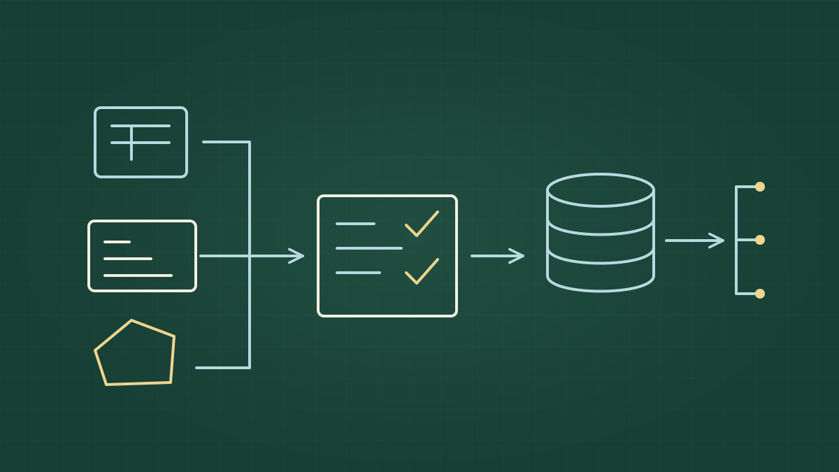
Construí uma arquitetura que chegou a mais de 100 fontes de dados. Nenhuma delas era minha.
Eu não controlava a qualidade na origem, os formatos, a frequência de atualização ou os nomes usados para representar as informações. Limites, irregularidades e erros faziam parte do trabalho. Precisava transformar essa diversidade em um ativo centralizado, reutilizável e compreensível para a equipe e para quem consumia os dados.
A primeira condição para isso vinha antes da integração: eu precisava entender o que estava trazendo para dentro.
## Se não sabe o que é, não entra
O critério era simples: se eu não soubesse explicar o significado de um dado, ele não podia entrar na arquitetura. Se quem executava o pipeline, a sequência de etapas que coleta e transforma os dados, não conseguia explicar a informação, como o usuário conseguiria?
Ter acesso a uma base pública e ao seu dicionário não garantia esse entendimento. Era necessário pesquisar o contexto, examinar os registros e, muitas vezes, analisar o comportamento dos dados para investigar o que estava acontecendo.
Cheguei a ligar para a Agência Nacional de Energia Elétrica (ANEEL) para validar uma informação. Também li um livro sobre solos para entender um conceito. Levamos essa exigência a sério: saber abrir um arquivo não encerrava o trabalho de compreender seu conteúdo.
## Dar nome também era construir a arquitetura
Com tantas origens, eu precisava de ativos que pudessem ser usados em diferentes projetos e por diferentes pessoas. Isso exigia uma taxonomia, um sistema comum para organizar e nomear fontes e dados.
Construí um padrão de nomenclatura para que todos falassem a mesma língua. A centralização precisava vir acompanhada de uma forma compartilhada de identificar as informações.
Esse trabalho fazia parte do reuso. Para alguém utilizar um dado em outro projeto, precisava conseguir reconhecê-lo e entender o que ele representava. A arquitetura tinha de servir à equipe inteira.
## Do dado cru ao dado utilizável
Ingerir uma base, isto é, trazê-la da origem para o nosso ambiente, era apenas o começo. Depois de entender seu funcionamento, precisávamos testar, decodificar os valores, ajustar formatos e normalizar os registros para um padrão de uso.
Quando era possível, corrigíamos os dados. Quando um erro era identificado, substituíamos o valor por nulo, registrando a ausência de um valor utilizável naquele campo.
A camada Silver era a etapa da arquitetura em que o dado tratado precisava estar apto para consumo. O critério de chegada era exigente: as informações precisavam passar pelas transformações e validações necessárias antes de serem disponibilizadas.
As principais exigências desse trabalho estavam conectadas:
- **Entender o significado antes de integrar.** Pesquisa e validação com a origem ajudavam a esclarecer o que o dado representava e seus limites.
- **Padronizar para permitir reuso.** Nomenclatura e tratamento criavam uma base comum para trabalhar com fontes diferentes.
- **Testar antes de disponibilizar.** A validação automática fazia parte do caminho até o usuário e dava suporte às alterações realizadas pela equipe.
## Cruzar dados quando não há uma chave comum
Em um banco organizado para relacionar tabelas, uma chave primária identifica um registro, e uma chave estrangeira referencia um registro de outra tabela. Ao combinar fontes independentes, nem sempre tínhamos esses identificadores em comum.
O trabalho de integração podia exigir outras formas de vinculação:
- **Correspondência aproximada:** os chamados *fuzzy joins* procuram relacionar registros pela semelhança entre valores, em vez de exigir igualdade exata.
- **Relações espaciais:** os cruzamentos usam a localização e a relação entre geometrias para associar os dados.
- **Modelos de vinculação:** combinam informações para avaliar quais registros correspondem à mesma entidade.
Isso ampliava o trabalho necessário para tornar as fontes utilizáveis em conjunto. Entender os dados também era uma condição para decidir como relacioná-los.
## Aprendizados, lições, erros e principais impactos
A arquitetura reuniu **mais de 100 fontes, 200 pipelines e 380 processos**. Com esse ativo, conseguimos **dobrar a quantidade de projetos de dados entregues com metade do tamanho do time**.
A equipe podia trabalhar em diferentes partes da arquitetura com validação automática, voltada a impedir que erros chegassem ao usuário. O resultado combinava reuso dos ativos com uma forma comum de tratar e conferir os dados.
Dessa construção, destaco:
- **A responsabilidade pelo significado continuava sendo nossa.** Mesmo quando a fonte era pública e tinha dicionário, compreender a informação exigia investigação. A ligação para a ANEEL e a leitura sobre solos fizeram parte desse trabalho.
- **Reuso exigia entendimento compartilhado.** Centralizar dados vinha acompanhado de organizar nomes e formas de uso, para que o conhecimento pudesse circular pela equipe.
- **Disponibilizar cedo demais era uma armadilha.** O dado precisava chegar à Silver tratado e validado. Estar acessível não bastava para estar pronto para consumo.
- **O impacto apareceu nas entregas da equipe.** O crescimento da quantidade de projetos entregues foi o resultado relatado dessa arquitetura. A quantidade de fontes dimensionava o ativo; a qualidade continuava sendo o critério para construí-lo.
## Ingerindo mais de 1 bilhão de pontos por dia
Fonte: https://vbfelix.github.io/portfolio/0039-geobehavior/index.html
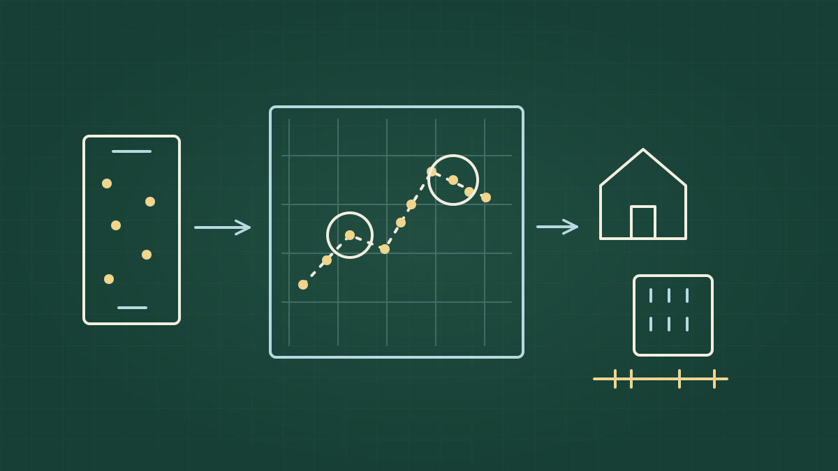
Mais de 1 bilhão de pontos por dia. A estrutura do dado era simples: data e hora, um identificador do dispositivo e uma coordenada. O trabalho para transformar aquilo em informação útil era bem menos simples.
Conduzi de ponta a ponta um projeto que lidava com dados de mais de 100 milhões de celulares. Minha atuação atravessou arquitetura, engenharia e ciência de dados, com a execução realizada pela equipe.
Recebíamos cerca de 30 a 50 gigabytes (GB) por dia, em lotes que chegavam a cada hora. Precisávamos organizar e processar esse volume, controlar o custo e, depois, construir algo útil a partir dos registros de localização.
## Receber era a parte fácil
A ingestão, a entrada dos dados no nosso ambiente, colocava um problema de armazenamento e processamento. Precisávamos de formatos compactos, que ocupassem pouco espaço, e otimizados para leitura, para que trabalhar com os dados não exigisse um custo desproporcional.
O pré-processamento também era importante. Antes de desenvolver os indicadores, havia trabalho de preparação dos dados, especialmente sobre sua dimensão espacial: a localização de cada ponto.
A Uber foi uma referência nessa etapa. A eficácia com que o aplicativo processava os pontos ao solicitar um motorista nos levou a estudar sua abordagem geral de processamento e adaptá-la à nossa necessidade. Meu papel era conduzir essas decisões e manter a conexão entre a estrutura de engenharia e o que a ciência de dados precisaria construir depois.
Resolvemos o desafio do volume com uma estrutura de baixo custo. Mas ter os pontos armazenados e prontos para processamento ainda deixava uma pergunta: o que conseguiríamos entender a partir deles?
## Um bilhão de pontos não significava a mesma informação sobre cada celular
O identificador não me dizia quem era o dono do aparelho. Ele permitia acompanhar registros associados a um dispositivo, mas oferecia apenas uma parte de seu comportamento.
A frequência desses registros variava muito. Alguns celulares geravam **um registro a cada dez dias**. Outros chegavam a **400 registros por dia**. Tratar esses dois casos da mesma forma desconsideraria uma diferença central do dado.
Essa irregularidade mudou a forma como precisávamos trabalhar:
- **O volume total não descrevia a cobertura de cada dispositivo.** Era necessário examinar os registros disponíveis para definir o que podia entrar em cada análise.
- **O período de observação precisava variar.** Alguns dispositivos ofereciam informação útil em poucos dias; outros exigiam períodos mais longos.
- **Disponibilidade não bastava para uso.** Critérios de elegibilidade, as condições para aceitar um registro na análise, faziam parte dos métodos.
Trabalhamos com diferentes janelas temporais, os intervalos de tempo considerados na análise, para ampliar a cobertura dos dispositivos. A irregularidade dos dados precisava ser tratada junto da construção dos indicadores.
## O Geobehavior
Com critérios definidos, construímos o Geobehavior: indicadores para caracterizar padrões associados aos dispositivos a partir de seus registros de localização.
Conseguíamos inferir locais associados à moradia, ao trabalho e à frequência de visitas. Ao combinar esses padrões com os dados do entorno, passávamos dos pontos isolados para uma caracterização do dispositivo.
O identificador continuava sem me informar o nome de seu dono. O que tínhamos era uma leitura de parte do comportamento observado, construída a partir dos registros disponíveis e dos critérios adotados.
Essa distinção era importante para entender o resultado. Um perfil dependia da informação que aquele dispositivo havia produzido. A quantidade de dados recebida pelo sistema não tornava igualmente completa a observação de todos os aparelhos.
## Aprendizados, lições, erros e principais impactos
Conduzi o projeto desde a estrutura para receber e processar os dados até a construção dos indicadores. A equipe resolveu primeiro o desafio do alto volume com baixo custo, tratou a irregularidade dos registros e desenvolveu o Geobehavior.
Dessa experiência, destaco:
- **A arquitetura precisava preparar o uso analítico.** Formatos compactos, leitura eficiente e pré-processamento espacial faziam parte da preparação dos dados para os indicadores.
- **Usar o volume agregado como medida de informação seria uma armadilha.** A diferença entre registros esparsos e frequentes exigia critérios de elegibilidade e períodos de observação distintos.
- **As janelas temporais faziam parte do método.** Adaptar os intervalos analisados era o caminho adotado para ampliar a cobertura diante de registros irregulares.
- **O resultado foi transformar pontos em indicadores de comportamento.** O Geobehavior combinou padrões de localização com dados do entorno, criando uma caracterização que ia além do registro cru.
Minha contribuição foi conduzir essa sequência de ponta a ponta, articulando as decisões de arquitetura, engenharia e ciência de dados para que o volume recebido pudesse se tornar informação utilizável.
## Criando meu clone com IA
Fonte: https://vbfelix.github.io/portfolio/0040-criando-meu-clone-com-ia/index.html
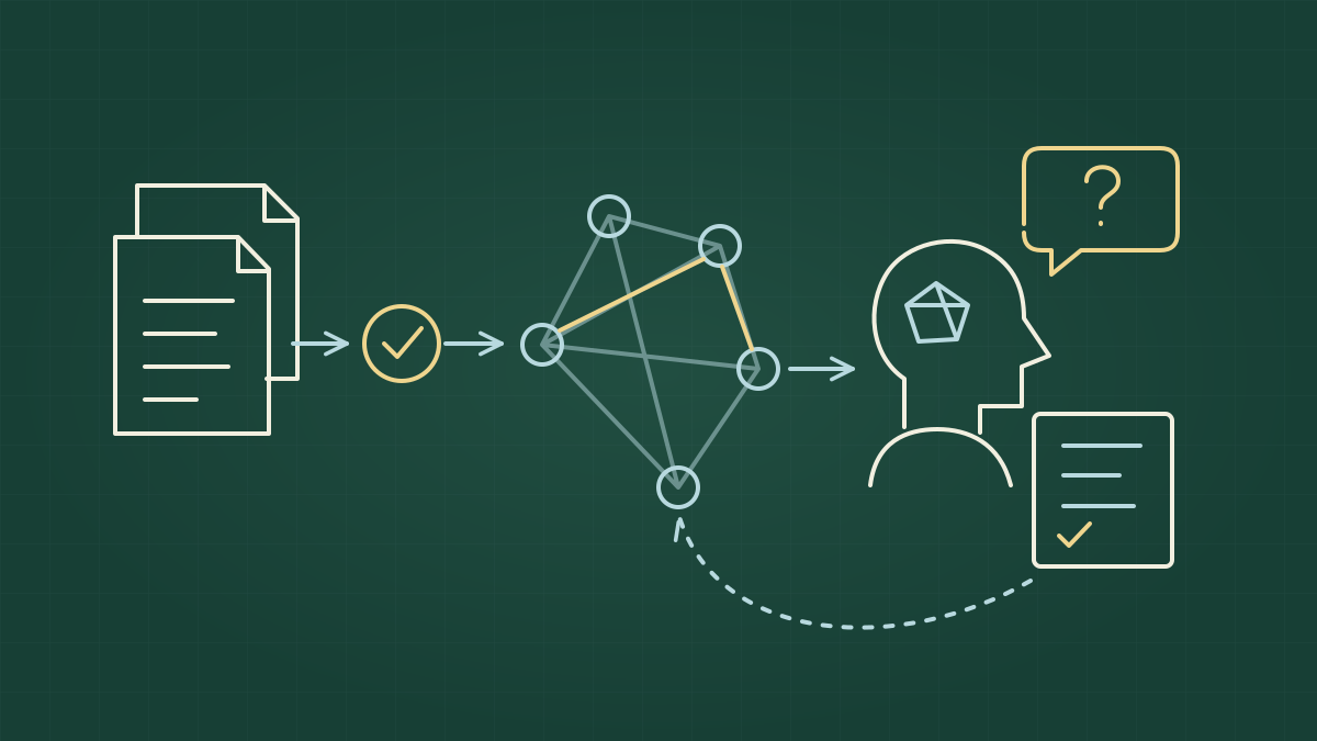
Na época da Copa, brincamos na empresa que precisávamos de um Vini Jr. Um clone meu para responder às perguntas e apoiar o time quando eu não estivesse disponível.
Tínhamos várias fontes de conhecimento, mas faltavam centralidade e curadoria. Um dos desafios era saber como consultar aquele conteúdo e estruturar as respostas. A informação existia; organizar seu uso fazia parte do problema.
Foi dessa brincadeira que veio a ideia de salpicar uma wiki com a minha personalidade e tentar criar meu clone com inteligência artificial (IA). Criticismo, ceticismo extremo e uma pitada de chatice. Essa parte funcionou: às vezes, a quantidade de perguntas irritava.
## Um fim de semana e alguns vestibulares
Quando conheci o conceito de [LLM Wiki, apresentado por Andrej Karpathy](https://gist.github.com/karpathy/442a6bf555914893e9891c11519de94f), fiquei maravilhado. LLM é a sigla em inglês para grande modelo de linguagem, o tipo de modelo usado para compreender e gerar texto. A proposta era usar esses modelos para construir e manter uma base de conhecimento organizada, com páginas ligadas entre si e alimentadas por fontes.
O que me atraía era organizar informação para a própria IA consultar. Eu queria consultas mais rápidas, com menor gasto de tokens, as unidades de texto processadas pelo modelo, e menos alucinações, respostas que parecem plausíveis, mas não têm sustentação.
Meu primeiro segundo cérebro foi para a empresa em que eu trabalhava. O maior desafio estava na entrada: selecionar e incorporar conteúdo curado, lidar com múltiplas fontes e resolver muitas divergências.
Foram **35 horas de trabalho em um fim de semana e mais de 500 perguntas respondidas**. Acredito que fiz alguns vestibulares ali.
O acervo exigia decisões. O fato de uma informação estar escrita não encerrava a discussão sobre o que ela significava ou como deveria ser usada. Para organizar esse trabalho, impus algumas regras:
- **Perguntas críticas bloqueavam conteúdo.** Certas lacunas precisavam ser respondidas antes de permitir o avanço.
- **Consultar a internet era proibido.** O trabalho precisava se apoiar nas fontes fornecidas.
- **Divergências e respostas precisavam de dono declarado.** Era necessário identificar quem respondia por elas.
A construção da base exigia minha participação justamente nos pontos em que havia ambiguidade. O volume de perguntas fazia parte desse esforço de curadoria.
## O clone precisava saber por onde pensar
A wiki, por si só, não foi suficiente. Eu queria que o time tivesse acesso também à forma como eu pensava a empresa.
Passei para ela uma estrutura de entidades e ligações. As entidades eram os elementos que eu distinguia naquele contexto; as ligações registravam como eles se relacionavam. Essa organização servia de base para orientar a consulta.
Dependendo da pergunta, eu definia por onde começar. A partir das relações, indicava por onde seguir e até onde chegar. O conhecimento ganhava caminhos de investigação.
Isso fazia diferença para o que eu estava tentando construir. Ter conteúdo disponível atendia à necessidade de memória. Para apoiar o trabalho do time, eu também precisava explicitar como usava aquele conteúdo para examinar uma questão.
Meu critério precisava aparecer na estrutura. A IA teria de conseguir percorrer relações que, para mim, faziam parte do entendimento da empresa.
## Um pouco de mim, inclusive a chatice
A brincadeira com o Vini Jr. deu nome ao tipo de apoio que queríamos. Usei minhas instruções pessoais e a memória do meu chat para trazer características do meu comportamento: criticismo, ceticismo extremo e disposição para questionar.
A personalidade tinha uma função no trabalho. Eu queria que ela examinasse o motivo por trás de um pedido e insistisse nos pontos que precisavam ser esclarecidos. Às vezes, isso significava fazer perguntas suficientes para irritar quem estava do outro lado.
O objetivo era não deixar a pessoa seguir sem o motivo correto.
Esse comportamento complementava as regras da base. Havia conhecimento organizado para consultar, caminhos para investigar e uma postura de questionamento diante do que ainda precisava de fundamento.
## Especializar para trabalhar com o time
Criei também **skills**, conjuntos de instruções para executar operações específicas. Nesse caso, eram voltadas aos processos do trabalho de produto.
Eu definia o formato da entrega e o aprofundamento esperado em cada operação. Isso permitia padronizar o trabalho do time e organizar a forma de atuar com aquele conhecimento.
O segundo cérebro passou a combinar:
- **Uma base curada**, com fontes e divergências tratadas.
- **Uma estrutura de consulta**, com entidades, relações e caminhos definidos conforme a pergunta.
- **Um comportamento crítico**, que questionava motivos e premissas.
- **Instruções para operações de produto**, com formato e profundidade controlados.
Era essa combinação que aproximava a ferramenta do apoio que eu queria oferecer quando não estivesse disponível.
## Quando coloquei meu clone à prova
Em um teste, peguei um projeto que eu mesmo tinha desenhado e escrito. Trouxe uma pessoa do time para analisá-lo comigo e com a IA.
Eu perdi para ela.
A IA recuperou decisões antigas, restrições e premissas que eu já não tinha na cabeça. Apontou possíveis bloqueios, dependências e implicações que não estavam explícitos. Também conectou informações que eu conhecia separadamente.
O desconforto estava em reconhecer que boa parte daquele conhecimento tinha saído de mim. Eu conhecia os pedaços, mas não tinha feito todas aquelas ligações ao examinar o projeto.
Foi uma demonstração concreta do que eu buscava: um sistema capaz de usar o contexto que eu havia organizado para questionar o trabalho, inclusive o meu.
## Aprendizados, limites e principais impactos
Não sei se foi a melhor aplicação possível de uma wiki. Foi uma tentativa de clonagem que apoiou meu time e, naquele teste, trouxe pontos que eu havia deixado passar.
Da construção, ficaram alguns aprendizados:
- **A curadoria exigiu julgamento.** As horas e as perguntas fizeram parte do trabalho de organizar fontes, esclarecer divergências e atribuir responsabilidade pelas respostas.
- **Conhecimento disponível não bastou para o apoio que eu queria.** Precisei explicitar relações, caminhos de consulta e critérios que usava para pensar a empresa.
- **A personalidade precisava servir ao trabalho.** O ceticismo e as perguntas insistentes tinham o objetivo de exigir fundamento antes do avanço.
- **A especialização ajudou a padronizar a atuação.** As skills definiam operações de produto, formato de entrega e profundidade.
- **O teste mostrou o valor de recuperar e conectar contexto.** A IA levantou questões que eu não havia levantado no meu próprio projeto.
Talvez meu clone não fosse tão criativo. Mas, naquele teste, lembrou do que eu tinha esquecido e fez ligações que eu deixei passar. Era esse tipo de apoio que eu queria tornar disponível para o time.